I like icon and horizontal text , or only icon solution .
These solutions are close to the goal. If only we can figure out how to deal with those tabs… vertical text is not the right UI design and is very bad for usability.
Is something like that can be the solution ?
Nop, I really don’t think that this type of solution could work out of a little part of the users.
To me it looks 1) more readable than the vertical tabs 2) once you get practiced you could find things faster
That’s not a solution to the graphical design of the sidebar, which this thread is about. Your video is unrelated.
How about moving tabs into buttons with popovers? They might go to the bottom of the editor(3d viewport). sidebar might simply be replaced with tool settings
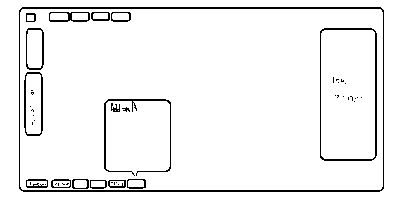
(Sorry for the quality, but this was the best I could do because I’m currently outdoor. Yet you’ll get the idea…)
As a result, the 4 sides of the 3d viewport might look like this.
Top: Header menus and popover buttons(such as pivot, overlays, shading, etc)
Left: Toolbar(T)
Right: Just the tool settings(N)
Bottom: Extra popover buttons(which was the sidebar tabs)
This organization might be really simple and easy to use.
In Blender Today, it was stated that the popover is actually internally treated as a panel in terms of coding. It shouldn’t be too difficult. This solution might also get rid of the horizontal text completely. Consistency between editors might also be recovered(since most of the editors don’t have tool settings at the header).
8 Likes
yeah I like that at least in the interest of consistency. I suppose we should be able to hide this just like the header ? also it would be nice if we could colapse this either horizonatlly or vertically exactly like the N panel (through a shortcut or by dragging or pressing that arrow)
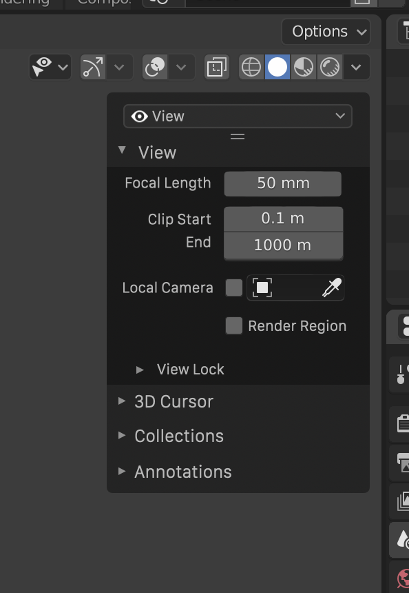
Right now we have a secondary header
I am necromancing this thread as a reminder it’d still be nice to de-uglify the sidebar. It’s just not up to standards with other parts of Blender’s UI design.
4 Likes
all editors have a similar npanel… but yes, i think that could be improved and cleaned
Yes, at least the design should be cleaned up. It’s one of the main parts of the UI.
Also, vertical text is a bad idea IMHO.
Similar to the approach mockup up by @LudvikKoutny, here’s a further tweak:
This removes the need for vertical text, which also add an annoying vertical bar all the way down the view, which push the controls further into overlapping with the viewport.
Part of this concept is that the user would be able to expand open the menu to reveal a list:
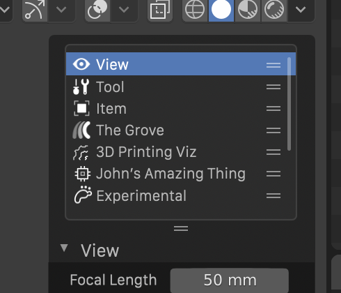
This list could be re-ordered by the user, so if he/she uses a few things mainly, they can be moved to the top of the list.
17 Likes
This has become a design task now: https://developer.blender.org/T76023
8 Likes
What if the tabs were drawn in a navigation bar region? It’d give you more options for inserting UI elements (buttons for overflow popovers, display mode cycling, tab sets, etc) and it’d improve discovery.
A popover for showing/hiding tabs, a UE4-style search box in the sidebar header, and horizontal tabbed navigation within panels might be worth looking at, as well. A mixed approach will give you better results than a straight swap from vertical tabs to a drop-down/list view.
1 Like
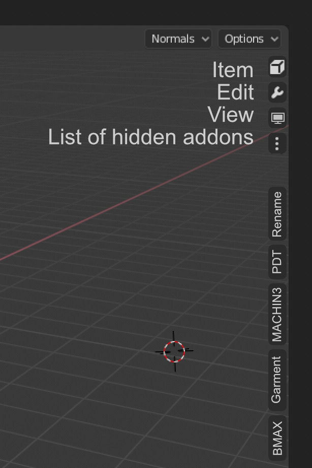
I would like to propose an idea similar to those that have been proposed previously and which adds, in a modified form, the idea of the list of addons.
This allows
- save the immediacy of the tab system
- operating simplicity
- space utilization of the interface
Do not look so much at the visual solution, which can use tabs, buttons, … simply the concept of usability.
The idea is simple, through customization (or automatically according to the screen space), you decide which tabs appear and the rest are accessible through a classic drop-down menu. And the bar is visible without any panel visible, not like actually.
The use of icons is secondary, but it would be a good addition to reduce the use of space.
3 Likes
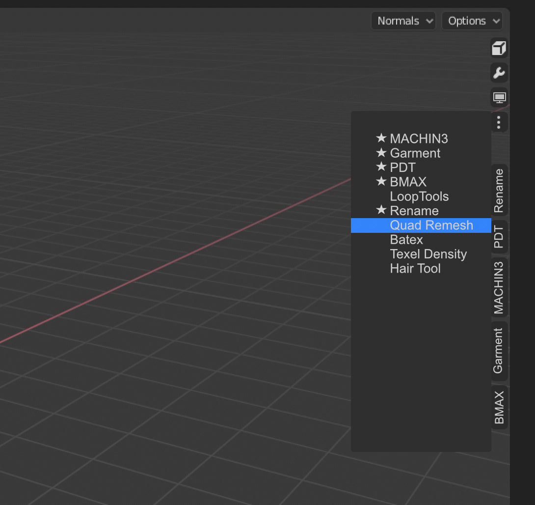
A question about longlist toolsets.
Will it be also handy to handle them with such a solution?
Asking because we have really longlist toolsets, like on this example GIF:
And it’s a very nice design I must tell. The expanding+resortable list is a clever idea, and also the multi-selection sound interesting, considering it can also be re-used in other places like modifiers list.
Btw how would it look when everything is closed? (No more ugly + sign I hope  )
)
Yes that’s a really neat idea.
3 Likes
Haw haw thank you @Debuk that is very explanatory