Long scroll when you have many folders or files, before with horizontal view layout, it was easier you don’t have to scroll that much now we have a lot useless space in the middle of the window.
The fact that the save window is getting hidden ( goes to the background ) when clicking on the main window, it is pretty inconsistent with the way native OS, windows in my case, handles saving windows. In windows you have to finish the saving action before the main windows is active again.
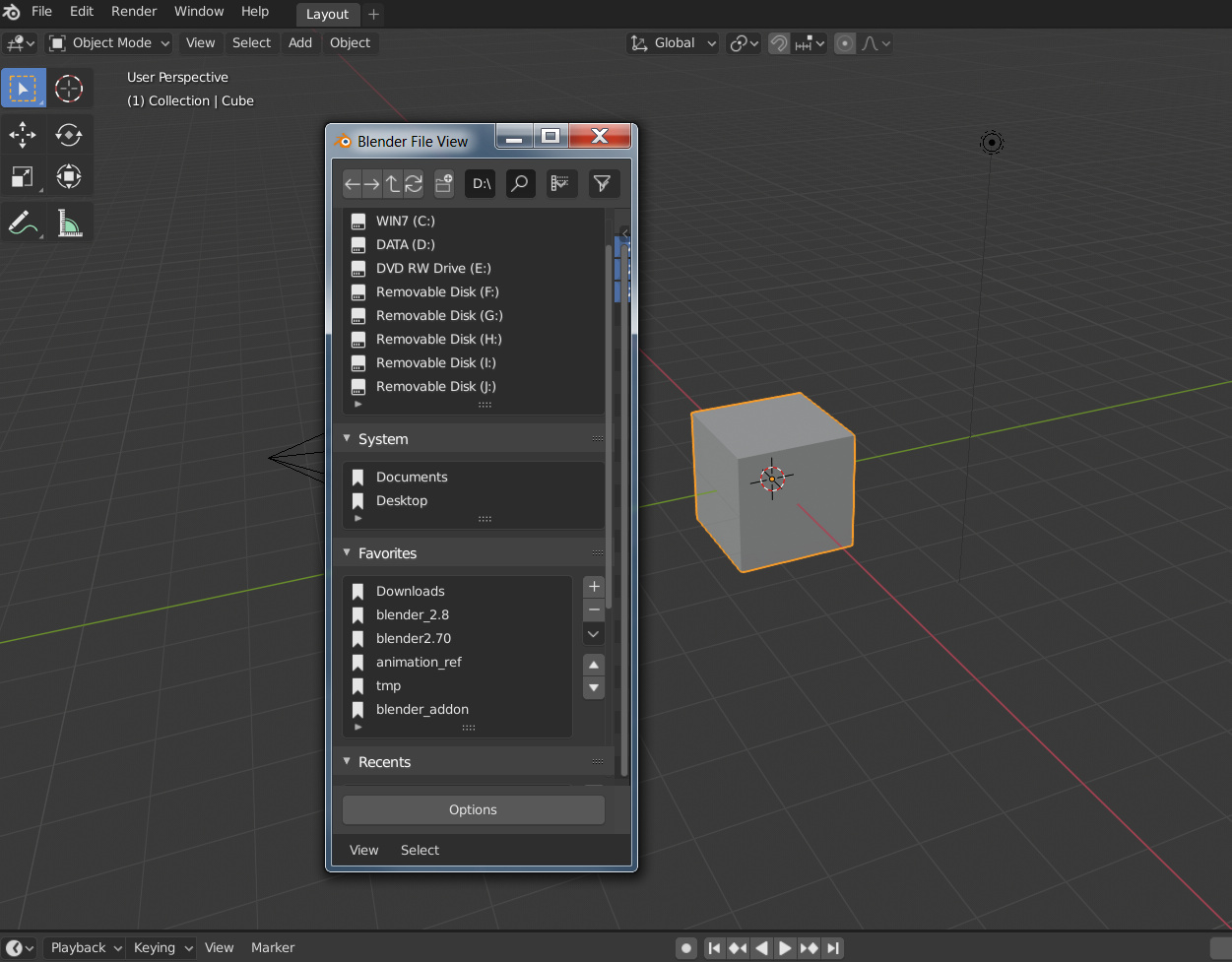
The saving window should have a minimum size bigger than the default, the default is just too small.
I think the user experience is the industry standard.
You are doing better than others, you are the industry standard.
The first priority of all functional user experiences is efficiency.
For example, this file browser assumes that it only takes 10 seconds and 5 short-distance operations to complete the task.
It now takes 15 seconds and 8 operations and more physical strength to complete.
Then he must be backward and will never be called an industry standard.
A user wastes a second in a function, and all users add up to this is a terrible number.
Wasting time is a waste of life.
So I hope that Blender will not blindly pursue the so-called industry standards.
What users really need is to complete the task with the most concise, most efficient and labor-saving operation.
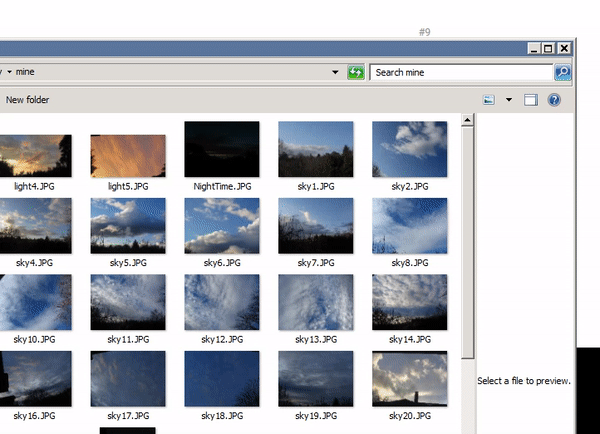
This is what i meant “The saving window should have a minimum size bigger than the default, the default is just too small.” I really don’t know how rephrase better. I put that pic to illustrate what i meant " That is the smallest you can resize that window". I guess the English is not helping
Interesting discussion. I don’t know if it was mentioned already before, but my most missing feature is to have the same window settings every time, when I reopen it. I really don’t like to reset my file window filters to my preferred needs, everytime when I open it.
It would help us a lot, if the file window would not only remember the same recent location, but the recent filter settings too. And the very best would be, if this settings would be saved into the blend file to reuse them the next time.
So here my wishes, that would solve a lot of problems in my opinion:
Save the file window user settings for the current session and individual Blender areas, if possible (File windows for Scene files, image files, append files etc.), . Don’t reset the file window settings, when the window will be reopened.
Save the file window settings into the current .blend file to use then for future work.
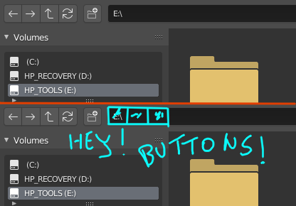
I don’t wonder that people are requesting double dot to come back when folder up action was mapped on Alt+Up Arrow. That shortcut literally takes two hands to execute, so one has to let go of mouse and use both hands just to go one folder up. That’s incomparably worse to just clicking the double dot. If the double dot has to go away, then you need to provide a sane alternative to up one folder, which Alt+Up Arrow is certainly not. What’s wrong with the Backspace key, which is the standard in pretty much every file browser out there.
Blender turning into “windowed mode”, i don’t mind it if it’s optional but it should be done in a smart way like that hidden feature with shift and click on editor’s corner to detach a new window, maybe add an icon for load UI instead of just in the preferences for when opening a new file, imagine opening somebody else files and seeing all these floating windows around and you have to close them all, with that icon i can pick which file to open with it’s UI or not, and like @bluesky said we care about t efficient and labor-saving operation we don’t care if it’s the “standard” way or not, it’s cool that blender has it’s own file-browser which could be developed even further to have more advanced features like the Asset Manager with a complete data-base system and anything that wouldn’t possible if it called OS one, see sometimes going against the stream is good.
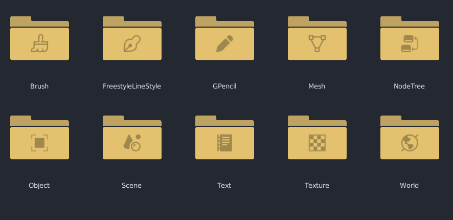
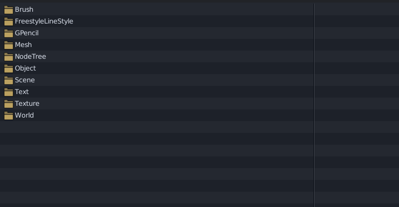
I noticed that now by entering with append in a blend file, the various objects are now colored which is fantastic, but at a real utility level, I believe that the folders that contain the various types of objects they too should be colored for easy to identify (I refer to when they are in miniature, having noticed that in thumbnail mode they display the symbols of the objects contained) @Harleya
Excited to see how the file browser will improve.
I do find the view settings quite inconvenient, because I’m both used to the old file browser where everything was just buttons at the top, and I’m used to the Windows way of doing things in a single intuitive slider:
I don’t know about y’all but I really like this slider. To me it’s the best of both worlds:
A lot of different settings collapsed under a single “popover” which keeps things grouped and avoids visual clutter (if those are the reasons to not have the buttons in the header), and everything is immediately available with a single click-drag action.
Anyway, just my 2 cents.
Just a small thing, but when importing obj’s now it’s one extra step to expand the geometry dropdown in the import options to switch to keep vert order. Speaking of which, why is that not the default? I can’t remember the last time I wanted to change the vert order when importing.