Blender UI paper cuts

Old left overs in the screens area, some a couple of workspaces are there since alpha testing.
I made a note of this before, also post it in a bug i believe.

1 Like

Someone needs to work on the theme section. Several UI colors are not available there, even some that are there don’t even work at all. It’s tough.

1 Like

add the tabbing on these buttons and on file browser (also with arrows)
Screenshot%20(138)

3 Likes

Hello dear community

I noticed - what I assume to be a paper-cut - the toolset menu in a Grease Pencil Object, shifts the number’s order when you change from ‘Draw’, to ‘Fill’ or any other tool.

When the ‘Draw’ tool is selected, the list goes from 0 (‘Draw tool’) through 8 (‘Circle tool’) –
but when on any other tool ie. ‘Fill’ or ‘Eraser’, the list starts at 1 (‘Draw tool’) through 9 (‘Circle tool’).

I imagine a solution to be, to change the ‘Draw tool’ order from 0-8 to 1-9, to align with the rest and easing up on the muscle memory :slight_smile:

4 Likes

Not just colors. Can’t even adjust Node Editor grid size, Node Frame padding, etc. Just a very few examples.

Maybe we should start a new discussion for these though. I mean specific area focused, like one topic for node editor, one for image editor, etc.

1 Like

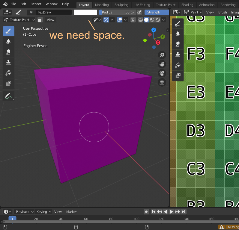
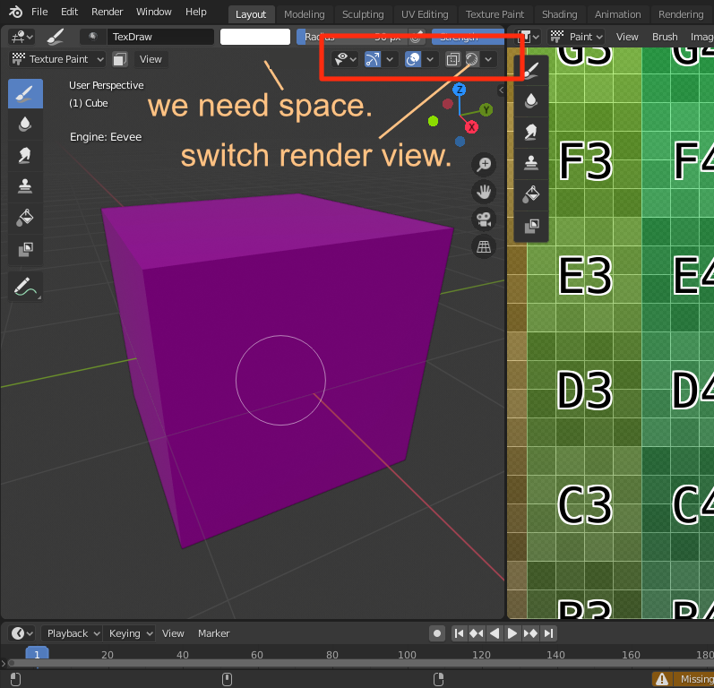
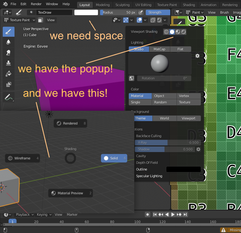
and finally to better understand why we need space …
Screenshot%20(149)

2 Likes

No luck…

maybe then it was May and everyone was tired … and yet the results of real success had to come …
maybe now they have changed their mind :wink:

Good luck with that. :wink:

:joy: … anyway…
the fundamental rule is only one, the more the interface is fun and relaxing, the more people are addincted.

Navigating in those buttons using the arrow keys is mandatory. If it’s not there, then it should be considered a bug.

Problem is blender’s design essentially did away with focus, in the sense that it always follows the mouse. In other toolkits it either doesn’t follow the mouse at all or follows the mouse only when the mouse is moved.

Also, tab key, which is used to shift focus around is used for many other things. RIP. F.

This also means that offering accessibility to those with dissabilities is much, much more difficult.

this is true, but some “windows” are on top … and should take priority until they go away …
moreover, things are changing a little, since we will soon have floating windows always on top …
So at least for these elements on top, until they are closed, like the file browser or various temporary and floating popups … the tabulation could work easily.

It could be solved easily with icons in the header and a few of polish.

It can be reduce to this without problems

8 Likes

exatly, we need to reduce the space, especially for split views, like one in uv-texture-panting and another in 3d view … so we have most of the tools accessible without having to drag the brush topbar
here’s how other professional applications keep the brush tool bar minimal

this is how the situation is today without touching anything on my screen …

I’ve discovered this weekend that I can finesse grid_flow sub-layout breakpoints with scale_x. It makes it easier to force breaks before label text is cut off, and it’s amazingly useful for narrow/dense layouts. I ended up making a panel that covers many of the same settings as the viewport popovers in order to get a handle on it:

I’ve also been playing with different ways to combine sliders and toggles, aiming for a solution that plays a bit nicer with the layout grid. This screenshot shows one way to do it, collapsing a full-width toggle button down to an icon when it’s active:

And this one shows an alternate layout, with a cancel button instead of an icon:

I really like this kind of layout for the mesh analysis overlays. Putting the drop-down menu on the same row as the toggle and displaying the related sliders in a box() element takes up less space than a sub-panel, and it does a decent job of communicating hierarchy. It makes it easy to tune the breakpoints of the sub-layouts, too.

I played around a bit with expandable header sections, but I haven’t found the best way to implement them. I’m thinking I’ll need to create a system to change the icon on hover when a modifier key is held down, in order to indicate different behaviors. That’ll make stacking popovers and expanders a lot easier.

6 Likes

Do you need shift to select various options of the same group?

What is it, an addon you are doing?

Nothing I plan to release — testing UI tweaks with an addon makes it easier to keep my local branch clean, since I don’t have to worry as much about reverting experimental changes before generating differentials. Popover layouts and single-row header buttons are all in python.

I have had to change some things on the C side of the UI in order to make double-row header buttons work, though. The 3D viewport header might be transparent, but it has a fixed height; tall header element will clip, rather than overhang. Here are a few elements I’ve tested:

image
image

I’m thinking that an adjustable-height header and some smart breakpoints would alleviate some of the crowding on small screens and split layouts, but it’ll take a while to implement.

10 Likes

why don’t you make a differential proposal on developer.blender.org, maybe they’ll accept it?

I like how you are organizing the head of the 3d view, although I must point out that my problem, as I have already written about, is to have top bars that can be used comfortably in small window sizes split for texturing + 3d view etc. .
(I also like your sidebar, I love the fact that the buttons are easily usable while remaining tight)

:yellow_heart: