Yes it is 100% useful. And more importantly, it is a crucial component in the set of small details that collectively compose a robust, user-friendly, native-feeling, “complete” user interface. Forward and backward buttons are on most non-basic mice and many users are completely used to them functioning as native extensions of their fingers in the process of interfacing with their computer via their mouse, or even touchpad— on my laptop, I have a four-finger gesture set up to also trigger forward/backward movement; this is an easy customization in the Windows 10 settings app (or maybe it’s even default? I don’t recall) and I would presume it is very common for people to use. For web browsing, it is a life changer to swipe or tap the mouse thumb button to instantly navigate, and likewise in Windows Explorer and even VS Code.
The buttons are a natural, native function that is expected functionality from any history-based navigation interface. If it’s lacking, it feels incomplete and mildly frustrating. I won’t quit Blender for the developers’ negligence in omitting it, but it’s one of the many features that will make me dislike how un-native the Blender file browser feels. I am also too lazy to bind those keys myself, and I would go on living without those buttons doing what I expect from a native implementation. But it will continue to be a small annoyance that, with many other small annoyances, add up.
If the goal is to polish up the file browser and make it feel complete and native, then this is a must-add detail. Better yet, it requires no feature development, it just requires setting a default keymap for all users. Comprehensive sane defaults are the first step in building good user experiences. This wouldn’t clash with any other feature, it wouldn’t unexpected change up any functionality, it wouldn’t have any controversial affects on workflows. There is literally no reason not to wire this up by default so it behaves expectedly for any and all users.
before that i would enable F2 as a default shortcut to also rename files and folders in the browser, at the moment only and always renames the selected object in the scene when i have a browser open.
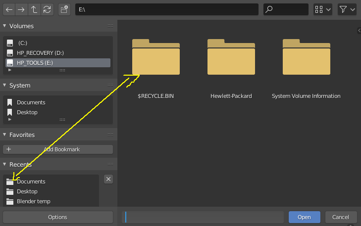
Huh? There are a number of different view modes, Vertical List, Horizontal List, Thumbnails in four different sizes. For each of these view modes it shows folders of the same color.
It is just that we are not coloring the folders in the “Recent” list.
Ah… no worries. Yes, I agree with you. I’d rather have the folders be colored the same everywhere. In fact the grey folders look a bit… disabled to me since the others are colored. Although I was outvoted on that, it can always be something that is changed later. It looks a bit funny but not that important. Lots of other things to do.
New file browser has some nice features. It opens in separate window which is great but it still it needs many fixes mentioned above. Some below bother me the most:
in file list there is missing Up Arrow with dots … that is used to navigate to the parent directory,
file window does not remember window size and other previously set settings. Manually resizing every time when it opens is not a solution,
there is no single click to open folder,
icons need to be easily distinguished. Introduce colors. Have a look how it is done in Windows explorer or OSX finder.
@billrey@julianeisel other user mentioned this points in particular too,
almost everything done in this new browser we could reduce it to taste or what its people more used to see, from moving the the icons to povovers and making a float window even up to the “+ -” buttons, there is a level of like not like that its ok normal with every change, but this two points in particular are different, the argument to do double click to open folders and remove the go up arrow may be standardization or something like that (im not sure) but it really hit hard on productivity its not only that i may like or not it really does hit in the ease of navigation, i hear yestarday from @pablovazquez in the blender today that may be an alternative to the “go up icon” but still the double click stuff to open folders in the middle, please reconsider this two points, probably you already have i didn’t check the lastest tickets in fabricator im not to up to date the last thing i saw where the + - back but even those -+ aren’t as importan as the
single click to open folders
go back closer to the content of the editor
F2 for renaming or something for rename thats not in a menu.
this last one may be a w.i.p. bug again im not to up to date in the fabricator task, at the momentF2 only renames objetcs even when the Browser its a float independent window still tries to rename the objects in the scene, and the need to go in to a menu to rename its also a big drawback functionality wise.
You know that there’s no standards in the Linux world. You can’t never refer to it as standard. Linux is a total mess when it comes to designs and standards. Not to mention the horrible OSX.
What’s the most used file browser in the world? Yes, you guessed. Start from there.
Just to add my two cents. Really liking the cleaner UI, but options should be enabled by default and the proposal from above to standarize the UI, and allow the search and location boxes to be better aligned.
Single-click vs Double-click
As it seems many are split between single click and double click, it should be an option in preferences (personally i prefer the speed of single click).
Add option for popup vs existing window
There should be an option to either have the file browser as a pop-up or to open from the existing UI a la the render window setting. It is quite nice to be able to see full screen for file browsing. It allows one to find documents easier in a folder with many items.
Lag
The new pop-up window has quite a bit of lag which also makes me prefer the old existing window interface.
System bookmarks
Maybe this would be a good time to incorporate proper system bookmarks on Windows as they work on Mac and Linux?
Sidenote: Standalone File Browser?
It would be somehow great if this file browser could be spun off as a stand-alone alternative file browser for the three OS’s. I don’t think such a project exists at the moment.
Many of the points raised here (and elsewhere) over and over again are already planned to be addressed, see T69652. Read this if you want to learn about further plans.
One thing that’s repeated often is the single vs. double click to open folders. The single click has some issues:
With LMB-select there is no good way to select directories without opening them. Previously RMB had to be used to select.
Single click is confusing & inconsistent (clicking on regular files invoked a different action than clicking on folders). Personally I’ve found this very annoying - it just felt broken.
Most common file browsers use double-click, there should be good reasons to break with user expectations here.
While we don’t want to force the double-click on users, it’s a question about good defaults. IMO - and other UI team members agreed - double-click is the better default.
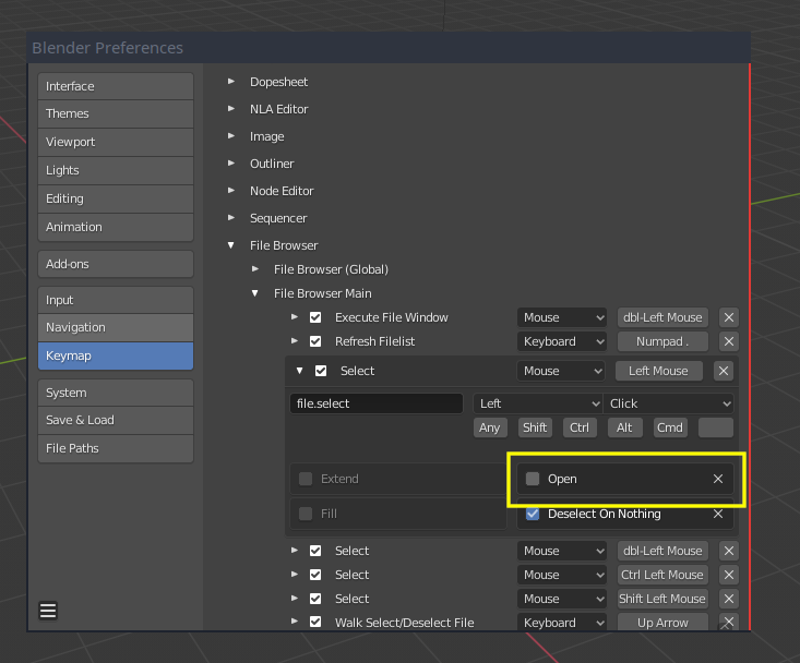
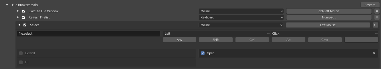
To get back the single click, the Open property of the file browser Select operator can be activated:
Later im going to properly read those, at the moment looking fast at those task it actually scares me a bit the idea that the references for blender file browser are Operative systems file browsers, If i would plug my cel phone and download my vacation pictures with Blender it would be a great thing to see but im not using blender as a generic OS.
Didn’t know this property, just tested it works as expected i can work with this thanks, im on the right click select team maybe thats why its so weird for me and counter productive to keep double cliking to enter a folder in Blender.
I agree. At first the(old) file browser was a bit weird, but once I got used to it, it was much faster for me than, say, Maya’s or XSI’s. At the very least I think the “Sort By” icons should be exposed like they were. I used the “sort by date” function ALL the time - having do dig for it in a menu is not an improvement. I would like to at least be able to choose to add those icons back to the header.
The new thumbnail sizing is a good improvement, I think, but now I’m noticing that some image formats no longer are displayed like they used to be. That might be a bug (I hope it’s a bug, anyway).