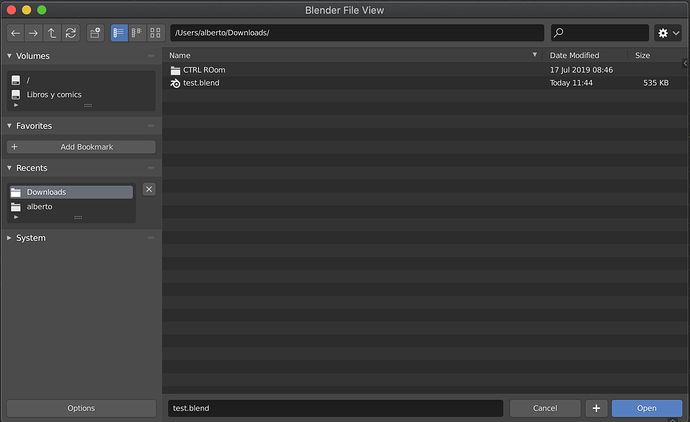
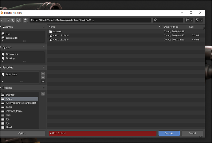
Let's talk a bit about the new File Browser 2.81

I have been using the lastest builds and there are a lot of really cool things for example,

  • Importer/exporter options in panels in the sidebar (i really like this one for the extra space).
  • New and updated icons.

and things that mmm looks cleaner however a bit hidden.

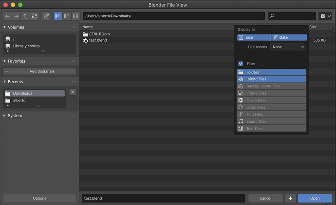
  • Popovers for view and filter options.
  • Vertical list view with interactive column header.

But it has a few draw backs that im not sure if those are bugs or work in progress or simply pick and choose,

Float window
This is a weird one, consistensi its the word of the day but its not properly working.

*It lags a lot:
one of the problems in the old browser was the lag at the moment of resizing, this was not fixed even worst the lags also afects the movement of the window in the OS (at least Windows) so it kinda defeats the purpose of a floating window

*its not fully independent:
Not sure if its being handle internally as system window or something like that but if there is a Preferences or Driver editor opened, trying to save a file will replace the previous ones.

Interaction


In this points i understand the consistency part, looking to it from the point of view of a normal software user that never used a 3D soft but the “powerful” part its what bothers me a bit.

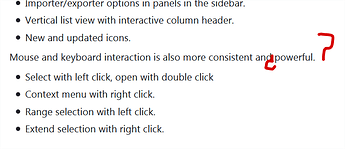
*select with left click, open with double click:
Why is this more powerful? before one click opens a folder now i need two or (and this is probably a bug) hold ctrl+click, what it was a simple action like going into a folder now requires more clicks.
There is though a weird behaviour if i click and drag a few pixels a folder, when i release it opens the folder, this is kinda nice but it start to become confusing especially with the next points,
i can drag and open instead of drop the folder ?Âż?Âż

**Range selection with left click.*:
Im a bit confused by this one
Blender at the moment does not suppor multy drag and drop also does not support copy and paste in the file browser.

*Extend selection with right click: Âż? Âż is this an error in the W.I.P. release notes?

*Rename a file requires a menu:
Not much to talk here, before was ctrl+click, now i need to W/right-click find and find an option in the menu to do the second most common action after creating a folder.

*Can’t delete:
Basically that, a file browser where i can’t delete, this actually goes against the “consistent” statement, yes its dangerous but the delete with the confirmation checkbox was never a problem i also realise that this change was before the new browser, i expected to be a temporary change.

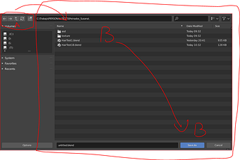
*navigation icons:


vs

Before it was possible to comfortably navigate and every thing was close at least in the vertical space(i understand that people with really wide screens may have some issues)
So it was possible to do everything that was required in the rectangular B space, if there where a lot of files may need to go up and down but mainly was all in the same place (from navigation to filters), this was so efficient that i rarely used the A space , i don’t remember the last time i used it. Now A and all the B area are required to do something, or use the shortcuts that are the arrows, a group of buttons that are away from the wasd and mouse area, so again it consitant maybe, powerful not that much. . .

**menus at the botom?*:
this is surely a wip miss but i mention it because its probably too little of a thing to do a bug report for it, and its kinda cute :3

9 Likes

agreed.

it is very uncomfortable to work, the way to handle the filters and thumbnails is terrible
I think you should add a way to revert it using the user preferences, today it is like a incomplete feature.

I prefer use the system browser instead

4 Likes
  • The floating window needs to stay on top. An option to be in modal mode would be nice too.

  • View modes in a popover is a no go, yeah. They should be directly accessed in the header.

  • It should remember the last view mode. And maybe the window size and position.

  • The +/- buttons to increment/decrement needs to go back.

  • The giant “Options” button on the bottom left needs to go.

  • We should be able to click on an empty space to deselect.

  • The “Open/Cancel” buttons shouldn’t change size when resizing the window.

  • We should be able to resize the “columns header”
    image

  • ???

5 Likes

It would be nice if when the file browser is open if you press the “+” key you increase the number of the version you want to save, regardless of whether the mouse is over this new floating window or not. When this dialog is open I think the “+” key should do this by default, right now I have to make sure the mouse is always inside the pop-up window and it’s a nuisance.

4 Likes

This new file browser is SO much better than the old system. Thanks dev team.

4 Likes

The one thing that I have hated most about the old file browser is that I could not simply expand the area for the file name. I typically have somewhat long file names, and the inability to expand the file name area to an arbitrary length meant that I sometimes did not have an easy, quick way to know which was the file that I wanted, because the differences in the file name(s) was/were hidden. If the filebrowser redesign has not made it so that you can drag out the file name area to see the whole name of a file with a long name, that would be a major oversight. I have not tried the file browser redesign, but @billrey and @julianeisel , if @TheRedWaxPolice is right, please give us the ability to increase the size of the ‘name’ column simply by clicking in the vertical area between ‘Name’ and ‘Date Modified’ and dragging out the column size.

I have not tried out the experimental build yet with the new file browser, but I want to post this here where I commented an issue with the 2.80 file browser related to icons and icon placement. Not sure if it still applies, but it’s important.

The popups is a bad design, but the remove of the “+” button is a really big mistake. Was always easy to understand and useful, I don’t know why to remove it.

2 Likes

I just tried it and it is absolutely an improvement. Still a little clunky when it comes to resizing and stuff, but I am sure those bugs will be worked out before release. I disagree with most of OP’s points, like claiming double-click is wrong for opening folders, as these are standard things in Windows Explorer and the like.

One small bug, I can’t tell if it’s due to my laptop’s track pad or if it would also happen with a mouse, but when I move my mouse to a folder and then double tap to click, it does not open the folder. (Instead, sometimes, it moves the hover-highlight to another line.) If I select a single folder (so its background turns blue), then I can open the folder by double clicking. But if I have a folder selected and then I go double click another folder, it opens the original selected folder not the one I now have my mouse over.

I also am not really a fan of the right sidebar. It sort of makes sense to fit it in as an N-panel for that type of window, but it also looks visually confusing. I feel like it would work better as a menu similar to the “last operation” panel in the 3D viewport. Or even better, as a second step after the file browser. So you select your file to import/open or export/save and then it brings you to the next step with those import/export options. It is just too visually cluttered and thus confusing to have two vertical sidebars sandwitching the small file browser inside.

Can we also simplify the content of the left sidebar by removing the resizable list containers (with that resize handle at the bottom of each list), and instead just list every one automatically with the necessary height to show everything? Then the entire left sidebar could scroll instead of making each list container scroll independently. Doing it that way would be a huge clutter-reducer that makes it less visually confusing.

I also would really like to have the up-one-level (..) entry back at the top of the file listing.

With this littles changes I think that mayotiry of people will be happy…

-Go back of the “plus” button
-Go back of the icons for view mode
-Put all the options of the filebrowser in the top right popover

The popover could be redesign a few to be more constant in the design with blender popovers and more clear. The short options don’t have reason when the users have the option to click the column.

@billrey

5 Likes

The favorite place for the old file browser is to embed the current window and click to open the folder by default, which makes people feel very comfortable, I think this setting is very advanced.

The only thing that confuses me with the old file browser is that he can’t save the current settings, such as sorting by date.

The new version of the file browser floating window and double-click to open is completely backward design, floating window is so small, I have to maximize each time.

The function of quickly returning to the virtual folder of the parent directory is gone, so the convenient function is gone.

There is also a small bug that does not automatically complete the saved file extension.

Sorting and various settings require multiple clicks is also a bad design. If you can automatically save the current settings,
this screen space saving design may be useful, but the file browser does not lack screen space, What it needs is to do what I will do with fewer operations.

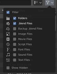
Since the filter options are not an enum - you can filter by more things at a time, that part would be less clear with those suggested changes.

Here you can see you can enable several filters:

Presume you mean sorting. Yes, for the vertical list it’s redundant, but not for thumbnail view or the horizontal list.

Not 100% sure what you mean by this. If you are referring to the + and - buttons to increment the file name numbering, we’ll add them back but in a different way:

4 Likes

I don’t understand why will be confusing the list, when is like actually works blender 3D view popovers. And like by default we have 2 of them highlighted the use is clear.

image

I don’t see them in my “Save as” windows

It’s not, because it isn’t an enum. They are individual options that can be toggled normally, and don’t require you to hold Shift to enable multiple Filter options.

Implicit in ‘we’ll add’ is the word will, meaning it will be done for the 2.81 release.

1 Like

Sorry, I see the image and read a few of the message I though that it was actually implemented. I’m busy and doing 4 tasks at same time.

It’s not possible made that control work without shift?

Pretty much that…

By the way, forward/backward buttons on mice that have those buttons (like for browsing forward/backward through history in a browser or file explorer) should also work in this file browser.

Just go to Preferences / Keymap / File Browser. Add new keymap items that connect “file.next” to Button5, and “file.previous” to Button4.

Nice to hear that’s possible. But it should definitely be mapped by default for 2.81 with the new file browser!

Is it useful? I mean that seriously. I’m not sure that I’ve noticed that my mouse even had those buttons on the side. LOL. Do we map any extra mouse buttons anywhere else? Would they useful anywhere else?

1 Like