https://developer.blender.org/rBadfe68e2025b6d85312361a3d1b4d1397c1ce2a9
https://developer.blender.org/rB5e2f0adb1b9c8df45e00be579e20144b3972b53b
Slowly getting there. ![]()
![]()
https://developer.blender.org/rBadfe68e2025b6d85312361a3d1b4d1397c1ce2a9
https://developer.blender.org/rB5e2f0adb1b9c8df45e00be579e20144b3972b53b
Slowly getting there. ![]()
![]()
@julianeisel Is this flickering/refreshing in the main area of the file browser intentional?
This only happens when I exit the top text field. The search and the bottom fields they don’t trigger this effect.
Sounds like a bug?
While not a big issue, this is easy to fix/avoid. Committed ac15bf1646.
Whoa, that was fast. Thanks.
If you take a look at the tasks I linked to earlier, you will see that these changes have been planned for a while, some of them even since months. I.e. see T69652, T62971#732734.
Unfortuntatly some are much harder to address than it may seem, and there are many things that are higher priority (e.g. there were many regressions caused by changes we had to do in rather instable places in the source code). Just check the reports of my last three weeks (since the file browser merge) to see why things are moving slowly.
Cool.
But you know what would be also cool? On Windows, the open dialog have that extra preview panel on the right, that displays the selected image etc, in a larger size.
How about something like that in Blender’s file browser?
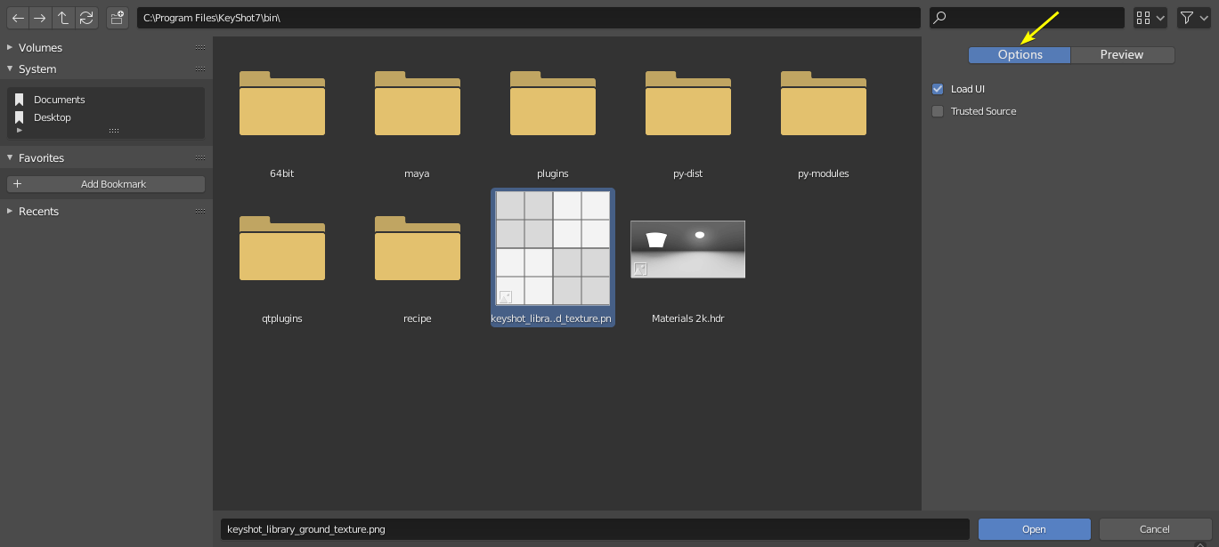
That would be nice. ![]()
I’m not specifically a fan of that “Options | Preview” button row, but perhaps just placing the preview at the top and letting you scroll down (if necessary) to the options would be a good idea. Maybe make the preview collapsable.
not sure if it has been mentioned yet, but creating a new folder is a bit fiddly with the confirmation dialog coming up under the cursor.
That button is pretty small, not sure we need a confirmation dialog at all, chances are more often than not people wouldn’t be pressing it by accident.
Plus, creating something new isn’t a destructive action, so a confirmation is really unnecessary.
very annoying thing is when u save image… each time u have to click options and after that u move mice… to choose file format… very bad workflow.
That’s why the confirmation popup was removed in the new File Browser.
I always take the risk of using latest blender in my production. Today I thought why not include a button in the save menu to pack textures in it. Currently it’s on another place but people think or regret about it at the moment of saving.
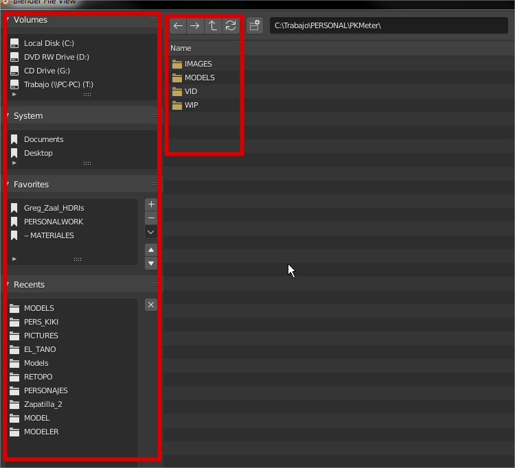
This is a nice change, now its getting more balanced, this new position brings back (kinda) the go up option as it was before and as a bonus adds more vertical space to the bookmarks and recent tabs on the left.
![]()
yes, but I find this line doubling disturbing
I just wanted to bring the details of the dates closer to the names, currently not possible in other ways than to tighten the window … … and I discovered this …
I think it should collapse so the search bar disappears and the search icon gets integrated into the right side of the file path bar, and clicking the icon turns the bar into the search bar while typing text (it switches back when deselected/defocused).
It is possible now with double click folder open has ability to click once and start typing to jump to corresponding folder of the same name just like it works in windows file browsing? I use it a lot that I click just some folder press lets say “EL” and it would select me first folder starting with letters EL
The new version of the top left button position improvement is more reasonable than before.
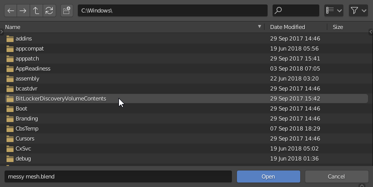
But the file name input box and the save button are too far away, which is not convenient.
I think the file name is very reasonable after the path is placed, and the save button is closer.
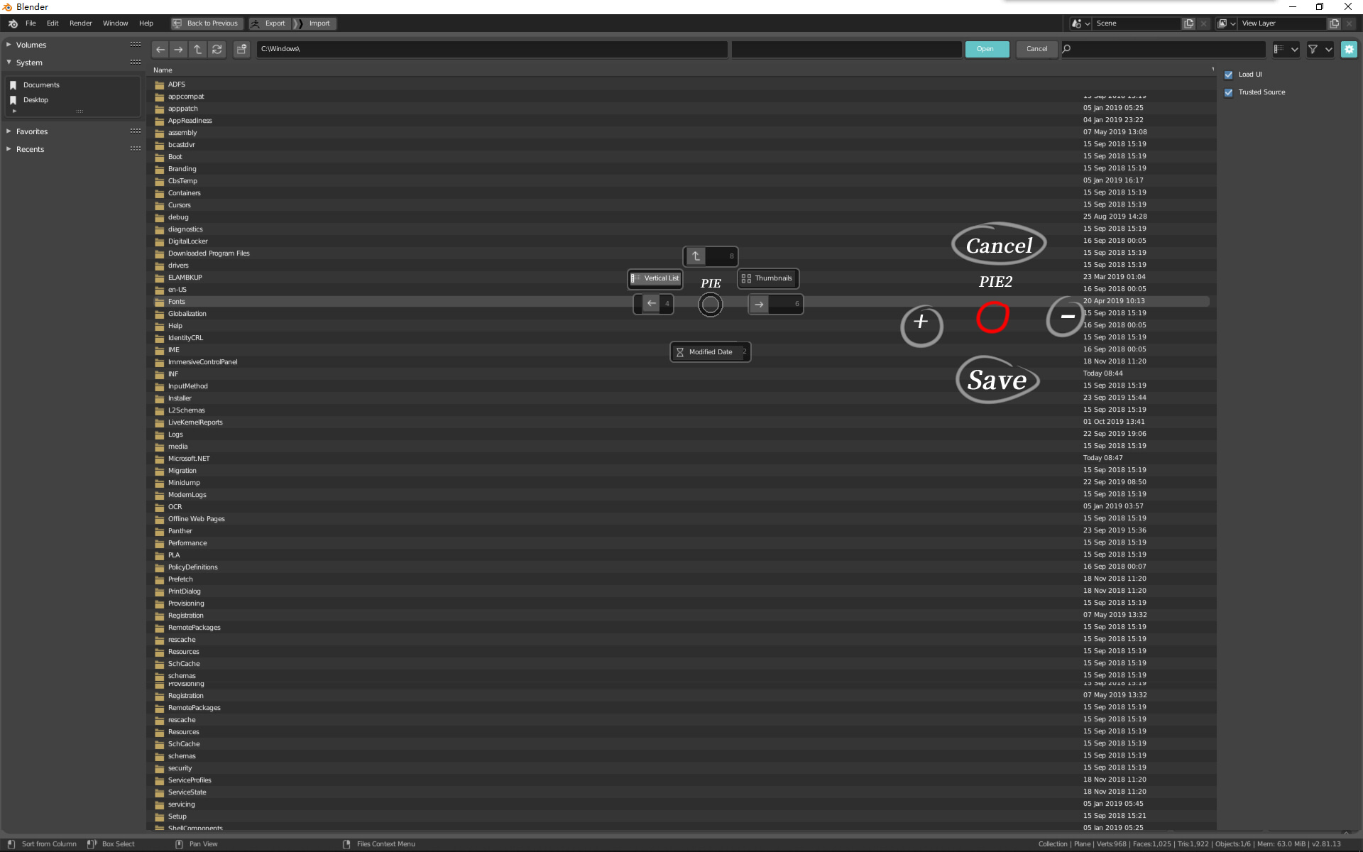
You can add two PIE menus, which will make the operation faster.
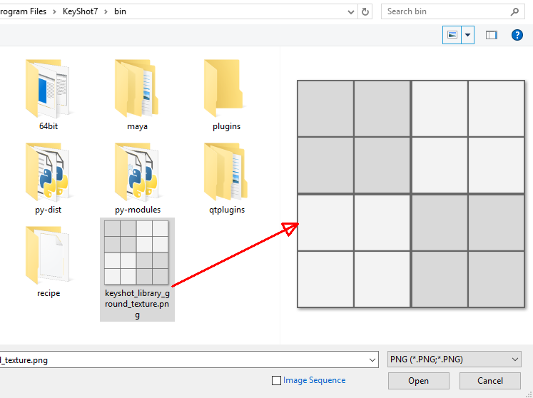
Also hope to increase the image preview function
@julianeisel If I try to close Blender while the File Browser is open, the Close Dialog shows up behind the File Browser…
Bug/limitation?
Yes, it was implemented as an overlay before the floating windows. Now it should be reimplemented as another one.
Interesting. It might be necessary to just close all temporary windows (file browser, preferences, etc) when the confirm-quit dialog is invoked. Would there be bad consequences from doing so?