I like the 2, 5 and 8 (it looks so vintage… <3)
I don’t know why… It reminds me Substance painter.
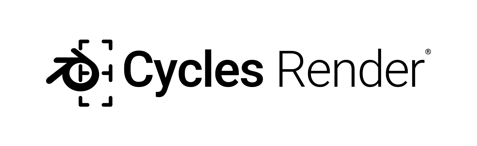
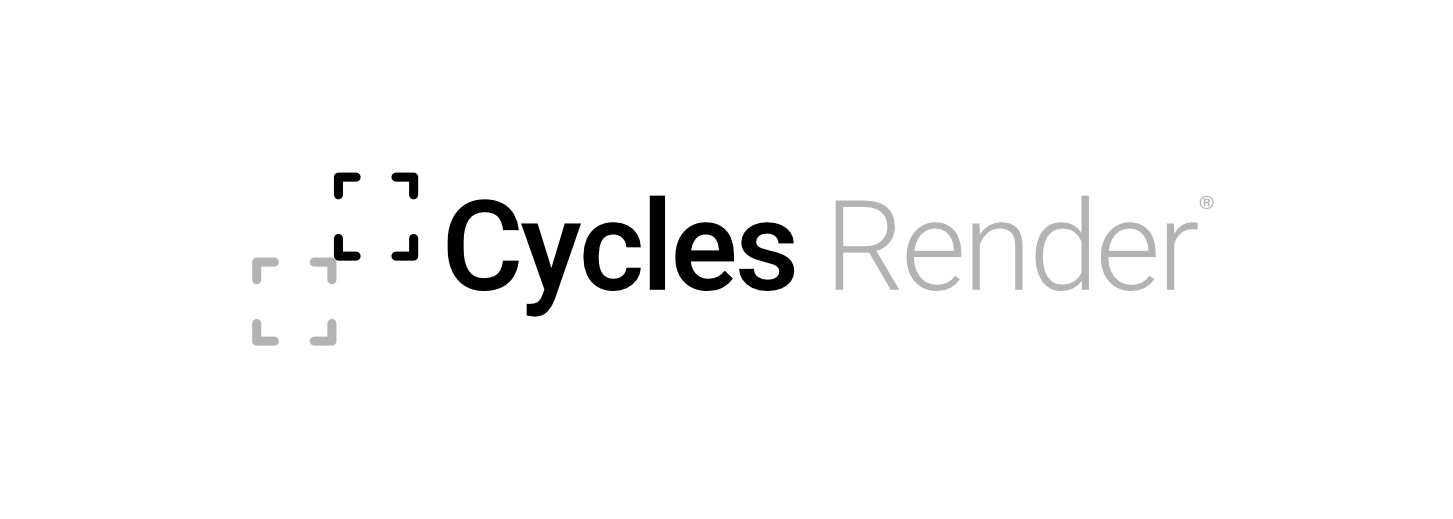
Hi all, just dropping a quick idea, the goal is to suggest Cycles is part of Blender 3d (reusing its original logo), and suggesting the render engine with the little buckets (tiles), the one you see going around when rendering.
Many variations can be made, this is just one.
Regards,
MG
7 Likes
I like the render tiles idea, but I still don’t think the Blender logo should be used at all. The main reasoning being that a Cycles logo will only be used for it’s standalone version, because the version that comes with Blender won’t need a logo, is part of the program after all.
So Cycles, as a standalone app, needs its own unique logo and brand, just like Arnold has a different logo from Solid Angle, Octane is different from Otoy, and V-Ray is different from Chaosgroup.
Blender is the umbrella brand, and Cycles is a product of Blender, with its own logo and branding.
2 Likes
I agree, if the goal is a pure “standalone” Cycles logo, blender one should be avoided.
I personally like an even simpler one like these ones attached (still tiles idea), behind the tiles we can draw something though, a ray bounce icon, an engine…whatever.

40 Likes
I like this very much! 
3 Likes
How about fill “C” with tiles?
I really like the tiles idea. What about something similar to this:
1 Like
Este definitivamente es el mejor.
Blur is no good for logos, they usually are fully vectorial
2 Likes
This would be nice for some intro animation, but as a logo is best to keep text and symbol separated so the symbol can work by itself.
I absolutely love the way these look, @MarcoG! The only two issues I see are the visual imbalance of the two tiles, and the different opacities. I love the concept and and the execution.
1 Like
Thanks  yes, the difference could be dimmed down a little bit
Really inspiring Ideas and Approaches are posted already!
inspired me for this small Collection.


Hey, the right one even contains a piece of Pizza… It´s Pizza Time. At least for one xD
1 Like
These have been interesting to read through. I really liked some of @JulianPerez ideas.
As a general rule of thumb:
- It should be identifiable at 16 px wide and not become a mush of colour
- It should have a single-colour version (silhouette)
- It should be readable in black and white, both black on white and white on black
- If it has colour, it should work without gradients/blurs
- It should be able to ‘hold its own’ without accompanying text
- As brecht has said, it should represent Cycles in some way.
As a concept generation tool, what makes Cycles different from other renderers? What is iconic or unique about cycles (in a positive way - noise is a characteristic of Cycles, but not necessarily one good for its image)?
4 Likes
Cycles4D the commercial cycles implementation for Cinema 4D has a logo
More images and info
https://insydium.ltd/products/cycles-4d/
2 Likes
I like this one (at the bottom) very much.
Yup, that’s why to me the key is basically to take Blender’s logo and make a Cycles version. If we keep a close composition but with very distinctive features and the same colors, this might just be enough to make it good. As programmers say: Keep It Simple Stupid.
Imho it could be as simple as what some already posted (like @JulianPerez here or @Tpal there).
It could be as simple as these:


The colors and shapes similatity makes it clear it’s part of Blender, yet the C shape makes the link to Cycles and makes enough difference to dinstinct it from Blender.
No need to display render noise or render tiles, that’s just details that don’t add mutch to the icon, that any raytracing engine could have too (but they don’t AFAIK) and it just makes noise in the icon’s readability.
Nowadays we don’t make icons full of detail, partially because of the wide range of screen sizes we use (we don’t want to design a different icon for small screens like smartphones, then one for PC, then one for printing, then one for…) and because we know that at the end of the day:
What works better for an icon is just simple shapes with a few flat colors that could be drawn by a 5 year old kid and still be recognizable at a glance by everyone.
Blender’s icon is already that, we have a strong base we can start from, let’s go with that.
2 Likes
Hey there!
Opening this topic again because we have a new product out called renderset (render manager addon - Render Manager Addon Renderset - Blender Market) and it supported Cycles/Eevee out of the box, but now it also supports Octane and Luxcore.
We’d like to show that on the product page so I’ve added their logos but suddenly felt that cycles needs one too so searched around and found that it still doesn’t exist.
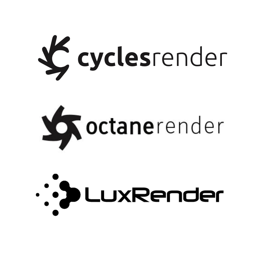
So I couldn’t hold myself and had a quick play-around and realized that since those projects are so close together it makes sense to reuse the blender logo and create it’s variation around the letter C. I think the result looks pretty nice. I personally prefer the bottom version since it resembles the blender logo less (it’s simply vertically flipped version of the above).
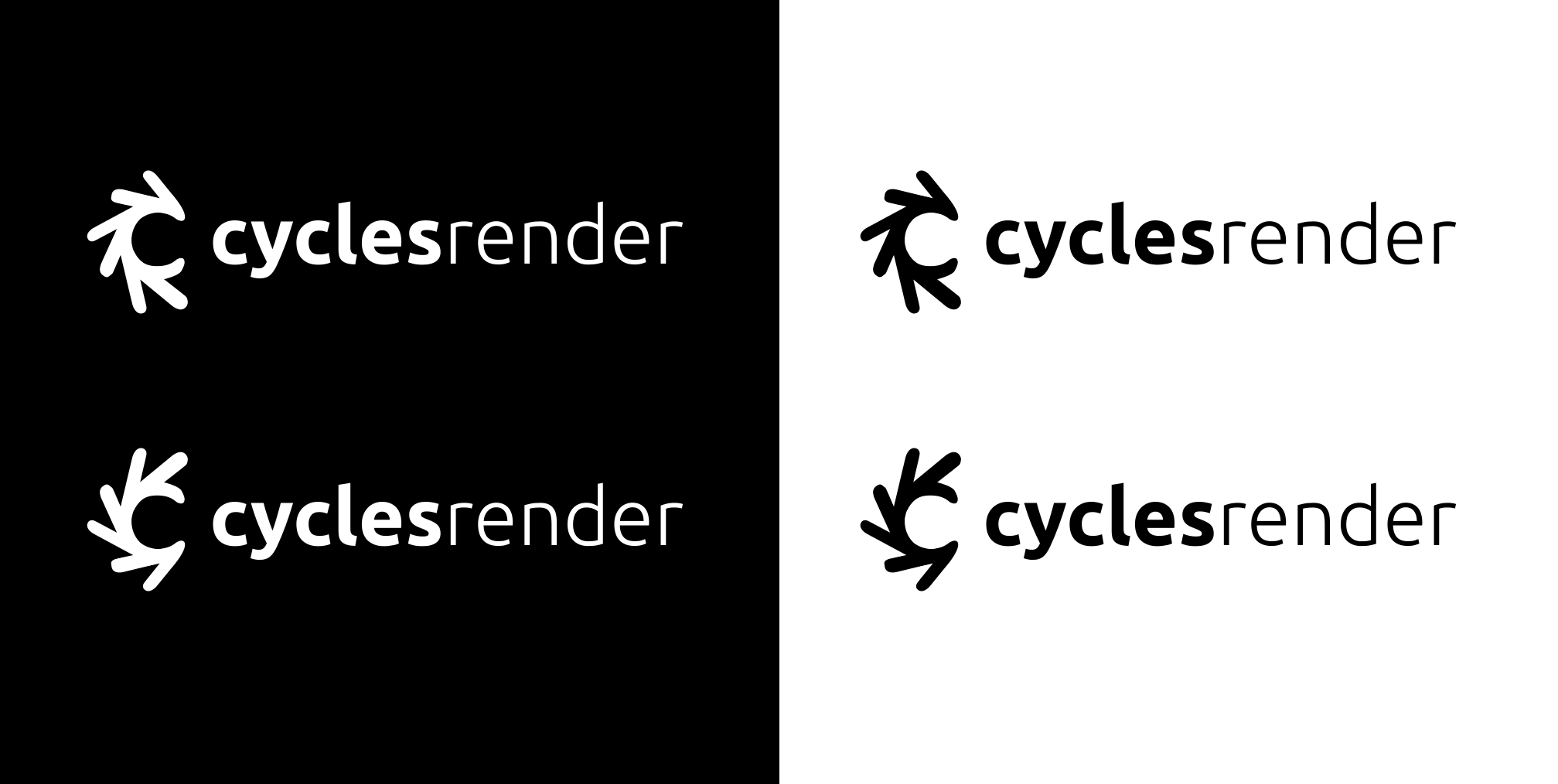
What do you think? I’d really like cycles to be represented with a logo aswell.
Here it is next to those other renderers:
2 Likes