I designed two of those logos 
Octane Render owner paid me for the job. The logotype is protected by copyright law, so - I think that the Octane’s owner won’t like Cycles’s logo design that’s so similar.
8 Likes
Honestly the logo is created from Blender’s logotype and I don’t see that much similar except for the spinning pattern. It isn’t even entirely closed and the proportions are different:)
But to make it even more distinct, the other variant that isn’t flipped would be more different from the Octane logo as it spins the other way.
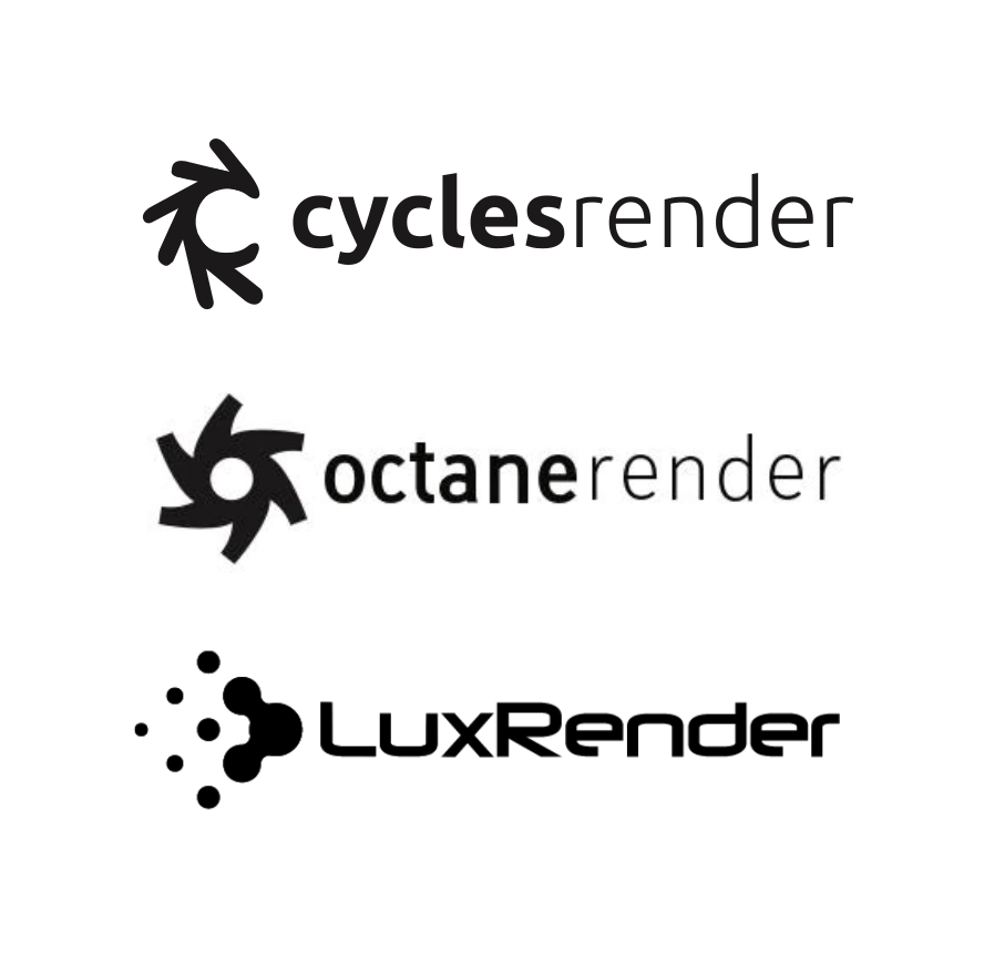
Also you can’t simply claim copyright rights on something that is mildly similar, it needs to be measureable…
Check for example Keyshot’s logo:
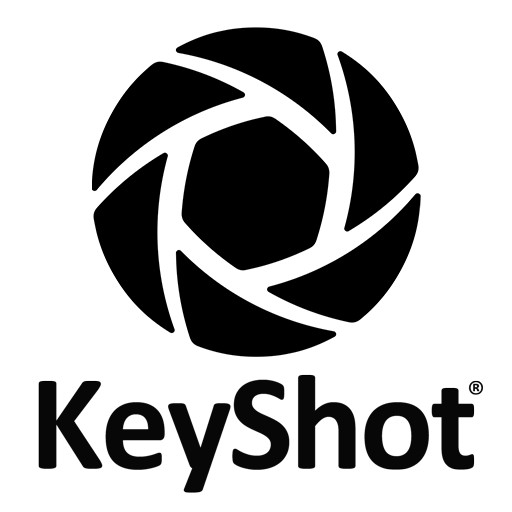
It might be inverted but is much closer to Octane than the Cycles version above.
2 Likes
I’d make the “tails” of Octane’s logo gettin’ shorter and thinner the farther they are from the beginning of the upper part of the letter “C”. So that the last tail resembles the other end of the letter “C” in scale and proportions.
It will make the logo look more dynamic and interesting.
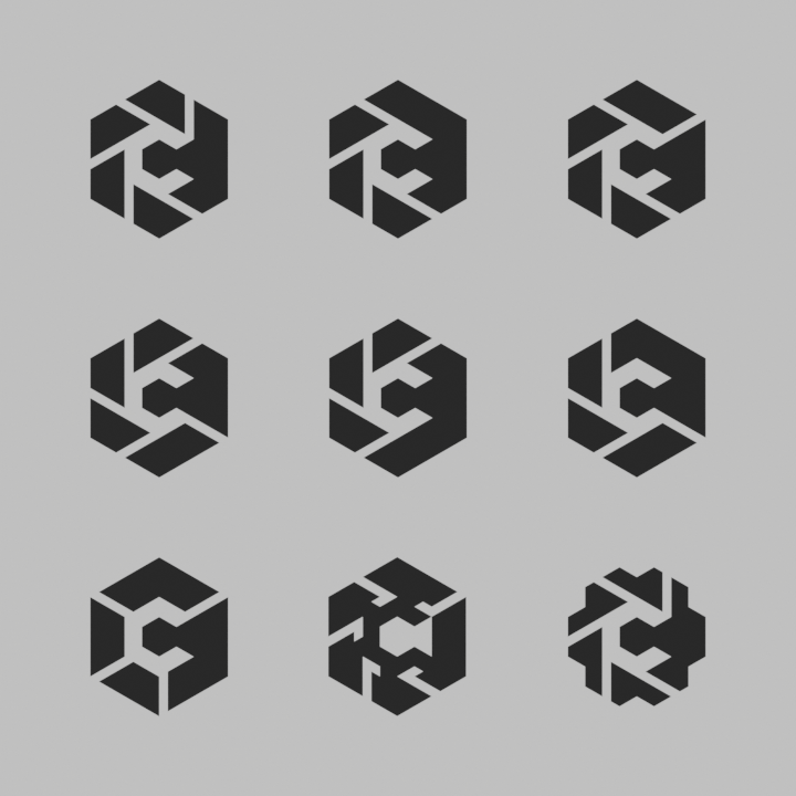
Here’s some more ideas, remixing a few trends that have emerged here.
General symbolism**:
- Isometric/cube (dissected into a grid of triangles/diamonds as a basis) – Combined with the opening in the C, it can resemble a camera side-on, or a shadow cast by the inner cube in some cases
- Camera aperture blades (or alternatively, ray lines) – alludes to the Blender logo style somewhat too
- The ‘C’
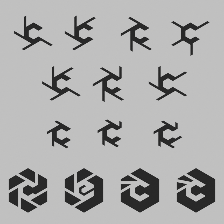
I explored various ways of slicing it up, trying to keep readability at smaller sizes. Here’s the ones I thought were the most interesting:
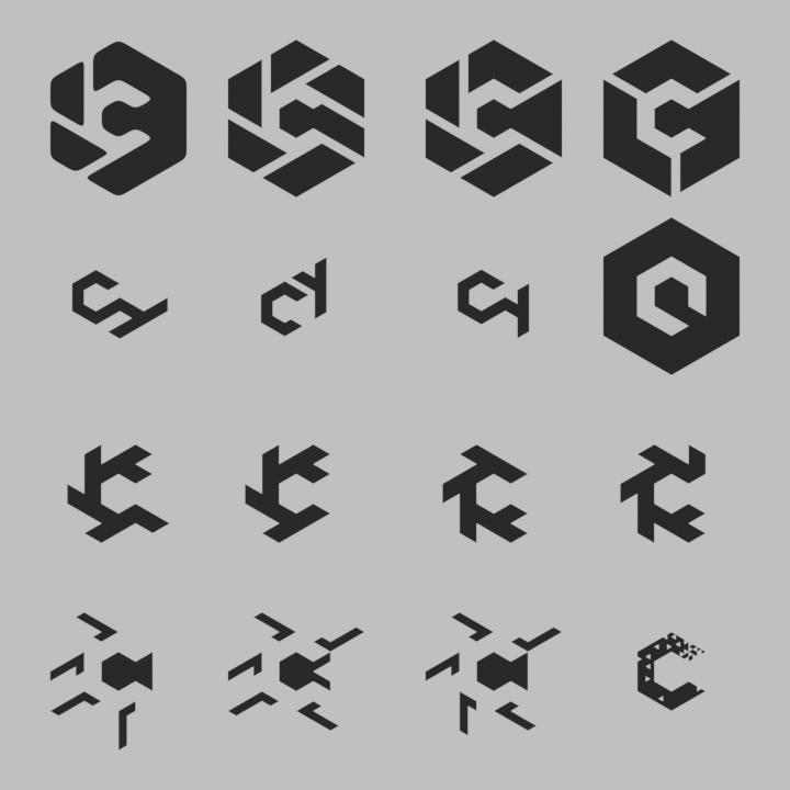
A few secondary ideas. Note the smoothing/rounding on the top-left one. I think that could be applied to most of the others:
Finally, a sample presentation, with text:

The typeface is ITC Avant Garde (Bold). It is commercially licensed, but I think it fits well. Perhaps it could even sit on its own without a logo. I wanted to avoid pairing it with the ‘renderer’ wording, as it feels extraneous and clunky.
** I acknowledge that the isometric cube has been done a lot (in logo design in general), but I do really like it as a foundation and felt it was worth exploring/expanding a bit more, even if it’s just a basis for future inspiration. This list could of course readily be used as a set of things to avoid in a potential design too
49 Likes
I dig it ! I think it’s worth trying with only tree branches, same as the Blender logo. What about having them go the other way around, too ? Maybe it’d end up looking too similar to the Blender one.
1 Like
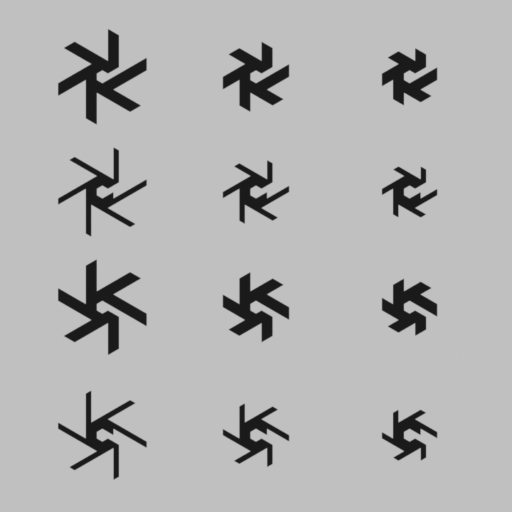
Branches? Like, the inverse, without the black outer cube? I did those too, just didn’t include as I felt they suffered less readability at smaller sizes than the others. Here they are anyway:
Top 2 rows: the inversions of some of the original set
Third row: Some thinner variations of image 2/row 3 in my previous post
Fourth row (left to right): a variation with 6 lines (since I missed it last time), one idea for an EEVEE variation, and two variations that break the isometric rule but mimic the Blender logo closer
And some more secondary/tertiary ideas. Bottom 2 rows are just the top 2 flipped/reversed:
5 Likes
The idea of Cycles logo is neat. Personally I find @AdamPreisler and @WoollyBear versions the most as they tick most checkboxes of what good logo needs to have.
To add some spice, here is my more frivolous take on the subject.
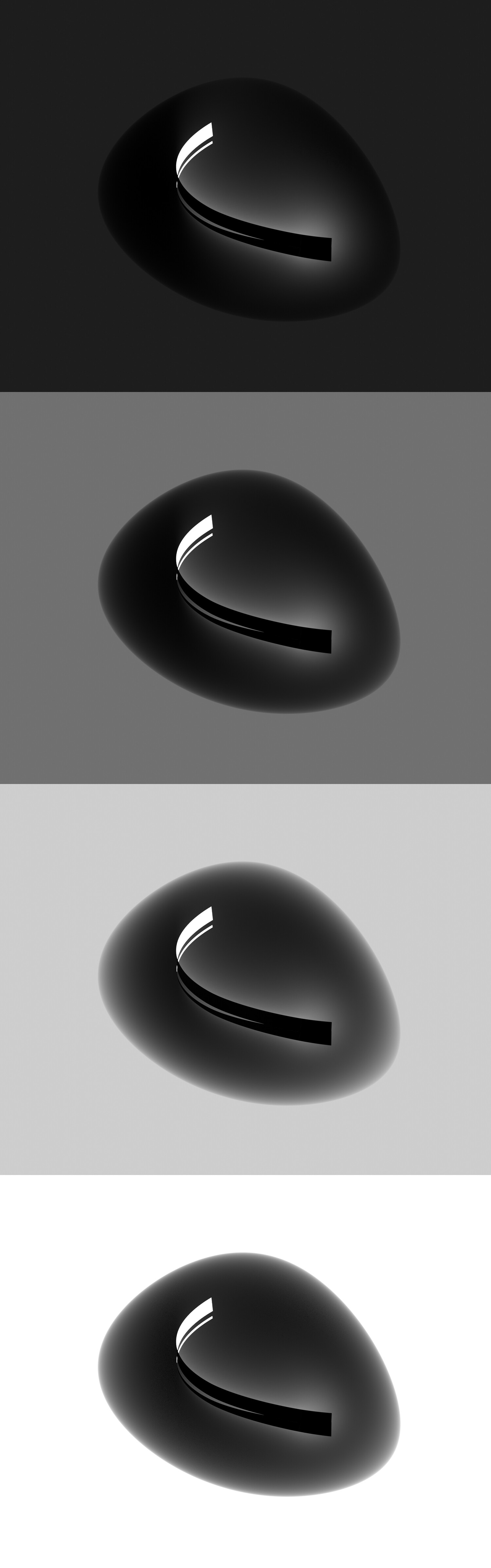
Although it is an interesting shape and it somehow resembles to an eye, I can’t even classify it as a logo. How would this depict or tell about a renderer? How about Cycles to be more specific?
Never saw an eye in it, now I can’t unsee it.
As for logo classification - neither do I. I wanted to play with shapes defined with light rather than shapes defined with line. But yea - as a logo right now its insufficient and clearly needs some refinement. The central form is ‘C’ shaped - maybe too little. Also it emits light which symbolises image creation. Outside shape made of volume represents dark undefine space and is used for showing how the light is emitted and scattered. Simply instead showing one ray the concept is to show all of them.

I’m not very good at graphics. There are surely curves to modify
but I find that we understand the reflection / refraction, and we can see a “CY” in the original logo
1 Like
While I like those I think they are very harsh, sharp and overall look unfriendly in a way.
Almost like a logo of some dystopian futuristic industrial mining company.
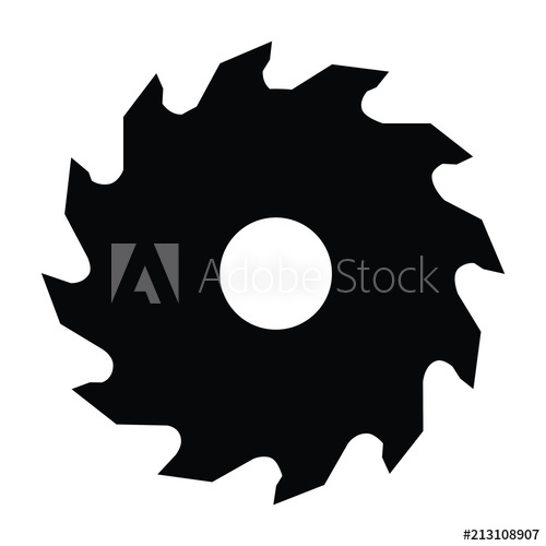
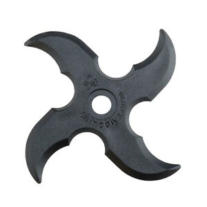
It resembles to me a saw blade:
Or a shuriken for that matter:
I think it’s good but would dial it down on the sharpness and make it more friendly looking.
That’s also why the ends here are rounded (like Blender logo) and they are quite long.
1 Like


I really think any logo ideas here shouldn’t be derived from the Blender logo. They should also be representable in the form of an icon (so there could be an icon for each render engine in certain parts of the UI).
6 Likes
This one does!
![]()
btw this one above here was intended as a joke, involving “blender” as the make-up tools.
But coming back here and looking at it with fresh eyes, I think it’s not bad at all…
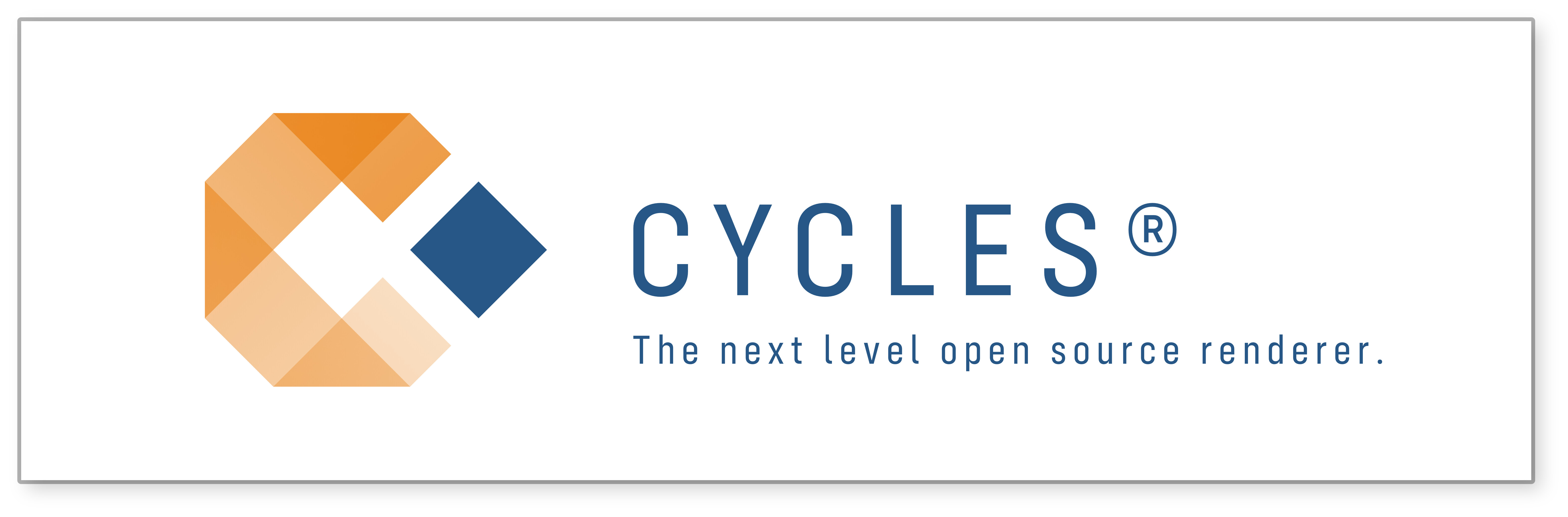
Not bad, I like it- I especially like the blue/orange color combination that immediately connects me with the Blender “mood”.
One itchy thought: I’d remove “The next level”, from the bottom line. Besides I love Cycles, I don’t think you can consider it a ‘next level’ renderer. It implements well known algorithms and techniques, derived prom public papers. New (next level) technologies usually pertains to proprietary software, and I mean like big movie production in-house developed softwares.
This topic is about logo proposals. I’m not sure if it is clever to start adding american-ish slogans and ®s (besides, is Cycles even registered?). It really makes things look and sound corporate to me, which isn’t the point.
2 Likes
I really think this one is simple, yet very appealing design!
2 Likes