Cycles is a… pretty big project now, but its iconography appears to be nonexistent. Other than the somewhat-stylized bit of “Cycles” typography on the project site, I can’t find anything.
Is there anything like an official logo available? Are there reasons to have one beyond fulfilling my desires? Would we need to ask the Blender Foundation folks to approve if we ever were to get one?
There is no logo for Cycles. It would be nice to have one, and people have tried some designs over the years. None I saw worked well in my opinion, we need something that’s a bit original and stylized, maybe with a hint to some rendering / light / physics concept.
There isn’t any immediate need to have a logo, just would be nice to have.
I’m now in the middle of rebranding antergos linux distro but after that I think I could find some time to make a brand for Cycles. Not only logo itself but whole brand. I’m brand designer
I really like to watch logo ideas cause sometimes they have something in it, but honestly shooting blanks without proper story, background, mood, motivation and overall idea could be pointless. Not always though.
@brecht if you are interested in making Cycles “fully branded”, with visual guide and such - let me know.
@cgslav, for the overall branding we just follow Blender, we don’t need to make Cycles look like a separate thing that much. Just its own distinct logo seems enough.
Good question, I am also curious as to who we would ask about incorporating a community-made Cycles brand into the official publications surrounding Blender and so on.
I would be the one to approve of the logo, along with the rest of the Cycles team.
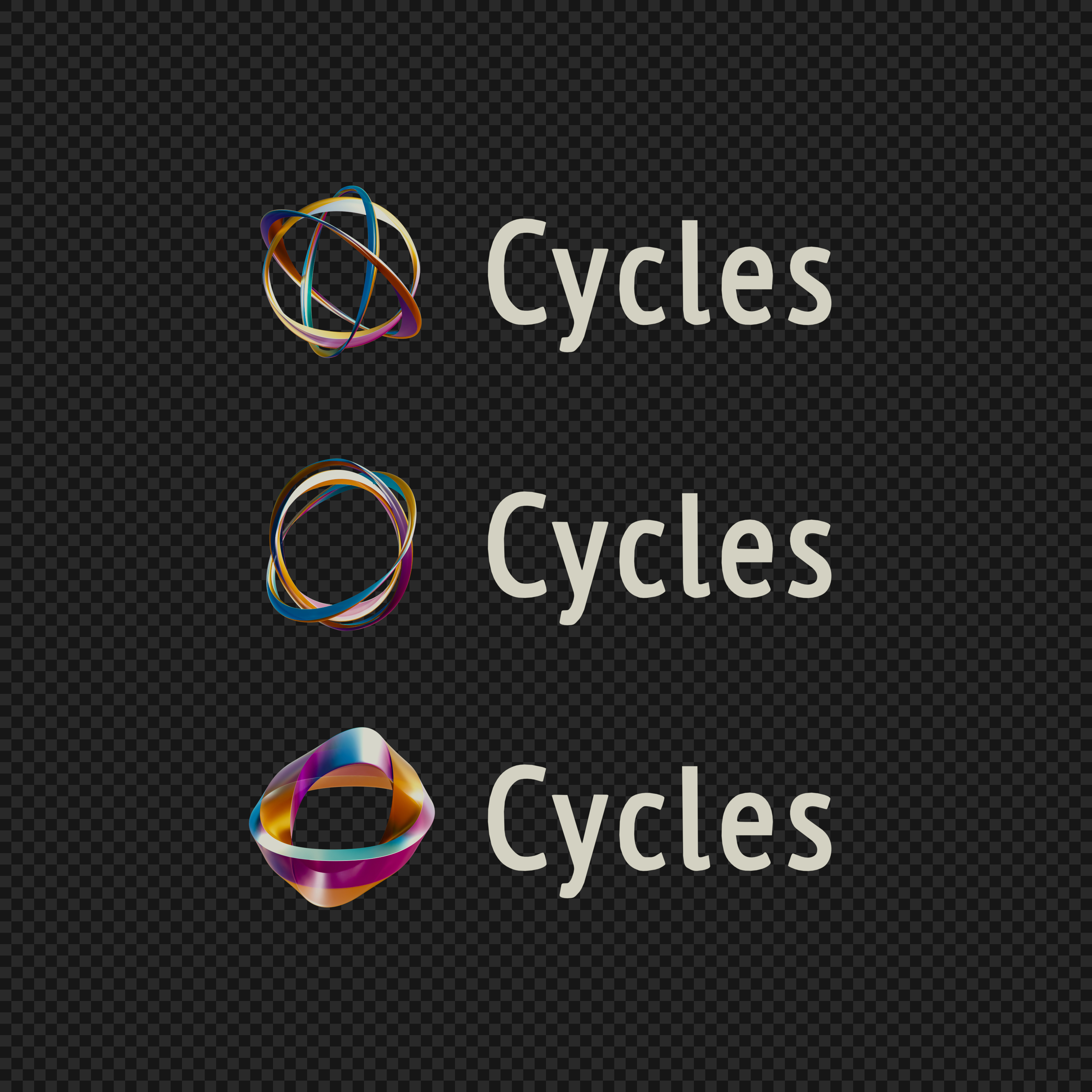
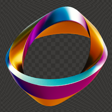
None of the proposals so far jumped out at me though. Probably there should be at least some concept related to rendering, shading, lights, optics, color, … in there.
Now extrude it into 3D and make the blue dot a fluid sim with white water, etc., and give the “C” and the feathery arm things all different interesting materials (glass, fur, etc.).
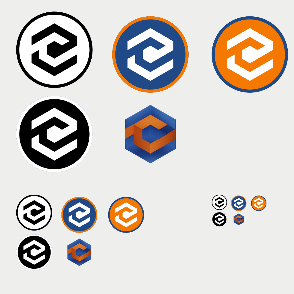
The stylized “C” character stands for Cycles, obviously.
The color is orange with a blue dot in the center, reminiscent of Blender’s logo.
The “C” itself is faceted in a gradient of the orange color (ranging from magenta to pale yellow). It is also suggesting the following ideas:
Flat shading (a flat shaded mesh, catches light differently on each of its facets according to their normals and the light source)
Chromatic circle (idea of a palette of colors)
The hexagon and the white lines coming from it, shape the “C” like the lens of a camera (Aperture) suggesting photography and hints that Cycles is a render engine.
Note: I don’t know what is the font used in the Blender logo, so I put Arial. ^^