Agreed. This is why I proposed having an icon as more stand alone just like the blender logo itself. I think an icon with no text would be the way to go. This is why Apple, Nike, McDonald’s have such iconic identities. Simplicity is the best…which is probably more difficult to make it unique lol.
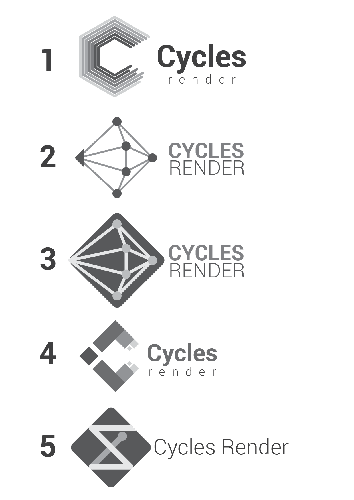
My favorite is definitively Line 2 n° 5 : simple and effictient IMO. Maybe test the same, but with blender logo’s blue instead of the dark orange ?
Other icons are either too simple or thin, either too detailed. I’m also not a big fan of the raindow colored icons, they kind of look like google chrome.
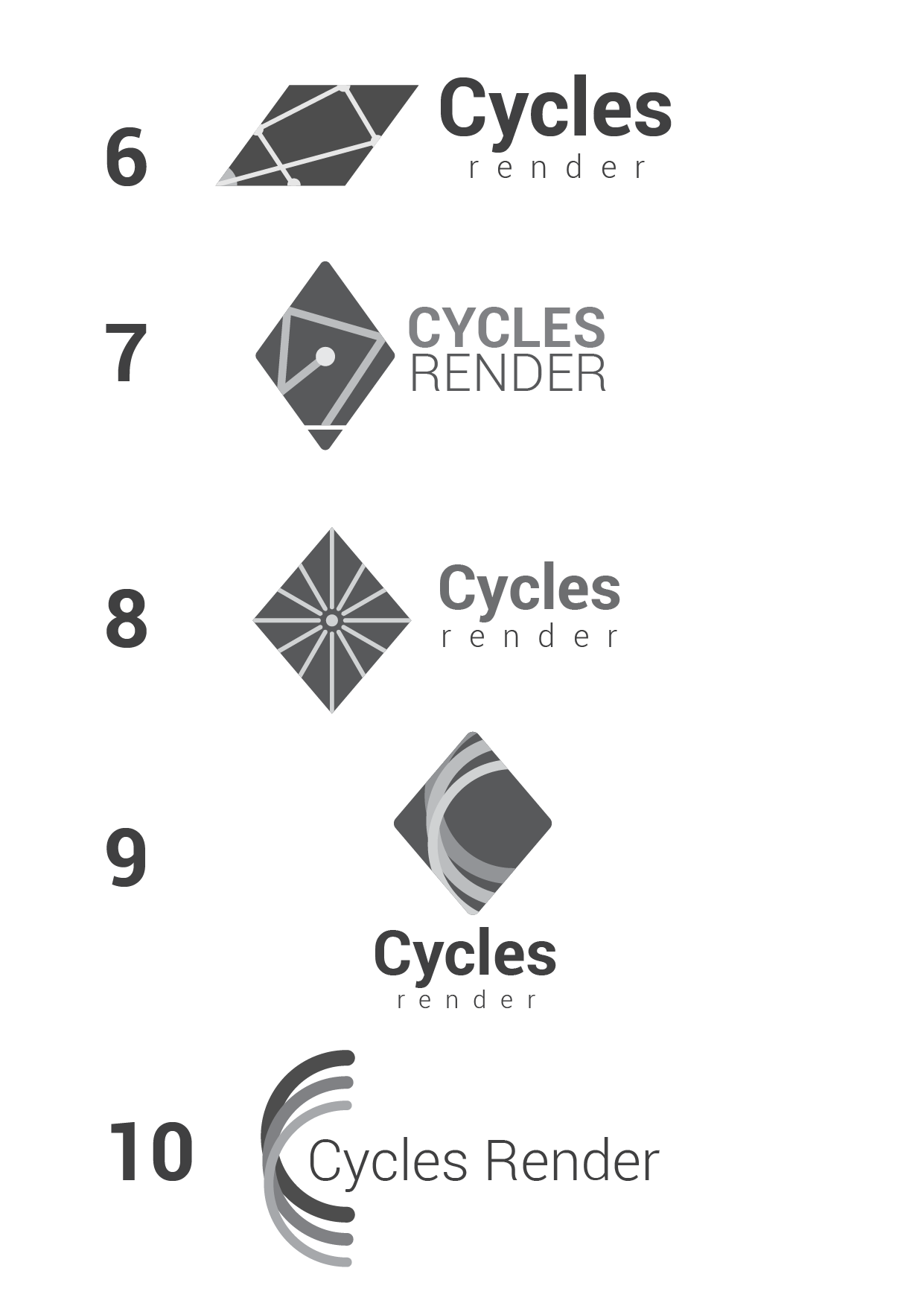
The varied width one looks like an awesome logo, but it loses the feel of bounced rays. How about a version that is somewhere in-between, preserving the beautiful look of the varied width one, but toned back sufficiently to still look obviously enough like light rays?
Varied width is too much a shuri-ken. I prefer the 9 rays constant width
Should we start a separate thread now for an Eevee logo?
2 Likes

Still playing with the idea over the past few days, still not entirely satisfied with the layout of the lines. Putting this one up to see what you guys think anyway.
New font - Exo 2 (700 / Bold, I really like this one), thinned the lines a bit and tidied the alignment, removed one, added some colour and a slight gradient (I hear they’re coming back round in style…!)
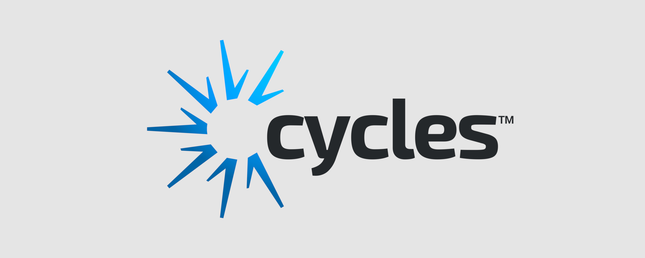
Thoughts?
10 Likes
Wow, looks slick! I like it
1 Like
@WoollyBear, it looks nice, but I feel like the idea of bouncing light rays got completely lost.
Yeah I’d have to agree there. I’ll keep chipping away at it.
By the way, what do you think of the font? Colour? Would be better without?
@WoollyBear maybe try to integrate the text better with the graphic. For example.
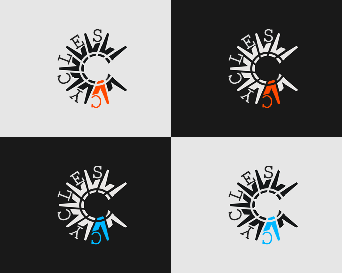
Maybe with a different font and better alignment - this one was a 3min mod
3 Likes
this is really unreadable!
as Brecht points out the newest iteration has lost the bouncing ray appearance, which was probably what draw attention to this draft
1 Like
I agree, this is completely unreadable, sorry.
A logo should be easily recognizable and readable even at small sizes! This is a) visually way too complex and b) goes against how humans read words.
The logo/font has to feel right too. This is an important factor. For me a lot of these tries here convey this association/feeling:
I don’t think the aggressive look fits too well for cycles. The symbol itself. I really like the font that phocomelus picked though.
I like the font, though it also depends on what the logo next to it will be. The gradient colors in the logo make it feel too different from the Blender branding too me, and seems part of what mights the light bounces thing less clear.
2 Likes
@anon18120698, I don’t think a 3D logo is ideal, it really should work as a flat design. The shape looks too much like a “get out the vote” logo.
4 Likes
@kame404 Pretty cool, resembles blender logo which is a plus
1 Like
Here’s my most recent attempt, after reading the comments from everyone and the guidelines given by @Brecht I tried to represent the concept of raytracing and bouncing, without repeating the effort made by @WoollyBear, so some of them are quite literal hehe.
The only one I kept from the previous set of sketches is the number 4, because I think it serves to represent not only the rays bouncing but also the render process, with the little squares at the end.
Some notes:
- Almost all of them are using the rhombus as the main shape, this is to separate the logo visually from other render engines logos. They’re already using spheres, cubes or hexagons with different variations.
- This sketches are kept in greyscale, so we can focus on shape first. Color will be added later.
- Since Cycles is also a standalone app, I don’t think the logo should have any resemblance to the Blender logo, we can connect them both with the use of color, not shape.
- The font used here is Roboto (in different styles) from the free Google fonts.
I hope you like them, let me know what you think! ![]()
26 Likes