Is there an official logo available for the Cycles project?

NICE! The typography could be different. But the logotype is great. Have you tried a version with less “rays”? Like 9 rays instead of 11. So it’s still readable in a smaller size.

5 Likes

Based on the idea from @kaeru

@brecht

Another draft with a couple of variations for you guys…

Are these more in the right direction?

The font is A Google Font called Heebo (bold). I’ve got a few more options if you don’t like that one…

28 Likes

Here is one I did in Illustrator

I like this logo graphic you did (version 3) what if you did something like this?
cycles_phocomelus
This way it can be used as a stand alone like so
cycles_phocomelus2

10 Likes

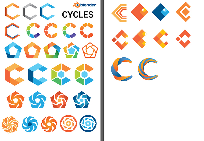
I had some time to do some sketching for the logo, I was mostly playing with different forms and shapes, and tried to stick to the Blender color scheme in general.

I already have some favorites but I’d like to know your opinion before doing more iterations.
12 Likes

Thanks! All right, time for me to get working. This is so encouraging that someone really pays attention and read these threads. I´ll upload mine when ready.
Woh00!

Question: Are you also looking for an eevee logo? If so, who approves it?
What happens if we have 2 rendering modes´logos on public presentations? Will there be confusion?

1 Like

My fav so far. I would suggest a few changes to streamline it.

  • decrease icon size by a few points
  • eliminate the shorter leg on the first ray (@ the 2 o’clock position)
  • combine varied width and white space alignment

Here’s a quick edit:


I’m sure yours would look much better with everything aligned properly.

7 Likes

@WoollyBear, thanks for the variations! The “White space aligned to rays” one I like the best so far. Somehow the varied width doesn’t look as much as light bounces to me, though I like that less white space makes it feel like a more of a coherent whole.

It would be interesting to see some font variations. The Heebo one is ok, nothing that stands out too much but I’m not sure if it needs to.

@PixelUrge, text inside or integrated with a logo doesn’t work so well I think.

@JulianPerez, I’m missing some kind of clear rendering or physics concept to make it more than a C or swirly cycling shape. The swirly black holes have a link to light physics, but we don’t do relativistic rendering so it might not be the best thing to hint at.

@DavidRivera, you’d have to ask Clément if he wants one, he’d be the one to approve it. Cycles runs independent from Blender so the need is a bit more clear, Eevee is still Blender only.

6 Likes

Agreed. This is why I proposed having an icon as more stand alone just like the blender logo itself. I think an icon with no text would be the way to go. This is why Apple, Nike, McDonald’s have such iconic identities. Simplicity is the best…which is probably more difficult to make it unique lol.

My favorite is definitively Line 2 n° 5 : simple and effictient IMO. Maybe test the same, but with blender logo’s blue instead of the dark orange ?

Other icons are either too simple or thin, either too detailed. I’m also not a big fan of the raindow colored icons, they kind of look like google chrome.

The varied width one looks like an awesome logo, but it loses the feel of bounced rays. How about a version that is somewhere in-between, preserving the beautiful look of the varied width one, but toned back sufficiently to still look obviously enough like light rays?

Varied width is too much a shuri-ken. I prefer the 9 rays constant width

Should we start a separate thread now for an Eevee logo?

2 Likes

Thanks for the feedback @brecht and @L0Lock, I’ll work a bit more on the ones you mentioned :slight_smile:

1 Like

@brecht @pablovazquez

Still playing with the idea over the past few days, still not entirely satisfied with the layout of the lines. Putting this one up to see what you guys think anyway.

New font - Exo 2 (700 / Bold, I really like this one), thinned the lines a bit and tidied the alignment, removed one, added some colour and a slight gradient (I hear they’re coming back round in style…!)

Thoughts?

10 Likes

Wow, looks slick! I like it

1 Like

@WoollyBear, it looks nice, but I feel like the idea of bouncing light rays got completely lost.

Yeah I’d have to agree there. I’ll keep chipping away at it.

By the way, what do you think of the font? Colour? Would be better without?