This is vertical display title default.
Is possible horizontal display title or icon display?
and this text display change to icon display
This is vertical display title default.
Is possible horizontal display title or icon display?
and this text display change to icon display
a horizontal display letters of the text would undoubtedly be more readable …
even if I would prefer the icons representing the various sections and the passage with the mouse “popups with the vertical text and the description of the sections appear”
once I got used to recognizing icons, I would find it easier to locate the sections
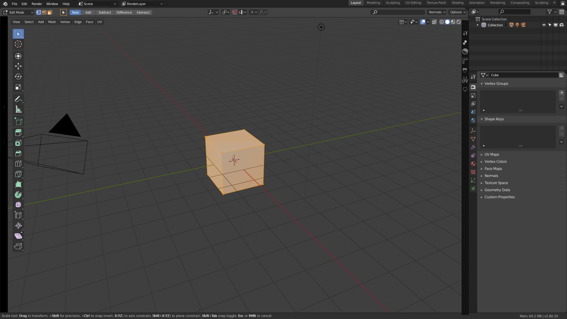
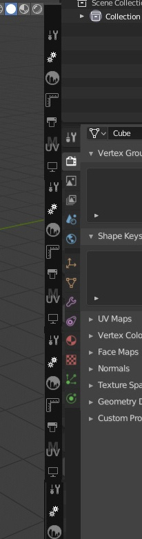
See some proposals to solve it
Main problems with icons
It’s necessary separate visually from both elements, and then the easy solution is left the text.
WOW! It means your proposal will become true in recent version ?
But I think N-shelf on the right is good .
Jajajajaja
No
PD: The right and left is not important, my proposal is not about that, is about how to move to the left if the user wants, without problems
Like you can see in your mockup it’s a problem when you put near to the properties editor. Maybe we can solve with a better mockup, or maybe we need other idea ¿Optional icons?
But I don’t know if devs like or not this proposal.
I have to admit that I see problems, it prone to errors, when you mix with T-shelf and the properties tabs. And I did this other proposal
What about this solution , Only Text icon for N-shelf . Properties icon is graphic icon.
Text icons mus be created by addons dev, so probably nobody will do like this and they will do normal icons.
To make that it must be obligated by Blender, so also you will confuse addons with similar names…
It works better with a properties tabs column in the right… But all that are bad solutions. And actually I can´t tell a good one taht works in all situations.
Of Course that nobody wants the old T-shelf tab full of tabs and hard to finde anything. And that will happens with blender2.8 the first day with all addons loaded.
You can place the Property tabs in the other side. Place mouse over them, press F3, search flip region, and they are moved to the right side. Same logic than with others, tabs far not near work, “tabs panels workarea panels tabs (prop-panels prop-tabs)”.
are you saying the shelves should be restricted to one side?, that’s a big no no from me, i would prefer they stay the way they are instead of shoving them in one place and not be able to flip them.
Actually, they could flip.
Glad you finally found it.
Please guide me. Thank you.
My solution is to remove completely the property panel editor and move the content to the right sidebar and move addons on a left sidebar or in a flying menu… I will show a mockup soon
You can do it with the add on “Simple Tab” available on blendermarket
after just press Win+; you will get a list of emoji and then you can rename all you add-on inside the N-panel with emoji
after If you are in other OS just launch your emoji list
but i still don’t find a way to rename it with the list of blender icon