The basis of this proposal is a design that unites both the new ideas coming from the codequest without losing a single one of the current functionalities and workflows of blender. Combining all the ideas of the developers with the needs of new and old users, amateurs or professionals. The aim of this proposal is a transversal interface, which can be used for Blender101 and for the most extravagant poweruser.
The proposal does not focus on the theme of the program (although it bets on the grey one in the face of new changes), it is not its purpose and this aspect has not been completely taken care of, but it contains the main modifications and proposals of the codequest (flat UI, change in some menus, popovers, tabs).
What the whole proposal really focuses on is how to structure blender and its interface, user possibilities and workflows. Not if, for example, the viewport options are one popover or another. Thinking about the future, about the needs of blender expansion if necessary nodes everything.
I hope you like it and comment.
PS: I especially thank Zebus, who had the idea of the navigation widget, which I think is a very good idea.
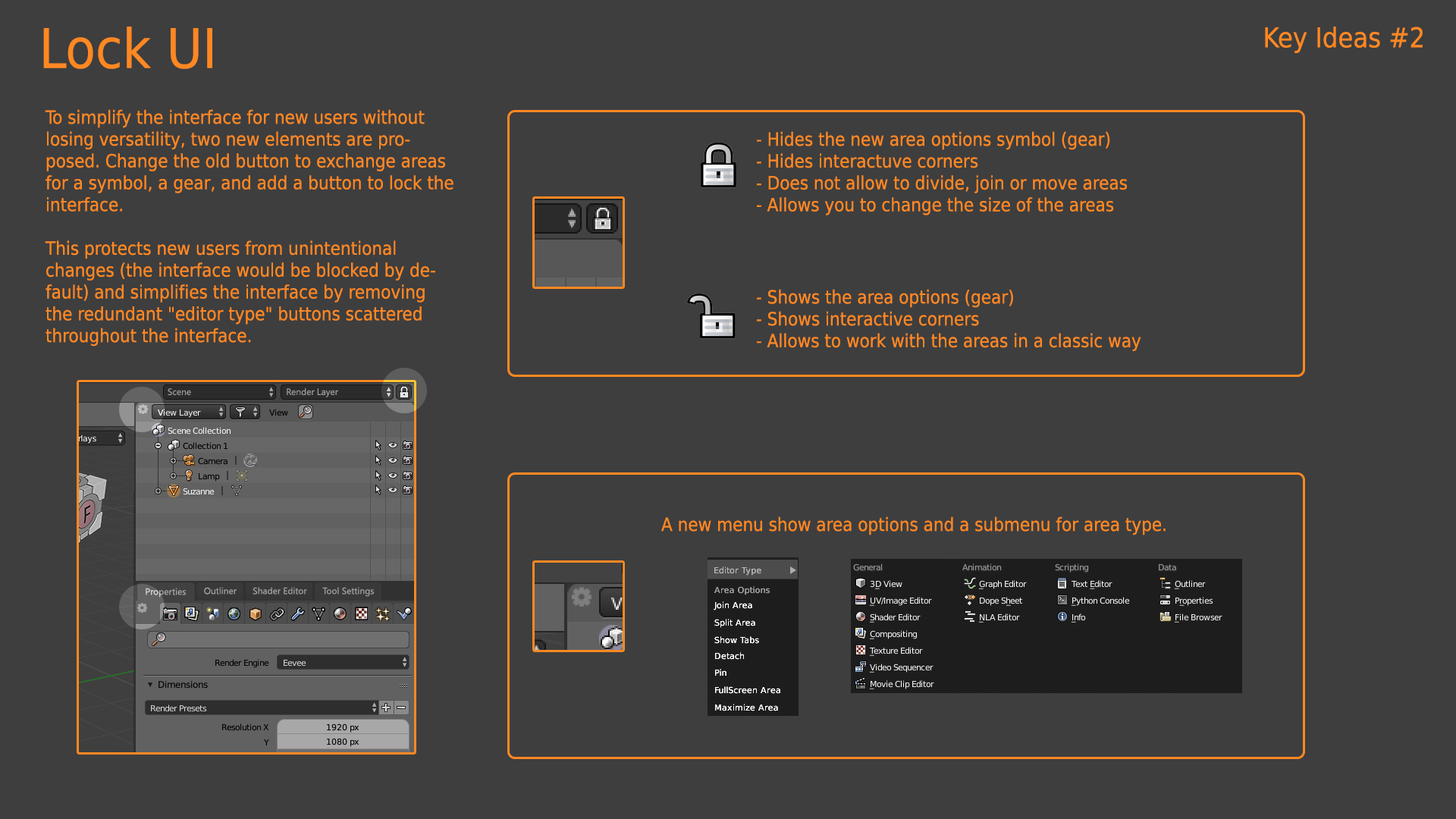
I don’t think so, for now in Blender2.8 the problem is similar to 2.79 or even worse. although now there is nothing flashy in the corners for the user on the other hand the new system is difficult to use and carries a lot of errors even for experienced users. If you want the best for new users the interface lock and hide all those controls is the best choice.
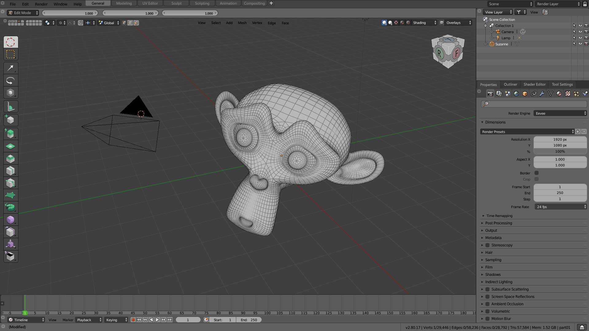
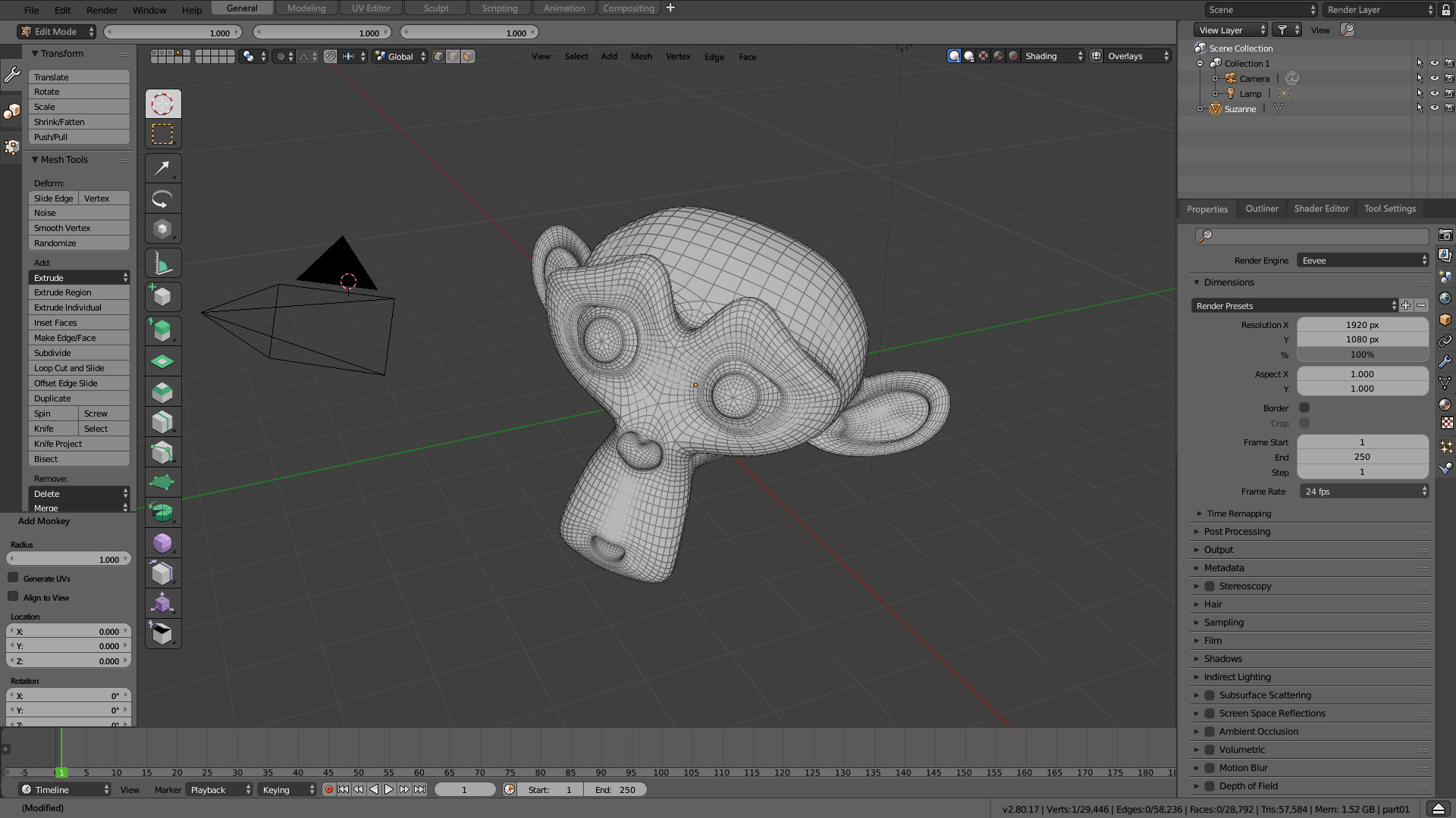
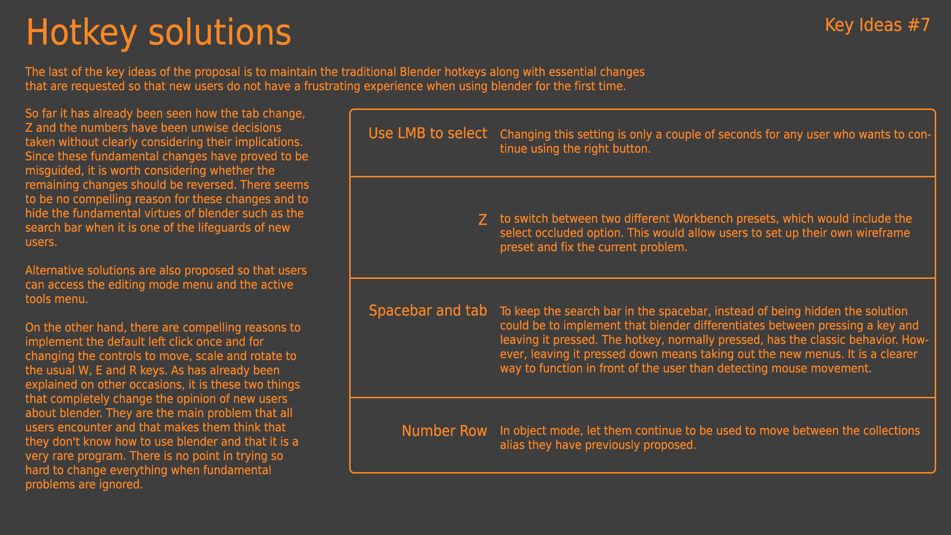
I forgot to mention at the end that the proposal also contains a change in the behaviour of the traditional corners.
click+drag = move areas
Ctrl+click+drag = divide area
Shif+click+drag = detach area
For my part I support the fact of making proposals like this one, made with great care, explained in detail, giving the projections and cons of the proposal. I think we all worry about trying the UI of 2.8 and if something we think can be improved, make a proposal similar to what Alberto does. I think that the place to say what is wrong, it is better to propose how you can improve, and show a visually understandable example.
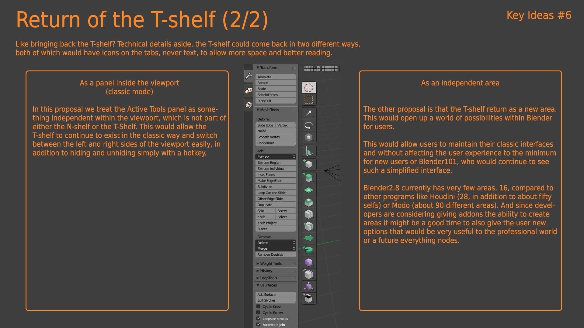
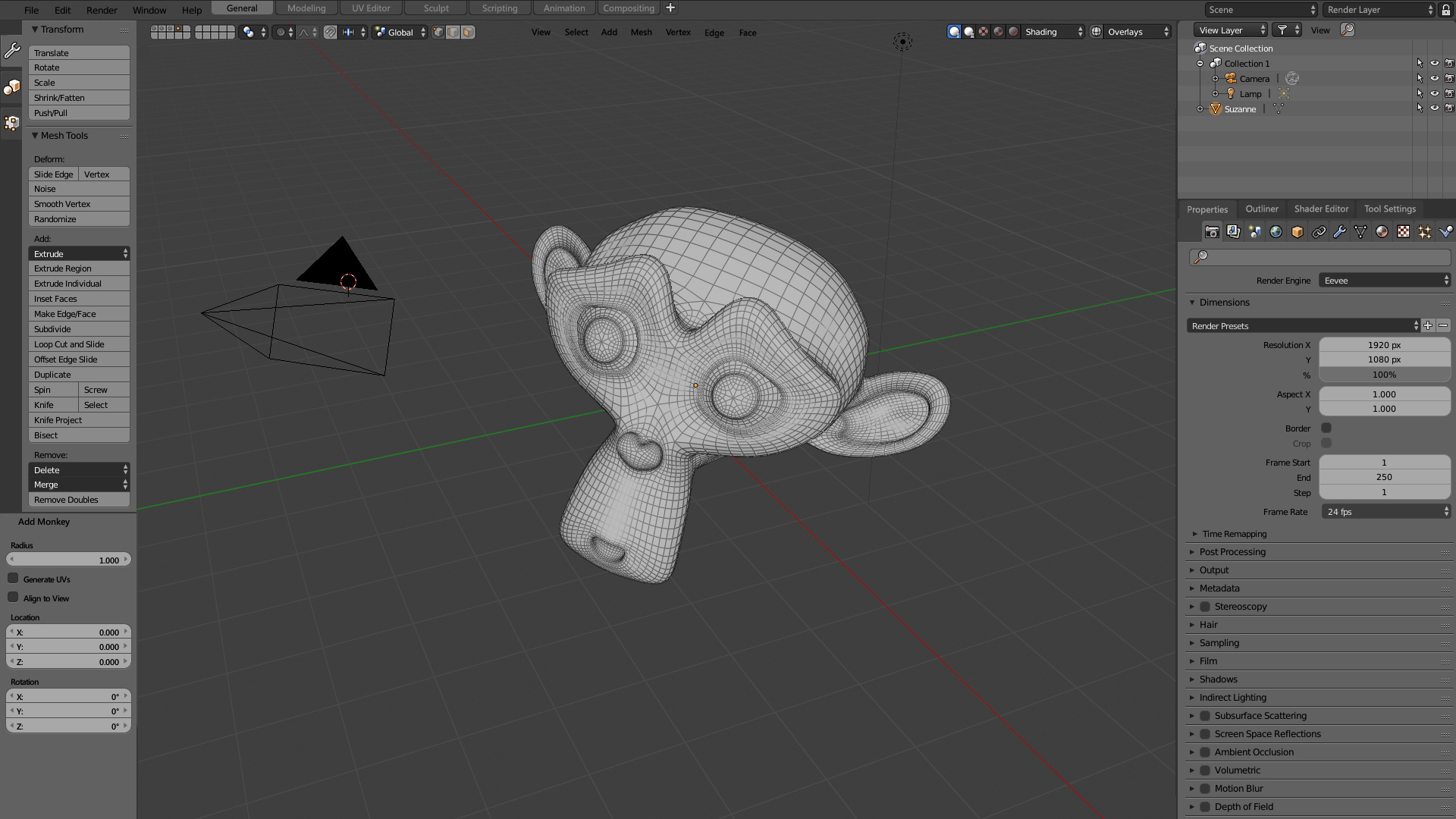
Idea 3 is a good one. I also am not completely sold on the removal of the T panel. I thought the N panel was the least useful of the two. It has a lot of items that are found elsewhere in the UI and has some features (camera tracking for example) that aren’t used in most workflows. The other items could easily be moved elsewhere. Does this mean that the N panel should go completely? Maybe not. I know a lot of users like to work with a single view maximized which I suppose is why we have the repeat functionality in the N panel. Maybe we could have two tabs on the 3d view N panel like there are in the VSE. One for traditional N functionality (though I think the user should have control over what shows up here), the other for old school 2.79 style T panel stuff.
A better tooltip will be good and a constant request of the community, something similar to zbrush solution (classic tooltip and with ALT pressed extended tooltip). The problem is the weight of ¿thousands? of images/videos. So the best will be avoid images.
The only question I have is regarding the top toolbar necessity. The devs added it without a clear explanation of why should some options be there, fixed, completely separated from editor area, which leads to problems like having Sculpt mode on an panel/area far below (or on a second monitor) and having to move the mouse alllll the way to the topbar to change some brush setting. Since you brought the T-panel back, is the topbar really necessary anymore?
I really like the little tabs on the t-panel which will give a proper space (back) to Addons which nowadays with the changes don’t have a space dedicated to them like they had.
IMO also, the bar which has the editor options (like the timeline play buttons, or the 3D view bar which has the layers/view options) should remain on the bottom of the editors as default like on 2.79. I liked shading options on the top though. IMO is much more confortable to lower the eyes than to move them up to look at the layers/options. I never saw a reasoning for why they changed the bars to be defaulted to the top instead of the bottom.
The better proposal would be a mix between yours and Regnas, in my opinion. With all the tools settings relegated to the t-shelf like before, which is a perfect place as it is:
-easily accessible on the left side
-goes together with the editor, instead of being fixed on the top. You can have your interface divided in 4 areas, each area with it’s own T-shelf and options, like before (which worked great, no reason to change).
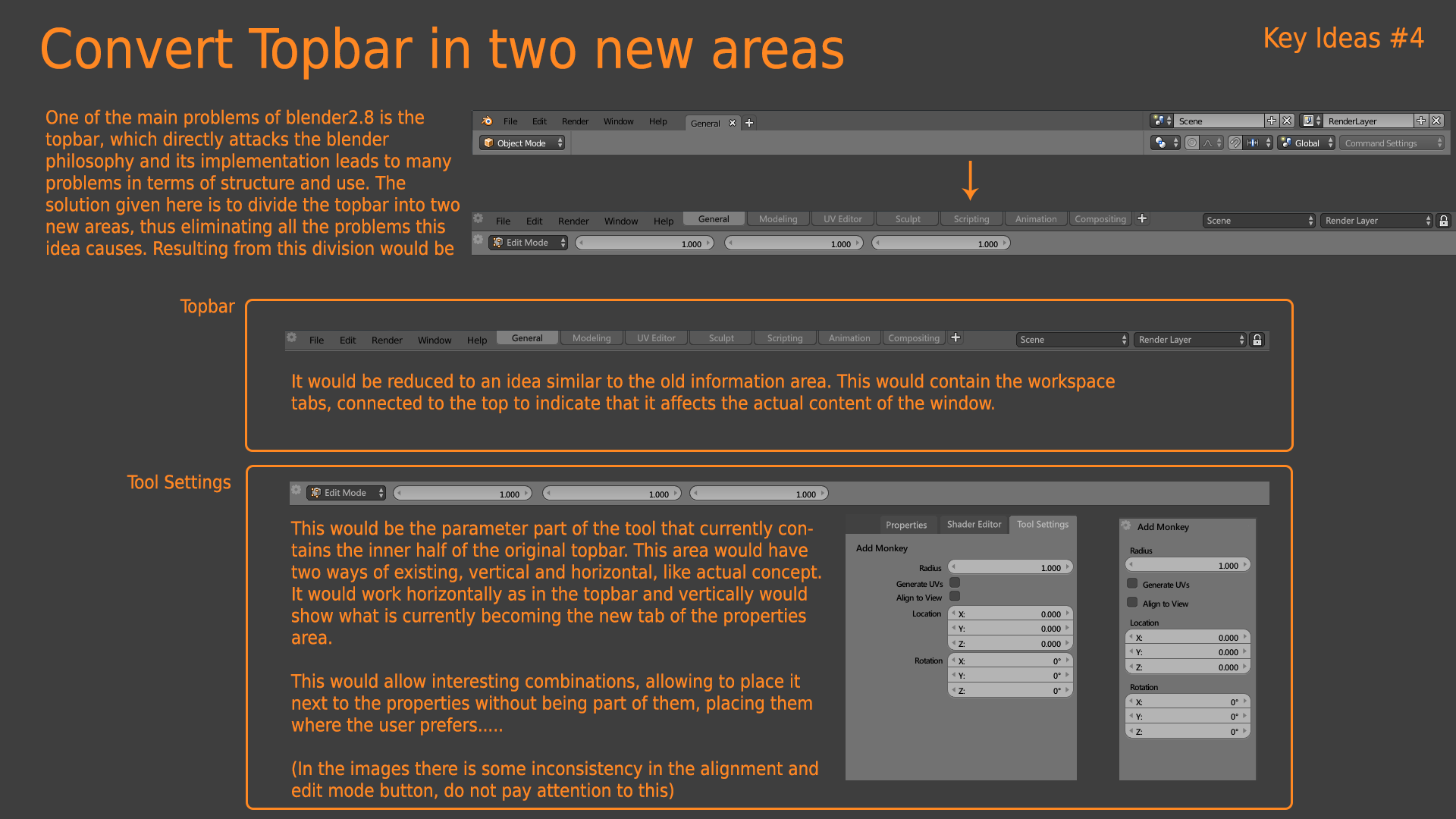
From my point of view, the topbar is not currently very useful. It is an idea with a clear origin, to put the settings of the commands, that has not worked at all and instead of being erased or re-done it is being sought to give it a utility and for it it seems that of equal spoiling the entire interface. In my proposal I maintain it out of deference to the developers, but from my point of view it is completely superfluous and both its concept and its realization have failed. If you want to keep it I think it should be an “edit mode” area, where you choose the editing mode and when you switch between them it changes what the bar shows, which could be the menus of expensive tools, edge and vertex, add, specials,… Leaving a space for the activetool and if necessary user icons or addons afterwards.
The problem with raising the topbar as in Mayan/houdini as many people do is that it is not the same concept. These programs have dozens of bars of that type, arranged in tabs, so you can have all the functions there. Blender will only have half a dozen bars where nothing goes in and what’s worse, the topbar doesn’t show what you want there, it shows depending on the editing mode. How does it know what you’re doing by doing physical simulations? how does it know if you’re doing retopology? it can’t, no program can do it and let the user put the bar that suits him best.
The biggest current mistake with blender2.8 is that the topbar and statusbar are fixed, it makes so little sense within the wonderful interface of blender2.79 that I still don’t understand why it wasn’t done right from the start. It should be user configurable areas like the rest of the program. To make the user go through the bad time of having to necessarily use both areas where the designer has decided that they should be seems illogical to me. It’s like saying, "We have a great interface, what do we do? ■■■■ it.
Whether the headers are up or down is not a problem for me, it is easy to move and is something that is almost circumscribed to personal taste. Personally I would put it down because I don’t see much point in you having to go through a row of icons to get to the toopbar.
The settings area, at the moment that the settings inside the viewport have been finally implemented, seems unnecessary to me.

