Well, a release date for 2.8 was made public, yet developers are silent in regards to some questions pointed here (and in various Interface Proposal topics). I’m worried if things like the Top Toolbar (topbar) will remain like it is, unchanged, until 2.8 release… when even on Pablo’s most recent videos he appears to prefer it hidden. If even developers are not using it, why keep it like it is before launch?
Wasn’t the purpose of an UI change to make things better and simpler?
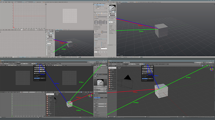
Here’s an analysis of mouse travel time to reach certain options with the removal of Tool Settings options from the Toolshelf (“T” shortcut) on the left side (splitting some of them to the topbar, and some to the Properties editor panel) when using a dual-monitor setup:
On this example, I chose two semi-random options:
-One that is present in the new Topbar: the Sculpt Plane (Area Plane) option.
-One that is only present on the new Property tab for tool options: Symmetry Lock
I also setup a quad-panel view on the first monitor to emulate a busy and random workspace, with the 3D view located on the bottom right which is the worst case scenario.
The Red and Blue paths are to reach Scuplt Plane options. The New UI has the new Blue path.
The Green path is to reach the Symmetry Lock option.
As one can see, by using the Properties Tab options on the new UI, we have to travel almost 2x longer (500/270px) to reach the option Sculpt Plane on it (red/blue path).
To reach the same option on the new Top Toolbar (blue path), one has to travel almost 4x longer (1020/270px) on the first monitor, and 20% less on the second monitor.
To reach Symmetry Lock on the Properties Tab (green path), on the first monitor one has to travel 60% farther (500/300px) on the first monitor, or if you use the topbar, 3x farther (933/300px).
To reach the same option on the second monitor, the user also has the option to move the mouse back to the first monitor to the Properties Tab to reach it, which is 40% farther (1040/760px). or use the Topbar, which is 30% farther (970/760px)
Result: only 1 of the 8 travel distances exemplified gained a minor time reduction (20% faster), which is to reach the Sculpt Plane options on the second monitor under the new UI.
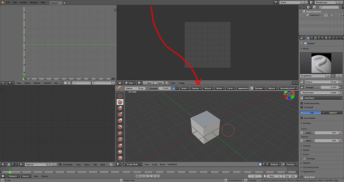
This extended travel time could be partly solved by having the Topbar not fixed on the top, but located on the top of each Editor as needed. For example, sculpt options located on top of the 3D view where they are needed:
This brings the most used options even closer than the old Toolshelf had them, but some options even farther.
If you question: “Why travel time is important?” Well, this is a workflow velocity measure. Increase a little bit of time here and there and you are looking at dozens of minutes increased in regards to the previous workflow. And remember, the philosophy here was to make it better and simpler.
ADDONS DEDICATED SPACE
I didn’t hear anything about it, but where will addons dedicated space be now that tools options are not on the Toolshelf? The same mouse-travel distance problems will appear since we maybe wont be able to access Addons options on the second monitor (have to go to the first monitor)?? I cannot see how complex addons like Animation Nodes would be properly placed on the Topbar. Either they bring a dedicated addon space on the Toolshelf like before, or a floating popup that can be hidden and brought back with a shortcut.
Having Addons limited to the Properties Editor Tab is bad, because on a second monitor it would waste fixed space by not being quickly hideable like the old Toolshelf was (or having to move the mouse to the first monitor to access it).
In case people think that I’m only complaining without offering a solution, to me good solutions were presented on some UI proposals, like this one, which reinstated the left Toolshelf tool options, and used the old Toolshelf Tabs space for addons and other stuff: UI Proposal

