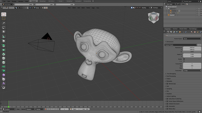
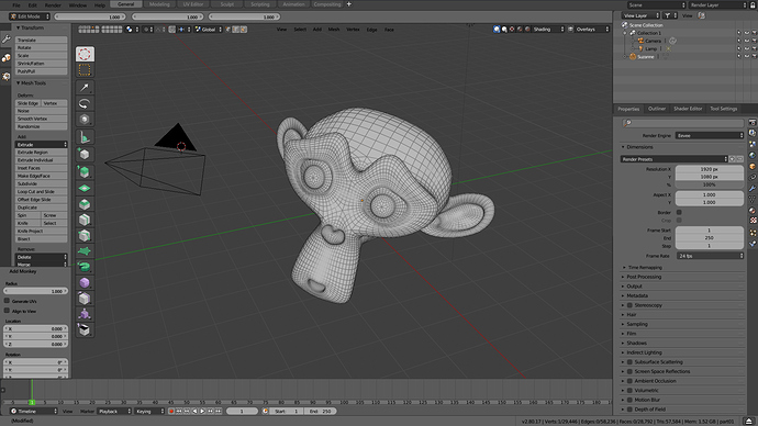
It’s and old mockup from 2.79/CodeQuest era, but also could be good remember… Basically
- reduce the editor button to a single gear, less confuse for new users and reduce noise
- allow to lock interface, hidding completely the control
- Change workspace tabs to top to not confuse with editors tabs
Without lock interface
With lock interface
(It’s an old mockup with other concepts from here Interface proposal for blender2.8 from a user's point of view)

