Improvements to the Blender macOS User Interface Experience
Name
Jonas Holzman
Contact
Email: [email protected]
Nickname: Brainzman - on blender.chat, projects.blender.org and devtalk.blender.org
Synopsis
In recent years, Blender support for macOS specific features has drastically improved. With the introduction of the Metal Viewport, features such as HDR support and development support from Apple, Blender can now be easily regarded as one of the best 3D applications available for the Mac. However, when it comes to its user interface, Blender still doesn’t feel quite properly integrated within the macOS environment. This GSoC proposal aims to change this, with the goal of making Blender feel closer to a fully native macOS application.
Benefits
This proposal plans to improve the Blender macOS user experience by incorporating part of the Blender interface into the macOS interface. Effectively making it closer to the macOS Human Interface Guidelines, and providing macOS Blender users with a familiar experience, more tightly integrated into their operating system.
To achieve this goal, this proposal will focus on the improvements of two main UI elements: the macOS menu bar and title bar. While this proposal will focus on macOS implementation, a byproduct of it will be the creation of an unified interface for native menu bar items, which will then make it possible to implement such functionality on other OSes and Desktop Environments in the future.
Deliverables
Menu Bar
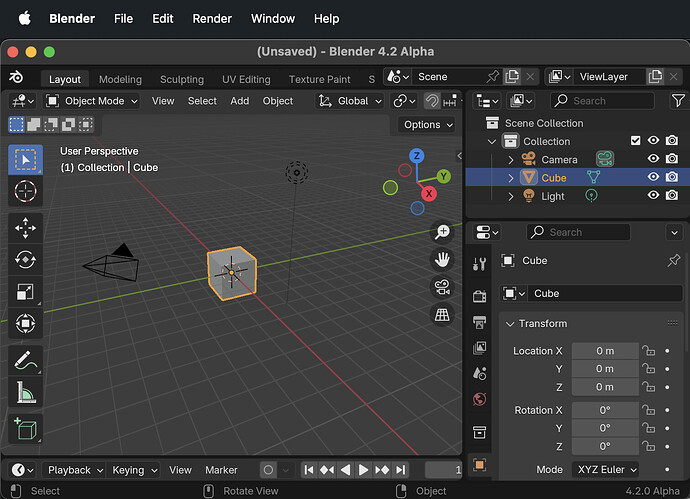
The menu bar is an essential part of any macOS application, and is the natural space for users to look for global operators and commands. Currently, Blender implements its own menu bar in its topbar. This deliverable aims to port its content to the macOS native menu bar through the use of a new native menu bar system interface. A task made easier by the fact Blender already conforms to the macOS menu bar style convention (File, Edit, etc…).
Non-functional visual proof of concept made via modifications of the Objective-C GHOST sources
Inline Title Bar
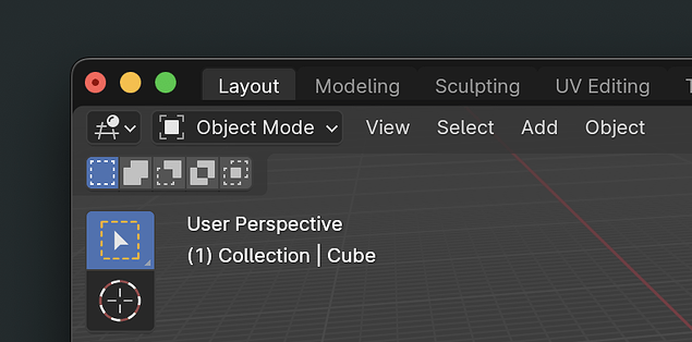
Expanding on the space freed in the topbar by the menu bar. The idea of the inline title bar is to fuse the macOS window title bar with the Blender topbar. Unlike the Menu Bar deliverable, which consists of creating a native menu bar interface that can be used by multiple OSes, this will be a macOS only feature.
Simple proof-of-concept made via modifications of the Python UI and Objective-C GHOST sources
Possible window title bar design mockup by Arjo Nagelhout, featuring expanded draggable areas
Additional Deliverables
-
GHOST sub-system interface for native menu bar items
-
Menu item icon support in the macOS menu bar
-
Fix macOS window positioning bugs (Tracking Issue)
-
Explore tighter macOS system integrations (Bonus)
Project Details
The main goal of this GSoC, improving the integration of Blender within the macOS User Interface, has already been proposed and discussed in this devtalk post by Arjo Nagelhout.
Menu Bar
Design
Existing Blender topbar
The current, in-window Blender topbar will be stripped of its text menu item (File, Edit, Render, etc…), only leaving workspaces on its left-side. The Blender icon might be kept as a simple icon label with no menu item attached to it for horizontal balance (as can be seen in the Deliverable mockup), as its original menu content will be part of the “Blender’’ main macOS app menu.
Icons and Checkboxes
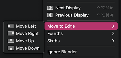
In macOS, menu bar items support icons, allowing us to properly replicate the Blender menu items.
Menu bar item icon example from Rectangle
Displaying an icon requires an NSImage object, which can be constructed from any image data type that macOS supports, which can then be obtained from the Blender icon atlas, with a possible rasterization step. Due to the potential complexity of retrieving and adapting the Blender Icons, this feature will be worked on separately as an independent deliverable.
For the equivalent of checkboxes (such as Edit > Lock Object Modes), macOS only natively supports checkmarks, which are shown as having no icon when unchecked. Thus, to keep the original intent of the Blender interface, the original Blender checked and unchecked icons will probably be used instead.
Keybindings
To conform with the macOS menu bar, keybindings will be assigned to the macOS menu item. This has multiple user interface benefits, including having keybinding trigger an highlight of their parent item menu when pressed, serving as an additional visual queue to the user that the action was executed, and making the Blender key bindings available to other apps.
One technical limitation that comes with this system is that the keybinding will be “catched” by the menu item, and will thus not be visible to the Blender process, to fix this, there are multiple potential solution:
- Find a way to disable this behavior program-wide
- Make the menu bar item delegate forward the operator call to Blender through GHOST
- Make the menu bar item delegate forward the keystroke to Blender, essentially repeating it
The last option seems preferable, but issues may arise when a keybind is held, or pressed multiple times. This will require further experiments.
Help menu
In addition to containing the current content of the Blender Help menu, macOS provides a built-in fuzzy finder in the Help menu of any app. Which, although far from being a replacement to the Blender F3 menu, provides macOS users with an easy and familiar way to locate menu items in the menu bar.
State of the Menu Bar during Blender startup
Since the topbar code is part of the interface, the content of the Blender menu bar won’t be available straight from startup. The common solution to this problem is to display a minimal menu bar during loading, only containing the main “Blender” app menu.
Implementation
This feature is by nature heavily dependent on the host operating system. As such, this proposal aims to expand GHOST, the Blender OS Interface/Toolkit with a unified interface to communicate with the native OS menu bar, while also providing an implementation for the macOS Cocoa backend.
Bringing native menu bar support to GHOST also has the added benefit of permitting implementation of native menu bar items to other systems, such as certain Linux Desktop Environments, in the future. An example of software supporting such functionality is IntelliJ IDEA, which they implement in a feature they call Linux Native Menu.
Existing Blender Topbar Code
An important requirement for this project is for the existing blender topbar Python UI layout implementation (defined in space_topbar.py) to remain as unchanged as possible, making it serve as a common UI menu definition for the “normal” topbar and the native menu bar implementations.
The space_topbar editor will thus have to be expanded so that, when the host supports using the native system menu bar, the topbar UI menu item block will have to be removed from (or not added to) the topbar layout, and menu item blocks parsed into simpler data structures to then be passed to the GHOST native menu bar interface.
These simpler native menu item data structures should contain the necessary information to display them on any OS, such as item names, operator metadata, poll functions, keybindings, etc… As well as supporting recursivity for submenus.
Ghost Interface Implementation
The implementation details for the GHOST Native Menu Bar interface will need to be discussed in depth with Core and UI Module Developers. Multiple paradigms are possible, such as storing the entire state and content of the menu bar and keeping it in sync with the OS, or using methods to add/clear and update items, letting the space_topbar editor directly handle the native menu bar item by item. Editor handlers and listeners will also have to be put in place to guarantee correct updating of the native menu bar items on modifications, such as when enabling an addon or modifying a keybinding.
An eventual, but more fragile alternative I also explored was to instead use macOS specific “extensions’’ to the space_topbar editor, similar to what can already be seen in the codebase in places such as source/blender/blenlib/intern/storage_apple.mm or intern/locale/osx_user_locale.mm. But multiple problems, such as locking ourselves in a hardcoded variant that can only be used for macOS and general lack of expandability and modularity made me instead go towards the idea of an unified native menu bar interface through GHOST.
Inline Title Bar
Design
Draggable Areas
Additional vertical padding might need to be added to accommodate for the window draggable area. As can be seen in this mockup from the UI proposal by Arjo Nagelhout.
Themes
The topbar being already colored by user-defined themes, macOS users will thus be able to customize the color of their entire Blender window.
Child Windows
Blender differentiates between Main and Child windows. As child windows do not have topbars, they will have to keep their original, default macOS title bars.
Window Title
For the window title, which in the case of Blender essentially consist of the filename and file saved state indicator, there are multiple options:
- Remove the title text entirely, a concession that a lot of modern macOS applications make, but which in our case goes against the macOS HIG Windows guidelines
- Keeping the original macOS title bar text, adapting the padding of the topbar to accommodate it
- Remove the title text, and reproduce its content in the Blender topbar
In any case, the current window title bar text will still be available in other places throughout the macOS interface. Such as in App Exposé, or when a minimized window in the dock is hovered.
Implementation
The macOS technical implementation is fairly simple, the macOS title bar becomes transparent, overlays the window, and its size defines the draggable area. Leaving us with just the traffic light (Close, Minimize, Maximize) indicator buttons. This transparent area can then be matched with the topbar, adding padding to accommodate the traffic light buttons and draggable area.
In addition to the modifications described in the first deliverables, the space_topbar editor will have to be expanded with macOS specific draw and layout functions, which can then be switched to using either check flags from GHOST or macros. The GHOST Cocoa windowing code will also need to be expanded to apply the inline title bar style depending on whether or not the window is a Blender main or child window.
Additional Deliverables
Fixing macOS window positioning bugs
Window positioning related bugs have been a problem for a long time on macOS (see the related Tracking Issue). When using multiple displays with different screen resolution and scaling, Blender windows will not properly position themselves on the screen when getting popped-out of their editors or when restoring a blend file window layout. Investigating and fixing this bug will also be the occasion to potentially refresh the Objective-C GHOST Cocoa window backend code.
Exploring Tighter macOS System Integrations
If all the other deliverables have been successfully implemented and additional time remains, further paths for macOS specific UI and UX improvements could be explored. Such as:
-
Finder .blend file preview support: Allowing macOS users to preview blend file thumbnails via a Quick Look extension that would be shipped with Blender, similar to the current behavior of the internal Blender file explorer.
-
Improved Text Cursor Behavior: Add expected macOS text cursor movement behavior (Cmd jumps, etc…), as was briefly implemented and then reverted here. (suggested by Austin-Berenyi)
-
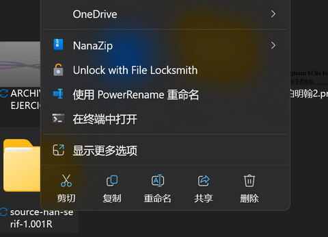
iCloud Drive Integration: Include iCloud Drive in the Blender internal File Explore System shelf, similar to the basic OneDrive integration that already exists for Windows. (suggested by blenderrocket)
Reference and Related Projects
Apple Human Interface Guidelines
For macOS menu bar and title bar design, Apple Official HIGs for the Menu Bar and Windows.
Godot
For the native menu bar interface, a good example and possible reference of an existing free and open-source software targeting multiple platforms and delivering a native menu bar experience on macOS is Godot. Which uses a common menu bar interface in its GUI code, which is then passed to its platform specific implementation, its equivalent of GHOST.
Other great references of creative free and open-source software targeting multiple platforms include GIMP, Inkscape and Krita, which also implement native menu bar support on macOS in similar manners.
Project Schedule
| Date | Tasks |
|---|---|
| Bonding Period | Improve Proposal, UI Design and Implementation Details with Mentors and Related Modules Members |
| Week 1-3 | Native Menu Bar GHOST Interface Implementation |
| Week 4-6 | macOS Menu Bar Implementation |
| Week 7 | macOS Menu Bar Icon Support |
| Week 8-10 | macOS Inline Title Bar Implementation |
| Week 11 | Fix macOS windowing bugs and explore tighter system integrations |
| Week 12 | Additional Time for Finalization and Final Evaluation |
Bio
Hello! I’m Jonas Holzman, a 20 year old French Software Engineer currently working in the field of robotics for the cinema industry. I have quite a long history with Blender, from sparking my interest in the field of Computer Graphics many years ago, to, through its community, bringing me opportunities which would eventually lead to me using it professionally; this software has played quite a key part in my life, and I hope to, through this proposal, be able to improve it for the better.
When it comes to programming, my original field of interest was initially more oriented towards embedded systems, hardware and general low-level programming in C and modern C++, as well as visual arts in the likes of Processing, and general interactive media projects. After dabbling in quite a few fields, from software defined radios to OS development among others, I took interest in computer graphics programming and quickly got into Blender.
What initially attracted me to Blender, in addition to its awesome community and capabilities, was its modularity, expandability and general software design. Very quickly, at first through addon development, and later through modifications of its sources, I started playing with it and adapting it to my needs.
Later on, through the Blender community, I was able to put the skills I had developed into practice on multiples add-ons and real-world projects, such as Nexus VI: an ambitious French sci-fi web-series project whose VFX were made entirely with Blender, for which I created custom Blender builds and tooling. All of which strengthened my desire to continue investing myself into Blender and pursue a career in media related software R&D.
Coming back to the core of this proposal, I personally love UI development and design. The idea of approaching software from a purely end-user perspective, and perfecting an interface for it to feel right and intuitive is extremely appealing to me, and even more so when having low-level control over UI elements. When it comes to Blender UI development in particular, I myself have made a few contributions to the codebase, such as:
- #113751 - Fixed startup.blend default Viewport view tilt
- #116494 - Implement a Clear Recent File List Operator
- #119758 - Improvements to Revert File Operator Confirmation Popup
Around 2 years ago, I had to switch from a Linux based setup to a Mac for professional reasons, while its closed and strongly opinionated paradigms put me off at first, I became quite interested by its internal software ecosystem and design over time, and, through my work, quickly picked up some Swift and Objective-C. After dabbling with macOS development and using Blender on a Mac for a while now, I tried to sum up all the UI improvements ideas I had for it in this proposal for me to work on and improve.
Through the years, Blender acted as a link through many of my passions, combining my love for programming and open-source software with computer graphics and visual arts. Through this proposal, I hope to strengthen my understanding of the Blender codebase, improve the Blender macOS user experience, and most importantly, give back to this amazing free and open-source software project.
