Having used Blender for quite some time I have grown accustomed to its interface. However, there’s always room for improvement. I’m looking to help improve the software in the area of usability, consistency and adoption of standards such as the ones discussed in this post.
Being very new to the Blender developer community, I’m still trying to find my way around. What would be the best way for me to work on these UI projects? I have currently looked into the “User Interface” project on developer.blender.org but I don’t know how to get in contact there.
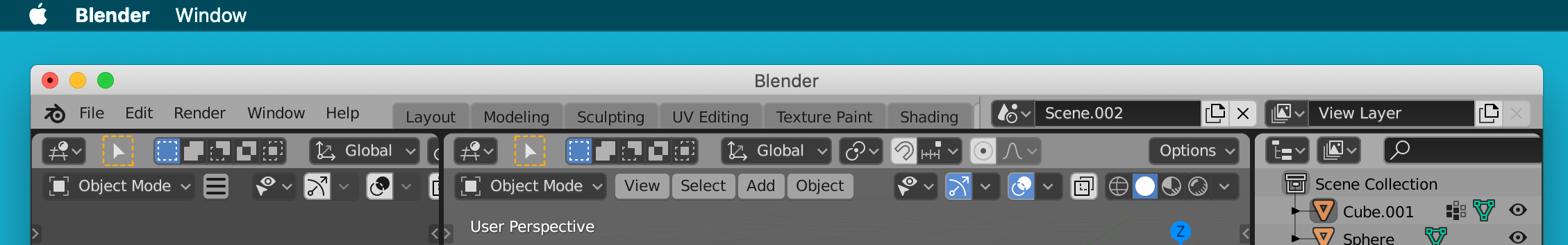
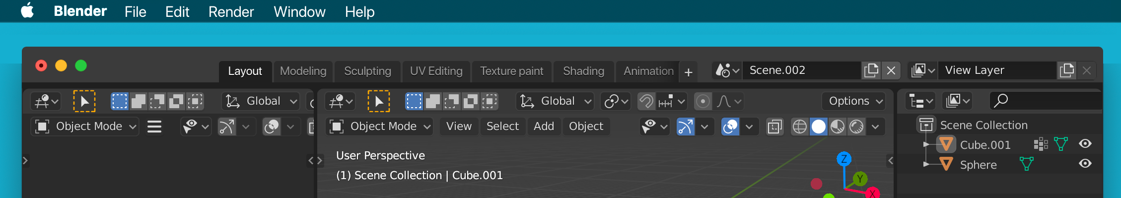
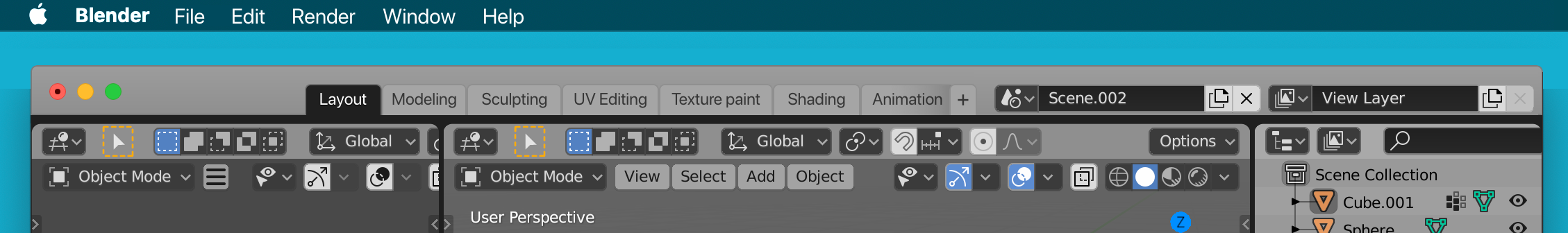
Current implementation
The following screenshot is the current implementation (Blender 2.83 on macOS)
In line with the human interface guidelines of macOS - Menus in the menu bar instead of the title bar in macOS are used by all programs and are expected from users.
Reduction in vertical height
More workspace tabs on smaller screens
A clear indication of the workspace tab bar being scrollable and an always visible add button might entice people working in smaller windows to explore more workspaces.
Considerations
The scene selector and view layer selector could be redesigned to take up less space or adaptively resize when the window becomes smaller. That way the workspace tabs get priority and draggable space could be increased. (This would have implications for other “asset link browsers” however)
Contrast between the main interface and the title bar
Feasibility. How much effort does platform specific integration of the title bar take?
When the window is out of focus, the title bar should reflect this (e.g. become lighter and greyed out) How can this be implemented with taking themes into account?
I would like to add some objections to this design proposal myself:
It could create a separation between Blender users who use macOS or Windows, for example in following tutorials or documentation. There’s thus something to be said for trading some platform specific standards for true identical user interfaces across platforms.
To truly understand the impact this could have, it is important to look at how other programs have tackled this problem and how that turned out for the aforementioned areas.
Maybe a first step would be to have double menu bars, one that stays in the platform independent user interface and the other that fits the macOS standards. Just a thought.
Are there maybe discussions I’m missing about this sort of topic? About platform specific UI implementations?
Currently all the menus all coded in space_topbar.py and can be uniformly edited for all platforms at once. (without learning a new language, I’m assuming objective-c would be used)
People develop addons and may want to add a new menu item. Can the macOS menus be edited by Python API ?
Lastly, menu items in macOS cannot be right-clicked upon.
There’s not much of a design argument against this. We always wanted it to be something like that. Blender in general could integrate itself much better inside each host OS.
The main issue is a technical one: Since Blender’s menus are defined in Python, and since addons can extend any menu, we can’t just statically include these items easily in the native macOS menu bar.
In theory it is possible to write some kind of wrapper that would take the Python menus as an input and output native macOS menus. The main issue then is a lack of macOS developers with this kind of focus. I would love if we could get to do this
I’m on Windows, not Mac, but I’d love to see exactly this level of platform integration. The Mac version should feel part of that ecosystem, and the Windows version should follow those conventions. The changes shown really wouldn’t be disruptive for tutorials as it is just outer-edge interface changes. This is normal for many other cross-platform apps. Done properly it could still be extended by python addons.
Let’s see: the lates incarnations of developer tools for Mac and Windows (Xcode, Visual Studio) do get away with the top bar, title bar, caption bar, etc.
An application should follow/addapt the trends for each specific platform and not enforce unique workflow, or Windows workflow on MacOS, Linux workflow on Haiku OS or Haiku OS workflow on Windows.
After I have experienced this design in Xcode and Visual Studio among many applications adopting this design. I really hope Blender will implement this.
Wouldn’t be enough to just remove (maybe as an option for those who want to keep it) the title bar and custom render these buttons inside the Blender UI according to the platform? The biggest implementation issue I can imagine would be the drag&move, double click to maximize/minimize window support.
What was not clear to me if Blender developer were OK with this design proposal:
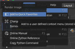
While it’s not possible to extend the menu to include a new item, it is still possible to add a “Addon” item that contains the extended menu added by the addons (Look at how Anki did it). Though it might not possible to “Add to Quick Favorites” through this (unable to right-click).
regarding the “following tutorials”: macOS users expect menus to be in the menu bar in the first place, coming form other mac Apps thats where someone would look for these menus. And the location isn’t that different, flollowing a tutorial, you would still find these menus, most software handles it this way.
The only problem I can see is the right click, but the operators still exist in the search, so you can assign short cuts. showing both menus would violate Blender rule to never have the same option in two different spots, that would be confusing.
Adding new items should be possible, but Im currently not on the skill level to do this
Blender has full control over drawing inside the window. But when using OS specific UIs, functionality data would need to be standardized and shared via the OS api. This requires quite some changes in order to make it work properly. So yes it can be done, but it isn’t the same as moving menu from within the window to the top of the screen.
My coment was more form the UX perspective, the technical side is difficult for sure. I’m not an expert in those systems but especialy conectiong the SwiftUI elements with Blenders codebase and wrapping all the bpy stuff reliably will be difficult.
Blender currently has way more important problems so its something for the future, but I would like to see those deeper integrations when possible