GSoC 2020: Outliner Discussion and Suggestions

Hi,

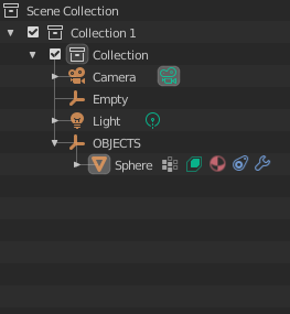
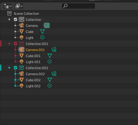
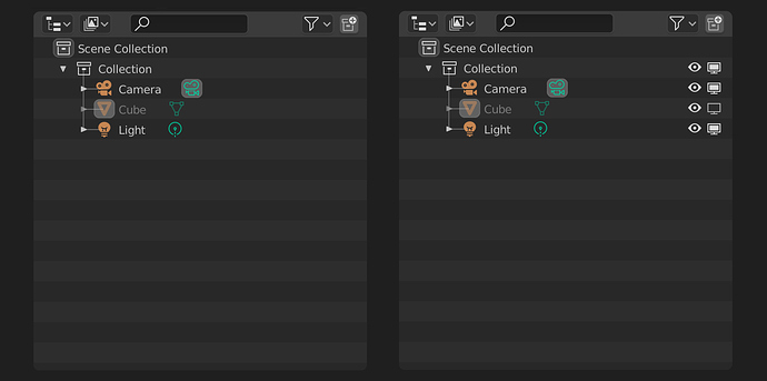
What I mean by visible differences, is that atm in the Outliner/View Layer, there’s no good way to see what is what.

e.g. Is the Collection linked from a external file, or a instance native to the scene? They look the same.
The instanced Collections do have a different colored icon, but italic text would make that distinction even more visible. For the Linked Collections, it might be possible to color the icon differently to set them apart?

The same for ‘duplicate linked’ objects. Now in the Outliner you cannot tell what is the original, and what are the linked copies. It’s the same fore ‘duplicate linked’ Collections.

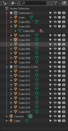
There is no visual clue in the Outliner to differentiate the various ‘states’ of the things in the scene:
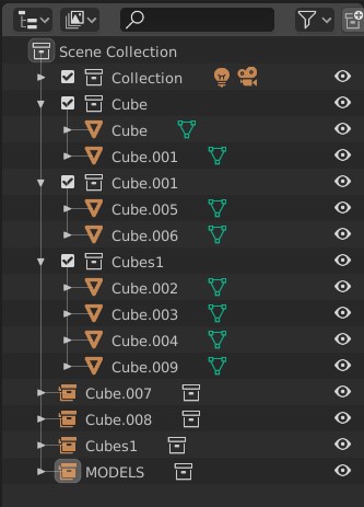
view_layer
Can you quickly tell from the Outliner what are the externally linked Collections, the ‘duplicate linked’ Collections or the copied or Instanced ones?
The same for the Cubes. There are ‘duplicate linked’ cubes, and copies of the ‘original’ cube. There’s no way to tell what is what atm…

Other 3D applications solved this by adding different icons, or different colored icons to these variants.
Or have font differences (bold, italic) for instances, clones and sometimes copies.
It is one of my more immediate gripes with the Outliner atm, next to selection & deletion of hierarchies. :wink:

I still find the Softimage Explorer window one of the cleanest, or clearest to navigate regarding visibility:
http://download.autodesk.com/global/docs/softimage2014/en_us/userguide/files/3dexplorer510.htm

or Maya’s Outliner:
http://help.autodesk.com/view/MAYAUL/2018/ENU/?guid=GUID-4B9A9A3A-83C5-445A-95D5-64104BC47406
Although I feel that to be somewhere in between Blender & Softimage regarding workflow visibility.

Hope that makes it a bit more clear.
And I haven’t tried the latest builds yet, so cannot comment on mode switching atm. But any active linking between the Properties panel and Outliner object data is very nice and brings back some of the things I missed from Softimage. :slight_smile:

I wouldn’t mind showing you both Softimage & Maya workflows via Skype if you’re interested. Just let me know.

cheers for all the good work!

rob

Edit: Installed the Outliner build, and the mode switching is very cool! Happy camper here. And no more switching to edit mode when selecting the vertex icon. :slight_smile:

One thing though, when I select an object in the Outliner, I would like to switch to Object Properties, not the Object Data tab. You select the ‘top’ of the data, so this should reflect the switch in the Preferences tabs. Other than that, this is a massive speedup workflow. :+1:

Edit 2:
Not sure if this is a small bug, but when I select the material icon on a object, and then select the object icon again, the Properties focus stays on the material. It doesn’t switch to Object Data, like with a fresh object selection switches now to Object data.
3 Likes

I also think it’s just a matter of polishing, the mode column it’s a great introduction in my opinion. I really hope that in the future cameras will be re-introduced, setting the active one from the outliner it’s really handy.

Properties sync:

-As I already wrote, I think that for truly benefit the syncing with material properties, the material icon should be exposed at the right of the object’s name and not only in the hierarchy: even if material properties is not the main space for editing materials, it’s used many times also for changing settings like displacement, screen space refraction and blending modes, therefore it should be easier to access.

-I think that @radi0n’s proposal of syncing the object properties with the object’s text field and/or orange icon could be really nice and worth trying.

-I know it’s probably out of scope, but maybe also Force fields should have object data and physics icons, along with empties they are the only objects in the outliner that have no icons on the right. In this case, technically also other objects with physics properties should have the icon in the outliner (maybe for objects other than force fields, it should be only inside the hierarchy).

-BUG: Syncing with light properties happens only after we select another object data’s icon, otherwise it doesn’t activate. If instead, we click on other icons like modifiers, and then we click again on the light’s object data icon, it brings you to other properties editors.

And besides this, congrats Nate for all the work done so far! Properties syncing it’s a dream come true, and with all the other new features to come, Blender’s outliner is becoming a true badass :facepunch:!

Blender outliner capable and fast to use. One downside is that it can get visually overpowering.

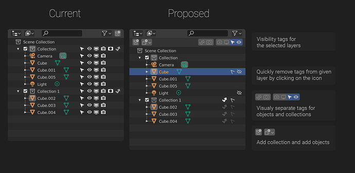
One of the problematic areas is the visibility toggles and tags for objects and collections.
In its current state if you want to change a object visibility toggle you have to enable the whole column from an overflow menu, then go back to the layer and activate/deactivate the tag. It is one of the main
functions for managing objects, and it’s hidden away in an overflow menu.

If you have a object with a specific toggle enabled, you have to have the whole column enabled from the overflows. it is easy to have the outliner with the wrong visibility toggles enabled given tht every collection has its own outliner configurations (as intended) which means you have to enable the toggle columns you need every time you change a workspace.

Is the default cube hidden in the viewport, or it is disabled from the viewport ?

One solution is to have a dedicated row of toggles displayed on a prominent place in the interface which act on the highlighted objects. A tag icon is displayed on the layer to indicate the changed state. Faded icon is displayed on the children of the collection with a changed state.
The object state can be easily reset to default by clicking on the tag icon.

Pros:

  • Easy to discover (works similar to Photoshop layer system)
  • No visual repetition.
  • Only change is indicated
  • No overcrowding

Cons:

  • requires highlighting objects before setting a tag
  • adds a whole new row of icons to the vertically heavy interface
  • Requires a big change in how blender traditionally works (and probably big change in the code)
  • To work properly the outliner has to change the property of all highlighted objects, not just the active one

p.s. I forgot to gray out the hidden cube and light on the proposal mockup :frowning:

5 Likes

This is working really nice! It’s incredibly convenient to be able to go to the pertinent panel on the fly.
I was wondering, while pick-walking it might be nice to be able to press enter on the keyboard to jump to the pertinent panel as well. Another short cut would be just as well, just some equivalent on the keyboard.

1 Like

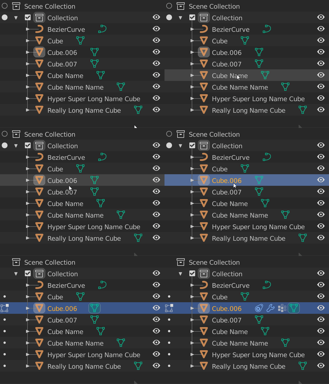
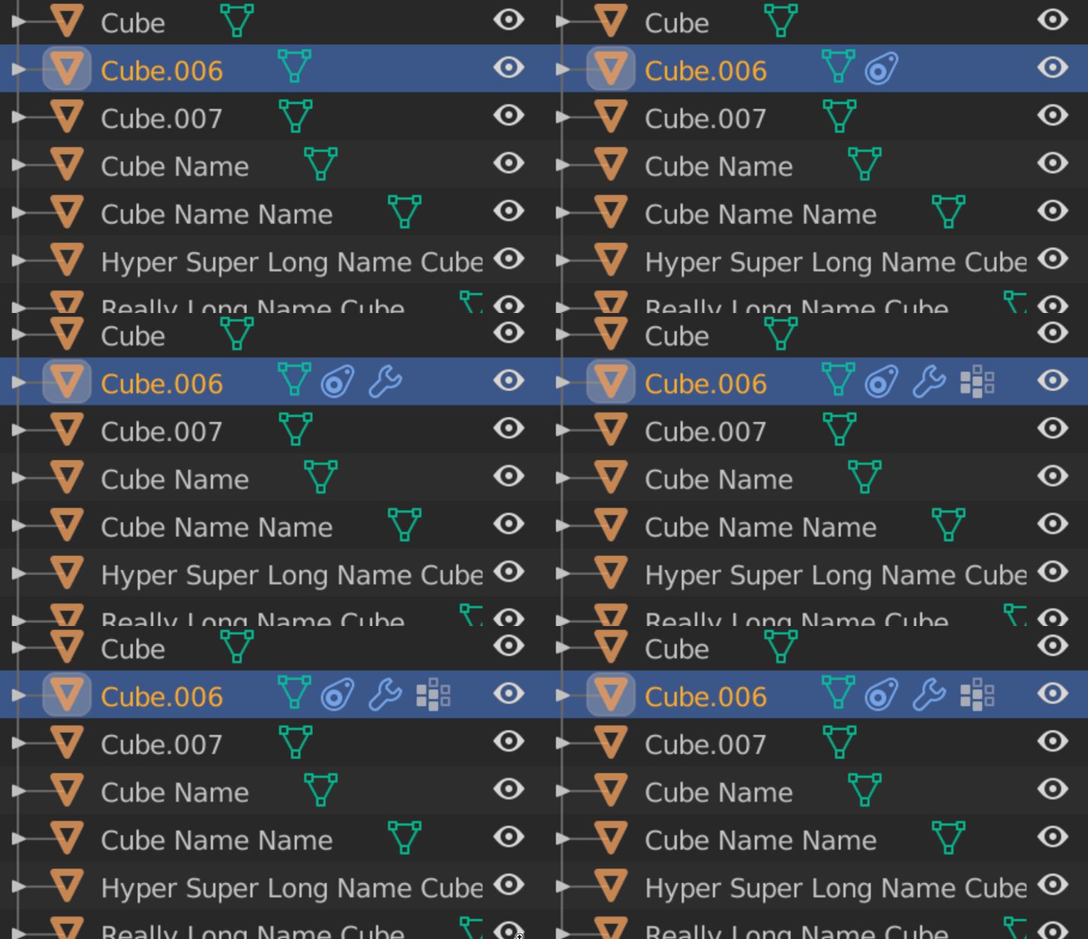
Something I noticed, while looking at the outliner, is that when you have a mesh, it will have the Object Data icon in green beside it. When you add things like modifiers, constraints etc, the object data icon gets “pushed” to the right to make room for the incoming icons, like so:
Pushing Data
I’m not sure if there is a reason for the current behavior, maybe there is a reason that object data always needs to appear last? If not, I think it would maybe feel cleaner if nothing jumped around. I think the other icons should come after the Object Data icon, like so:
Ordering
This way doesn’t cause jumping, and makes it just a little bit more consistent on where to find the object mesh data icon in long lists.

8 Likes

Hi again all! A few of you reported bugs with properties syncing (still not sure the best name for that…). I just had a proof of concept implementation and skipped most of the types. Today I added every type I could possibly think of, including objects. I may have still skipped some obscure outliner item, so let me know if I missed something.

Also, I’ve committed fixes to master (2.90) to fix object and collection delete hierarchy (works in View Layer mode now!), and some selection cleanup.

Thanks for the great overview of what could be improved.
One tricky case is duplicate linked. That just uses the same Mesh datablock for both objects. It might be possible to draw differently if the Mesh data has multiple users, but that would require backtracking in the outliner.

Externally linked collections should definitely get the “link” icon next to them. I’m not sure why they do not at the moment. It’s drawn for the child, but would be more useful for the parent. And about the properties editor, see the above :slight_smile:

I’m still reviewing this with the UI team and others. If the column does not come back, would a right-click context menu entry be useful?

I agree, drawing the materials on the object would be great! I’ll add it to the todo.

I haven’t seen a mockup like this before, but I like it! There might be room for improvement of course, but I do think this has potential. And it probably wouldn’t be as large of a change as you expect - just a new fixed row would be drawn with some buttons. I’ll look into this!

I’m going to make some walk navigation changes soon. If those don’t fix it, (I’ll announce when I do make them of course), let me know.

Great idea. I’ll look into that too :slight_smile: So many little papercuts here that would be nice to fix

5 Likes

Hi Nate,

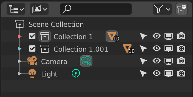
I made a additional proposal for you regarding Outliner visibility:
outliner2
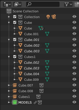
In this example, the linked (and its instanced) Collections are (maybe) colored differently and have a link icon at the root icon.

Any object or Collection ‘Linked Duplicate’ is shown in Italic.
An idea for the Mesh data is to show a number icon when it is used in more than one object.
Like as with a Collection showing the amount of objects in it when collapsed.
This could also be extended to a material icon, if that is showing in that list as well.

I feel this is already helping a lot regarding an visual overview of the data in the scene.
Hope this makes sense :wink:

rob

3 Likes

The properties sync is awesome, finally the amount of clicks has been reduced for example.

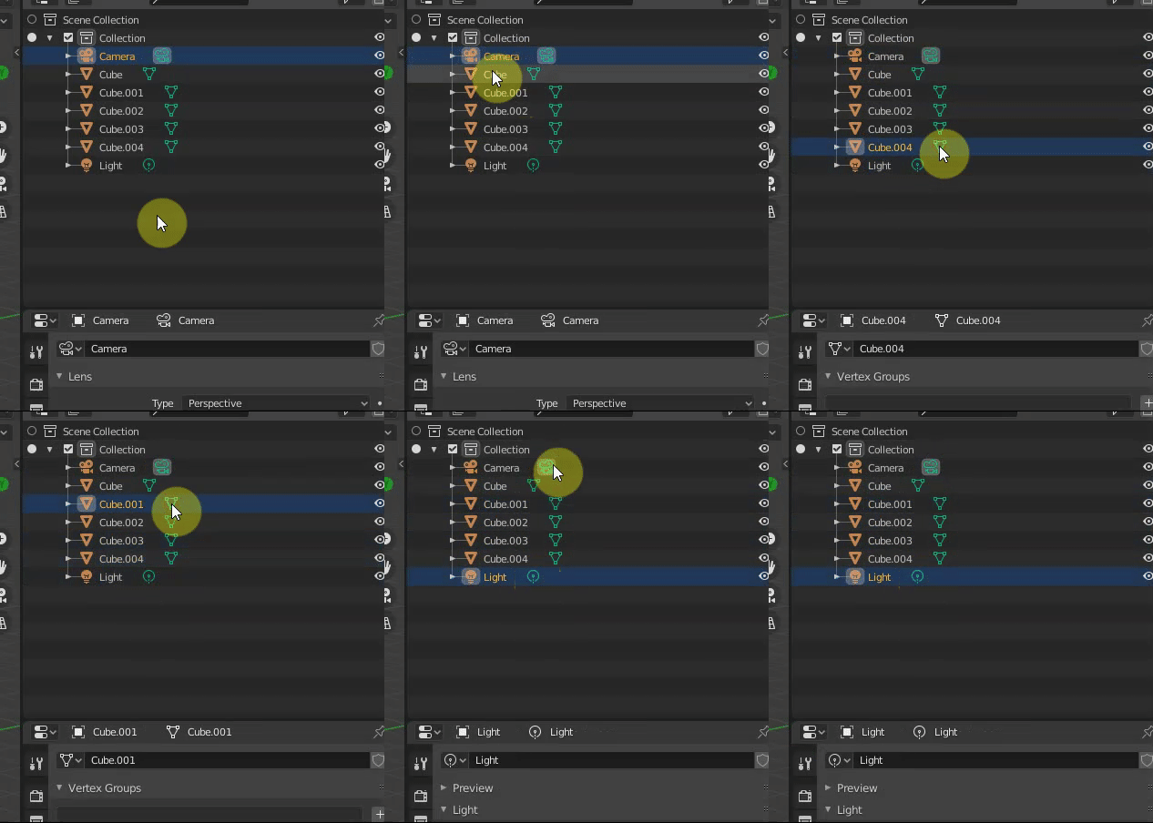
One small thing (I hope) is the active icon regardless on what icon you click.

I expect to see the Camera Object Data Properties gets deselected if we select another object’s Data Properties. Is it possible?

Better a visual example:
ezgif.com-video-to-gif

I made a proposal at the very beginning of this thread asking if is possible to have all the object “tags” visible to avoid displaying the object’s hierarchy to select other data attached to the object?
Like this:
image
https://devtalk.blender.org/t/gsoc-2020-outliner-discussion-and-suggestions/13178/4

1 Like

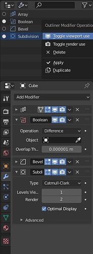
Can the left column of data activation managing opening/closing of modifiers in Properties Editor ?

Can displaying modifiers tab by a click or Ctrl Tab shortcut in Properties Editor change display filtering in Outliner ?
Passing Object State Filter to Active, could help to manage modifiers through outliner’s list.

The outliner in my opinion should be a place to easily manage large scenes. There are things that irritate me…

Context menu:

  1. Multiple objects selected - clicking new collection should ad those objects to collection…
  2. Deleting parent - should also by default delete children, and not throw them in the main collection… A secondary option could be to “dissolve” the parent leaving children. Should apply both to collections and parented objects.
  3. There should be a possibility to copy/paste modifiers/materials/etc from context menu in the outlier.
  4. Materials/modifiers/vertex groups/etc should be managed from the outlier - enable/disable/show/hide/rearrange.
  5. Linking objects between scenes could be more straightforward…

Drag and drop:

  1. It should be possible to drag and drop materials/modifiers/etc between objects; with modifier keys copy/linking
  2. The visual representation of drag and drop action is poor. It should be more obvious were the dropped object will go or if the if the action will succeed at all

Probably out of the scope:

  1. We really need better grouping options.
  2. Syncing with the modifier stack to display only the selected modifiers in the stack.

Question:
Is there an api to add options to the context menu from python?

15 Likes

Hi @natecraddock, I’m going to ask something particular. I understand that your work is about UX in the outliner, and what I ask is more of a “feature” kind. But maybe it can be something like a “fake” Blender feature, obtained just via outliner UI. I’ll explain.
Many people want Collections to behave like “super-objects”, as in you can assign a modifier to them and it will propagate to all the objects inside the hierarchy. Maybe this is too much. There will be problems with many objects, different types etc…
But also many people ask for something easier: collections to behave like groups, so that you just select one element and the whole hierarchy gets selected (there’s also an addon that tries to achieve this, sending collections to a new scene, and porting back an instance). Now, I wonder if a simple outliner trick could do this. Collections should maybe have a “status” variable, that states if they are open or closed. Open would be like now, closed would be a sort of single block of objects. The collection icon would tell us if it is open or closed. When closed there’s no arrow on the left, you can’t roll down the contents: to do that you should open the collection. Tab on the outliner area would open/close the selected collection, as we are used to enter edit mode in te 3d viewport. Also an entry in the context menu would allow to open/close collections.
Sorry for bad explaining, it’s late, I’m tired…

1 Like

Thanks for the continued mockups! Not everything here is possible, but I do like where this is going. The point is clear though, anything to make the outliner more organized will be a benefit.

That active camera is the scene camera (the one used for the viewport & rendering). Object data cannot be active, that is why it doesn’t change.

Yes, more could easily be shown to the right in the outliner.

I’m not sure I understand all of your questions here. Do you mean that a ctrl+click in the modifier properties should filter the outliner to only show modifiers?

@d-V-b I agree with many of your points. Hopefully I can get around to lots of those small issues.

This is possible, and I do understand. I’m not sure the outliner is the best place to solve this though.

Hi all, sorry about the quiet couple of days here…

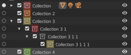
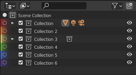
Let’s talk about collection color tagging! I have it working well, and the only thing that remains is to pick a set of good colors, and decide exactly where to draw them!

You can get/set them from python bpy.data.collections['Collection'].color = 'ORANGE' and from the outliner right-click menu.

I have 7 colors (Red, Orange, Yellow, Green, Blue, Purple, and no color) currently, and adding more is trivial. I think 8-10 at a maximum is fine.

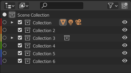
Here are the tests I have done

1

This one is subtle and out of the way. It is also very easy to implement. It is very close to the activation radio button though. We might remove the radio button later so this is still a good possibility.
collection_color_left

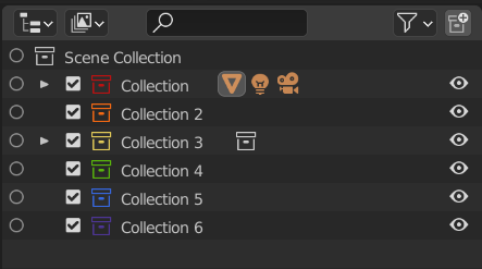
2

My favorite at the moment. This has the same benefit as being subtle like drawing a bar to the left. It’s not as simple to code, but still works well. One flaw is that the icon is thin, and the colors do not show clearly.
collection_colors_icons

3

This was suggested many times, and I tried it because it was easy. I’m really not a fan - it conflicts with the selection lines, and it makes the overall UI of Blender very very unbalanced.
full_line_color

4

A few others I tried; these have a few issues (not updating to the correct x-position always).
image

5

Coloring behind the collection icon is good, so long that we choose colors that have good contrast against the white/black. I really like this option as well.
image

In my branch I committed the colored icons version (#2) because it works well enough for now. Let me know what y’all think about the placement of the colors, and the colors themselves! I just picked colors that already existed in the default theme for now, so I haven’t spent much time to make them consistent in saturation/contrast. :slight_smile:

19 Likes

I think 3 is fairly atrocious haha! 2 Maybe looks a bit gaudy, kind of hard on the eyes I think. 4 is Acceptable, but I think that the checkboxes are an option in the outliner filter, so if you didn’t have it on then too bad so sad, which may not be very elegant (Though admittedly I like it). 5 Seems ok-ish, though it makes it really hard to see the active collection, which is troublesome. 1 Might be my favorite, it creates the least complications between icon/color interaction. The issue with it is that it might be a bit small, It would genuinely be nicer were it a little wider, but I don’t know if moving the icons over to make way for that is necessarily a good move.

TL;DR/My take of this is:
1 - is the best, though too small
2 - is hard on the eyes
3 - way to much
4 - Very nice, not unlike photoshop, but might be a problem since the checkbox icon is optional
5 - Pretty good, makes it hard to find the active collection icon

5 Likes

Cool stuff :slight_smile: Overall I agree with Bobo_The_Imp. Though for me it’s more of a tie between 1 and 2.

One thing that is currently not adressed, is applying the colors to the items within the collections and how to deal with colored collections within colored collections. This is probably the biggest downside to 1 as it only allows for one color to be displayed.

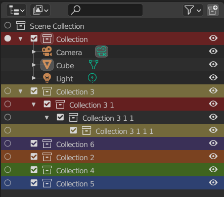
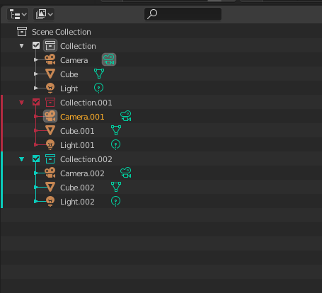
What about this mock-up by SaintHaven in the blenderartist thread about collection colors (link to post):
5e228936480b7a72b427aa365cd4b029c5503ba2
It’s probably not as easy to implement, but I like that the color is applied to the entire hierarchy rather than just the collection itself. Working with scenes that contain a lot of objects the collection itself is often out of view so behaviour like this would be very handy.

Another thing about collections with a lot of objects: There’s currently no way to collapse a collection without having the collection in view. So I often find myself scrolling until the collection is in view just to collapse it, which can be a little tedious.

So here’s a more mock-up for colored collections I made based on the one above, but maybe it could address the collapsing as well, if pressing anywhere on the colored line would collapse the collection (similar to how reddit handles comment threads).

Though just having the arrow colored might be a little subtle when the collection is collapsed:
Coloured-Collection_Mock-Up-02

By the way, I’ve been working a bit with your branch and I’m loving the properties syncing. It feels pretty great and is such a time saver! Awesome work! :smiley:

15 Likes

Nice mockups! I didn’t think of items within the collection for highlighting. I hopped into Photoshop and noticed that if you group stuff and assign the group a color it does the same color for the contents. At first I thought this is pretty nice, but after some looking at it I’m not so sure. In Photoshop the text cannot be colored, just the eye icon, whereas in blender, we have an orange icon for the object, followed by a green one, then possibly others (blue, white etc). It’s a lot of color. So if you color the whole hierarchy it kind of sandwiches colors on the left and right quiet a bit. So I’m not sure if I’m sold on that concept, I think it might be enough just to denote the collection with color and not the hierarchy, for clarity.

This is true, but I think since in example 1 the color indications don’t indent with the hierarchy, they are left justified, you can just just display another color below for the collection inside, only when you open up the top collection revealing the contents .

1 Like

Very nice @natecraddock! I also think that versions 1 and/or 2 are the way to go.

Regarding color choosing I think that the best way is to either make it random or leave it to the user.
Hardcoded number of colors might be limiting in big projects and personally I would avoid it, but if that is the only option, I’m ok with it.
Purple color of your choosing seems very low contrast from the background and might be hard to see on the screens in bright environment.

Personally I like the most first version posted above by @lone_noel. It’s very elegant, non intrusive and it highlights items inside collection very clearly.

1 Like

1 is my favorite. Hey, here’s a question… would a gradient be difficult? Here’s 1 again with the “bar” 1 pixel wider (4px) plus a gradient that fades to 0 alpha.
image

I kinda also like 2 but you’re right that the thin-ness of the icon is not ideal, and due to that thin-ness some colors are not going to look good on various interface themes (e.g. the purple has visibility issues on dark themes, and yellow probably would have visibility issues on light themes).

3 is pretty hideous and is not like the way I’ve seen layer colors done in any other DCC software I’ve used like Photoshop or Maya or Substance Painter.

4 probably has to be disqualified because the checkboxes can be toggled off in Filters.
image

5 is also pretty good but as already mentioned it has the drawback of potentially making it hard to know which collection is the active collection.

1, 4, or 5 are the most similar to other DCC software, but 4 and 5 have some not-small drawbacks.

I do rather like this mockup as it effectively combines 1 and 2 (and sort of 4). I think it’s valid to consider that the entire hierarchy should be denoted in color as well.
image

This could also be done with the little sliver of bar on the left of each row.
image

I really wouldn’t want to have to type the color for every collection, that would be tedious, and I would never want it to be random. A quick set of preset colors is probably good for most users but only 7 to 10 total could be too limiting. Maya has 31 preset colors to choose from, for example.

I strongly agree on an option for custom user colors, however. Something like:
bpy.data.collections['Collections'].color = 'CUSTOM' and feed your own RGB/HSV.

Using Maya as an example again, if none of the 31 presets are to your liking (lol), you can do exactly that and enter your own color with the RGB/HSV color picker.

11 Likes

A Ctrl click was not my idea, but you understood the principle.

Ctrl Tab/Ctrl Shift Tab are shortcuts to change active tab in Properties Editor.
So, user can display Modifiers Tab in Properties Editor by a click on button icon of tab or using Ctrl Tab shortcut.

So, what I meant is : Could it be possible to have an automatic filtering of outliner when Modifiers Tab, in Properties Editor, is activated/displayed ? Or a Modifiers Display mode in outliner ?

I am not saying that should be always the case. I thought that should be an option in Filter popup.
But if it is possible to make it work through a Ctrl click. Why not ?
That way, modifier’s list could be managed through Outliner by default, without need to enable Modifier’s list addon and without loosing vertical space because of list in Properties Editor.
Something like that.

Synchronization with Properties Editor is currently following one direction.
Order from Outliner → Execution in Properties Editor.
Is it possible to have some orders following the opposite direction ?
Orders from Properties Editor → Execution in Outliner.
Activating Modifiers Tab would change Outliner to a Modifiers display mode.
Activating Scene Tab would change Outliner to Scenes display mode.
Activating View Layers Tab would change Outliner to View Layers display mode.

I suppose that would force to find a way to define a main Properties Editor, in case, Layout contains several Properties Editor.

About collection color tagging, I like test 2.
I think that 1 is too thin to be noticeable.
I agree that SaintHaven’s mockup looks better with colored checkbox and hierarchy lines.
If it is problematic for some reason, maybe you could attempt a mix of 1,4 and 2 or 1,4 and 5.
Result should be more noticeable and contrasted without being as atrocious as 3.

About choice of colors, I think the best option would be to let it to user through Collection panel in Properties Editor.
That would be great to have a Collection Color used everywhere in UI.
Same Color in Outliner, in 3D Viewport, in Node Editor for simulations.

1 Like

#2 looks pretty cool to me.

Can’t wait to have this feature, such a nice upgrade. :slight_smile:

1 Like