GSoC 2020: Outliner Discussion and Suggestions

for a long time I had some ideas of reorganizing blenders interface (started this mockup back in the beginning of 2019). I will try to lay out the basics of my thoughts.
there are several ideas implemented in the video. The most relevant are listed below.
You can also check out a clickable mockup of the proposal:
https://xd.adobe.com/view/24fc3cc8-089d-4d5a-74a7-29f91c755b35-52cd/?fullscreen


Please excuse the mouse pantomime :slight_smile:

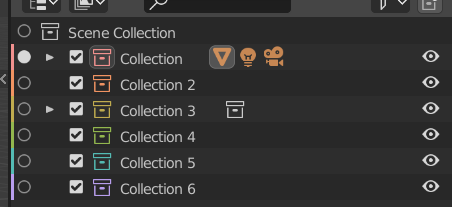
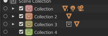
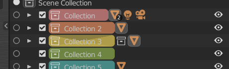
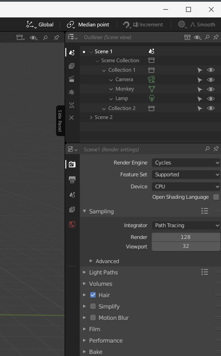
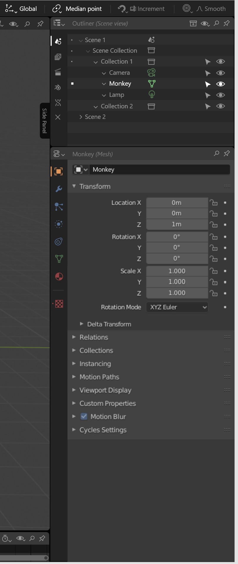
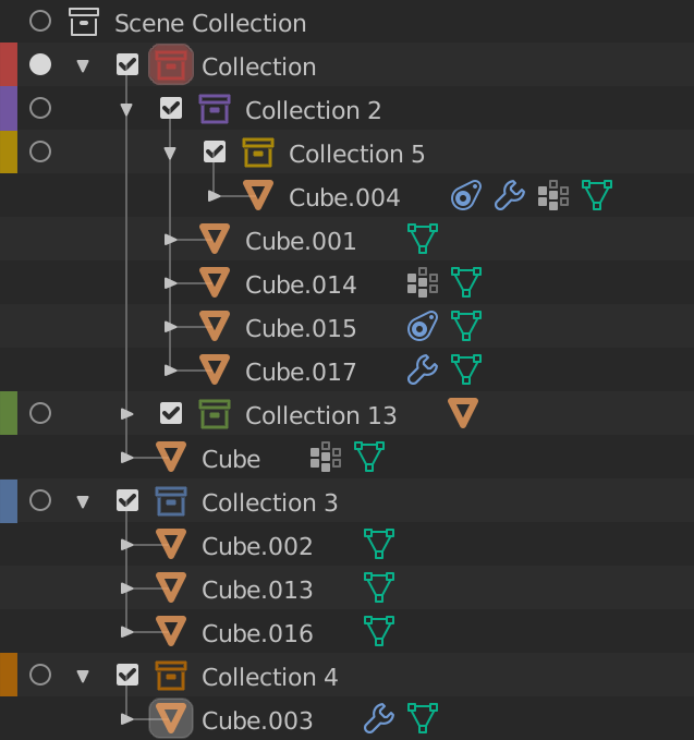
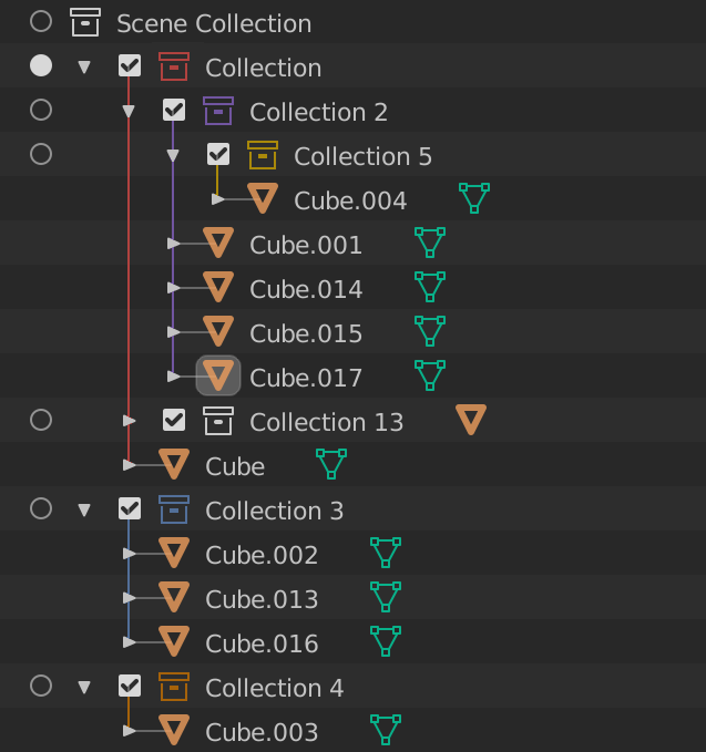
  1. Can we have the outliner modes layed out similar to the properties tabs. Most of the time these two editors work side by side, so we can use the same visual language for both of them. Functionally I think it works fine, and it enables easy switching for the different modes. Right now they are hidden in a drop-down menu and I think a lot of people do not realize they exist.
    I know I don’t use them as often as I should simply because I forget about them.
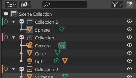
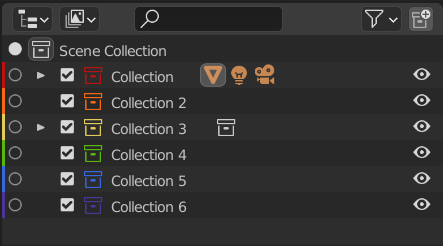
    It could work like in the picture below.
  2. Contextualization… Outliner and properties editors work on the same data and there are plans for synchronizing the selection across editors. right now however they do not filter the content of the editor for the current selection. This is more easily seen in the properties editor where you have tabs for the scene, rendering, world, output and selection all the time. This can easily be avoided by adding the scene as root in the outlines (so you can select it). We can only show the global tabs when you have a scene selected in the outlines. when you have a specific object active you show the tabs specific to its data type. Also when nothing is selected the root is selected and we show the global tabs (rendering, output, scene, render layers, world).
  3. Compact view (maybe too radical for the current blender state…) When we need to use all the functionality of the editors, but we need the space for the viewport, when the width of a column of editors is too small we can collapse all the content and only show the gliphs. the content can be easily reached by a popup. This is implemented in Modo and is very useful for small screens and minimal layouts.
37 Likes

+1 for vertical tabs for Display modes.

4 Likes

That compact view for outliner and property tabs is a great idea! :heart_eyes:

2 Likes

If the collections will have colors, then objects in the 3D viewport should also be painted in the same colors with Saturation and Value variation.
For examples, greenish objects are collection 1, reddish objects are collection 2, etc.
Also switching the viewport shading to the colors of the collections in the Viewport Shading overlays.

3 Likes

What if you combine 1 and 2?
image

8 Likes

About the collection colors, my vote goes to: 1, 2, and the combination of both (Sainthavens mock up).

1 Like

That could be one option in the shading popover

Agree, the option one is the winner for me and the combination of both is not bad either.

Thanks Nate, my favorite is proposal 2, specifically the version that @lone_noel showed, but also proposal 1 looks like a good alternative. As you said though, it creates some visual clutter, being the color bar so close to the radio button. Maybe, when the mode column is active the radio button is colored, while when is not active, it’s replaced by the bar. I know that it sounds confusing, but it might be an alternative.

Actually, regarding the radio button I have something to ask: in these last weeks it has been largely considered the idea of removing the activation column; the thing is that now that selection, activation and mode toggling have been decoupled, how cameras and collections will behave in terms of being “active”? For example, without the column now the only way to set the active camera will be from the Scene properties, while before it was possible also by clicking on the camera data icon in the outliner. In this case, I absolutely push your proposal of setting the active camera via the context menu.
Same for Collections, how we will set the active one without the mode column? You spoke about reintroducing the previous method, activating it only by clicking on it, but at this point I’d wonder why setting the active collection is different from setting active cameras and scenes, a unified system for all of them would be better in my opinion.

1 Like

Please do not put the rainbow, it does not clarify anything, but colors coordinated with the existing interface, more simple and clear, make it most understandable.

1 Like

These look fine in extremely simple outliner setups, but I think as soon as you start adding nested collections and what not, it becomes crazy colorful and hard to see:


Personally I think this is a mess.

If you remove the color from the lines that denote hierarchy it becomes better:


To be honest I still think this is a bit too colorful for my taste, its visually very busy.

I think just showing the color on the very left is out of the way enough to not cause too much visual noise, but still be helpful:


Mainly the reason I think this is better is because when you color the collection icons and lines themselves, they are so close to the objects, which are orange, followed by the properties icons, like modifers being blue, object data being green etc. It’s just makes a lot of colors very close to each other. When they are so close to each other it really drags the eye here and there. When it’s just the blocks of color on the left, it leaves all the content on the right more “pure” and a little easier to parse.

7 Likes

While i agree with you that your first option isnt visually too pleasing – it just works in my opinion. In the end it serves a purpose - to help your eyes navigating a complex scene.

I use the color tagging feature a lot in adobe software (ps, ae,…), otherwise i’d go insane if everything is gray in that layer based mess. Colors help, even though it aint too pretty. Looks like some clowns exploded in there.

The second option doesn’t work in my opinion. Its neither here nor there if you know what i mean. Its uglier than option 3 without the merits of option 1. I’d rather go with 1 or 3 than with 2.

In the end i think the best would be to try it out in some builds when its available to see how it “feels”.

2 Likes

I agree that having everything colored is way too much.

In principle I really like both your other mock-ups but I personally would color every item in a collection with the collection color unless the user assigns a different color to it. This is the way Photoshop does it so I think its pretty solid.

One small thing that bothers is that it creates these discontinuities within the color strips. (Like when the yellow collection is nested within the purple one.) But that might be solved by using rounded ends for the color strips indicating the end of one colour group:

I also tried a more subtle way of coloring the lines and icons and I like it quite a bit. Though I can definitely see how this is less visually “pure”. :slight_smile:

14 Likes

Hmm, i like your first mock up too. Not bad!

I agree, these are great! Even in the one with the colored lines, which I’m not as much of a fan of, removing the arrows and the lines aiming in at the objects from the coloring scheme makes it way easier to read.

Not a fan of having only color strips (or at all for that matter). They’re off to the side and there’s just too big of a disconnect partially because of the radio buttons in between and because it’s just far off to the side of the panel. Even harder to read when having complex hierarchies and lots of nested collections like on lone_noel’s mockup.

I do like the colored collection icons and lines though. I’d be inclined to take off the colors on the object and data types to make it more legible. Then again, a lot of this comes down to personal preference.

I’d be interested to hear opinions of people using the outliner heavily in production, like riggers or layout folks. Not sure how aware the community is of these changes happening.

@natecraddock - I’m guessing the Blender Animation Studio is pitching in as well when it comes to feedback. What’s their preference?

1 Like

I have to say I like the first verison, it seems the most clear to me. Thanks to the colored lines you immediately know which collection an object belongs to.

1 Like

Wow! 25 replies in less than 24 hours, collection colors must be exciting :wink: Thanks for the great feedback and mockups.

Colors

So the first thing: We need good colors to make a better decision. I tried picking less saturated and slightly more consistent colors as an experiment. I also merged #1 and #2.

image
In this example, I think the new colors work great for the collection icon, and poorly for the colors on the left (because the bars appear to bleed into each other). I tested with the other themes and it generally works well for the icons. There is still room for improvement, but I think that this shows the choice of color influences where it is effectively drawn.

A few mentioned user-customizable colors in the preferences; I really don’t think that is a good idea. Every similar system I tested (Krita, Gimp, Photoshop, MacOS, Google Drive) doesn’t allow that. I think it’s simpler to pick a good set of colors that work well, because they are named in the UI. It would be annoying in UI and the code itself to have Color 1, Color 2, Color 3, …

I think we could use a few additional colors for sure. But I think the 20-30 that some apps offer is quite a large number.

Placement

Again, I’m looking at other apps to determine the best way to do this. The original #3 came from Krita, and I do not want to color the full lines. MacOS colors a small dot to the side which is simple and nice. Perhaps the radio icons could be replaced with a dot which has more visual weight than a bar.

Some (like Google Drive) color the icon itself. These have the benefit of staying aligned with the hierarchy. With better colors than my original wild guesses, I think coloring the icon actually does look great. We could also color a rounded square behind it too.

A few other ideas:

6

Rounded behind the collection icon. Has the benefit of nesting alignment, and it is visible (ignore the glitch on the green).
image

7

If the width could stay consistent, this is a cool idea too. That would require cutting characters off of collection names though. (again, ignore the GPU draw issue on yellow… It’s just a quick hack :slight_smile: )
image

Hierarchy

Many also proposed showing the color for sub-collections/objects by either drawing the bars on the left, or by coloring the small hierarchy lines that already exist (like the proposal from SaintHaven on blenderartists). I like parts of it (the hierarchy line does look nice) but I’m against coloring the triangle and checkbox. Those are different from the collections themselves.

image

I coded the line drawing, and like @Bobo_The_Imp i’m not convinced that they add much meaning here. I think they just add more noise. Perhaps only drawing the vertical lines might help. We’ll see.

To me, collection color tags are a quick way to organize collections and not objects. Drawing the color should be limited to the collection.

I have not asked yet, but in the next week or so I hope to start getting feedback from them. I’ll admit I haven’t used Blender as an artist as in the 2.8x series as much as I did back in 2.5x-2.7x. That means collections aren’t something I use frequently. I totally understand the concepts, but I don’t have daily experience in organizing collections. So I’ll get back to y’all on that.

tl;dr: The overall opinion was to color a bar on the left, the collection icon, or both. Currently I think coloring the collection icon itself is the best route, but with some work coloring behind could work great too.

8 Likes

I think a gradient would be tricky (haven’t checked though). And custom colors might be tricky. For now I’m not going to add them.

This is possible, but outside the scope of this summer of code. Cool ideas here though, maybe better in a different topic or on right-click-select?

Really cool mockups here! You have certainly put lots of work into it. Again, probably a bit too much of a change, especially 4 weeks into GSoC. Probably better on a different topic or RCS again.

Yes, I’ve put this aside for now. What we have works well and can easily be changed. I’ll get back to this once I get more feedback later :slight_smile: But yes, I do agree, the options for activation should be available and consistent.

1 Like

I think the lefmost color bars are redundant : as you said, they blur into a vertical gradient and I personally can’t distinguish one from the next. I think your proposal #6 works better.

Bone groups work like this. There are custom colors in theme preferences that the user can set, and I think collection colors could work the same. Being limited to a few builtin colors sounds a bit “Blender 2.7” don’t you think ?

2 Likes