I’m really happy to see you continuing the improvements of the Outliner.
I have been collecting few ideas since the last year:
1- There is a proposal from Andrzej Ambroz (jendrzych), that the icon and the name color changes for the objects that are in edit mode. Aug 10 2019, 5:01 PM, which I consider an excellent proposal. This would relieve from having the Object Data icon.
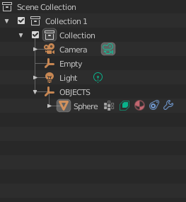
Additionally, I would like to suggest the having the icons depending on what the object has on it, materials, modifiers, constrains, etc. all visible next to the object name. Something like this:
 .
.
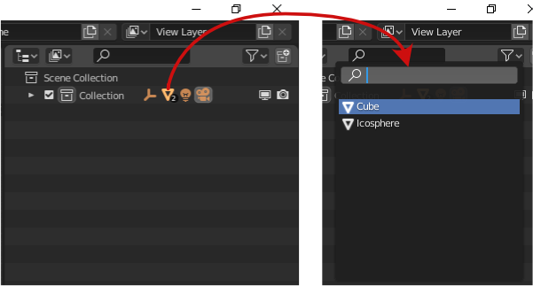
I see few advantages on this, first the user can see clearly what the object has enable or assigned, second we can use the same principle of the list menu when we select a parent or collection that has many objects as child to quickly select what the user needs (and this tied to the properties sync) could be a boost on the workflow.
The list menu I’m talking is this one:

Third advantage is a little more clean hierarchy when everything is unfolded, by grouping the materials, just like the Vertex Groups, or modifiers.
2- Drag and drop without holding Shift to make a child or to take it out from the parent. Just like collections behave.
3- Deleting parent have to delete all the child without warnings, just like Photoshop for example. This applies for collections as well.
4- Hide parent will automatically hide child with the possibility to override one child visibility (same for collections).
5- Scroll bar always visible. (from my last year wish)
6- From the context menu a “Delete only parent”, so if the user wants to delete only the parent of a hierarchy, just click there and that’s it.
7- Be able to select (move, scale, etc) a hidden object. Specially great when dealing with boolean objects.
8- Have axis for collections like collection instance.
9- Honestly I have to say that I dislike so much the concept of active object vs selected one, can we just get rid of it?
10- When using box select, one the objects that gets inside of it should become the selected one. Unlike now, where if I have a light selected and then I use box select to other object, the light gets deselected but still is the active object… extremely confusing and useless if I’m totally honest with you.
That´s it for now ![]()
Anyway keep the great work ![]()