After reading the above discussion about the edit mode icon, I agree; repeating the mode icon does cause a lot of clutter. I first used the dot and this was just an experiment. I’ve reverted back to the dot. Also I have decided that it is best to hide the collection, scene, and camera dots while not in object mode.
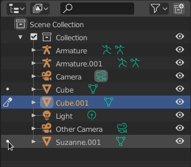
This leads to my idea for a name: “Mode Column” because it shows data based on the current mode. In Object mode it allows changing active scene, camera, and collection. In a different mode it shows which objects could be toggled into this mode, and which object currently is in the mode. Here is the current state:
Object Mode
Sculpt mode (or any mode)
I’m really happy with how this looks and behaves currently. I would love to hear thoughts on the name (Mode Column) and using the dot.
This looks better I think. Will there be a build on graphicall soon to test it?
I took a walk in the morning today after mulling over the sames things and came to the exact same conclusion for the name, “Mode Column”. Works for me!
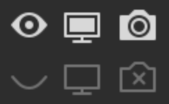
I had a look at the build, and I think reverting to the dots is looking much better! I do think that darkening the dots still needs to happen though. All the other icons (eye, screen, camera, etc.) darken quite a bit when they are not active, they also often “hollow” themselves.
It’s not just for consistencies sake though, I think the brightness level of the dots is very demanding, your eye is called to it more than it should I think, for something that is inactive that is. For long lists of objects its a lot of information to process.
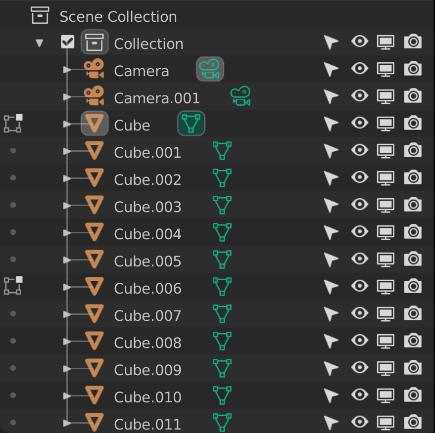
Here is a mockup I made, idea on the left, current build on the right.
Basically I just darkened the dots and also made them hollow, so small rings I guess. I think it makes it clearer what is active and demands less visual processing at a glance. I think this is particularly important in all the other modes other than edit. In sculpt, weight paint, vertex paint, and texture paint mode, you can only have 1 active object at a time. So that is potentially 100’s of dots that have the same level of brightness as other icons when there will only be 1 object that has the corresponding icon to the mode. 100’s of icons that appear only to denote 1 object that is active is overwhelming I think, unless those dots are a more muted color.
I also made a version that isn’t rings, just darkened dots.
Either are fine I think, rings are maybe just slightly less drawing for the eye. You could even make it go from a ring to a dot for the behavior when you hover over it.
Unfortunately I have not understood this behaviour.
If the eye is temporary, what is the non-temporary version? The screen icon is not, since it disables the object in all view layers. I use view layers to manage my scene, don’t want to hide an object in all view layers.
I like your proposal a lot, visually it doesn’t produce noise which is great. +1
If I’m totally honest (sorry if I sound harsh, not my intention at all ), the radio button for the collections is irrelevant. I prefer just clicking on the Collection than just aiming to a small circle, just like before.
I totally agree about the left column for objects and cameras and the rest, but for the Collections I would get rid of it.
Another caveat of it is that if you have the left column hidden it is impossible to click on a Collection to make it active.
So I would dare to make a small poll here.
Get rid of the radio icon ONLY for the Collections and keep old behavior (Again ONLY for the Collections):
I personally would find it quite useful (the radio buttons for collections that is).
Let’s say I have a complex scene with many collections and sub collections, it’d be handy to set the one I want active and keep it that way until needed, being able to locate the active collection down the roas as well.
Setting them active by clicking on them is convenient but can get quickly out of hand with complex hierarchies when quickly creating meshes/lights/empties/etc. or importing objects into a scene.
Not sure what others think. It’s definitely interesting to see everyone’s opinions.
My main concern is when you have the left column disable, how do you make a Collection active?
A solution could be make a condition, if the left column is hidden then the user can make a collection active by just clicking on it like before.
Exactly what I was about to propose Fine with me. Not sure if it would messy things up on a code level but from a user point of view I can live with that.
Oh that’s right, I forgot you could select other objects from within edit mode. If I understand correctly, you’re working to generally decouple select and activation.
I like this quite a bit, especially with @Bobo_The_Imp 's adjustments.
I’ve given it some thought and using the left column to indicate the active collection/camera/active objects in the current mode seems to be a reasonable way forward. After all, those are usually the most relevant items in the outliner, so it’s actually good to have their indication be the most prominent within the inset hierarchy.
Making all the colored Object data icons more like shortcuts to the relevant properties or something similar that is in general more consistent is also great.
Is there any chance to get more visible differences between the various objects that can populate a scene.
So Collection, linked Collection, Instance, proxy etc. in icon and/or font changes.
For now it all still looks the same, and you never know what is what from looking at the Outliner. This has been discussed before.
And I’m not a fan of the current left column development to be honest…
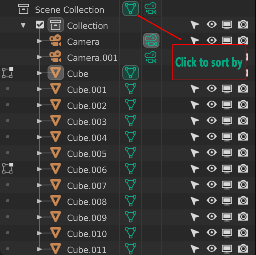
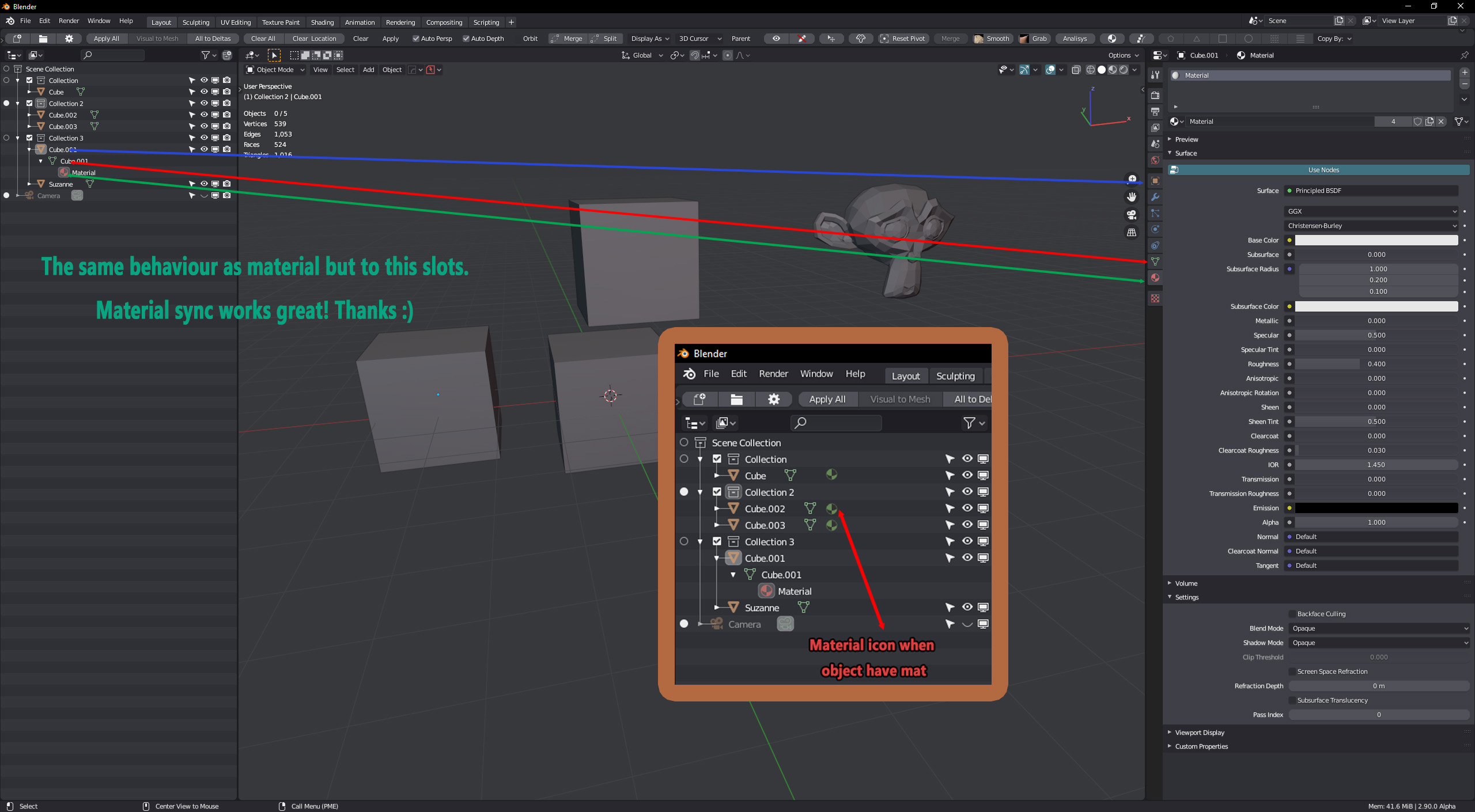
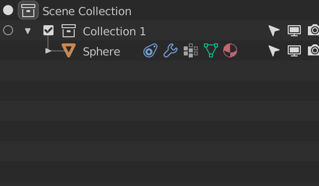
Wow, I didn’t even realize that in the last branch material synch was already implemented, that’s great! Only thing I ask, can we pleease have the material icon next to the object name?
Now that we’ll have outliner/properties syncing, it would be very beneficial to have the icon right there and not digging inside the object hierarchy.
The original left column idea came because we wanted to add properties syncing. But some types (mesh, curve, surface, armatures) already toggled edit/pose mode when clicking the data. So we decided it was best to preserve the current behavior for toggling modes, but also add syncing.
I’ve discussed things a bit with William and Brecht about this Left/Mode column. We decided that cameras and scenes should not be in the mode column. We may potentially remove collections as well, in favor of the current 2.83 behavior of selecting the collection. The mode toggling will stay for now. I’ve already removed cameras and scenes from the column in my branch. I haven’t given up here, but I’m putting it aside as it works well enough for now (just needs polishing). I would like to get continued feedback here and get more input from the UI team.
So now I have started working on properties sync/selection! I would love to hear what you all think! It only works for a few types (world, camera, mesh, curves, materials), and I’ll add the remainder soon.
Could you be a little more clear? I think there is great visible differences (names, icons, colors) between types of objects. Also, thanks for sharing that you don’t like the left column, the criticism is good What do you think now that it is focused on mode switching?


 Fine with me. Not sure if it would messy things up on a code level but from a user point of view I can live with that.