Wow, that looks neat!
I don’t like the idea of those settings in the top right-hand corner (transformation, snapping, proportional editing) as they feel far from the area where the user needs them, but the look of your proposal is really something. I wish Blender would have a UI like this! Really, really clean and easy to read. Blender’s UI still feels cluttered. Your proposal is an example of how to make something clean.
Thank you. I like minimal and clean interfaces and I tried to tweak blender in that direction.
The settings in the upper right are off topic for this tread. I realised they are all global toggles, changing them in one place changes the setting in all editors and all workspaces, but they appear in multiple places in all 3D views. You can end up with 5 distinct buttons to toggle snapping for example, and you only need one.
2 Likes
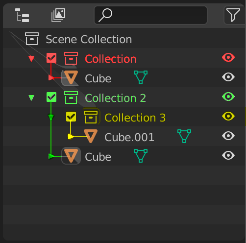
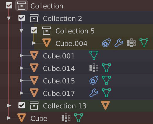
Fully agree. This is already hard to read in this relatively simple scenario, let alone when more levels of nested collection would be added. Increasing the width would proportionally increase the real estate the left color bar would take.
Personally I’d just go with something like this (disregard the artifacts, got some issues with intel iris on mac)
2 Likes
Here’s my proposal:
If those dots are planned to be added, why not combine the color with that column?
9 Likes
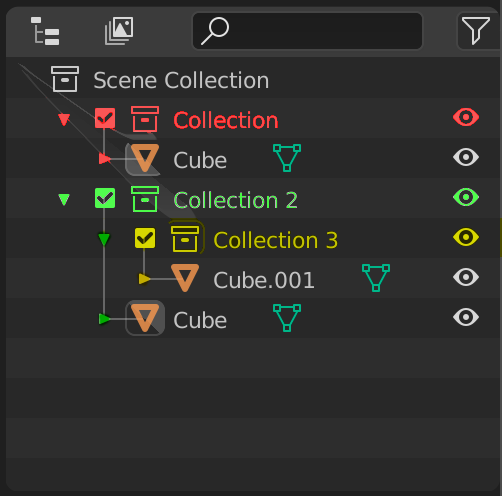
I think that @dan2’s proposal has significant advantages for a number of reasons.
- It puts colors on actionable elements. A big downside of the color bars on the left hand side is precisely what was pointed out by @Bobo_The_Imp - one has to find the color on the left and then move one’s eyes over to the right to find the relevant items in the outliner. That disconnect of space introduces uncertainty when one does think one has found the item, and then many people might then look back to the left just to confirm that they did not make an error. Putting color on the triangle (that you click on) and on the toggle icons on the right hand side places color on elements that you actually want to do something with in the outliner. That would generally totally eliminate the uncertainty that would be introduced by an empty space separating a colored bar on the left and the item that one actually wants to affect.
- The coloring of the text itself also creates a “line” or “train track” that guides the eye from the objects and collections icons in the middle to the toggle(s) on the right side that one would want to click on. That is true even if one’s label is as small as the word “Collection”.
The one downside of the proposal is that it does not give the user a quick-and-easy-to-read view of the scope of the collection. That is where having the line itself colored would be valuable, and where I would change the proposal of @dan2 to incorporate color in the collection lines as seen in the proposal of @nokipaike and @RonanDucluzeau
Finally, is it hard to give the user the preference of letting the triangle and the collection line, and the collection text be gray or match the color of the collection? Some people like myself would prefer the triangle, the collection, and the collection text all be colored, and others might not like it. Giving the user the option usually gives a win-win that makes most people happy.
1 Like
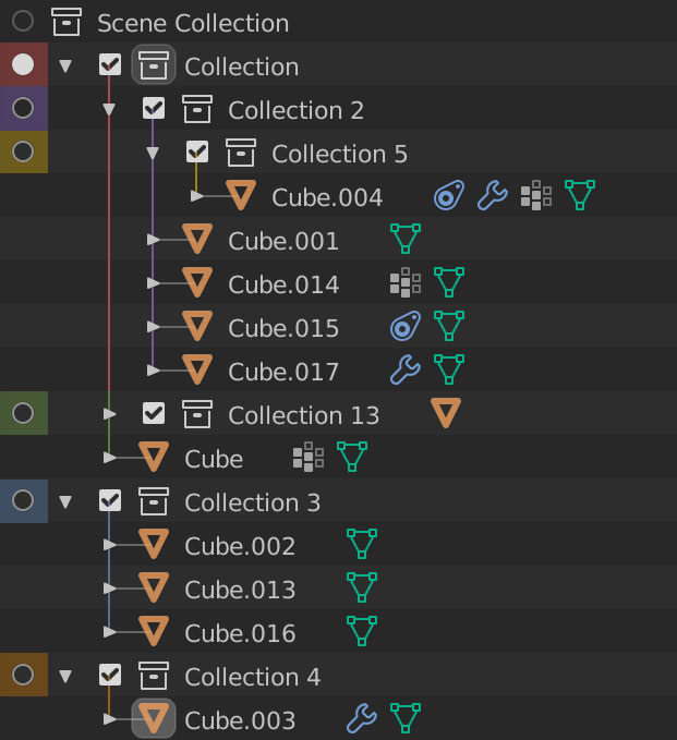
Yep, makes sense. More legible this way. Sorry for the crappy mockup and the lego colors. There’s only so much I can do with a trackpad on an old macbook while in Sunday mode on my couch. 
I guess making those parts independent is not going to make the theme settings more convoluted, there are already a million settings one can tweak.
3 Likes
That looks perfect (at least for me, who is just one data point). One other thing immediately pops out about this proposal. One can very easily tell just by looking at the toggle icons what is and what is not a collection. One does not have to look to the left. I think that would be a time-saver, and a little knowledge of one’s own collection hierarchy (or even just the perception of indented color in one’s peripheral vision) would also give one an idea of what is a top-level collection and what is a nested one, again without looking anywhere else but the toggle icons.
1 Like
You know, I’m actually coming around on this method. Krita does this right? Maybe this should be considered more, I’m going to bump the concept. I think the reason I like it is that it doesn’t color the elements that are already in the outliner (hierarchy lines, arrows, check-boxes and all the property icons), yet it denotes hierarchy very well. I think since it is always background, never foreground, it eliminates a lot of potential design conflicts, which is very much a positive.
I was originally unsure of this method because it covers the screen SO much more then other ideas, but if it’s muted colors it’s fine:
I think some people in the past put the colors on top of the icons which made me hate it, if you make sure the icons are on top, its perfectly legible.
8 Likes
Could work, especially if the row background color is consistent or if the alternating row color difference isn’t quite this big. I like the simplicity of it. I’m definitely not into having an extra element just for color coding purposes.
Thinking about it I think part of the reason I’d need color coding is the lack of the ability to freely organize things in the outliner, glad that’s on the roadmap as well.
Looks nice.
One thing thought, are the dots always present, or they are toggleble From the filter popover?
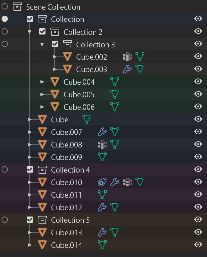
For me this is the most readable option.
I also agreed, mute colors could work, and everything more simplified can work also, the only thing I would like we pay attention, is the coloring of the subcollections …
for me, especially when I imagine I’m dealing with many subcollections it’s important.
(I’m reusing the old mokup just to make it evident, the intensity of the coloring is not a reference point)
5 Likes
Not sure about that. Toggling on/off different buttons makes this task quite difficult.
One option would be to put the coloring behind the eye (hide in viewport icon) but that can also be toggled off. I think it could color all the togglable icons on the right side, as I can hardly imagine a use case where you’d toggle all of them off?
So, everyone moved on to collection colors now, but the basic problems with the outliner still persist and so many of the color proposals just add to the visual clutter!
Yes! This is maddening to me. The default 2.8 layout is neither setup for beginner use nor for expert use. It’s some useless thing in between that everyone must make adjustments to in order to get full functionality out of.
Also, that checkbox that’s visible by default drives me crazy because:
- All other visibility options are in columns to the right
- The chexbox breaks the visual stair stepping of hierarchy
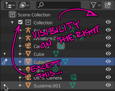
I’ve posted about this before (heck, I’ve posted this in the 2019 GSOC thread), and I’ll keep trying…
- The “eye” should replace the checkbox functionality and toggle ALL visibility on and off. Why? Because that’s the only thing that a new user see by default!
8 Likes
Yes. But I don’t think that is a real problem.
I disagree that 3 levels of nested collections is a simple scenario.
Currently, nested collections are not well handled. That should not last.
But I think that more than 3 levels of nested collections would be a really rare case.
We are not talking about object hierarchies. That is rarer to need a nested collection.
Nathan rejected the idea to color triangles and checkboxes.
That would only end-up with line of collection name colored. If this line is out of sight because of a collection containing dozens of objects that does not work, anymore.
Honestly in most projects I worked on since the introduction of collections I’ve used at least three nesting levels. It’s very handy using such a granular hierarchy for anything remotely complex comprised of several sets, hundreds of objects, or even nested instances (instances of instances of instances…). I believe this should be considered a common case. Collections allow for that kind of workflow, so let’s support it to the fullest instead of going for a solution that only works when the scene has only a couple nested collections.
1 Like
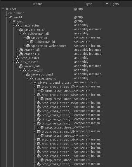
Not sure what department you’re working in, but in layout and lighting for example you’d usually go way beyond that. You can look at a simple katana scene graph from basically any production -
Be that is it may - I’m just trying to solve an issue with having a color tag on the far left, and trying to disable selection/visibility for a given collection related to the color tag way over at the right. There’s a huge visual disconnect. If people are not using alternating colors in their themes it’d be tedious and prone to making mistakes.
2 Likes
working like that will be in a dedicated workflows like layout and lightning as you mentioned, in that case it’s going to require that you have the outline in a really wide view to do any actual work.
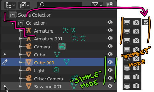
I think maybe if the design itself should cater to Both scenarios independently as they have a different requirements .
a simpler view of the outliner for quick changes and whenever you increase it’s width beyond a certain point you get more advanced view and decrease it when you’re done that way you don’t have to compromise on both of them and end up with something that doesn’t work in either
Yup. Every department will have it’s different needs. Rigging may require complex hierarchies but might not necessarily need as much color coding, modeling (especially if it’s not that technical) could work with a much simpler outliner, and like you said, lighting may need something way more complex.
The current outliner can be tailored to a lot of scenarios, I can’t see why many of these things couldn’t be optional, just as they are now. You can choose to display toggles, set the sorting to whatever, display certain types of objects or hierarchies, and change the width as well to your liking. You can even have different outliners doing different things at the same time which is awesome.
Just saying that it might be better to go from a fairly complex production based scenario to a simplified one - checking what can be enabled/disabled from a dropdown - then the other way around.
Many studios are looking into Blender, as soon as USD has matured it’d be great to be at a stage where the outliner can accommodate production scenes. We’ve already come a very long way, not so long it was close to unusable with selection not being in sync, and having to box select multiple items.
1 Like