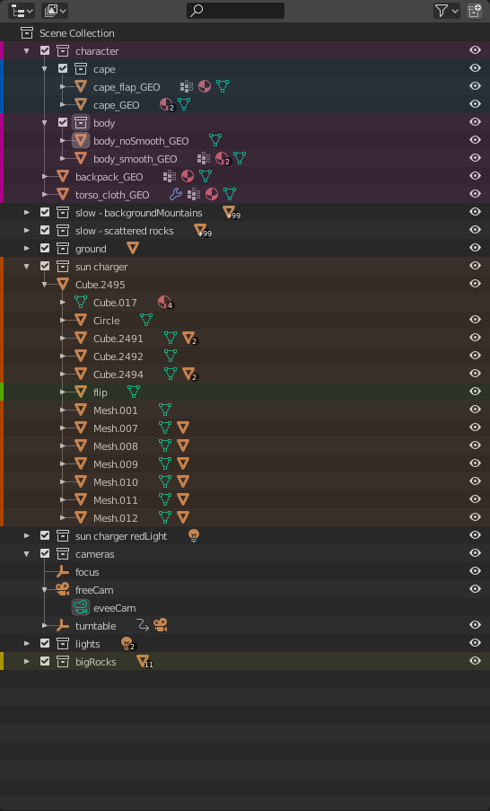
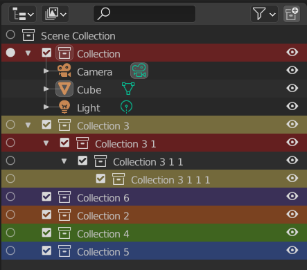
wow. so beautiful mockup. compact view for outline and properties is great, but off topic I think.
Nate, actually, your 1st and 3rd test combined, could work with a small twist. I think it’s all about finding the right dimmed colors for the entire row. In the end, all we need is to spot easily that piece which we know that we tagged with a specific color and then to see easily where it begins and ends the “group”.
5 Likes
Thanks for the mockups nate, the designs are solidifying, with some more deliberation I think we can reach something really good! Here are some points I wish to bring up:
I think this a problem just from color choice at present rather than design. The pastel color scheme you have right now is actually really cute, but it might be a bit too different from the current colors in the outliner. I’m sure that there would be a set of colors that could facilitate both the colors on the left and the collections. I will try to mock some up later, I don’t have much more time today to try things out.
I also can’t tell whether I prefer a backdrop for the collection icons with color, or the icons themselves colored. It’s hard to tell without a really solid color scheme. I find the icons being colored more elegant, it’s not as intrusive, BUT I do find it a bit harsh on the eyes. Since the lines of the collection icon are thin, certain colors can fade into the background a lot without making them bright like the pastel theme. It’s not so bad though. With a backdrop you have less room for colors fading into the backdrop, but it is way more intrusive. Not sure at this point in time what is better.
Regardless I’m curious if this will be ran by the UI team when we have a more clear design of the colored collections?
All the posts here got me thinking and I mocked up another idea:
Here is the idea behind it. After showing some colleagues (who don’t use blender) the thread and all the ideas, they really liked the idea of just the colors on the left. Mostly for cleanliness vs function, but they added that an issue with it is that if you look on the left, find a color, then trail your eye to the right you can potentially lose your place in the rows. Kind of like reading the same line in a book over and over, it happens right? So, I wasn’t a huge fan of coloring the hierarchy lines, but I don’t mind @lone_noel’s idea of just coloring the vertical line. With this idea, you just have the collection with a block of color on the left, then you can trail your eye to the right and spot the corresponding hierarchy line. Spot the purple one, find the purple block, then look to the right and find the purple line. This way your eye won’t get lost, and you have the added benefit of the left lane having spaces to further define collections . Whether it’s worth having the colored lines in there or not, I’m not sure, but it’s some food for thought.
6 Likes
That’d leave us with the left bar only if a collection is collapsed, right? That disconnect is bugging me personally, it just doesn’t read like a collection color tag. The hierarchy lines are cool though.
It’d also be interesting to see what would happen to objects that belong to multiple collections.
Yea I understand that, but I’ve known softwares to do it. Adobe generally does it that way for instance:
I prefer not coloring the collection icons to separate it from it’s contents more, particularly object properties. Here is an example why:
Looking at this, the contents are colorful, so if you color the collection its harder to tell where it starts.
“Was that a material or a collection?”
3 Likes
Ye, I personally don’t see a point of coloring the object data icons. If it was an option I’d just make all that stuff white. Not using colors on tabs either though, might be a personal preference.
For the photoshop example, there’s no row inbetween, no visual disconnect, so that kind of works. Blenders outliner and collection system can get a tad more complex though, like that objects in multiple collections example.
How about Nate’s #6 proposal above, with not coloring the icon but putting the color behind it? Not super consistent with Blenders UI but I prefer functionality over the visually pleasing at times.
1 Like
Yea all this color stuff is hard because of preference haha!
Yea I think it would work better if the radio icons were gone, which apparently might happen, design depending. If so, I would lean more towards just the left lane of colors.
I think it’s fine. Still had the issue I mentioned, but I definitely think it is a decent option! I’m not opposed it anyways.
If they were closer it could work. Radio buttons as well as those collection color strips on the left could be made optional (from a dropdown like the render visibility, selection lock, etc) and the collection icon could get a colorize-able tag in the theme options, that way everyone could have it their way.  Look at me, just quadrupling Nates work.
Color tags
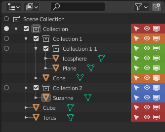
I would like being able to tell to which collection an object belongs to at a glance. It might not seem like a big issue in most of the mockups but when you have twenty or more objects in a collection, the collection itself might not even be on the screen to communicate the color.
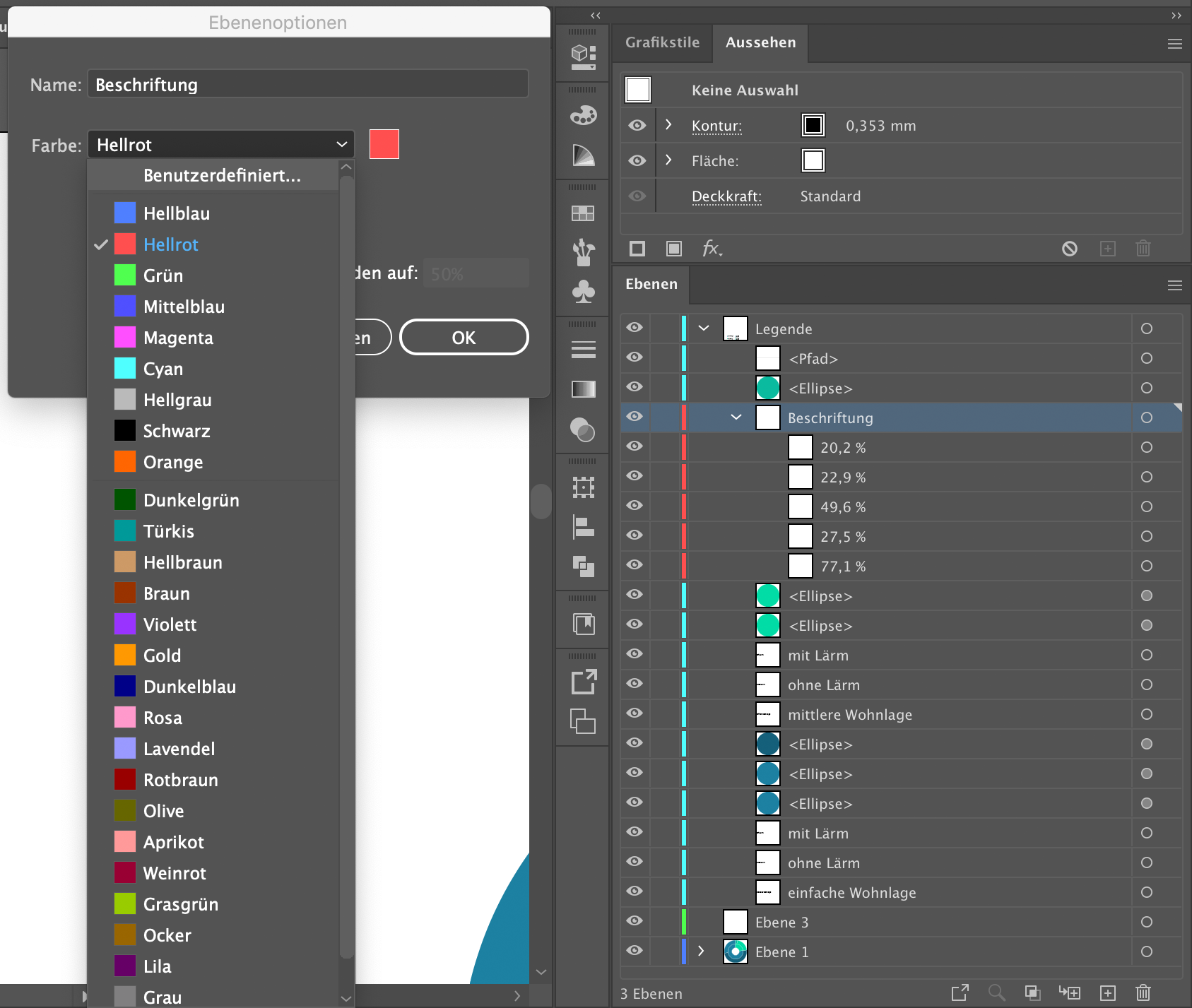
As another example, this is how Illustrator does it (I’m sorry for the german interface. That’s the layer options menu with all the predefined colors and ‘Benutzerdefiniert’ means ‘Custom’):
This is already quite close to what you’re proposing and the gaps between the items would help to break up the gradient quite nicely:
I do agree with @Bobo_The_Imp and I do really like his mockup combining the collection tags with the colored lines. But I think doing it like illustrator would be good, as well.
Colors
The colors should definitely be customizable via the theme. Some themes I’ve seen people use are really out there in terms of colors and I don’t think we can make one solution fit all. That simply is the blender way 
As seen in the screenshot above Illustrator has almost thirty predefined colors (albeit quite bad ones…) and allows for custom colors. But i don’t think there is a need for custom colors outside the theme if there are reasonably many.
3 Likes
Hi!
There is already quite much of opinions, but that’s what I think:
1
Nice and take very little space, but it is too hard to focus on such thin line especially if there is a chain of different colors
Screenshot
2
Doesn’t make sense for me. There is already a meaning for color of icons - white is neutral while others represents different data. Icons also not in one column when child presented.
Screenshot
3
As mentioned, it leads to a lot of color theme problems like selecting, highlighting etc. In controversial with first one it is too crowded and distracting.
Screenshot
Other solutions uses mix of first 3.
I think for colors should be used one consistent column, which never disappears depending on size of area and doesn’t represent much of the information.
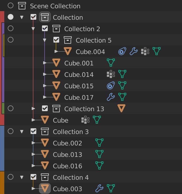
Actually, there is one - restriction columns!
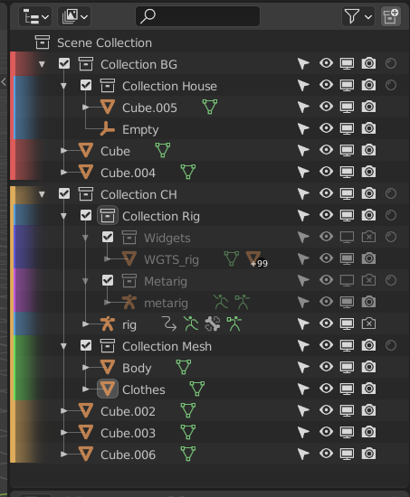
For me it is pretty easy to spot hierarchy (what objects in which collection)
Columns never disappear when outliner is crowded.
However, the one problem is how to approach child collections color when there is only parent have it (first two images).
I might be wrong, but thanks for reading! Great job done for outliner
I would like being able to tell to which collection an object belongs to at a glance.
Me, too.
I Like @lone_noel proposal for expanded collections.
I had an idea to improve it for nested collections.
Maybe increasing width of bar would make it better.
That would require an automatic increasing for more nested collections, anyways.
Why not re-using palette of random colors used in viewport and a shortcut to change random seed ?
Maybe, Ton’s idea of a custom palette reused everywhere in UI should be realized.
I already made a proposal on RCS about vertical tabs for outliner, last year.
Here is my proposal on Right Click Select.
2 Likes
Wow! Lots of great feedback and it’s fun to watch. I think the gradient one is especially great because it’s easy to see and doesn’t get in the way!
I’d like to add one idea as well. It’s a very simple rule:
“Clarifying the range of the collection at the top level”.
(1) Two rows of color bars.
By using two rows of color bars, it becomes easier to see where the topmost level begins and ends.
(2) Make a space between the two topmost levels.
Even very small spaces make it easier for the eye to see where they are separated.
Three rows of color bars might be works, but more than four will be noisy look.
Thank you!
______
[postscript]
Oh… My image looks very similar to Ronan’s.
Sorry, but I didn’t notice your post when I started to write this post…
1 Like
Nate, I like #2 personally. Thanks for the hardwork
This is the solution that in a similar way I proposed long time ago for a better use of the “full screen mode”, and also for a better management of the interface of the addons, in fact if I remember correctly I had proposed a similar solution in another tread or maybe on that of “the duplication of the properties panels pointed out”, I don’t remember well, and I don’t want to search. I just want to bring out the reason, and it’s because property panels, and the outliner are largely managers being part of the 3d view …
Anyway thanks for making a better summary and mokup. your comment is explain the problems and solutions very well.
1 Like
this is my proposal to your mokup, not to give too much trouble with the colors, but at the same time to make the various objects in the various collections and sub-collections quickly identifiable to the eyes … the colors are identical but with an overlay, for do not bother the colors of the icons, and opacity at 15%
4 Likes
How do you reconcile that with the hover/selected/active colors ? They also tint the entire line… the idea is not bad but it ends up looking a bit like a messy rainbow… the colored lines work really well though… maybe we could have them thicker, but keep the background consistent and solely used for hover/selection/active coloring ?
I think we need to find a good compromise of colors and opacities at the right point in order not to appear a colorful mess, and at the same time take the obvious advantage of easily identifying which objects belong to the various collections … believe me it is a great advantage when we have to eye deal quickly with large quantities of objects and collections … I think therefore it is at this point a question of refinement and polishing of the idea.
1 Like
I agree it’s important and I’m also pushing in that direction. I think some of the earlier mockups are not clear enough as to which object is contained in which collection, and your mockup definitely addresses that, although a bit too dark/dimmed I think.
Partially colorblind guy here. Any chance these color tags could have some sort of optional pattern fill? Most applications don’t offer pattern fills, but I cherish the ones that do. Trello’s my go-to example:

10 Likes
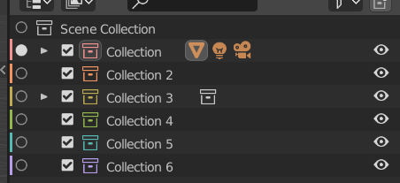
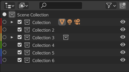
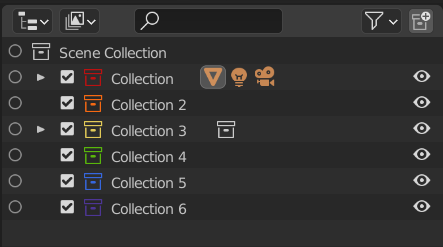
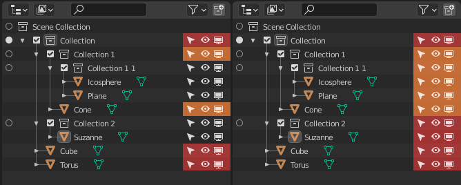
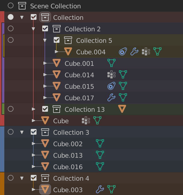
I don’t like the idea behind this left lane, though I understand the logic behind it. The issue is people are mocking it up where it just halves the width of the last color. That way, anywhere after 3 nested collection, its basically just an impossible to see sliver. Already with 2 nested collections its super small, just look at that yellow line.
To fix this you would need to continually use the same width for the colored lines which really adds up in width, and would push things to the right more than is worth it I think.
4 Likes