GSoC 2020: Outliner Discussion and Suggestions

From my point of view, the outliner has two basic functions: 1. to organize and find things (objects, lights, mesh data, bones, etc.), and 2. to do stuff to those things (hide/unhide, render/don’t-render, exclude-from-scene/don’t-exclude, etc). Colors themselves don’t change the structural organization of the outliner. Only collections, toggles, and ordering of items does that. So the only thing left for colors to do is to help with finding things and to help with doing stuff to those things.

When it comes to finding things, one consideration is whether the colors help with determining what might be called the scope of a collection - that is, not just what line the collection icon is on, but how big is the collection vertically and how it relates to other collections. This scope can be communicated in two ways.

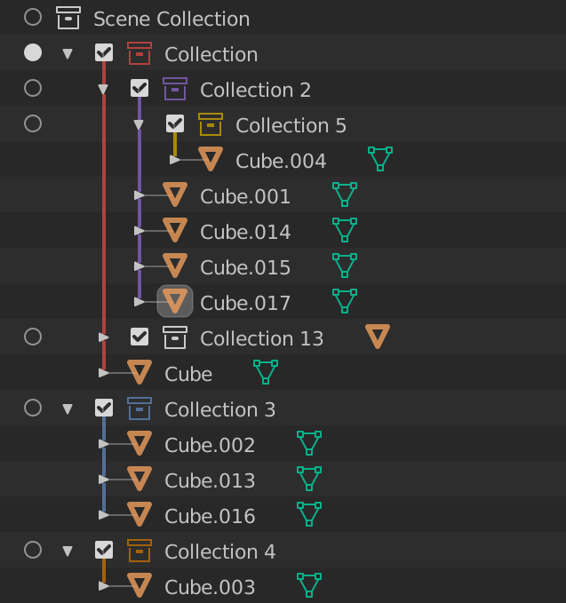
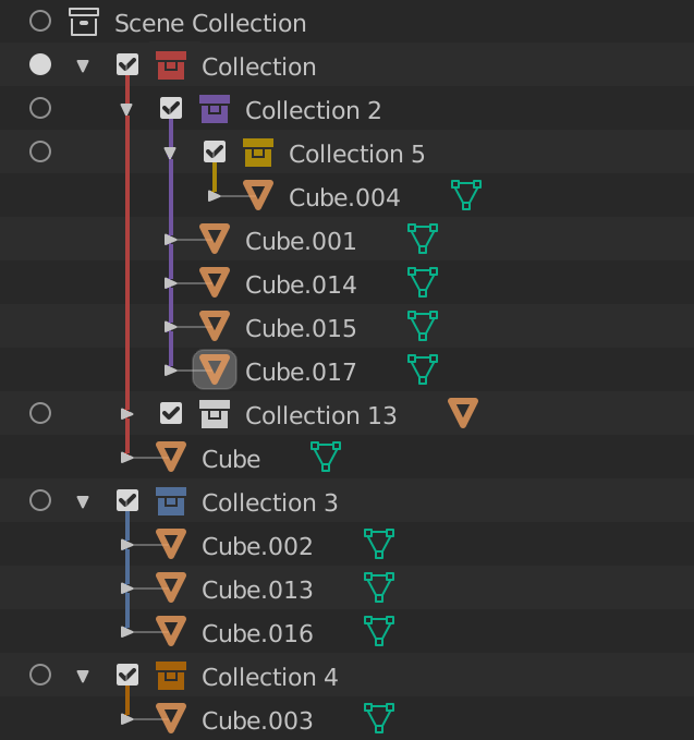
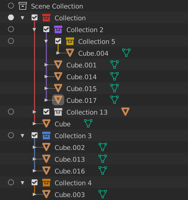
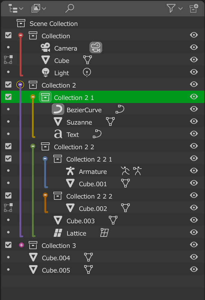
In the proposal of @nokipaike above, a collection within a collection gets its background colored starting from where the collection checkbox is and going to the right. This allows to see very quickly, just by a quick look at a color, not only how much of the visible outliner belongs to a specific collection, but also to see if that collection is contained within another collection. When it comes to the collection just below the scene collection, he has that collection’s color also extend out leftward to a color bar area, which I don’t think is necessary. If you look at proposal #1 of @natecraddock above, the color bar on the left side just by itself is poor for the task of using colors to actually do things to stuff in the outliner. There is some empty space that one has to track from the location of the left color bar to the collection checkbox(es), and a LOT of empty space to go even further to the toggles on the right of the outliner. Those bars also can not adequately communicate an arbitrarily large number of sub-collections well. So I think that colors bars on the left just are not helpful. I think that @nokipaike includes color to the left of the collection box of the topmost collection under the Scene collection because he wanted the color to connect up to the color bars on the left side, but if those bars are not helpful and are removed, that topmost collection should also have its color go no further left than its own checkbox. If that is done, his proposal captures the scope of particular collections very well, and the horizontal spacing needed for communicating the relations of colored nested collections to other collections is built into the outliner hierarchy.

Further, when it actually comes to doing things to the stuff in the outliner, the fact that the color extends from the outliner items out to the toggle area makes it very easy for the eye to immediately move from the targeted collection or object item in the center of the outliner out towards the toggle that one would use to do something to that collection or object item. So for usability - finding items in the outliner and doing things to those items - I think that a modified version of the proposal of @nokipaike is one of the best out there.

That does not mean that this would be what I would prefer, and I indicated that there is a second option. That second option is to color the collection lines, checkboxes, triangles, and collections names and also to color the toggle icons on the right. Then one can still see the scope of a collection and its relation to other collections, and when one has found the collection that one wants to do something to and thus needs to move the eye to the right towards the toggles, one simply knows that one is looking for the same color as what one just looked at.

Nate objects to coloring the triangle and checkbox on the grounds that “Those are different from the collections themselves”, but there is a one-to-one relationship between a checkbox and a collection. Every time one has a line with a checkbox, one can be assured that there will be a checkbox there, and vice-versa. So in that sense, the checkbox and a collection are not two but one, just as two sides of a coin are both two and yet always one.

The problem, though, is that just coloring the collection icon gives the eye very little color to latch onto. If coloring the vertical line is valuable to point the user to how big the collection is and how it relates to other collections, it too faces the problem that it is still a small sliver of color. Coloring the triangle and checkboxes, in addition to the collection icon and the vertical line, makes it much clearer at a quick glance what color the collection is and how much of the outliner it is taking up.

Look at @dan2’s proposal with the colored checkboxes, triangles, collections icons, and collection text, which does not have the vertical line colored, and it is pretty clear the vertical scope of the collection. Further, if the only two really good choices for communicating vertical scope and for connecting toggles on the right to the center of the outliner is a modified version of the proposal of @nokipaike or the proposal of @dan2, the proposal of @dan2 has much less visual noise and clutter, coloring just small icons already there than changing most of the background to various different colors. It is in light of this that I would sincerely hope that Nate reconsiders his objection to coloring the triangles and checkboxes. It (or something close to it) seems to be the best option for making it easy to find items and to do things to them with the least visual clutter.

And if a modified version of the proposal of @nokipaike does win out for what becomes default, I would hope that there would be options in the preferences area for users to color collection checkboxes, lines, triangles, collection icons and names and to leave the background a neutral color. I would rather have the colored icons than a rainbow of background colors covering much of the outliner.

2 Likes

Although the color coded for Collections is a really nice thing, I would prefer seeing Manual sorting implemented.

Being said that I’m not sure if the current color choices are the best, take an example the purple one, you can’t make any difference in what is happening there:
image

1 Like

I think the third one hits the mark. Subtle, but still gives you a proper separation of things.

I had in mind, that we were only talking about color tagging for collections.

How many level of items of same type are there in your screenshot?
For groups, Root _ World_Geo
Next level are assemblies.
For assemblies, Env_master_Sixave_Full_Sixave_Ground.

Blender is not Katana. It does not display Collections_Instances with Overrides at a different level of hierarchy.

So, If task ambition is just to color collections, I don’t think that my proposal was out of scope.
But if the idea is to color tag any type of hierarchy, I agree that would not be re-usable for rigging.
Although I don’t think that is pertinent to tag any level of hierarchy mixing all types.
IMO, Hierarchy tree indentation is already communicating that clearly.

I agree with that.
Triangle is designating presence of a hierarchy. (A parent with children or an object with datablocks.)
An object may be part of several collections. A child may be part of another collection than parent.
Currently, we are using dashed line and greyed out item to communicate that .
But if all hierarchy lines are colored those cases would be more obvious.

We could use white line to indicate that an object is also present in another collection.
And black line to indicate that child is out of parent’s collection.

And if hierarchy lines are colored, that makes sense to color triangles, too, to avoid discontinuity.

We can clearly see that reason of confusion with mock-ups, showing collection icon colored and white checkboxes and triangles, comes from discontinuity introduced by white elements.

I agree with GeorgiaPacific. That would be cool to have both options.
nokipake’s proposal as a soft color tagging and dan2’s one as an hard one.

As a simple case example for a layout scene we could look at a collection hierarchy like “cityLayout - Buildings - Midground - roofElements - Pipes - largePipes - rustedMetal”. It can get a lot more complex with shot specific variations or bigger assets.

While some companies integrate materials, color and placement in the object naming other companies are using group naming for a meaningful sorting. Many big VFX companies have to internally script softwares to be able to color tag in the scene view/outliner.

The more limiting or convoluted color tagging is going to be the less it’s gonna be used.

I’m happy to see any solution, and for my personal needs custom sorting would be sufficient in 80% of cases for my day job. I’d just like to see people used to other softwares look at it and say “hey, that’s really cool, I wish my go-to package had that”

1 Like

What if we thicken those lines ?

With solid collection icons ? not sure if it’s really more readable

Bit more saturation…

4 Likes

@natecraddock,

I’ve been fiddling with the build from Friday, and have some suggestions (again). :wink:

First, please add the material icon next to a collapsed object, like all the other icons (constraint, modifier, vertex…) that are already there.
It will save some clicks.

Second, I’m slowly warming to the functionality of a left column. :wink:
But with color coding of Collections, I like the proposal from @Jaydead to combine his suggetions with the colored Collections.

Three, regarding Color Tags, Is it possible to show a color grid instead of a list?
Also, if you’re going to make default & custom colors possible, make the default tag colors not swap on a custom theme to keep consistency. And 12 to 16 default colors would be fine by me.

Four, I agree with @eobet on the checkbox of a Collection.
With all the visibility options, it should not be there. It’s confusing and UI inconsistent now that we have the left column too as well.

Five, I’m more and more convinced we should keep this KISS.
All of the examples with overly colored lines and arrows, side bar colored line blocks, colored collection blocks (top/bottom) etc. will make the Outliner look like a carnival.

And at some point it will create situations where no color rule will apply:
Objects in the scene colored by the Collection color. So what happens when it’s in a colored subset?
And with the objects in several Collections all with their own color tags?
Collapsed collections? What color will be shown here, do we need to show all in one think sub column as @Bobo_The_Imp suggested?
I think this will only make it all less clear and more annoying to work with.

Six, I would love to hear on your proposal to start differentiating (duplicate) linked objects with various font sets. Also the addition of a number next to the vertex icon if objects are linked that way.
Also, as discussed before, I would love to see the ‘linked’ icon next to the top root of a linked Collection, not just the linked sub object. Any plans on getting that in too?

Seven, can we get a little bit more wide scrollbar? Working with a pen & tablet makes these small slivers a pain…

And what I would love to see is some more icon colors, so there’s s little bit more room to fiddle with colors. But that’s not on you, and I know it sort of contradicts my ‘carnival’ comment a bit. But I have all my colors very desaturated, so it’s not that bad… :wink:

Phew… Done :slight_smile:

3 Likes

Solid shaded Collection icons are now reserved for linked or instanced Collections.
Funny enough there’s no distinction between the two…

Making - all - Collection icons solid shaded, will create even more visible confusion.
It’s hard to read as it right now. I suggested having slightly different icons or have the linked icon visible at all time.

Ah right I forgot about this. Maybe linked collections ought to have a little chain symbol on top of them ? In any case I don’t actually find my solid colored collection icons (!) notably more readable.
But I really dig the lines : clear, right next to the objects they’re relating to but not close enough to get in the way, work with out-of-frame collections (when scrolled past the collection icon)… they tick the boxes for me.

@eobet I gotta admit I don’t know the use for these “collection checkboxes” on the left hand side. We already have many restriction columns and it sure seems redundant. @dfelinto can I ask you what they’re for ? The manual isn’t particularly helpful : “Exclude the collection from the view layer. This is not really a restriction column. It is shown besides the collection icon.” -> https://docs.blender.org/manual/en/latest/editors/outliner.html?#restriction-columns

Wow there’s a lot of strong opinions here… I think it’s actually gotten a bit out-of-hand. I’m going to ask that everyone hold back on discussing collection colors for now, I never expected this many varying opinions, nor the amount of mockups. There are lots of things to consider, and I’m grateful for the ideas. I will be discussing this with the UI team and my mentors to see if we can come to a conclusion. Since there are so many messages about collection colors (around 70) I won’t be making thorough replies/comments, sorry.

14 Likes

my grain of sand

16 Likes

That sounds good to me, to be honest it is a pretty huge design task, so when you wrote it down on your proposal in the “extras” I thought that sounded about right; a time permitting thing, but probably not. So when you started working on it I was surprised! I think that all the chat generated from it has been good though, I hope it will be helpful for you and the UI team to consider. Also thank you very reading them all, it’s always nice that the GSoC projects are usually so open to the community, it really is appreciated.

I definitely agree that bringing it up with the UI team to see if a conclusion can be reached is the best way to continue. If colors don’t make it it into this project that is fine in my opinion, it is a big decision. Thanks for all the work so far.

3 Likes

Fully agree with @Bobo_The_imp, huge thanks to tackling this project and reading through all the comments.

Color tagging is a pretty hot topic, when we got it done internally for Katana it was a pretty heated conversation and opinions are still split. Tricky subject as there’s no solution out there that’d make everyone happy.

Same here by the way, no biggie for me if it doesn’t make it in. Custom sorting should hopefully be more straight forward :slight_smile: . I’m still curious what the UI team thinks so keep us posted.

I agree with @wevon proposal, we should use color more objectively, just to represent object states (selected/active) and for collection colors.
In this case, making everything coloful sometimes doesn’t help the readability.

Btw I always found that those squares with round corners around icons in outliner a little dissonant from the rest of the blender ui.

2 Likes

and moving the ckeck boxes to the left

Edited:

I have made a few small adjustments.
1-Separate the Object and Edit Mode options to better approximate the final result.
2-Show active collection with rectangular frame to contrast with the color circle.
3-Add a circle in the Scene Collection to be able to activate it.

Note: In Edit Mode there is no option to deactivate the collections to improve reading, it can be a good design option, but if you wanted to keep it it would resemble the original Mockup.

7 Likes

Usually, when the proposals go wild in all the directions and the opinions are split, implementing options and theme colors makes everyone happy (except the developer, maybe :slightly_smiling_face:)

1 Like

To draw the attention from the colors, I’m suggesting another subject: vertex groups. I’m using them quite intensive and I would love to have the ability to select them using the Outliner. Do you think it is possible without too many complications? Is anyone else finding this useful enough to worth the implementation effort?

4 Likes

Good idea. Custom attributes in general are going to be more prominent very soon, and it is likely that we’ll get a spreadsheet-type editor to go along, so it would make sense. @wevon I like your mockup

1 Like

I don’t doubt that collection color tagging can be finished this summer. It’s a really easy feature to code, and I believe the UI team will make a good decision.

There are different restriction columns for different levels of “hide” control. The eye (shown by default) only hides the object. It is still calculated. If you had a ground plane with collision physics hidden with the eye toggle it will still be used in the physics calculations. The eye visibility toggle is per view layer, which is why it is labeled “temporary” in the UI tooltip.

The viewport restriction (monitor icon) applies to all view layers. It hides the visibility of the object, but also disables it completely from the view layer, using the same example, the collision physics would not be calculated with any viewport restricted objects. These objects are still rendered though.

The collection exclude (checkbox) applies only to the current view layer. It restricts the viewport and render visibility and removes from other calculations.

I’ll admit the manual isnt super clear on these distinctions. I’ll see if I can add more details today.

5 Likes