Wow! 25 replies in less than 24 hours, collection colors must be exciting  Thanks for the great feedback and mockups.
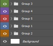
Colors
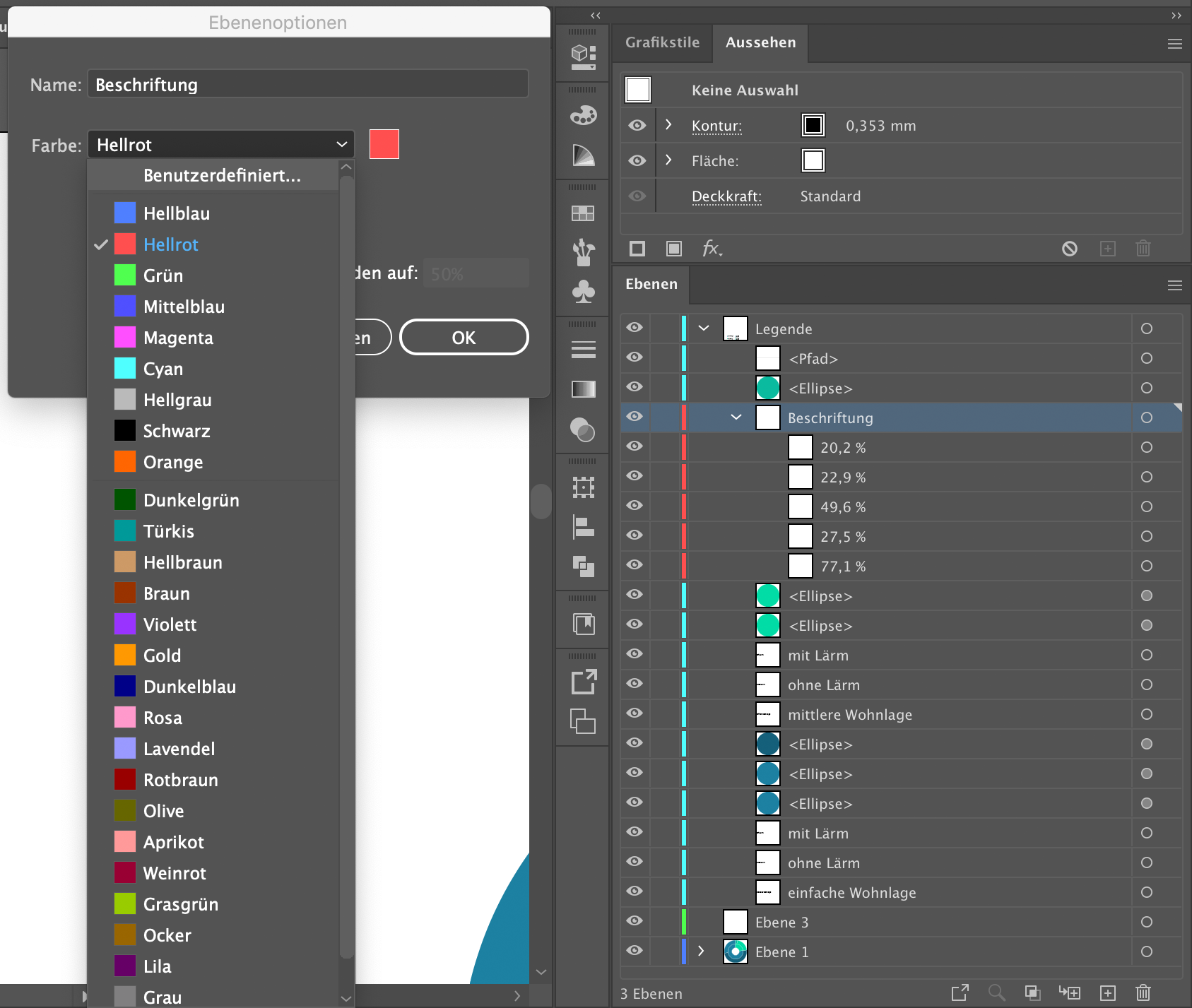
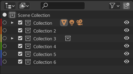
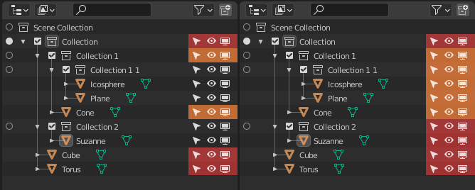
So the first thing: We need good colors to make a better decision. I tried picking less saturated and slightly more consistent colors as an experiment. I also merged #1 and #2.
In this example, I think the new colors work great for the collection icon, and poorly for the colors on the left (because the bars appear to bleed into each other). I tested with the other themes and it generally works well for the icons. There is still room for improvement, but I think that this shows the choice of color influences where it is effectively drawn.
A few mentioned user-customizable colors in the preferences; I really don’t think that is a good idea. Every similar system I tested (Krita, Gimp, Photoshop, MacOS, Google Drive) doesn’t allow that. I think it’s simpler to pick a good set of colors that work well, because they are named in the UI. It would be annoying in UI and the code itself to have Color 1, Color 2, Color 3, …
I think we could use a few additional colors for sure. But I think the 20-30 that some apps offer is quite a large number.
Placement
Again, I’m looking at other apps to determine the best way to do this. The original #3 came from Krita, and I do not want to color the full lines. MacOS colors a small dot to the side which is simple and nice. Perhaps the radio icons could be replaced with a dot which has more visual weight than a bar.
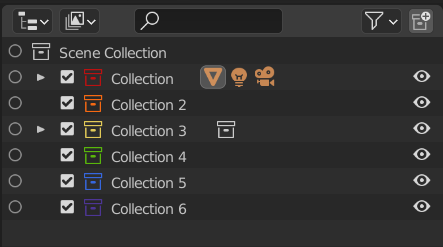
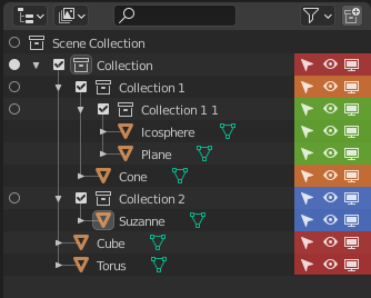
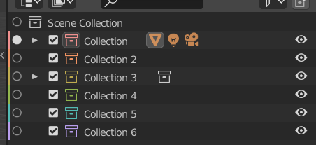
Some (like Google Drive) color the icon itself. These have the benefit of staying aligned with the hierarchy. With better colors than my original wild guesses, I think coloring the icon actually does look great. We could also color a rounded square behind it too.
A few other ideas:
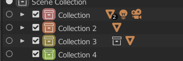
6
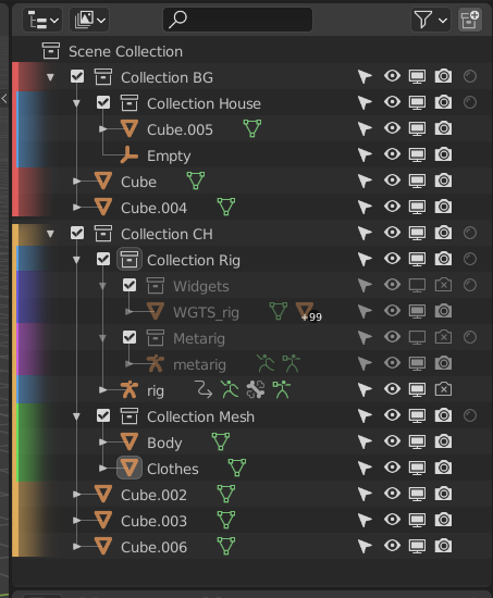
Rounded behind the collection icon. Has the benefit of nesting alignment, and it is visible (ignore the glitch on the green).
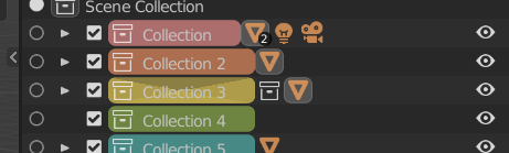
7
If the width could stay consistent, this is a cool idea too. That would require cutting characters off of collection names though. (again, ignore the GPU draw issue on yellow… It’s just a quick hack  )
)
Hierarchy
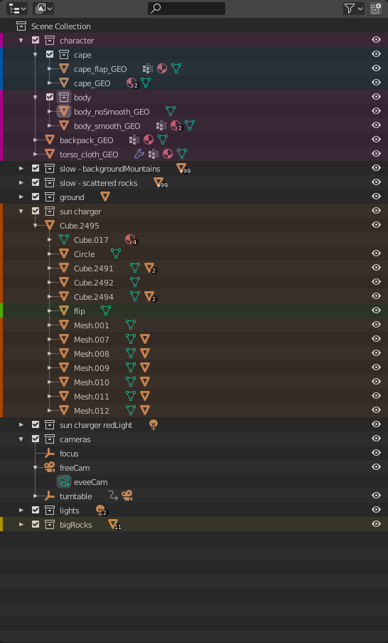
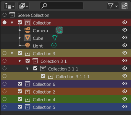
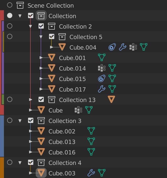
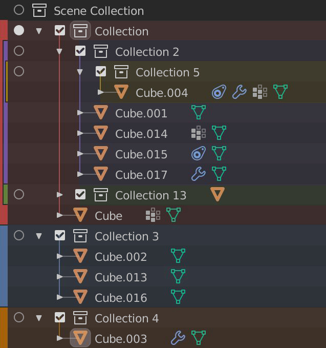
Many also proposed showing the color for sub-collections/objects by either drawing the bars on the left, or by coloring the small hierarchy lines that already exist (like the proposal from SaintHaven on blenderartists). I like parts of it (the hierarchy line does look nice) but I’m against coloring the triangle and checkbox. Those are different from the collections themselves.
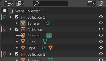
I coded the line drawing, and like @Bobo_The_Imp i’m not convinced that they add much meaning here. I think they just add more noise. Perhaps only drawing the vertical lines might help. We’ll see.
To me, collection color tags are a quick way to organize collections and not objects. Drawing the color should be limited to the collection.
I have not asked yet, but in the next week or so I hope to start getting feedback from them. I’ll admit I haven’t used Blender as an artist as in the 2.8x series as much as I did back in 2.5x-2.7x. That means collections aren’t something I use frequently. I totally understand the concepts, but I don’t have daily experience in organizing collections. So I’ll get back to y’all on that.
tl;dr: The overall opinion was to color a bar on the left, the collection icon, or both. Currently I think coloring the collection icon itself is the best route, but with some work coloring behind could work great too.