Thanks for adding another anecdotal datapoint to the usability study
(I don’t mean this sarcastically, btw. I really think it is useful.)
But there’s one point where I slightly disagree with you.
To add another anecdotal data point: I consider myself a beginner still (started with blender 2 years ago, strictly on a hobby basis).
At the start I used vertex colors in solid mode using vertex paint. But when rendering those colors did not appear. Also I wanted to paint inside polygons instead of just on vertices. So I switched to texture paint with material preview mode. It took me over half a year to figure out I could actually make use of those vertex colors in a material, when I started to understand how the material node trees actually worked. By that time I had already figured out you needed to be in Material Preview or Rendered mode to see the final colors and solid mode was just there to be fast.
“This is the way it’s always done.”
Not to say it wouldn’t be a good idea to add a color managed mode to solid view (if it doesn’t impact the speed). But after a while you find out that everybody thinks the way they do something is ‘the way it is done’. It’s very hard to keep everybody happy.
If we talk about intuitiveness, I’d argue it’s best to leave Filmic by default. With standard too soon enough people would be complaining about light clipping and color skewing.
Also, Blender is not supposed to be a beginner’s software. We’ve all been beginners, but we soon learn it’s about choices and configuring it to our heart’s content. On most aspects of Blender the defaults aren’t what people really need (example, many people have problems with the default 4096 samples setting when rendering, running out of memory). Yeah, sensible defaults should be a thing, but then again if they’re too sensible they’re then insufficient for more advanced things.
At the end of the day it boils down to learning the software. No one’s is expected to use Blender as is, just model stuff, press F12, enjoy. There’s always things to tweak. If you’re doing NPR chances are you’ve seen a tutorial that tells you to change to Standard if you want more vibrant colors.
[…] By that time I had already figured out you needed to be in Material Preview or Rendered mode to see the final colors and solid mode was just there to be fast.
When using Filmic, that’s indeed the case. However for new users this is unclear, or not well explained in the interface. Furthermore, it doesn’t help that the Solid view itself can also be a “rendered” mode, producing moderately good results on its own depending on the use case and settings.
A related issue is that artists with a background in digital 2D painting don’t generally have an understanding of, nor feel they need they have to use a high dynamic range of lighting values in their 3D work. Instead, they may often have a precise color scheme in mind they would like to use and expect the renderer to compute more or less correctly the lighting and shading from that.
Although technically flawed, the Standard view transform just makes it simpler for such artists to apply that ‘base’ color scheme to their scene and models and obtain a certain look, even if lighting extremes can become clipped; this doesn’t even necessarily only apply to fully NPR work. So, it’s no wonder that some people prefer it over the technically correct Filmic.
EDIT: I would also like to add that some sculpting workflows, mainly coming from ZBrush, may use fake (painted) shadows and highlights with vertex painting or texture painting, and for this the default color-unmanaged Solid view (aka “Workbench”) in Blender can be perfectly suitable even for finished works. These artists do not concern themselves with color management; the colors they see on their monitors are all they need and want.
As far as anecdotal points go I am with @Raviolini here. When creating textures for game pipelines then a color correction is most likely not the color range you want to be working in unless your pipeline has a specific one set up. For everybody doing renderings, resulting in a final image (sequence) filmic might be fine but creating for a game engine will result in wrong values that have to be converted.
My personal opinion would also be that Blender should either by default have a split between “General (Filmic)” and “General (Standard)” so that new users are reminded that there is a difference. Or just assume that everybody who wants to use filmic or any other color correction will actually know about it and then set it themselves. But not as a silent default.
And yes - it is semi-easy to just set it as a default startup or create a new default document yourself but that’s not the point. When you create your own default startup you already consciously know about it. Point is clarity of what to expect when creating a new default scene. That’s all.
The discussions about which one is the “correct” color space to work in will vary from project to project. The problem is clarity about what the user gets when they set up a new scene. Period.
If they know that default is not what they are seeing by default in Substance Designer or Unreal or Godot or wherever then they will search for it and read about it. But the main point we keep dancing around here is: The default simply expects theoretically what should be the best solution yet most regular Blender users will never read this thread. At best they start a new one when they realize that colors don’t look the way the expect.
Exactly. Hence whichever default you pick there will always be people who consider it the wrong default.
For people not really using (realistic) lighting Standard is probably what they’d expect. For people who do use realistic lighting filmic gives the expected results.
Game developers using blender purely as a modeler, or people using blender for 2D or NPR art styles fall into the first category, mainly. People doing vfx or movie work, or creating renders from within blender itself fall into the second.
As the Blender Studio itself falls squarely in the second category it is no surprise that that setting is the default.
Both you and @Raviolini imho make the mistake to think that your own workflow is ‘the most common one’. But I guarantee you that as soon as blender changes the default (back) to standard the other camp will start to complain here that the default gives unexpected results. It all depends on how you use blender.
The problem is clarity about what the user gets when they set up a new scene.
And I don’t see why there shouldn’t be two Startup files as per default when Pressing Ctrl-N to make clear what you are getting into if we can’t decide which one is the most common standard.
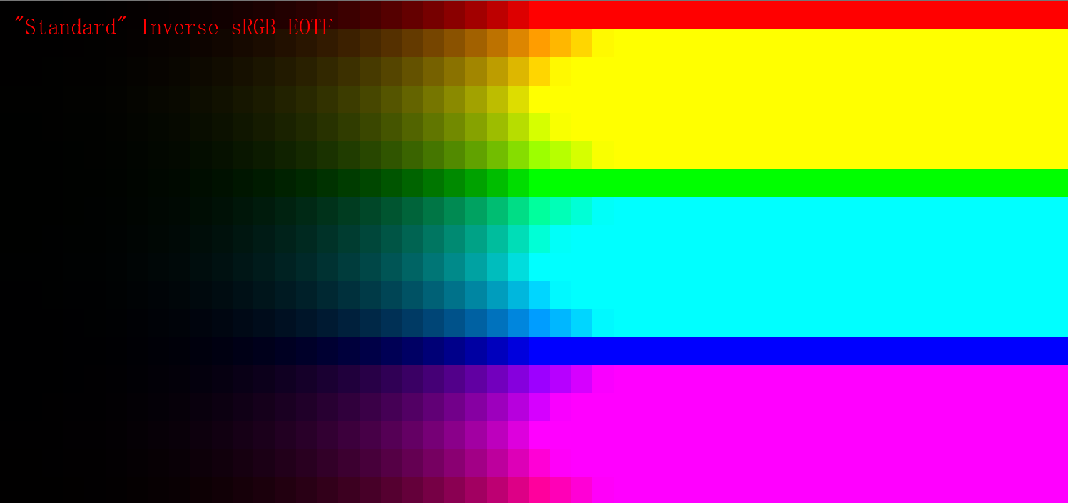
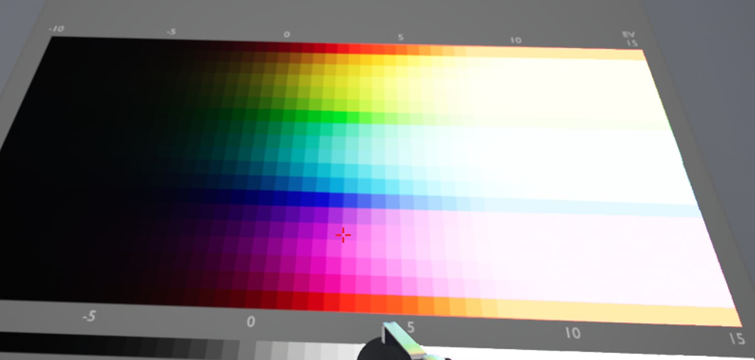
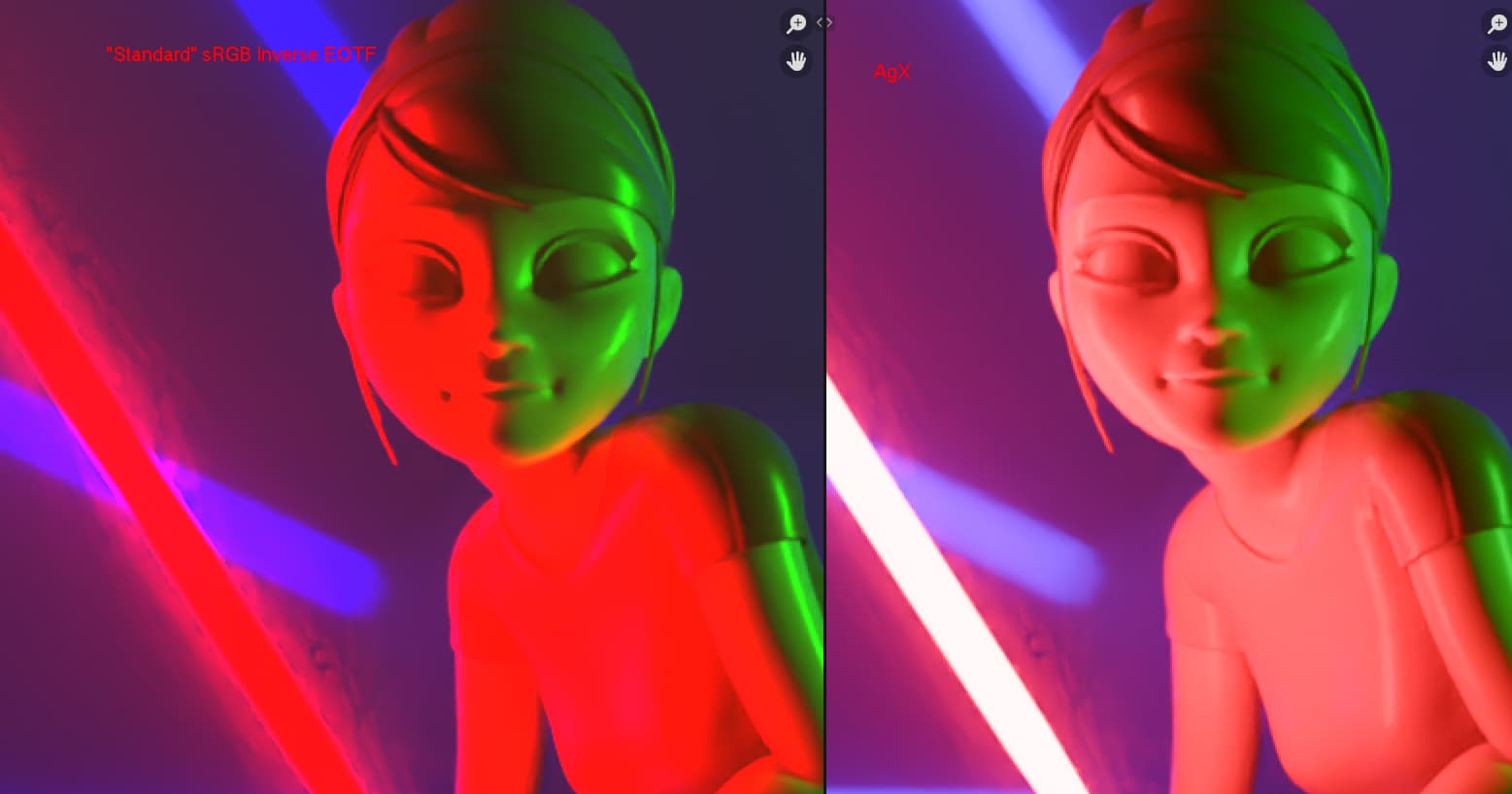
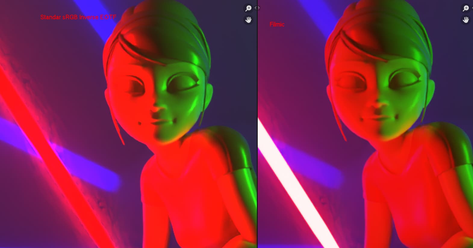
The “Stardard” inverse sRGB EOTF doesn’t produce vibrant color, the “vibrant” parts are actually reduced to only 6 colors. Again pay attention to this sweep:
Sadly whenever you have an open domain renderer you will be working with data from 0 to infinity. Almost every 3D renderer nowadays work in Open Domain. The base color texture you are painting is the reflectance percentage of the incoming light, the resulting reflected light intensity will always be open domain. Assuming 0 to 1 range is wrong.
Sadly no, again we are talking about view transforms here. When you said “color space to work in”, it is needed to remind you that Blender currently has the working space of Open Domain Linear BT.709, the working space range is 0 to infinity, regardless of whatever view transform you are using. It means you are working with large range all the time, you thought you do this texture creation workflow that is closed domain, but the moment you turn on the rendered view, everything is in open domain.
Basically people having the wrong assumption thinking they are working in a closed domain working space…
Haven’t installed Unreal in my current computer but I previously tested it in my other computer, UE by default is already using some kind of view transform, it doesn’t use sRGB Inverse EOTF by default. It is still skewing but at least better than sRGB Inverse EOTF.
(EDIT: crop the screenshot to hide the UE UI, in case the thing about posting other software activates again.)
Again this is about the “Standard” sRGB was never designed for open domain CG workflow, and it will throw a bunch of your rendered information away without thinking about what information is important for you final image displayed on the screen. Using “Standard” sRGB Inverse EOTF will hurt the experience of 99% of Blender users because from then on it would produce extremely ugly image by default.
It is absolutely wrong to use “Stardard” sRGB Inverse EOTF in modern CG workflow with open domain (0 to infinity) data everywhere. This is an issue about losing artistic freedom. Cases you would use “Stardard” like viewing closed domain textures are considered edge cases in CG workflow, these edge cases are exactly why we still keep the option in AgX instead of removing it. But in your open domain scene rendering, don’t use it!
Again Filmic will only produce slightly better result than “Standard” but is inferior comparing with AgX. So in some degree I agree with the title, but I disagree about “Standard” sRGB Inverse EOTF.
It doesn’t matter you are working with photoreal or NPR, the thing is your are limited to only 6 colors if you use “Standard”, it is a matter of limited creative freedom. Let’s move on to something better like AgX, let’s stop looking backwards.
That’s a bit too simple. If you use blender purely as a modeler for models you intend to use in a game which has all it’s data in sRGB, it’s better to set the standard view transform.
As soon as you use blenders rendering you are right of course.
Though I disagree with this as well:
Some NPR styles don’t use lighting at all. All textures are emissive. That turns the rendering into a closed domain (0-1 range) rendering. It is very valid to want to have no colormanagement on your textures in such a case and rely on your monitor being set to sRGB,
I understand what the other view transforms are trying to do, but what unaware users are getting in practice is that colors configured and viewed in Solid mode become desaturated and lose detail&contrast in rendered mode, if Filmic is used instead of Standard. In fact, I found this thread after I experienced this myself and tried looking on the web as for why Filmic looked so poor on a scene I was working with. My impression was that using a non-extreme lighting setup, the Standard view transform made colors closer to how I intended them.
I’m not saying here that Filmic is worse—it’s certainly better if one wants to achieve photorealistic renderings. However it needs colors to be tweaked in rendered mode after lighting has been setup. The Standard view transform seems simpler to deal with in a large number of cases where entirely photorealistic results and extreme lighting scenarios are not really desired.
I should clarify again that this is just my subjective/anecdotal end-user impression. For new scenes I’m now trying to setup colors in Rendered view and just forgetting about the Solid view for anything other than modeling.
The point is the “Standard” view transform is not preserving the “detail” or “contrast”, instead it throws the information away and turn them all in to six solid blocks of color. You lose details and you lose your contrast with “Standard”.
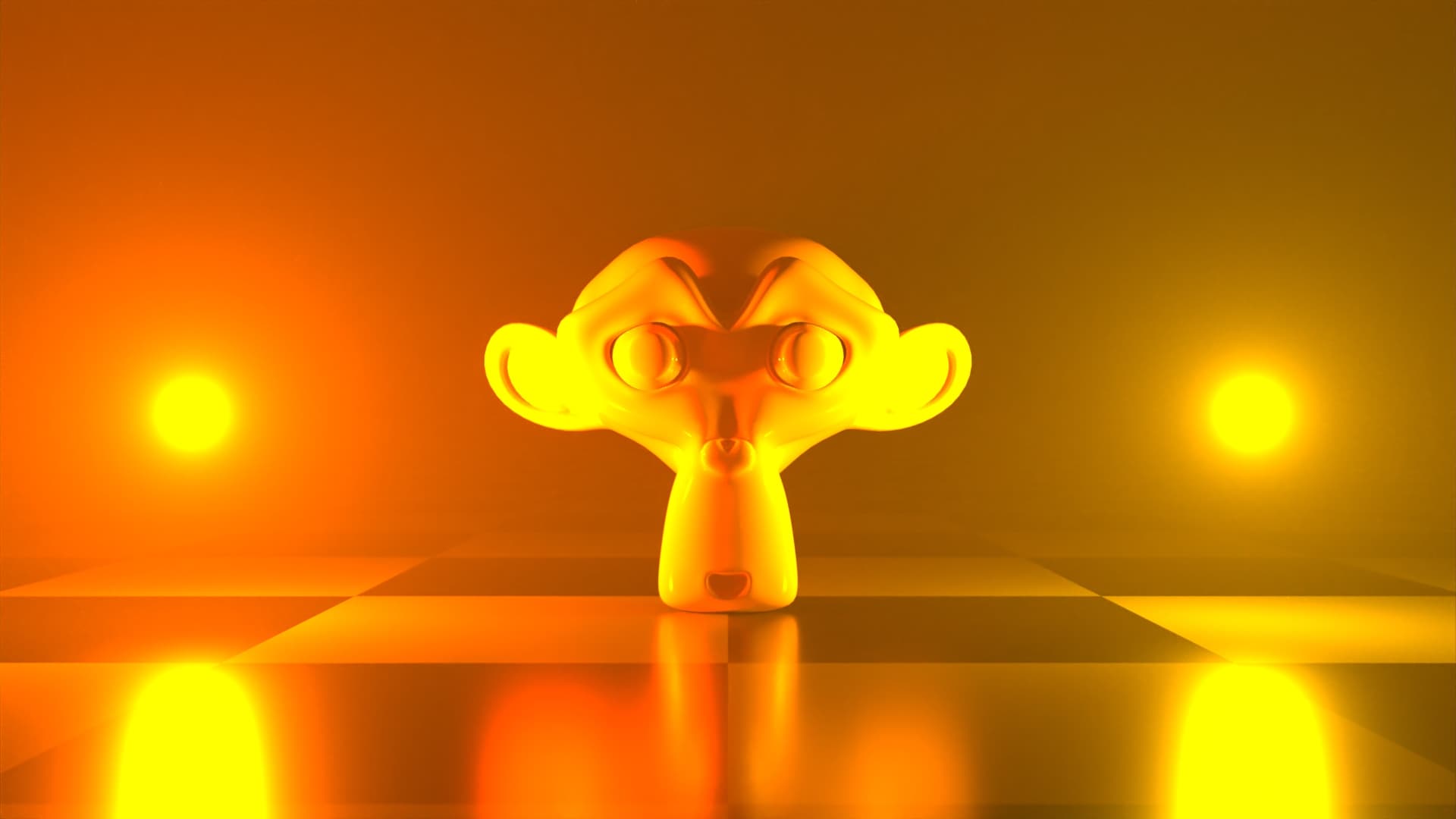
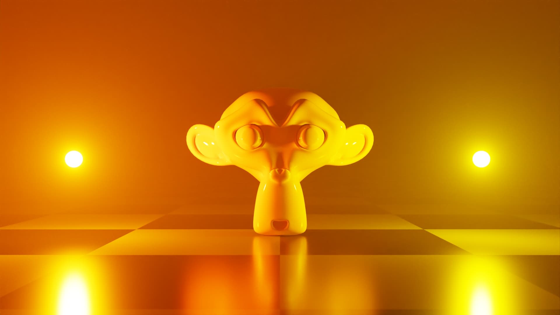
Higher contrast is about having larger difference between brighter and darker zones. Tell me can you look at the “Standard” result and tell whether it is the light saber that is brighter or the red side of face that is brighter?
Again Filmic is just as doomed, but at least you can tell the light saber is much brighter.
Do you want uneducated Blender users to produce the left side image using default Blender, or do you want an uneducated user to produce the AgX result out of the box?
Did you create the scene with the “Standard” view on? If so, your viewing experience when creating the scene influences your decisions of your edits, of course the “Standard” one would be the “expected” result in this case. But it does not mean that “Standard” is acceptable. Again, it limits your creative freedom.
Not photorealistic, we are talking about artistic freedom. Most phone cameras or even DLSRs are just as bad as the “Standard” sRGB Inverse EOTF (check out the new ARRI Alexa 35 if you want to see what a good camera would produce), it’s about using that option limits your creative freedom in more than 90% of the time you work in Blender.
Again, move on to something better like TCAMv2, AgX, etc. Stop looking backwards.
Do you have similar examples that do not use extreme light differences in the same image?
As I mentioned earlier, the scene was created with the Filmic view, but colors were configured in Solid view mode (which is not color managed and it’s where modeling is typically done) using either “Viewport shading” or texture/vertex painting.
When I tried to use the same exact colors in rendered mode, they didn’t work as intended, becoming dull and losing detail just like in the example provided earlier by the opening poster.
Apparently the colors were not saturated enough or reflected too much light for Filmic, so correcting this fixed things up while still maintaining the intended look, which was also suggested by troy_s elsewhere:
I’ve been using Filmic for all my renders recently. According to your answer, this preserves the color data accurately. However, if I am not happy with the washed out, desaturated look of the render, (and assuming my lighting and materials are correct) does that mean I should make all further adjustments using the exposure/gamma/curves and maybe the color balance node like Andrew Price shows in his tutorial?
I can’t really give too much insight as I don’t know your context too well. I will say that the first checkpoint is albedo; many albedo values are completely wrong. It should be a separate BSE question. Align your albedos to physically plausible values, otherwise they will reflect too much light and hit desaturation far too quickly. Also remember; you can’t maintain a heavily saturated colour and high emission / reflection. It is simply impossible. As a result, something must be done with those values. I can elaborate, but comments aren’t the most ideal. Hope this helps. – troy_sApr 7, 2018 at 17:20
But then, this means that there should be no expectation that colors observed in Solid mode will translate as intended to the rendered modes, which in my opinion is a usability and user-experience problem.
Guess why the material preview mode was once called “LookDev Mode”?
Remember your base color texture is the percentage of the incoming light being reflected away. When you hit the 100% value, it’s up to your lighting that how bright your color will be.
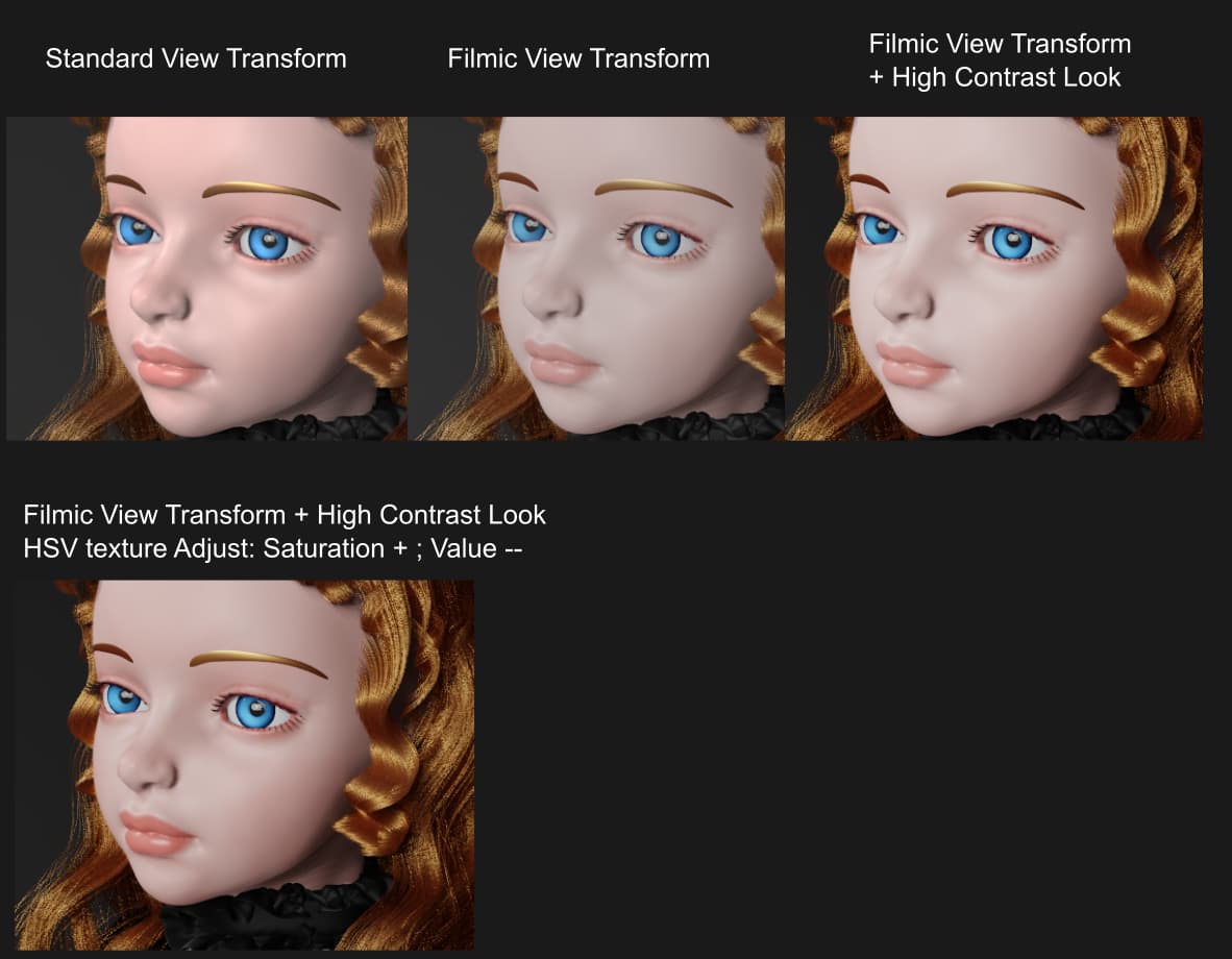
If you want higher contrast look, just use one of the higher contrast looks in the color management panel. Those looks are there for artistic contrast adjustments, please use them when you need to. In fact, the original Filmic-Blender didn’t have Filmic, the current Filmic is equal to the original Filmic Log + Base Contrast, it was from day one announced that you shouldn’t use Filmic without a look. The Filmic we have in current Blender is already base contrast, but if you want a different contrast, please use a different look.
This is not extreme, there are plenty of art works from the community that use these kind of lighting:
Though I believe these works of art should look even better with AgX.
Using a higher contrast look instead of the default ‘None’ look indeed made the model more contrasted, but it didn’t fix the loss of detail which is also occurring in the OP’s example. To fix the loss of detail for the most part, I had to correct shader colors to a significantly lower value and slightly higher saturation.
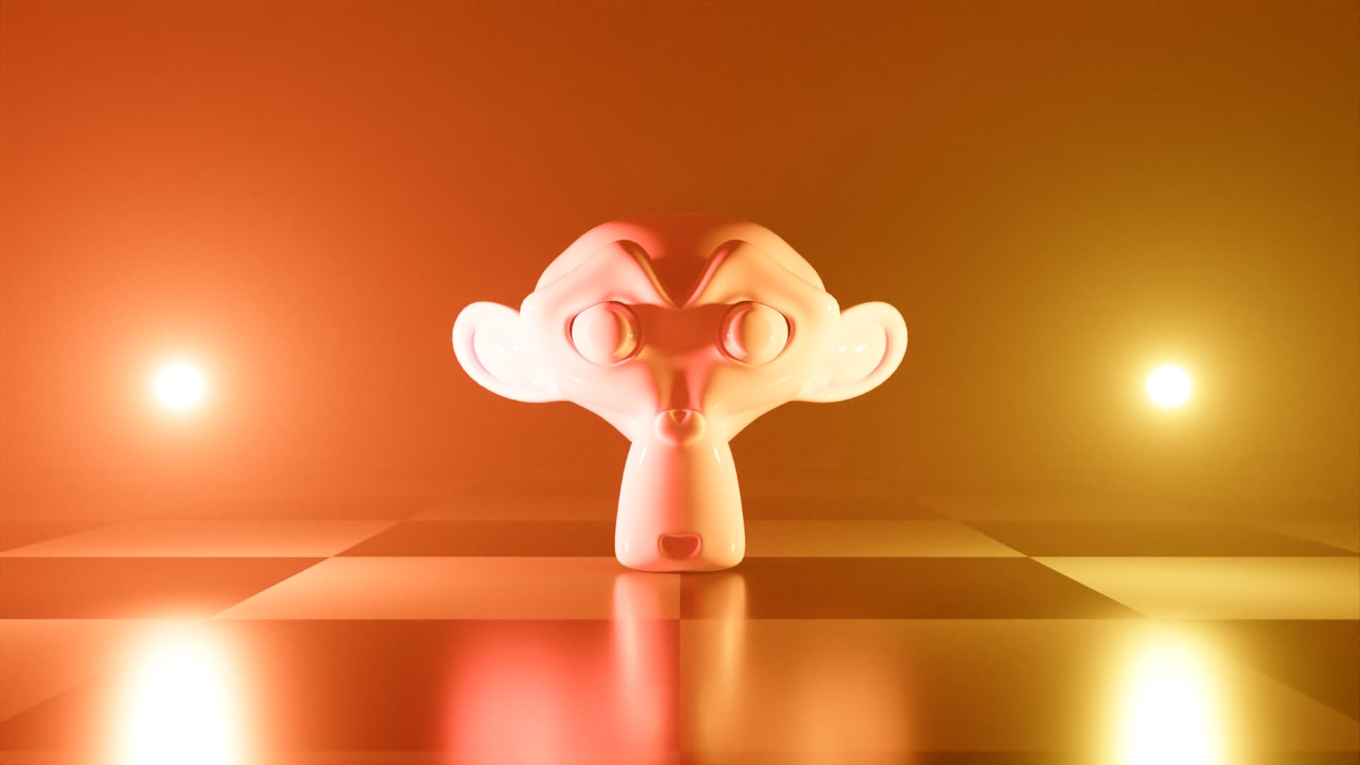
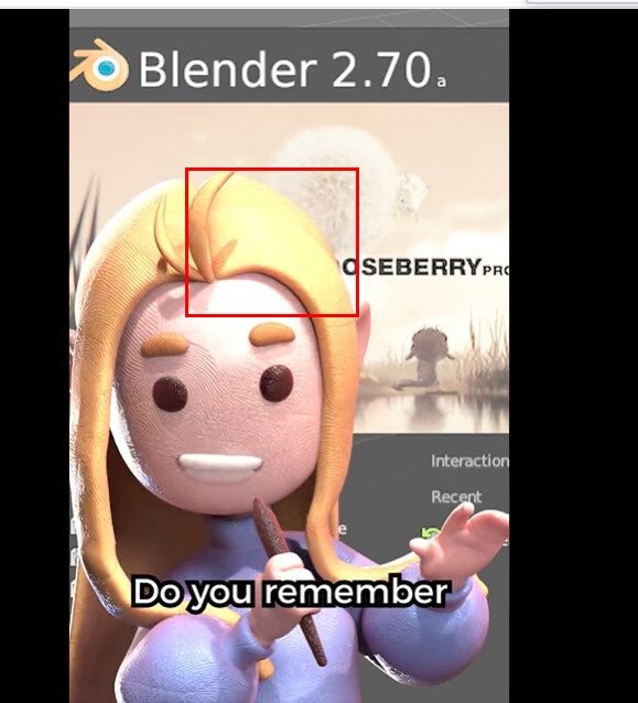
I don’t see a loss of detail here. There are indeed some difference but that’s grading preference I think. Also the scene lighting seems to be very low contrast from the first place. Consider moving the light closer and having part of the face be brighter, then you will see the “Standard” option producing some artifacts. Like this character figure in this twitter meme about Blender 2.7 UI:
Noticed this ugly artifact? This is what I call “loss of detail”. I am not sure but I believe the poster was intentionally using “Standard” to troll about the fact that we didn’t have Filmic back in the days, since her profile image doesn’t have this artifact.
I made an addon for this, it can save all render settings per engine. It only saves every thing from the settings tab. Let me know if you’re interested