Filmic as default is hurting the experience for people

Tried to save a cycles preset named test, directly after install.
Addons are installed via Preferences - Target Path - ‘Preferences’
Screen Shot 2022-08-12 at 7.11.44 pm
Modules Installed (Save-Render-Presets) from ‘/Users/NURB/Downloads/Save-Render-Presets-v003.zip’ into ‘/Applications/BLENDER/ADDONS etc/addons’

I got this error:
bpy.data.window_managers[“WinMan”].(null) = “test”
FileNotFoundError for ‘/Users/NURB/Library/Application Support/Blender/3.4/scripts/presets/render-presets/cycles’

Looks like the addon isn’t generating the needed folder structure and therefore can’t find anything to save into!

1 Like

Thanks for the report, I’ll look into it.

Could you check for me if you make the folder it does work properly?
It should create the folder if not there.

Seems like a permission error. Does blender have admin rights to that folder?

Hi,

the folders for Addons and the settings have the correct rights, otherwise blender wouldn’t save it’s preferences or addons get installed or install their libs.

1 Like

I have to ask, How many times we had this topic already? (Under different names).

And once again, i am reading some of the posts and they are EXACTLY the same posts but in different words in which we had in previous topics of this subject.

Even poor Troy Sobotka is probably tired of replying to the same things after covering them endless times.

Try this : Blender Support for ACES (Academy Color Encoding System)
Enough reading material for a week (it covers THE SAME points brought up).

Its easy to solve the issue of the both disagreeing parties that have different opinions, rather than blaming beginners or artistic skills , ı think that , LUT options on colormanagement or presets for ''Use Curves ‘’ option like color management presets are needed to see the draft of final look without using srgb, for example , I used curves and adjusted it to make it look exactly same as SRGB. But it had less exposure issues like strange saturated highlight and it was still having both advantages of 2 of color transform (srgb and filmic), so it was kind of a LUT by using ‘‘use curves’’ option to fix greys of medium / base contrast, so beginners or everyone need some default LUTs applied onto filmic so renders look more close the final result in color management tab and knowledagble people can remove it or change it, so thats why beginners struggle, it take long time to understand filmic or it deciveve u how render will look in final state and it dissapoints later. Default exposure and gamma and default base contrast always decieve people who has low knowledge about color things, I ve been there too so there is a need for better default values or presets like LUTS etc to preview viewport like the way u want instead of waiting for compsitioning later, hopefully viewport compositor will help that

Because both sides doesnt try to find the middle way that can make both side happy, some people want more automatic good look without understanding technicalities and want it look final as default but other party that is experienced and knowlegable always try to give lecture to make them understand why filmic is better and how to fix it or blame others artistic capabilities or knowledge.

Having same topic many times also prooves that there is a real problem about color management usability or defaults cuz new people always came up and complain the same thing, so there should be a middle way fix to make both sides happy and it will never end until these additions to blender is done.

What are good defaults? And again, why should everything be adressed to beginners to start with?

Beginners struggle with beveling meshes, so of course they’ll be expected to struggle with color management. Problem here is that you can find tutorials for any modeling or texturing aspect and no one ever talks about color management. So they’re in the blind.

I said in either this thread or the other one, cannot remember which, that what Blender needs is a better OCIO implementation, an easier way to switch OCIO configs and alternate between those. Then set a sensible default that works most of the time, and finally, get people to RTFM or wait until a popular youtuber decides to finally make a color management tutorial instead of tackling always the same exact topics.

Yes, gamma, exposure, etc. are complicated. No, shouldn’t be any easier or else we’ll lose control.

You’re a beginner for the first weeks or months, then you no longer are anymore, for the most of your time using Blender you won’t want it “adressed to beginners”, but as a professional tool that does the job and provides you tools and options.

7 Likes

Well said!
Would make blender easy for beginners, and the pros will have the fiddling to set everything up for non personal jobs/work.

Yes ss I explained, main point is ‘‘not’’ about focusing or adressing on beginners only, but focusing on ‘‘both’’ of the beginners and pro, its should benefit both of the sides, so there is no need to make arguments about saying ‘‘beginners will struggle and learn by time or , so it should focus on professionals’’
(Noone is saying we should remove filmic to make it not for professionals)
Professinals also said many times that they want a LUT feature so they can preview the scene more easily as if its more similar to SRGB, they didnt complain about filmic but they said they want to view the scene with a LUT same as filmmakers do when they are filmic a movie and viewwing it with a LUT before applying real color grading,

Yes, a better implementation or more presets and options is needed that will both adress beginner and professional, If there was a default LUT on color manageement, it would make beginners view the scene better while professionals can try different luts while creating a scene and during export they can choose ‘‘override scene color management’’ to export files with more filmic and washed out way to use in other software,
So defaults that I was talking about is not about making ‘‘standard srgb’’ default, its about putting LUTS and more presents that are useful to view the scene so both beginners and pros can benefit from it.

Overall, I dont understand why people still keep talking about learning process of users from beginner to pro, this page is not for that, not everyone have to be pro user and they may stay as intermediate or beginner but they can still use the software for simple things, blender is for both hobbyst and professionals, we should focus on making blender more usable by adding new options and making people learn more easily without needing for tutorials, its not a bad thing to put tooltips, screen messages or more options to make people understand things better without tutorials. Noone is against tutorials, but if software can do it by itsself by putting clear new options or presents, its better.

3 Likes

Fixed the isse, there was an issue with making a dir in a subdir. Now it should save it without any issues

1 Like

What is curious is there’s been no empirical evidence provided that this is actually an issue. It appears to be a few people who believe it’s an issue. I would expect at least some sort of empirical data establishing this is an actual problem area. Furthermore, there are many such learning curves one needs to go through learning Blender. How do beginners typically get up to speed? Perhaps they watch video tutorials? Perhaps they take a training course from someone who already knows how to use it? How many Blender beginning settings need to be changed so as to meet first time user expectations? For me, I would rather not change an existing behavior unless there is overwhelming empirical evidence that it should be changed.

4 Likes

What you wrote was pretty much generic and i have no idea to whom you are replying if to anyone at all.

What is curious is there’s been no empirical evidence provided that this is actually an issue.

what is the issue you are referring to?

I would expect at least some sort of empirical data establishing this is an actual problem area.

About what?

I would rather not change an existing behavior unless there is overwhelming empirical evidence that it should be changed.

Are you talking about Filmic? if so, the guy who made it himself (Troy S) said it was an old solution and blender didn’t offer anything better, We couldn’t use blender’s standard sRGB color management and ACES is beyond broken (For empirical data, see Troy S’ posts on blender stackoverflow and chris brejon website.)

From my understanding, there is no final solution here to the problem at hand, you can’t just plugin whatever you want to an OCIO profile and look up to heaven to do all the work, from my understanding, there are internal issues with blender itself, how it does its internal color management.

My personal note is that i am having fun with TCAM v2 (Eventhough it got no look provided for whatever reasons filmlight are trying to sell; selling in the literal sense), but you can plug-in existing “Looks” if you want, However, I dare not promote here something that isn’t 100% open nor free.

(AND OBVIOUSLY TCAM v2 can not be the default in blender nor included due to lack of technical transparency, I wish Troy S will continue with AGX, I am tempted to message him and ask others to message him with the following : “Hey mang, how are you doing, having a good day? good, Any future plans with AGX?”)

From my understanding, Some internal problems will be solved with the upcoming “Muh Soap bubbles, Muh soap bubbles” (Spectral renderer) , but some other issues related to how color and light are managed are too seeded in blender’s core.

2 Likes

I know ur point, thats what I always say ‘‘fake contrast’’ about filmics contrast options in other treads, , Details doesnt seem pronounced enough when u use filmic to high contrast and feel like details are not enough, and so the looks of filmic doesnt really fix fully without doing additional compositioning, so thats when I first start a scene, start with high contrast filmic and adjust texture color or saturations according to high contrast look from the start or it becomes hard to get desired result later without extra work. (I know what u mean detail loss is not real detail loss, but that remaining milky look after even contrast, when u dont do any extra color grading.) So, thats why I think I wish there were better '‘look’'options of filmic to make pronounced on detail/ depth via color management tab presets or new LUTS so people can achieve desired look more easily without always feeling something wrong with filmic default look options,

Yes I agree, TCAMV2 looks more pronounced and also looks little more contrasty and dark areas look more pronounced than AGX by default a and little better gradients as I saw in comparisons scene with blender’s open movie character’s demo with colorful lights on stage. I hope AGX advances little more into TCAMV2 quality

This is actually a really solid point to focus on. Specifically, it is worth thinking about what “contrast” is.

We cannot expect “contrast” to occur anywhere other than in our visual systems. We can follow some general trends, but ultimately we are balancing what “contrast” is, and what is happening in the tristimulus values.

Contrast is the sensation of a steeper “gradient”. But that asks a new question; “A gradient in what domain?”

That is, in terms of perceptual implications, “contrast” can be defined as a difference along three loose axes:

  • Perceptual “brightness”.
  • Perceptual “chroma”.
  • Perceptual “hue”.

Any one of the three will yield a steeper gradient in perceptual terms, and create contrast.

The problem is that there is no such thing as infinite contrast. We are bound to the medium. As we distort the tristimulus ratios, bad things start happening.

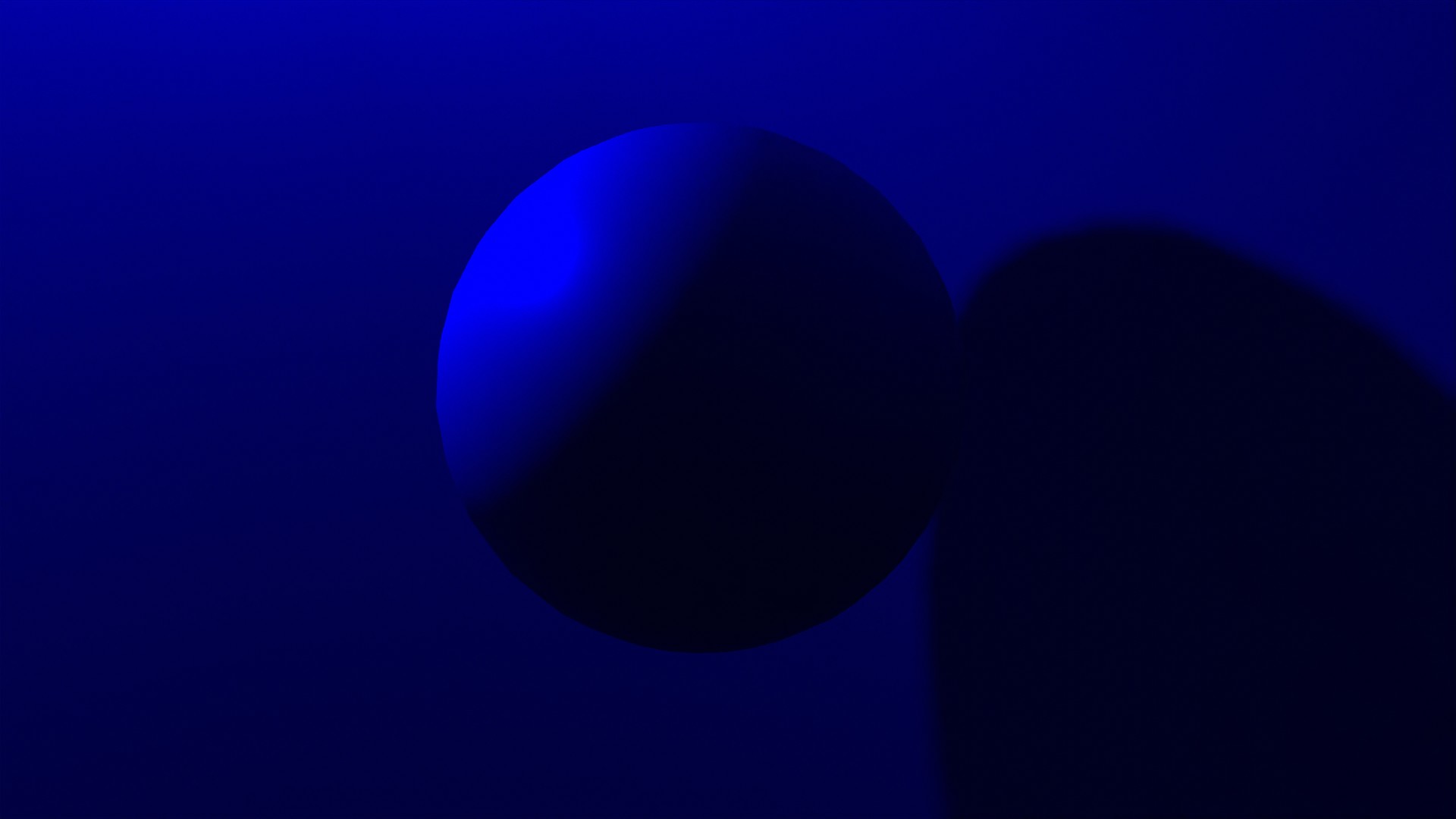
Think about the simplest render of an R=G=B sphere rendered under a pure BT.709 blue “light”.

How do we add “contrast” to this formed image?

We can only increase the gaps between the blue tristimulus values so far, and if we do so, we are going to introduce perceived posterization, or Mach Banding etc. There are limits!

But even if we choose to push the image further, we need to consider where we are pushing values beyond the medium’s representation range. Some possible outcomes:

  • Values that are pushed beyond move toward an achromatic value.
  • Values that are pushed beyond distort to another hue.
  • Values that are pushed beyond shift in chroma.

All of these are extremely challenging to negotiate, and no such model for image manipulation exists.

Contrast is an incredibly challenging concept.

The best we can hope for is for authorial tools to be responsive to the authors, such that they are afforded more control to adjust the image, both pre and post image formation, for their work and their voice.

TCAM is a architectural spine for a colourist-centric tool. As such, it actually fares extremely poorly without colourist interaction and look development. This is something that many folks pushed back against in the early days of Filmic, and wanted something that “Just Worked”.

The best way to see this is to try it. Filmlight offers a download of their basic, non proprietary look excluded, TCAM configuration. It will become clear that it is an architectural decision, and not an aesthetic baseline.

If someone wishes to try a real, high end system used to grade and shape the imagery of most of the higher end motion pictures out there, Baselight Look is also a free download that integrates TCAMv2.

4 Likes

(I agree, contrast is dependent on scene as u explained, its already a known thing but what is meant by lack of details by that user and me is not about subjectivity of contrast or not about contrast with hue or saturation, only being talked about value contrast. When the filmic high contrast is comapred with srgb , the details seem lost because of how looks of filmic is made or due to lack of LUTs that u can add on top of filmic looks as secondary layer. There is nothing against filmic view transform, the only thing we try to mention is that there should be better ‘‘looks’’ for filmic that are make things pop better similar to how srgb’s )

Now getting to main topic which is a simple thing that is not about any deep technical issue, just an artistic issue because of lack of more ‘‘looks’’ or secondary LUT or things to add on top,

When u use very high contrast in filmic it still doesnt look as pronounced as srgb’s regular look and still not able to get rid of washed out look with lack of details with high contrast because of how highlights look compared to midtones.

So when u add a simple curves to change highlights and or midtones slightly to add kinda more contrast between midtone and highlight, it leasily ooks more pronounced and less washed out while preserving most of the benefits of filmic

There should be more usable ''look options ''out of box with filmic if its possible to accomplish or color management need some LUTS instead of keep using curves everytime or going to compositor, to have more pronounced highlights differnetiation that cause details to pop up more wthiout always needing to always use curvers or color balance for value/contrast, so it will be more easy to have consistency when u make new scene, u can just use the look that give u final result more easier and more satisfying…

In other photo editing software, it always make u feel the need to apply level adjustment for midtones and highlights to makeless washed out or increasing whites at selective color adjustment
.
So i wonder if can we integrate such level/curve adjusment for midtone-highlight as '‘look’'s inside filmic filmic according to curve/level adjustment as below so people will get something good out of box without keep tweaking or compositioning.

3

4

Base Contrast was actually designed to be relatively close to sRGB in an average viewing environment. Of course, the two cannot be compared, ultimately.

Folks are, and always have been, free to do so themselves. It was highly encouraged in the early going, and more than a few threads exist on BA on various approaches to achieve this goal.

It can never be, in much the same way that sRGB’s inverse EOTF is not a suitable mechanism to form a picture for render data. It just is what it is.

Can there be improvements to the image formation chain? Of course. Will any of them “match” sRGB’s inverse EOTF “look”? Impossible.

It’s mixing apples and oranges. One would do well to explore how pictures are formed, and why it is imperative that the chrominance attenuates to provide information about the intensity of the illumination. Until this is understood well, all discussions are moot.

That is for an already formed picture. Render data is not yet a picture.

Curves are hideously broken in Blender anyways. Your adjustment isn’t remotely doing what you think it is.

  1. Photo editing software is just an example to make understand the cause of washed out look in curve values, i know render data is lost when u go photo editing software , its just an example to demonstrate an alternative to what contrast people expect and feel washed out after using filmic when there is no LUTS on top. Thats all that is meant,

  2. SRGB is just an example to explain the washed out look after filmic, noone said we should fully match srgbs look. I already told that I am not talking about image formation or view transform of filmic

  3. Noone need for me to understand all the details as much as you to discuss with you, when there a client goes to a architect, architect listen what users expect or what users feel missing visually, then architects fix the issue without telling technical details to the user he propose a solution instead of trying to show his professional knowledge.

  4. Yes in BA there is threads about that but I just wondered if it can be more officially supported or made available for everyone , so I dont understand where ur offensively explanative or defensive behavior come from when I didnt say anything faulty about the view transform of filmic that is created or I never mean to change filmic to srgb etc, , I was just trying to describe things by comparisons with SRGB, its just a ‘’’ matter of lack of LUTS / more look options on top of filmic presented to users with blender’’. So in my opinion there is no need to always defensively feel need to reply everything people talk about ‘‘lack of LUTS or other look options causing people to feel negative about Filmic experience while using blender’’ , if core of the problem doesnt come from filmic or filmics creator.

In summary, I only talked in my comment about Filmic usage without any LUTs or more look options presented by blender is hurting the experience for people , so its also about blender’s lack of lut system as well, not about filmic vs SRGB thing,.

I don’t think he is being offensive here.

But it’s important to know relevant stuff to actually have a meaningful conversion. Have you ever feel painful when a client tell you they want the color of the product to be “rainbowly colorful black”? Then when you try to specify what that means, they refuse to go deeper, and insist on “rainbowly colorful black”? I think we should agree that when someone is trying to bring more knowledge to the table, they should be respected.

When you say “fake contrast” a while back, honestly, I was like hearing “rainbowly colorful black” and I was not sure what you mean.

2 Likes