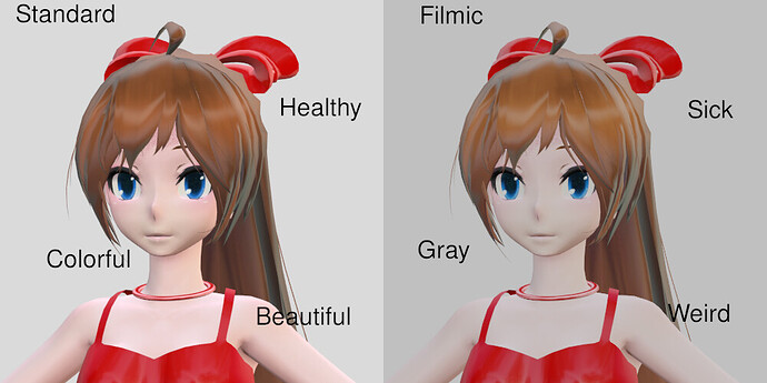
Filmic shouldn’t be set as the default in Color management
the standard View Transform should be the default
most people don’t know about filmic nor they want it
Filmic has darker colors, turning whites into a grayish colors and lights have a darker color
being less effective
New users don’t understand this, and this ends up hurting their renders
Your understanding of rendering is stuck in early 2000’s apparently  The linear values were never intended for human eye consumption, so some sensorimetric color transform is always in order. If a new user doesn’t know anything about the color management, having some reasonable color management active by default will actually improve the quality of their renders, not reduce it.
It’s the same as if modern digital cameras on the most phones took RAW image format pictures by default, and then display them on the phone screen with no tone mapping transform. Highlights would be clipped out without detail and blacks would be often burnt. The very first digital camera or phone manufacturer who would introduce regular tone mapped image format photography by default, out of the box, would probably make fortune, as most average people who don’t know what all this is would simply flock to buy that one camera or phone, because it just takes “better pictures” in their eyes.
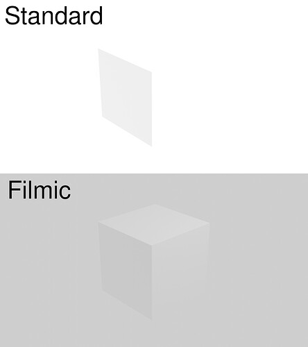
White looks gray with filmic
this shouldn’t be the default
Not everyone is making realistic renders in Blender
So what? It’s a cube in a white background? It’s not a photoreal render of a city. In fact, this is great demonstration of the tone mapping, because on the bottom picture you can actually tell you are looking at a cube, while on the top, all you see is a plane. You can’t make out it’s a cube because the color information is clipped.
If you need to do something specific which requires linear color without tone mapping, just turn it off. You know what it does, and nothing prevents you from turning it off. For a newbie, who knows nothing about rendering, tonemapping out of the box is a good thing, not a bad one.
Its not a photo real render of a city, because not everyone is looking to make a photo real render of a city
its stupid to have to set the color to standard every time i want to edit a video
if someone needs it the person should enable it
not the inverse, the standard should be the standard
this is a problem for new users who don’t understand why their renders look darker
If you use Blender for video editing, then I agree, but this is not a problem of Color management being the default. Color management is the default for any modern 3D software. This is a problem of Blender schizophrenia. Blender tries to be too much, both 3D software as well as video editor, and it causes issues like this one. You can’t have the right defaults for both 3D software and a video editor, as those defaults should be different.
That being said, simply turn the color management off and save the startup file. Now you will have your color management always disabled by default when you open blender.
its not just the video editor
I go to DeviantArt and see new users making the mistake of making renders too dark
because they can’t see the problem in their dark rooms with the bright screen on their faces
once they render it, they don’t get why the image looks darker than it should
Filmic is part of the problem
Dude… if the render is too dark, then what you should touch is the exposure and light intensity, not turn of tone mapping. When you “go to DeviantArt and see new users making the mistake of making renders too dark”, you make it sound like you are experienced compared to them, but an experienced person would know that when your 3D render is too dark, you adjust the exposure, not turn of color management.
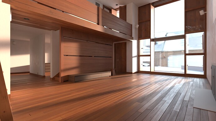
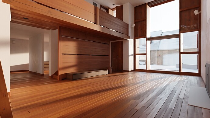
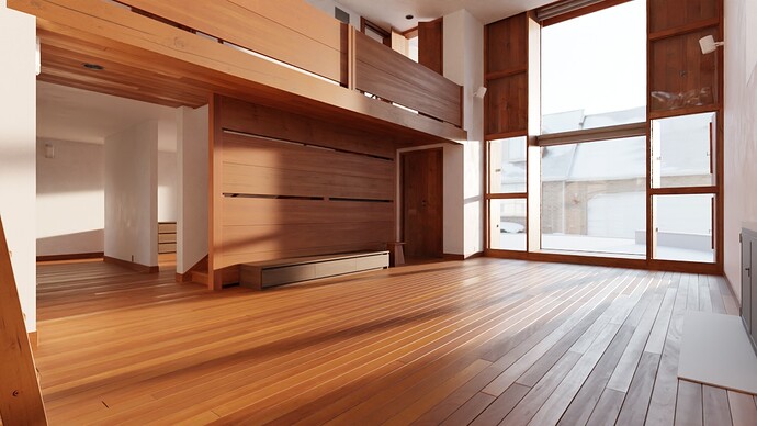
Here’s an example of practical use of the color management:
Same image, one has color management disabled, one has it enabled, and one has raised exposure to bring out the dark details. The one without color management looks by far the worst, as details in highlights get lost and colors around highlights look unnatural. It’s just straight up less photoreal.
if it is good for realism, then it should be enabled for realism
not for Cartoon characters, not for MMD models, not for games
most of the people don’t go for realism, therefore filmic isn’t good for most of the people
because they will have to adapt their textures, increase the lights, change the brightness
because filmic makes everything darker and gray
else they will have to change to standard every time
because a studio wants to render some realistic scene
because the big studio who gives money to blender decided that filmic should be the default for everyone
if you want to dismiss a problem instead of understanding it
then go on,i don’t expect less from Blendlets
- 1: Do i need Filmic for realism?
No - 2: Do i need to change from filmic if i want to edit a video?
Yes - 3: Do i need to change from filmic if i want to use Greasy pencil?
Yes - 4: Do i need to change from filmic if i am working with a cartoon character?
Yes - 5: Do i need to change from filmic if i am working with a game engine that doesn’t have filmic or i’m not going to use filmic at all?
Yes - 6: Why is filmic on by default?
Because muh realism
It depends on how you start your video editing session…
If you use the video editing template (File → New → Video Editing), the View Transform is set to Standard by default already… same with the 2D animation (Grease Pencil) template…
oh ok
so i just need to open the video editor in a specific way to not get the wrong colors?
give me a minute, i’ll just call every new user who wants to get into animation, and tell them about this little option they should pay attention to
because the studio guy decided that filmic should be the default
Filmic is a problem for new users who just want to play around and learn things
standard wont be a problem for the experienced user who wants to make some realistic renders
Says who? Most people, even the ones making cartoons, go for realistic light behaviour. Especially beginners. I can know because I am one. (My statistics of what ‘most users’ want come from the same place where yours probably come from: the place where the sun don’t shine ![]() )
)
Linear light output from a render is way more confusing for most ‘beginners’ when doing 3d modeling.
Yes, that’s why the menu entry is there. For beginners to have sensible defaults. Or you could create your own startup file and make your defaults what you want them to be.
a sensible default would be “standard”, how do you expect a beginner to know why white looks gray in blender?
Because a white cube when not overexposed is grey in a photograph.
- Open Blender
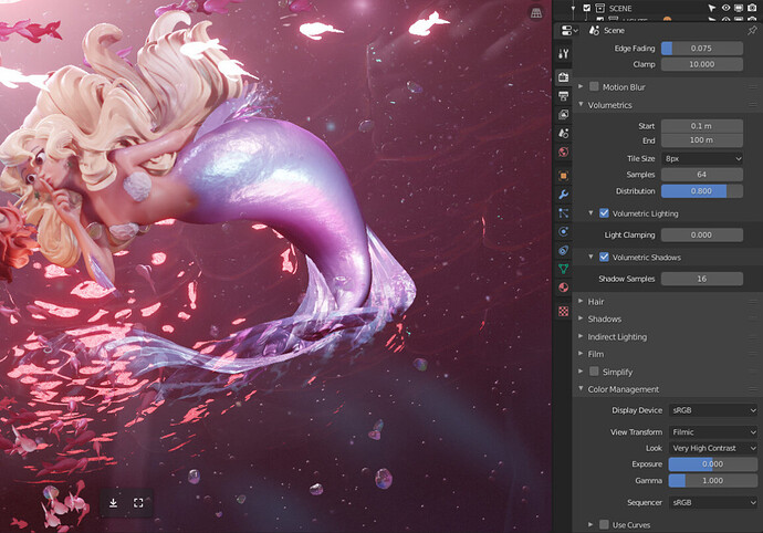
- Go to ‘Render Properties’ → ‘Color Management’
- Set ‘View Transform’ to ‘Standard’
- Go to ‘File’ → ‘Defaults’ and click ‘Save startup file’ and confirm saving.
- Now ‘Standard’ is the new standard for all of your new scenes.
You’re seeing a problem where there isn’t any, you infantilize users that don’t want nor need your hand-holding.
And most importantly, you seem to fail to understand Blender is about choices. Filmic is, by far, the best default option for color management and Standard is the worst, actually, you’ve missed all the discussion about replacing Filmic with other tonemappers like ACES.
As been told by other users here, the Filmic render is totally correct, and even so, the greys prove it, I understand there are use cases where you want pure colors, but for that you have other color management options, and if you need stylized/cartoonish looks you’re not a beginner to start for, because you must deal with advanced stuff from day 1.
I recall 4 years ago being puzzled as you, “why white ain’t white? how do I get pure white?” until I understood I don’t need to. There isn’t anything like pure white in the world.
Blender is about choices and options, if Filmic isn’t for you, don’t use it, Blender gives you tons of choices regarding that and you can easily make those default. Don’t change Blender for others, change your Blender.
if you need stylized/cartoonish looks you’re not a beginner to start for, because you must deal with advanced stuff from day 1.
no, shaders and and nodes are advanced
the common man doesn’t need to learn shaders and nodes from day one
day one is to get used to things
and then learn advanced stuff
Most of these were most likely done with a color management:
https://www.artstation.com/pablodp606
Your own artistic incompetence and lack of color management knowledge itself is not a proof that color management is a bad thing.
EDIT: Yep, he uses color management (as he should):
