The header was reorganize completely with 2.8… Header in 2.79
1 Like
Sorry, “The 2.8 header has been organised and neat for ages”
Point stands.
Also, you are not accepting the header only for one button and an empty space. Instead of see the possibilities of that empty space… like
- Add a Search field
- Add a alternative to the old 20 layers system
- Add new controls
- Allow better controls for some editor or modes,…
- Avoid button soup
- Better modular support
- Better multimonitor support
- Better position for sculpting and painting…
or futures improvements.
3 Likes
@brecht if the topbar/toolbar keeps the snap/orientation/pivot/proportional-editing settings ,can we get it to pop back onto the header if we close the topbar/toolbar, similar to how the editor menu in the top left does?
2 Likes
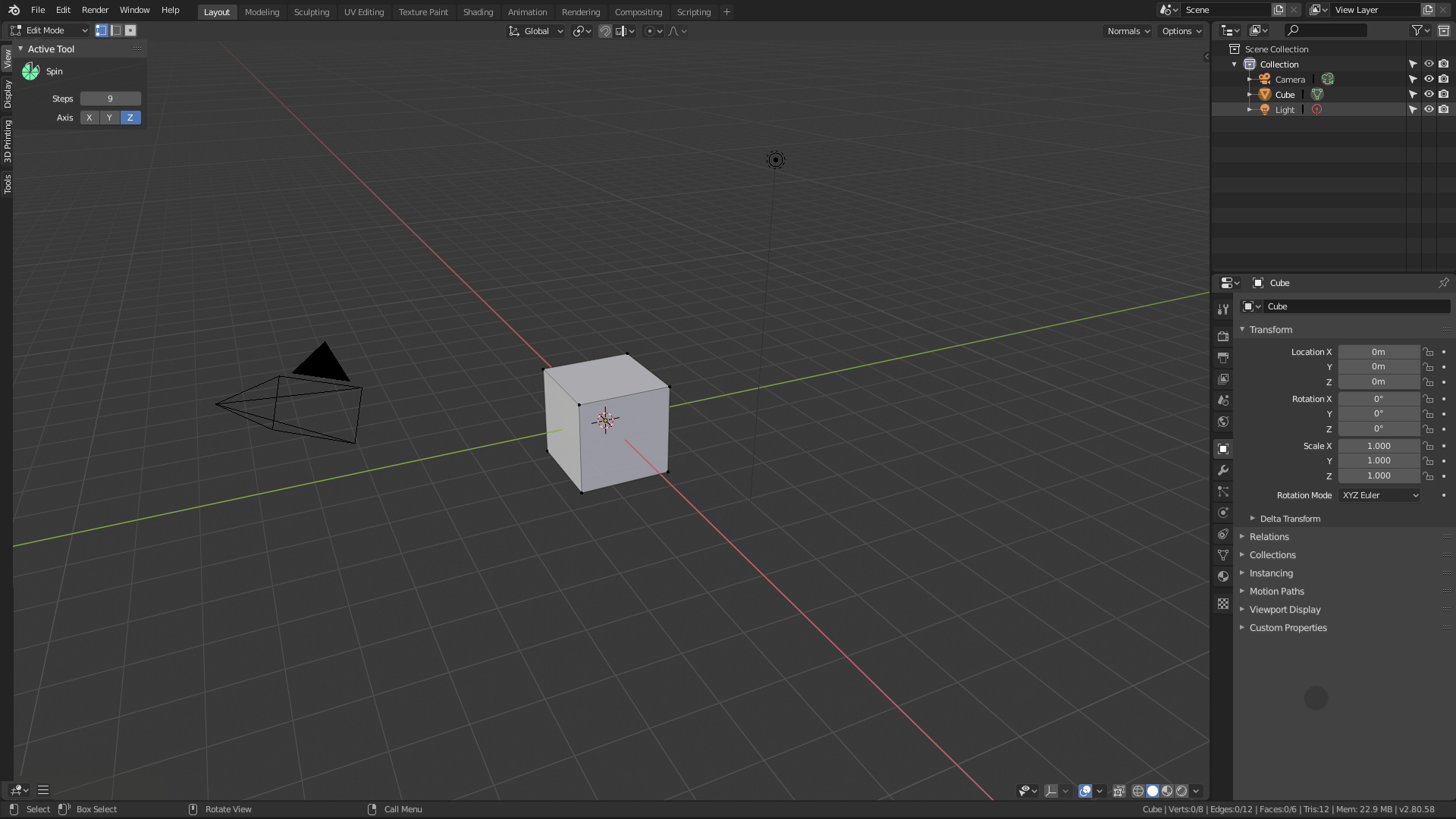
sincerely, I still without understand the “vertical space” that you lost here…
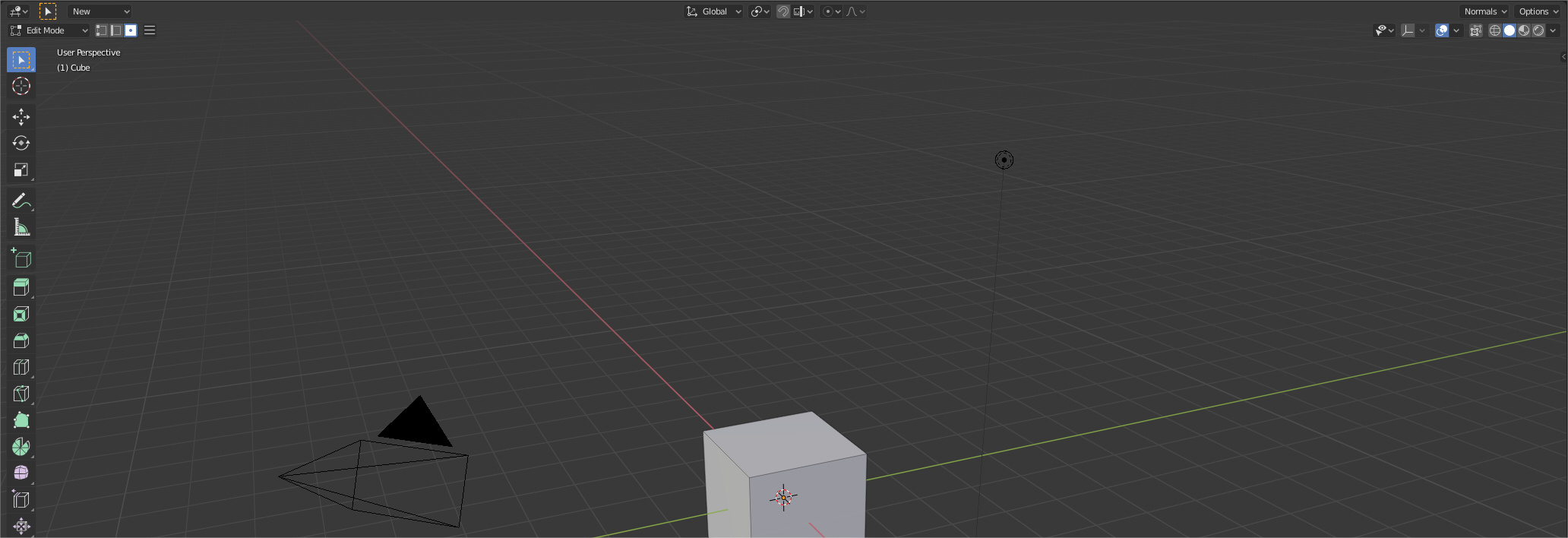
or here if you put the header bottom…

1 Like
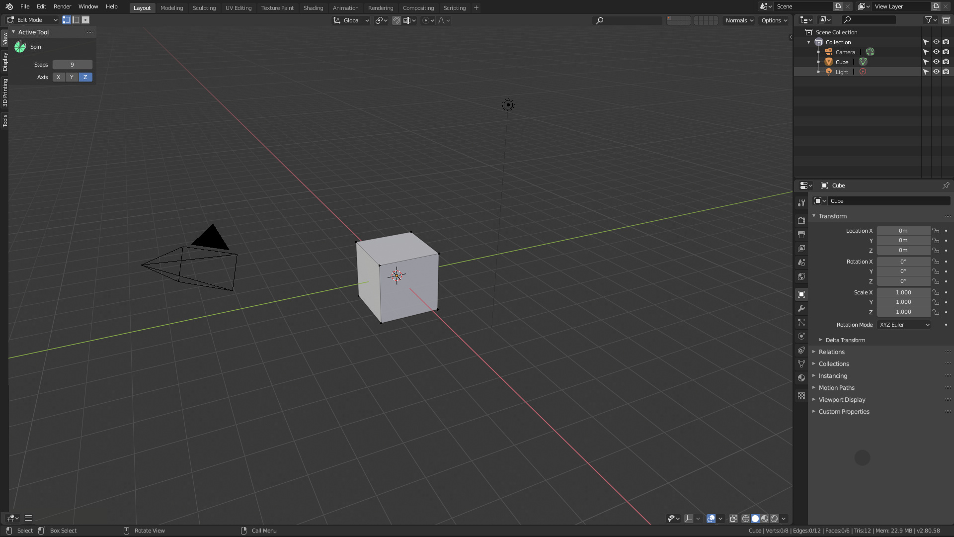
and once again, the Tool Settings can be completely blank
or there may not be enough space, even to display all popovers (not the settings themselves)
and when displaying some settings change the position of others it sucks
1 Like
why the daily builds for windows are still at 18 April, is there any problem?
I can’t do “tact checks”
it is evident that all that empty space needs polishing solutions in some cases …
I can do builds without problems
1 Like
Not like the old topbar, that was full of nothing…
This is a minor problem compared to the fact that with the topbar we cannot use two monitors or monitors beyond 22 inches. And even those panels can be improved.
The same thing happened at that bar before this change. And, again, those panels can be improved to reduce the problem.
And I repeat, minor problems are becoming when the previous topbar has dozens of much worse problems.
- Cannot be used on multiple monitors
- Could not work with custom layout comfortably
- Controls were far from any workspace
- Each area could not have its own coherently selected active tool.
- Much more space used
- Button soup
And that most of the complaints that you poenis now are complaints that already happened before…
1 Like
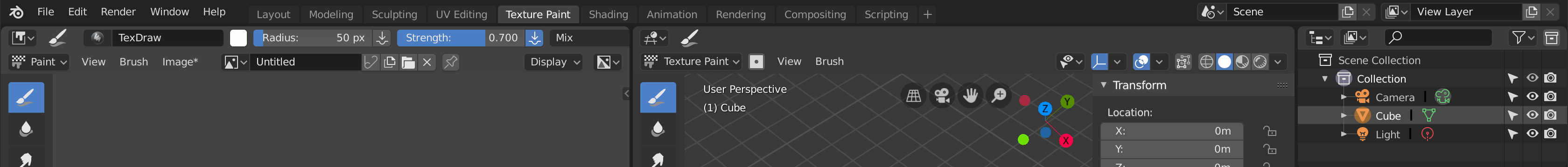
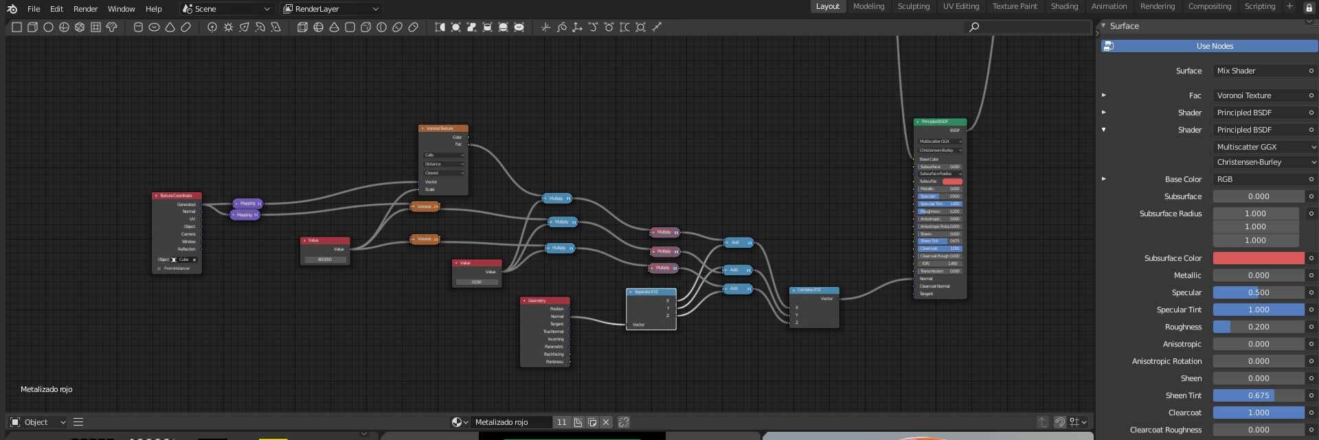
With a little polish in the paint workspace… all inside the toolbar in a screenshot with less of 1920px with all features. Only that user can`t change the name of the brush and the symmetry are inside options (could be change with a activable button)

2 Likes
Please, implement that. Otherwise one is obliged to always have visible the two bars, because those are fundamental elements in Edit mode very frequently used.
3 Likes
usually we don’t use active tools settings unless you want to apply them with a pre-set ones (which i think rarely anyone use this method )but the redo panel already provides that at least in edit-mode , so for example if you do a loop cut or a bevel u can change the settings afterwards, having snap/orientation/pivot/proportional-editing settings in topbar doesn’t make any sense, since now you’re forced to keep them both open which is inconvenient.
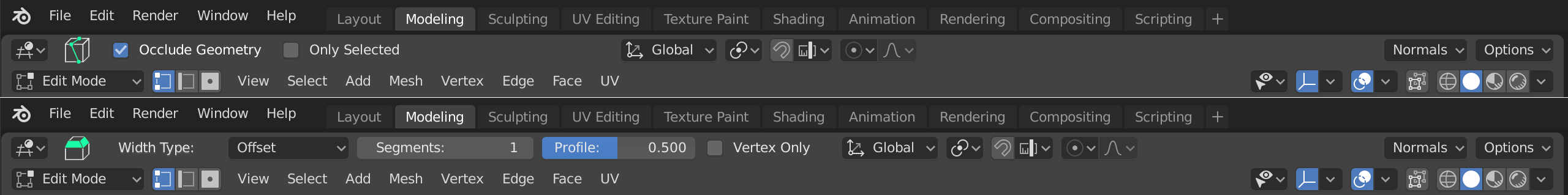
what clearly emerges in the top bar now, is that the tools, the sculpt sliders, the paints, etc., are too long, they could shorten by a few pixels to recover space, and allow good management even in space windows split into two
it seems they agree on the points we made…here is the task for the new changes that Campbell is testing…this is much more clear direction than before.
https://developer.blender.org/D4721
6 Likes
It pisses me off because I was take a lot of time trying and designing ideas until find a good and the bar was going to work perfectly moving two controls and implementing one more option. But since the active tool has been implemented in the N-shelf, which I also asked for, well… I like part of the solution.
Instead of implementing as in the proposal was asked for a toolbar, making whoever was more expert or used modal tools could hide the menu bar (Being only occupied the space of a single bar). Now it obliges users, experts or not, to have both bars whenever they want to use the toolbar. Both bars have tools, so both are now necessary, whether you want to or not. To be able to hide them or not, is useless now because the user is forced to use them.
We have lost the opportunity to
- Have a cleaner interface if we want it.
- Have a coherent interface for new users (a header for tools, a header for editor options)
- To be able to place each bar in a different place (what’s the point of placing one bar with tools on top and another with tools on the bottom? None, our brain will always want to have the tools collected in the same place)
- Solve the button Soup (screw users with small screens. Who cares?)
- To be able to implement in the toolbar new help and tools for users
- Leave space for an implementation of the buttons of the old 20 layers
- To be able to implement the search in a text field
A lot of the benefits of the proposal have disappeared… Not all, but a good part of it.
Now if a new user enters blender it is more difficult, because the topbar does not appear by default and only appears in certain workspaces.
PD: And I want to be clear that there were things I thought should be improved. And that I am happy to see the options of the active tool, such as the options of the active tool in the N-shelf, which I requested in another proposal months ago. But both were compatible. And they would have led us to such good interface solutions as this one.
or this
2 Likes
In order to evolve the discussion I want to link the proposal to add the active tools to the N-shelf. Where I asked for a few changes that could be solved now, especially
- Change the side where the N-shelf is placed (actually if you move the N-shelf to the left it’s placed at the right of the T-shelf, when it’s better in the left)
- Place the Active Tools in their own tab
1 Like
it seems you haven’t even read the whole task, the pros,cons and the Further Work also you are contradicting your own design here having tools and Tool settings in differents tabs in the"T" shelf…it’s easy to make mock-ups and proposals ,however until they get implemented and tested then you can see their benefits and flaws and that’s what’s happening here ,nothing is a stepping stone.
At first I did not understand part of the proposal, but I read it again. I have also compiled the patch to test it.
I don’t contradict myself, I have never been against it and I have always supported that the user has some “quick settings” at hand and all the options expanded in the N-shelf, I have said it hundreds of times. I’m not going to be a topbar defender, my designs have always been trying to unite the ideas of the developers with my proposals and with as little effort as possible. I have never reworked all the interface and tried to do everything from scratch without taking into account others. Even what is being done now is very similar to what I defended in June and practically the same as I defended in October 2018.
Even with all that I still think that although the two headers was an idea that was initially thought to solve the problem of global topbar during the conception of the idea came to light many improvements. Solutions to other problems and space to implement things that had been lost. And I have done it thinking of other users and the general good of Blender. I use modal controls only, my own keymap and my screen is 2560px, I don’t care about button soup. I don’t even think about using the active tools.
I don’t know what other users think. But to have the search box visually in the header, along with the return of controls for layer shortcuts and many other improvements… I find it great for new users and generally good for blender.
I also think that I could have had a header only for tools that was separated from the menus and settings of the viewer. And not only because of the 3D view, it was a very good option for the UV editor… and it works well also in the shader editor… fr example
2 Likes
There are too many addons, and putting them all in the N sidebar, or even if it’s the T sidebar, it’s a big caos.
what I would suggest, is to make a list of icons (arranged to be listened to with a slider) like the Active Tools, and use floating window for the addons that are called up when these icons are clicked, with peace of mind to everything.
…Something like Lightwave 3D
in any case the redo pannel already exists, and is in the process of being finalized …
If you see my proposal you will see that what I propose is to use icons in the tabs of the N-shelf, and to include some improvements in the behavior of the tabs. For example that the tabs are visible when you don’t have any selected.
Also it would be interesting, although I didn’t propose it so as not to dirty the main proposal, that you can select several tabs at the same time and mix the content of both (for example if you have several modeling plugins that you want to see at the same time).
I’m not against floating and pineed popups, as an option, but I think they are a very bad solution for new users and create a real chaos in the interface, complicating it too much. I would never use it by default.
Let’s not fool ourselves, that concept is the same as the typical dysfunctional interface that end up having 200 popups on screen. Like the desktops with widgets, which everyone has wanted to implement and which have been a failure in all the OS where they have tried to put it. In the end that is impossible to use and let’s not say already for new users who only get frustrated.
It is not the same to have 1 widgets punctually because we want to have it to finish in 3 clicks with this interface…
or this
These kinds of interfaces are things of the past that have never worked. They work for specific cases, a minority of users,… But they can’t be the way to work. In the end you waste more time with the interface than with your work.
One thing is for someone to say “I’m going to use the retopo plugin for a while, I’d like to be able to put it here temporarily” and another to force the user to work like that.
1 Like