I think that blender has worsened a little its functioning and philosophy since the inclusion of the topbar. To improve the functioning of the active tools, give much more flexibility to the program and also improve the multitasking I suggest that the Topbar becomes a new header that is in each area.
The idea would be to divide the current topbar into two parts, the current top part containing the menus and workspaces would not be almost affected. Just a small rearrangement of the elements not to fall into the problems of the current Topbar, making it more pleasing to the eye. The lower half of the Topbar would become a new header dependent on each editor (or on each editor that needs a Topbar). And it would contain different elements depending on the editor it is in.
This restructuring of the interface would allow a great flexibility for the users. You can place the topbar where they consider best. Place each header on one side, or both on the same, or invert it…
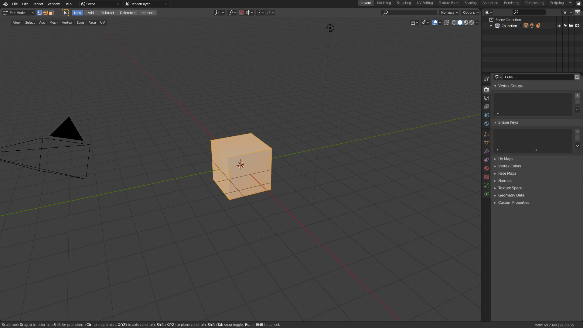
It would allow to use two different active tools in different areas and monitors without any problem. Currently in 2.8 can not work well with this because if we change active tool having two different editors the topbar is only able to show the last active tool activated. Making it difficult to understand the program and leading to errors.
It would allow you to put a search box in the topbar itself which is currently impossible because the search depends on the area where the user is acting. Facilitating the discovery of this tool for beginners.
It would allow to make a more specialized topbar in each editor where it is used And not just a repetition of the options of the active tool.
It would bring the Topbar closer to the user’s work area.
Unlike the current topbar that on wide monitors is very difficult to use. Also the user will have more space to configure the layout
It will allow to reduce the density of elements of the current header
that would be distributed in the new topbar. Focusing in the topbar all the options of edition, options of the active tools, mode of edition,… While the classic header would only contain menus and options of that area as for example the visualization of the viewport. Separating and nesting the interface better
would be ideal, and would solve the problem of many inconsistencies at the moment.
I believe that by now everyone is also well aware that the top bar, seen as a universal bar, is not as functional as it seemed on paper.
It is true that it has emerged, that in some cases, especially the functions of painting, sculpting etc, it is functional … therefore, I believe that it is only a matter for designers and devs to accept that the idea of the top bar universal in blender is not really functional and can be inserted into the space area, so as to restore blender’s original workflow philosophy.
I preffer to keep it simple. If devs attend our petition will be enough fo me… If we begin to make strange petitions or hard to imagine the benefits I think that devs never will consider the proposal.
The good thing of this proposal is that if you don’t need the old header (that it’s useless for pro users) you remove a lot of buttons from the editor.
Thanks for this. To me there is a lot about this proposal that makes sense - also the way in which you have added the mode switcher and selection modes. Also, the transform tool settings make sense in here, as you’ve done it.
Your proposal also results in a better balance between the amount of information we have in the top bar vs the 3d view header. Currently the header is overcrowded vs the top bar which is often more empty. This proposal makes the balance between them more equal.
I think this is something we should review more closely.
If you have time, it would be helpful if you can visualize how this will work in various editors and modes.
The original vision for the top bar, was that it would include the globally available operator settings (redo). But, this is now solved in a different way anyway.
The active tool settings differ based on the Editor type, and so this solution does fit better with the structure of the data and editors.
I was referring to all the brush options, both on the scullpt and on the Greace pencil and on the paint brushes in general.
in that case, the topbar is very useful (not universal)
It would be nice to be able to resize the editor-specific headers to, say, 2-3 rows if the user decided to (to reduce Button Soup™ while working in smaller resolutions (such as on a laptop).
==========
Another note…
To compound usability (and minimize complaints), having the ability to use a “custom shelf” in certain modes/editors (to stick commonly-used functions/menu-items/features/commands in) could be quite handy with this setup.
This “custom shelf” could be a supplemental slide-out toggle menu (like the “T” key menu pop-out) and a new shortcut just toggles [or cycles] between the different menus which “pops-out” on the side of the workspace (“T” key can call the default menu directly or cycle through, while another shortcut can call the other one(s)).
There could even toggle menus on the left and on the right too.
These would function almost identical to what Blender is already doing, but enhanced with the ability to use alternate custom-generated menus/shelves (or add extra functionality and discoverability with the press of a single key). Maybe one (say on the left) is a mode/editor-specific Blender menu, and the other (on the right) is the user-generated custom shelf (or shelves?)
I guess that the only main downside is that, for the paint modes, there may not always be enough space for all the popovers, but even so there’s always the Properties in this case.
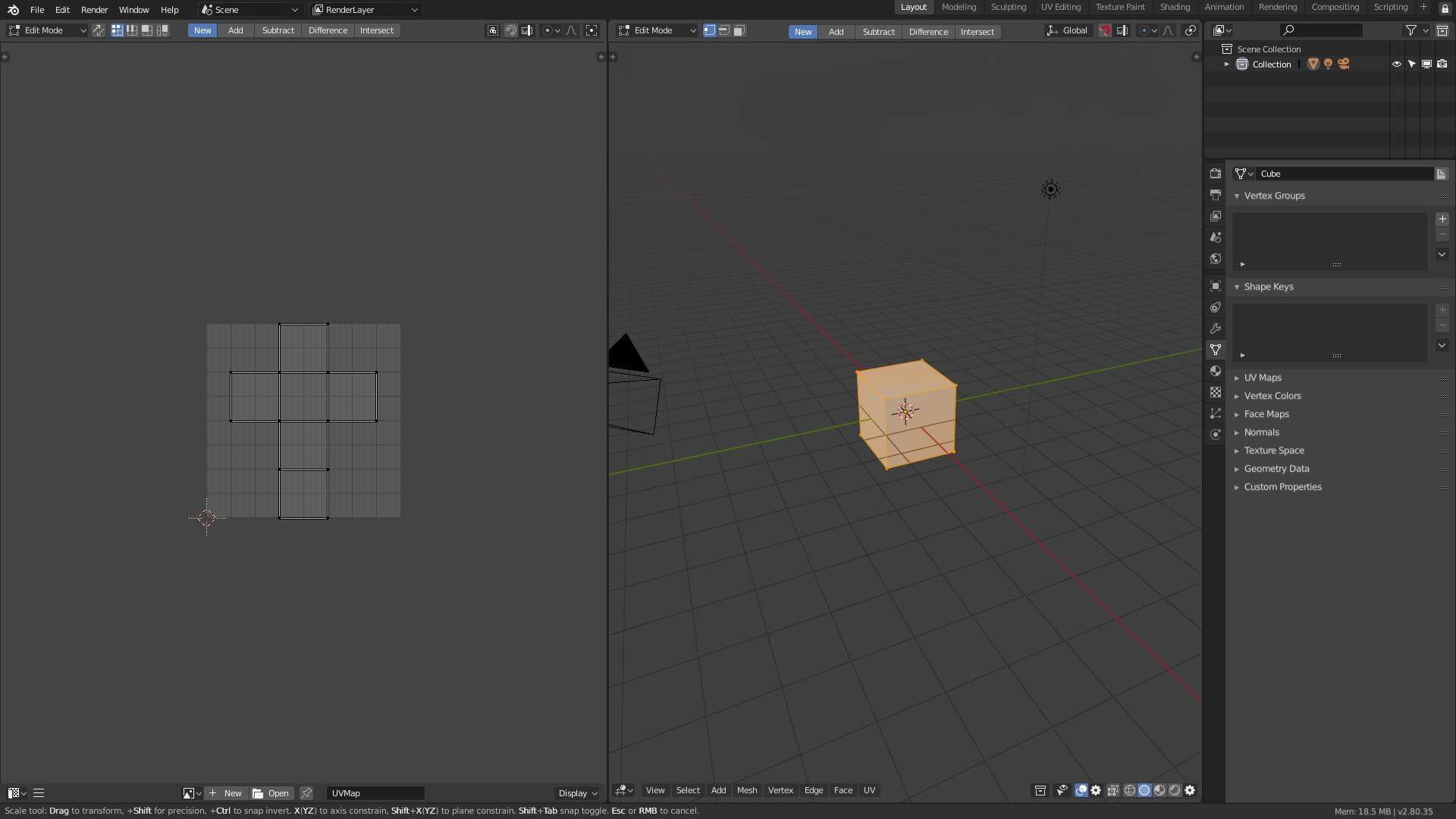
If you see in the message 6-7 I have put a example with Sculpt and all the popovers, added a searchbox and all it enter perfectly. And in that example is s 1080p monitor.
I do love the central premise of this, putting topBar info into the applicable editor, for all the reasons mentioned. I would just put it in a different place:
I would keep the header as the header, and put all the tool properties in a panel much like the last operator panel, on the left near the tools. Very similar to what you’ve mocked up there.
I don’t see them as being that different actually. We have the same two areas (one solid header and the other overlaying the editor) and the same buttons. We have just chosen to arrange the buttons differently between those locations. However yours does not seem to include the gizmos or info areas.
So with this you got 2 headers, one at the top and one at the bottom, or both together, on each editor?
Sorry man, but that’s a no go. This is a clusterfest.
Well, the difference is that in your proposal you only put in one site, not a header, the active tools properties. I Doesn’t allow flexibility. The solution still mixing editor properties and tools/edit mode properties.
And the button soup is worst, because except the active tools options the rest of topbar controls go to the header.
Yo show only what you want, one, two, two together, nothing,…
exactly like right now with same space used if you use the topbar.
honestly I prefer Alberto’s version, with menus outside, because they are the ones I will use most frequently
and give me the impression that they are more in touch with the 3d view