i would argue against that, they are not tool settings and putting them in the topbar will be useless especially if you want to hide it but still need those mode options… but hiding the header independently from the tool settings that i agree on.
2 Likes
Indeed, It’s a shame enough that the snapping and orientation settings got moved to the toolbar - since they’re applicable to almost every tool, especially modal ones, and having them in the topbar makes them get shoved around.
The more the editor topbar gets filled with buttons that were in the header, the more you mayaswell not have two bars, and just have renamed the header.
2 Likes
yep exactly, topbar should only be for Active,Transform…etc tools settings for each mode nothing more or less…it’s best to keep it consistent and not confuse users with irrelevant options.
1 Like
That’s a really good point I didn’t think about.
Before in a modal workflow you could completely ignore/close the topbar - now you can’t, you need it open.
3 Likes
(Note: i didn’t test it because build bot its not building for windows.)
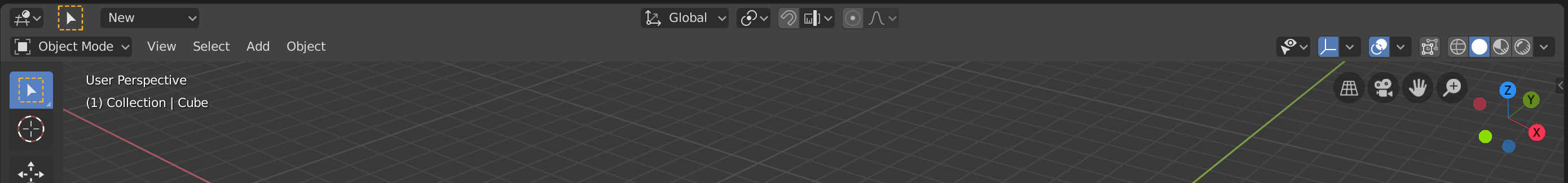
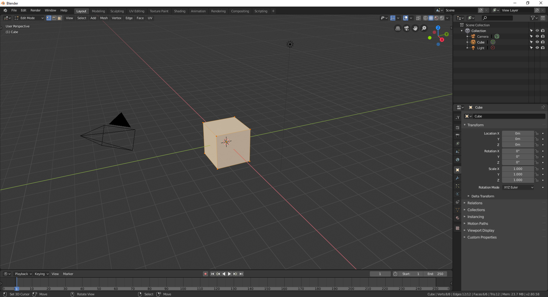
so now the top/header bar its been filled by viewport tools? what its happening with the active tools options? don’t tell me that now those are placed between the mode and shading options in the header
I don’t understand the complaints you’re making.
“Before you could hide the topbar”
Before the topbar did not show any information and only consumed space. Now the topbar contains the elements for modeling, snapping, proportional editing… all tool options in a tool-header, does not occupy so much space and does not waste space. It makes no sense to want to hide it. If somebody doesn’t want to use the active tools he only see a menu that says “New” that is simply impossible to bother anyone.
“65% of the header is empty”
This was one of the main complaints about 2.8, that the header was a soup of buttons impossible to use and difficult to use. This change solves a problem for hundreds of people who didn’t get the controls on their screens.
how does it looks when people its, for example drawing in grease pencil?
(again i cant test it, i dont build and build bot its not building, sorry)
Annotation
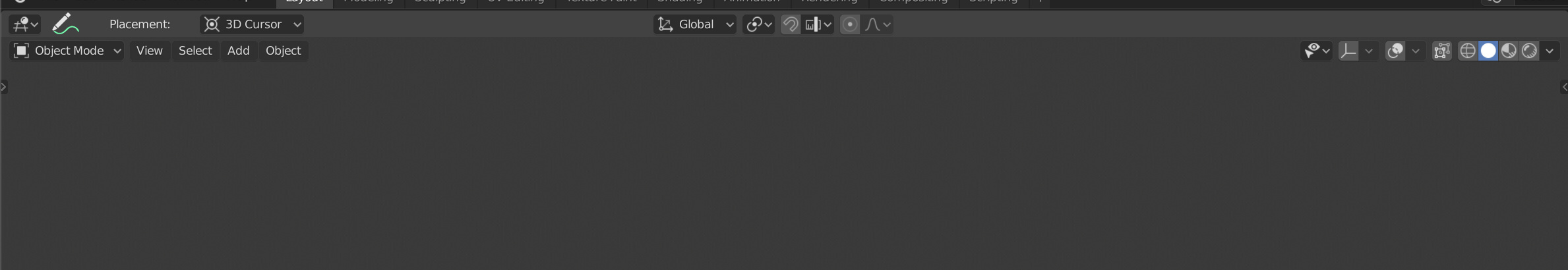
Grease Pencil
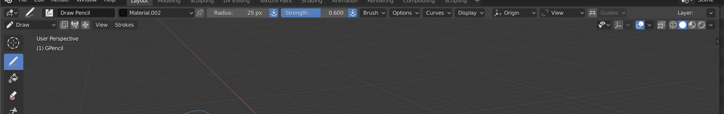
And these tool-header should have some polish work to reduce size a 30% easily
thanks, its… looks interesting, ill wait to buildbot to test it and properly form an opinion on this.

The typical modular working environment now requires the topbar be open in order to access snapping, orientation, pivot point etc. Meanwhile the entirety of that top bar is basically useless for anyone using modal tools. So the settings that apply to most modal tools have been moved into the space where active tools settings are defined, forcing the vertical space to be wasted even if you don’t use active tools. This is annoying especially when these settings fit just fine in the header before.
1 Like
That’s not true, myself and my colleagues only use modal tools and it works perfectly. Moreover, the design of this proposal is intended to improve the UX of users who only use modal tools and especially for the one who uses the modular interface.
No space is wasted because that header bar already consumed the same space previously. And the header that remains transparent has four controls to the left or right that can not waste any space. Header that if everything goes as the proposal will be optional like the tool-header
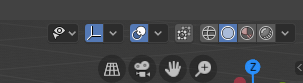
Here,
“toolbar” open
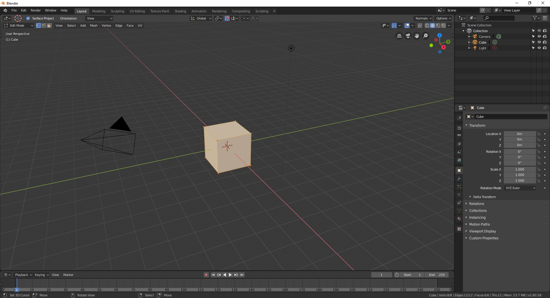
“toolbar” closed
The toolbar doesn’t have anything in it that you need to work with modal tools except the snapping, orientation, pivot point and proportional editing settings. Those fit perfectly fine in the header. the whole “toolbar” is wasting space.
Ideally, it should be hidden, and have a hotkey to pop up on the rare occasion you need one of the orphaned settings relegated to the Normals and Options menus in the top right, or need to adjust the 3d cursor behaviour.
1 Like
So, according to you, someone who is an expert in modal mode, the header he needs is to change shading and menus?
No, my point is that someone using modal tools does need the snapping etc menus, but not all the active tools options. The way it works currently, that means whilst someone using modal tools would normally want to have the active tool toolbar closed, they need it open. Those settings should just be moved back to the header.
1 Like
Like I told, if you don’t want active tools you only see the “new” menu. And I don’t think that’s an impediment that destroys anyone’s UX.
If you don’t want active tools, you have this big empty bar at the top, which now you can’t close because it has one small area with useful stuff on it.
1 Like
Something that a lot of people ask to avoid the famous button soup.
Quit it with the button soup. The header has been organised and neat for ages. Adding tons of blank space that’s useless is not a better way to organise the toolbars.
The header can easily fit those tool options, as it did before.
The only issue with readability at the moment is not that it could’nt fit these settings, currently it’s the removal of text on the menus over on the right recently.
Which I’ve gone over before, as to the ui language and hierarchical structures that have been broken by doing so, along with making the right side of the header hard to parse now.
5 Likes