Convert the Topbar in a new Editor Header - Proposal

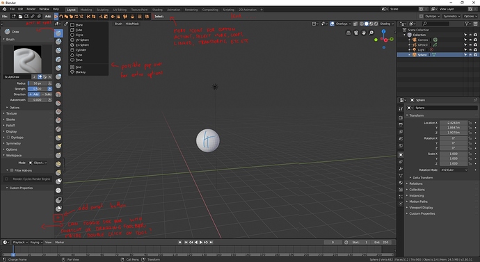
These popovers are horrible. They don’t fit in the interface, hide part of the 3D View, necessitate extra clicks and are undiscoverable.

On a related note:

  • Positions of cursor and vertices could easily live in the bottom bar, instead of the shortcuts help that doesn’t even follow custom changes made to the keymap.

  • Addons should be able to create pie menus, floating windows and custom editors, so people can just subdivide a part of their UI and add the custom window in it. It’s much more powerful than adding buttons to a slide out side bar.

  • UV and Node parameters should absolutely live in the property panel. There’s tabs just for that already.

I know you like your solution Alberto and you’ve dedicated a lot of work to it, but at the moment there’s too many problems with it. The top bar you propose has too many different types of settings in it, it’s not a metaphore for anything. It’s just the top bar of the 3D view and the top bar of blender merged into one. The top bar of the 3D view is there for a reason, it only affect the 3D view. Merging it to a different UI element makes no sense in terms of design, only aesthetics. I would argue the tools settings top bar we have at the moment makes more sense than it, and I think it has many problems.

I do like the physical search bar though, I think that should definitely exist.

The only thing that makes sense for a top bar in blender is to remove some of those menus and expose functions as easily accessible buttons, the way MS Word, OSX Finder, and virtually every other software in the world does.

Image

2 Likes

To be frank, A topbar full of buttons like that is a waste of space on functions that are, in the scope of things, rarely used.

What Might make sense is to put the favourites menu up there, but even then, most functions in the software are faster to access through their context menus, hotkeys, or the favourites menu itself, than they are through a button all the way in the header.

Though there is the plus either way that we don’t lose anything if we minimise it.


+1 for the [T]ool options panel

2 Likes

Only from the point of view of a long term user who has gotten used to all the other ways to access these functions. Things like pie menus, drop down menus and shortcuts, which are all hard to discover.

A top bar like this is huge for the discoverability of functions for newcomers. Of course customising it would also be great.

It is simple, intuitive, doesn’t have complex ramifications, and improves the software for the masses but also for tablet users, and people who don’t like to work with lots of shortcuts that you forget when you switch softwares often as most professionals do.

I think the tool settings in the top bar is only something that works in a software like photoshop because all tools do basically the same. They respond to pen pressure, and have relatively limited options.

In 3D the range of tools and actions is much more complex and based around “one time actions” like changing selection, making an extrusion, creating a face, adding a bevel, merging points, etc. Not based around pen pressure. So of course this works for grease pencil, but even there, it necessitates too many clicks to change brush or materials. You can even see all the available colours or brush settings so you end up having property panels open anyway.

1 Like

A lot of the proposed stuff that goes into those button-filled topbars is already in the headers though is the main thing.
There’s an Add menu right there, why inflate that out and spew it onto the topbar?

Because discoverability is terrible with text based menus with nested menus. Give someone who never used blender a copy and ask them to add an object. That should be intuitive and obvious but you’ll see them struggle before they understand they have to use the “add” menu. Add what? It’s not intuitive. I want a cube, there should be a cube button. That’s what most people expect.

And I’m not even talking about all the cool selection options like loop etc, which you have to know exist before you can find them.

2 Likes

You have to be pretty uninvested to not bother looking at the menus up in the header when you want to do something - so many functions are there, and that’s even a convention following on from other programs. Add is basically the ‘Insert’ menu.

The add menu is the most clear thing possible, you open it up and you get a list, mesh, curve, surface etc. Hmmm… “add”, “mesh”, what could that possibly be?

How does anyone ever learn any software if they don’t go into menus, or don’t even hover over the buttons for tooltips? This is how people learn software.

By the way, those selection tools, like loop select, are in the same place as in other software, under the selection tool. Granted the arrow could be a little clearer to give a better hint. Top bar icons are the worst place for functions, there’s no context to help guide the icon recognition and concepts, you rely entirely on the icon itself, but the icons are drowned out by a sea of other similar icons all in a row. That’s worse than a menu that says exactly what it does, “Add”.

1 Like

Again, don’t take it from me, put someone who’s not used to blender in front of it and watch them.

You said it, "so many functions are there’. It’s complicated to know them all and hard to find the ones you need.

Icons are easier to test than menus that close everytime you select an action. You first have to open the menu, read the content, navigate the submenus to where you want to go.

Of course eventually people learn the shortcuts and use that, but I’m still thinking of people who use many other softwares than blender and also tablet users.

It’s not complicated, google “3D Software UI” and see basically every software has such a bar.

1 Like

The first thing I would never do is put someone new to 3d in front of a 3d software package and expect them to be able to do literally anything without any help.

If you’ve used a 3d package before though, great, you should be searching the menus for functions and operators you understand the name of. Icons don’t translate between software.

It’s really not hard to find them, they’re all labelled in plain text and quite organised.

You don’t have to click every button to know what it does.
People read the tooltips, which is just as easy in a menu.

Menus work just fine with a tablet, using one makes them no harder. And even if it did, these are infrequent operations. How many cubes do you add, compared to literally everything else you do?

Other software is full of stupid ui conventions.

Why not? That’s how most people learn software. Download it and open it.

I think this approach has value. I’ve explained it enough, you’re free to disagree.

Only thing I want to add is, just like the menus, the top bar icons could be “mode” specific, or even workspace specific. So maybe if you don’t add that many cubes, other more frequent options will also be there.

Also:

Sometimes reinventing the wheel isn’t the best option either.

1 Like

That’s how most people learn simple apps, word processors, paint, a browser.

3d software is an incredibly complex set of tools and systems. If you’re not opening that package with the idea that it’s going to take some effort, some time, some research, or at the very least, hovering over some tooltips to learn how to use - you’re lying to yourself.

A 3d software that is that easy to learn, would be like paint, in comparison to photoshop. A veritable toy.

Those functions are all probably in those menus as well, preventing icon bloat over the entire screen. The menus also have the benefit of displaying the shortcut, showing other related functions, and having that plain-text descriptor.

I think you’re really going to struggle to find anything to put in those buttons that doesn’t already have a better, more organised place somewhere in either a header, the header menu, or the toolbar on the left.

Which is why some of the conventions have stuck, we haven’t found a better way yet, so as an example we have…
Menus in the left of the header!.

for your enjoyment

Edit: I want to make clear, I’m not saying we should get rid of the menus. They’re a good place to find rarely used actions. I’m saying they could be well complemented by a bar with common shortcut icons.

Also, it’s not simply about mastery, but also ease of access like I said before, for tablet users and people who don’t have all the shortcuts down.

1 Like

Sure,
But the menus are organised, clear, are not hard to access.
Icons are often ambiguous, messy, and take up a bunch of space.

And we’re talking about operations that aren’t frequent, rather they’re broad and random.

I think we both have preconceptions for each of these paradigms. Menus can be made simpler, icons can be well designed and organised. I’ve made my case.

Well, I think some of you didn’t understand the proposal.

The objective of the proposal is not to redesign the functionality of the topbar, it is not to improve the experience of a particular type of user, … the objective of the proposal is simply to solve the problems that currently has the topbar, workflow problems, which breaks the philosophy of the UI, that the topbar can work fully with several monitors, with several tools in several different editors, … and incidentally take advantage and put the search that is something that has been lost or hidden.

The aim of this proposal is not to redesign the topbar, make a ribbon,… it is nothing of that because the topbar is useless for anything of that. All that kind of functions would make them bad for many different reasons. To lose all the topbar only to add a few shortcuts to add meshes when not even these are the main thing that a user does and is only 5% of what it does is to waste the topbar.

My proposal only goes in the direction of taking the concept of topbar, not modify it, and simply solve problems.

Of course, someone has the idea of making an “editable topbar” and it’s really cool. But is that possible? One of the main problems is that the developers were not clear about whether this would be feasible easily, Campbell seemed to have many doubts at the time in BA about this.

Then, we forgot that blender works BY EDITORS. How do you solve the problem? We do that the topbar does not show more than elements of the 3D viewer? we do that it goes changing the shorcuts depending on where it has the mouse above? that only changes if we change of workspace? And as we do with the people who works with several monitors or that edits their own layouts?

And we return to the topic of the menus type ribbon. Why do we want the ribbon if we had the T-shelf? Basically the old T-shelf is a ribbon or a lot of shortcuts but vertically, which also work within the editor itself, thus solving all the problems mentioned above. If you want to do something like that simply put shortcuts to the N-shelf and use it as in the other proposal I have in the forum.

And all these ideas make it necessary to develop new solutions for active tools. So we’re not really improving the topbar, we’re just adding more and more features that need to be implemented from scratch. And a change that can be relatively simple can be exaggeratedly complicated.

But basically what I want to remember is that it is not a proposal to change the design, the concept of the topbar, its functionality, … is to solve the problems it has.

1 Like

You… Really haven’t made any case, you just keep ignoring, and not addressing, flaws in the topbar-filled-with-icons versus where those functions currently reside.

You’re going to come up against that though, because without changing the topbar, it’s still got problems and flaws.
Your proposal mixes tool options with the editor mode and other non-tool options (snapping, pivot, etc).
The horizontal nature of the topbar supports so few settings, and limited visualisation space, as far as brushes go.
It’s still taking up space for something where users probably only need to pop it open once in a while to change a setting.

The only solution I still see is putting the damn thing on the left as a sidebar or panel, right next to the tool whose options it houses, and letting people open and close it with a hotkey.

Well, although pivot mode, snapping and so on are not part of the tool are properties that the tool uses to work. They are closely linked to the point that almost all tools need these properties to work fully.

ok… Maybe you haven’t been reading.

  1. it’s not icon toolbar versus menus, it’s toolbar and also menus. Saying menus are good won’t prove icons would not be.

  2. I’ve said why menus are not optimal in this case: poor discoverability, more clicks, hard to parse. Essentially, useful for that thing you don’t have a shortcut for, and learning the shortcuts for the other actions.

  3. I’ve said why icons would be good: ease of discoverability, ease of access for tablets, users expect them and know how to use them, increases the welcome factor of the software and lets people who use lots of softwares switch easier. Why do you think BForArtists went in that direction?

  4. I’ve said why the current bar doesn’t work: too many inconsistencies between tools, not enough space or too much, drop down menus are more clicks and not practical to see available options, also would be better replaced by a proper T shelf like in the screenshot I posted

  5. I’ve said this pattern is often found in other UIs and even linked to a talk about UI that describes perfectly my thoughts on the subject.

I don’t know what you want from me? Maybe let other people express their own opinion about this idea?

1 Like

The idea is that the topbar changes depending on the current editor and edit mode, as would the menus. You get add mesh in object mode, but not in edit mode or sculpt mode. I don’t see a problem with that. Adding a “customise” option would also allow several selections of actions depending on the workspace. This is a great tool for customisation.

1
And I said the menus make the icon toolbar redundant because the menus accomplish the same thing in a more organised fashion, and taking up less space.

2
I stated menus have fantastic discover-ability, they’re standard in every software, and their text and organisation is second-to-none at quickly describing what the functions do. I also said the functions suggested for the icon-topbar are used infrequently, making the extra 1 click a non-issue.

3
Again, I’ve explained why menus (the place where the buttons you want to put on the top bar reside) are already great for discover-ability, and I also explained they’re perfectly easy to use with a tablet. Blenders menus even incorporate click-drag-release functionality for those using pens, leaving no benefit to putting buttons up there.

This ‘welcome factor’ is completely subjective, and pointless because the software and concepts are too complex to hold someone’s hand through everything, unless we want to bog it down with crap.

I also explained that abstract icons are worse for discoverability and recognition than text. A row of strange icons is more daunting than clear, concise text.

And you’ve just blown all of it off and ignored it.

4
This is true, but it’s no reason to shove a ton of buttons up in the header.

5
I got partway through that talk before I tried to pause it and reset, and there’s no way to scrub. Regardless it’s a Microsoft talk so is essentially worthless. Just because someone else does something (in a much simpler piece of software), doesn’t mean there’s a good reason to do it, and Microsoft are the kings at doing stupid things for no reason.

  1. it’s not doing the same thing. One is good for listing existing actions, the other is good to be able to use them quickly and often.

  2. Menus are discoverable, but where the actions are inside them is not, and you’d have to know they exist before being able to look for them. The actions suggested for the bar were only examples. I’m not pretending I can design this whole thing in a couple of posts, it is merely a proposal for an idea.

  3. it’s not easy to use a menu on a tablet. The click areas are tiny and the motions complex. Again, it’s not one or the other, if you prefer menus, they would still be there. I’m talking about adding functionality, not removing. Maybe the welcome factor is subjective, but again, don’t take my word for it. Just because the software is complex doesn’t mean we shouldn’t try to make it accessible, especially since blender is trying to get more users and the whole redesign was done exactly for that reason.

You’ve said icons are worse and I disagree. Icons can be bad or good. It’s a meaningless statement. If the visual language is effective, then it greatly improves it. Are you also advocating for the property panel to only have written tab headers? What about all the other icons around the interface, should they be replaced with text too?

  1. Please remain respecful.
1 Like