You don’t want to understand that the world doesn’t revolve around who doesn’t use a mouse and a tablet for a 3D suite and use a cintiq. And he wants everything next to his hand in the property editor because his arm gets tired.
The N-panel is where you put all the properties of a particular editor in a program with so many different ramifications and uses. Because you couldn’t put everything in inifnitos panels in the properties editor.
Should the property editor contain the position of the vertices? No
Does the property editor have to contain the position of the 3D cursor? No
Should the properties editor contain the texture properties? No
Should the property editor contain the addons? No
Should the property editor contain the Uvs parameters? No
Should the properties editor contain the node parameters? No
…
And I could go on like this for hours.
The N-shelf allows the program to have a good structure and interface hierarchy. This has been lost in Blender2.8 to the point that today there are dozens of options to which we simply have no access. You’ll be happy because you don’t care what’s not in the properties editor.
Many other users want to continue being able to work on SEVERAL monitors. And not having to depend on placing 4 property editors in the workspace, to be able to work with a full screen editor. Or for one of the dozens of ways of working that there are in blender and that are not “put everything next to my hand because the only one that matters in this world is me”.
I can say that about you, who supports changing the workflow of thousands of users just for pure selfishness. That at no time do you plan to support an interface that satisfies everyone, just you, and you say proudly that you want that what others use disappears even if it do not do any harm to you
Only because you want to have everything next to your right hand.
Don’t worry, don’t worry, the UI team has a very non-standard way of doing things, I’m pretty sure you’ll love the changes they might do in the future.
I’m all about intuitive workflows, which is against Blender’s rules apparently. So again, don’t worry, nothing will happen.
check your bloodpressure m8, too much salt could lead to hypertension.
for 2.8 the devs really worked a lot for an intuitive and cool UI not cool to say that
This – in isolation – is not Button Soup™, but that’s because *Button Soup™ primarily arises when a group of elements are placed near a group of other elements in a way that doesn’t maintain (at-a-glance) the visual clarity of the original groupings when the groupings are placed nearby to one another.
Maybe not what you’re talking about – it has everything to do with why I proposed my solution to the Button Soup™ (amongst other things in the general Blender interface, and also address the problems with your topbar proposal).
This is not the only solution to this problem. Again, this particular “hybrid” solution to the holistic problem of needing both “quick AND/OR permanent” access to tool options is why I proposed my “pop-out” menus in conjunction with the accordion menus shown here:
This fits well with Pablo’s suggestion/idea to move tools to the “N” menu.
With accordion menus that operate this way, there would be no issue with varying menu-sizes or visual problems with visual groupings.
As long as the editor menus remember your last accordion settings, you can individually set each tool up however you like, and have them always appear the way you need them – without the visual noise of certain complex tools.
@billrey – What think you on this style of “pop-out” menu for the tool properties? – Can it be done?
Addons could become quite robust with these hybrid accordian + pop-out menus that can be tucked away.
Ultimately, my basic point is this:
The nature of the problem is holistic – it cannot be solved by changing just one thing at a time.
By focusing on eliminating Button Soup™, this problem can be approached holistically.
Otherwise, trying to “fix” a holistic problem by changing each aspect in isolation is like shooting at a target that moves in arbitrary ways the moment after you’ve already aimed your gun.
The only way to hit a target like that is to aim where it will be – not where it is already at.
The main issue with your proposal is that it doesn’t show tools that have complex settings/gizmos. It also doesn’t include other elements in the viewport like the 3d gizmo or viewport text (which are all very important to determine, holistically, how to reduce visual-clutter and, ultimately, eliminate Button Soup™).
All tools should have a set of “primary” and “secondary” options:
For complex tools (that couldn’t be easily displayed in a flat toolbar) “secondary” options should display in a toggle-able version of the “N” menu (e.g. for sculpt tools), while “primary” options display in the topbar menu as suggested. You’d hit the “N” key twice to hide the menu (once to toggle it).
For screens like the UV editor, I still think having two “topbars” is seriously a redundant waste of space in some ways (i.e. why have “Edit Mode” dropdown displayed twice?? – this should be a “global” setting and thus should appear at the topmost or bottom-most part of the screen).
No. I’m saying that just to end this non-sensical conversation. Your arguments are pointless, clearly all you want is 2.7 back. So no point continuing.
I see no reason to be saying holistic so many times, it’s a nice word, but nothing more. I have created the thread about this in particular because my approach has been to divide my proposal into different themes rather than into a global proposal. But it also solves the problem without rethinking the interface.
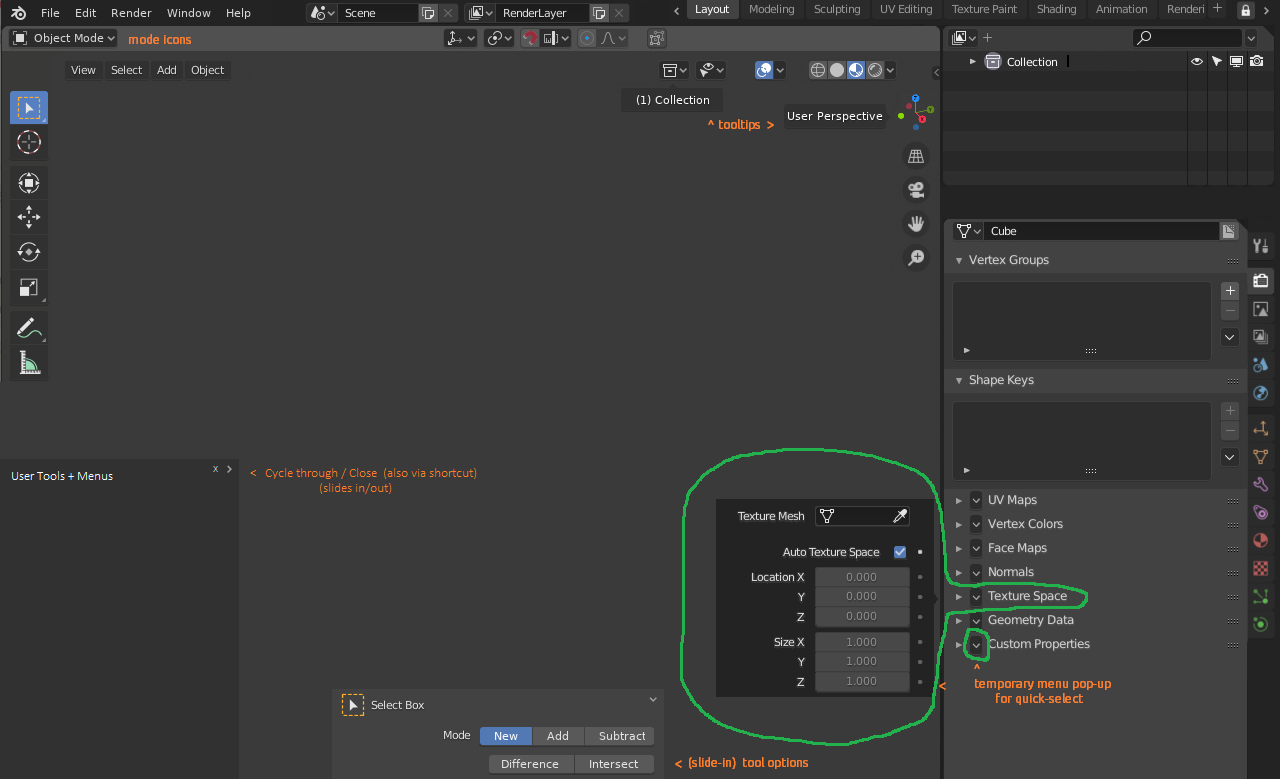
And I’ve already said several times, even have an open topic about it, that Blender should put the tool options in the N panel. You can even see multiple mockups here.
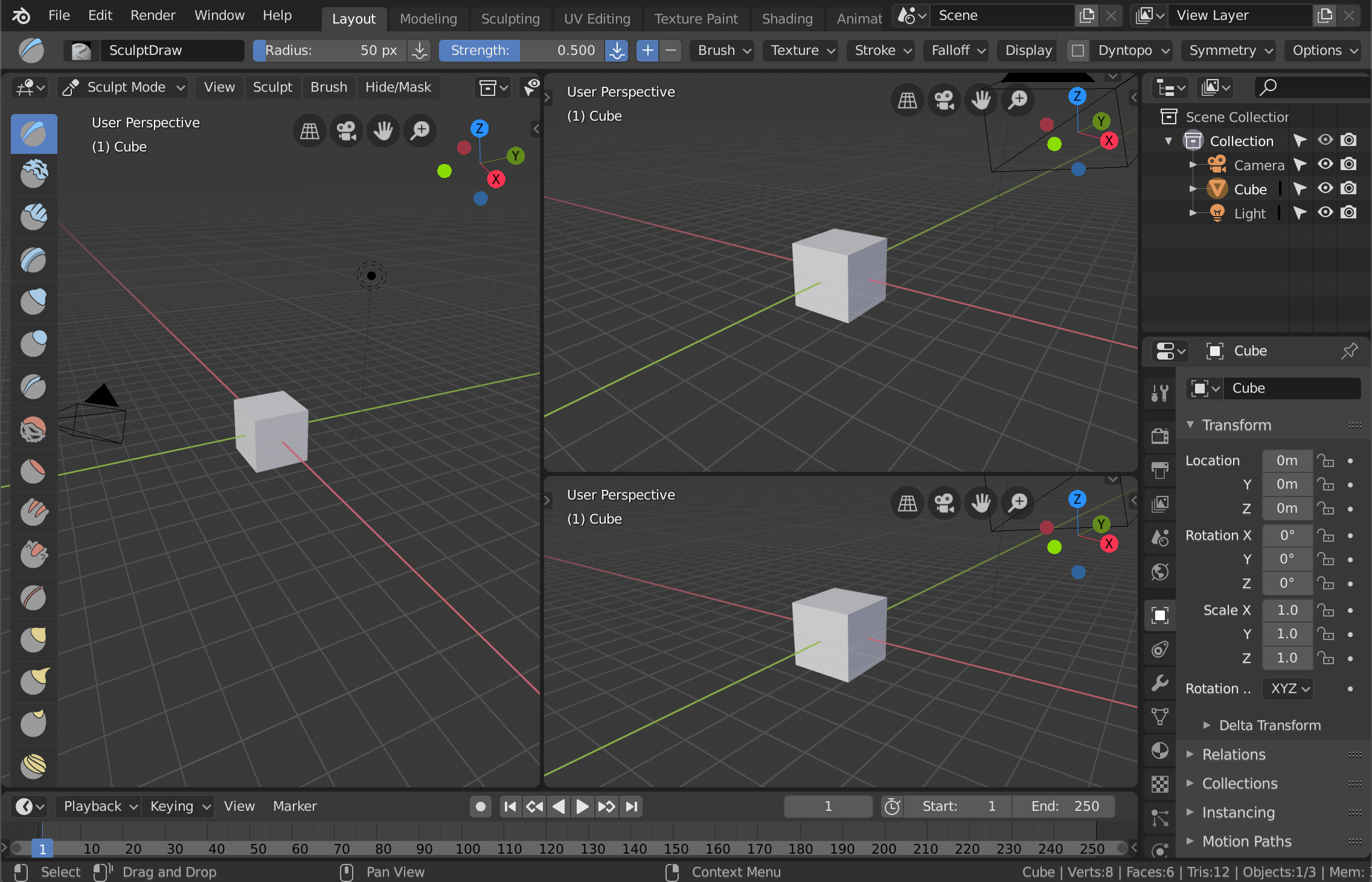
While I do quite like this idea overall, and it has a number of advantages, there are some pitfalls/issues too. For example, if you have many viewports, the top bar would be inside each editor, and there wouldn’t be enough space in an instance like this:
In most apps, things like the toolbar would be a separate area, not a region inside the viewport. But that is a slightly tricky subject in Blender, because of how the context works.
In general, your proposal somewhat assumes you are using one ‘main’ viewport, where you would see your toolbar and tool settings. I think that’s fine overall, given that this is how things like the header and toolbar already work.
It works well in 1080p split in half, at least in my tests. With future active tools I can’t tell if it will work. Even better than the current layout that already gives problems in two vertical areas in a screen of 2560x1440
Yes, and your proposal also helps in this regard, because you moved the transform tool settings (orientation, pivot, snap, proportional editing) inside the Editor-topbar, which frees up space in the header.
I emphasize the word “holistic” because I want to you (and any others) who think the word has no meaning to begin considering its value in the context of a usable UI.
It is a word – but one whose meaning inherently explains why your proposal cannot alone “solve the problem”:
holistic (adj.) – “characterized by comprehension of the parts of something as intimately interconnected and explicable only by reference to the whole.”
You are trying to hit a moving target without referencing the physics or the intentionbehind said motion – as such, its movement seems (and will always appear) arbitrary to you.
You do not give the inherent interconnectedness of the UI (as an interdependent whole) the weight of consideration it deserves, and therefore miss many very important points of consideration.
And while individual buttons and toolbars aren’t inter-dependent “systems” per se – an entire user-interface (as a whole) IS, and must be treated (and designed) with the whole in mind (as was my example).
Couldn’t mouseover determine the context? – Or could we simply “hard-select” our desired context per-viewport (by clicking a checkbox inside of one)?
We could label any viewport as our “main” viewport, and the toolbar (say sculpt-brushes) will show/hide from this viewport only.
We can also select a “secondary” viewport (which could be the same viewport we labeled as “main”) to handle extended tool properties in something that functions similarly to the “N” menu (but using another {not N} hotkey to toggle between the two menus, with N showing/hiding the most recently-displayed menu.)
@Alberto I see now your proposal. I …“almost” read all the thread: for what I understand the top/toolbar, in your proposal will be back in the views?
I do fully support it: all the reason you pointed at are correct and rational.
Fully self-contained views are (…are… were?) one of Blender UI key-point feature: no going around with mouse to reach your target.
Looks great, right now I’ve got a pretty ugly custom toolbar in the topbar instead of the active tool settings. It is basically for the stuff that isn’t importatnt enough for quick favorites, to keep the QF more tidy and efficient. With your proposal I think I could have both a nicer looking UI and an interaction-mode-sensitive custom toolbar in the header.
I dunno maybe I can do that already with the topbar? I don’t know enough about scripting to really know how to say what viewport to check and then change the topbar’s custom toolbar to a different set.
I had tried to put stuff that is in the 3d viewport header up in the topbar, so that I can put a different custom toolbar in the header for each interaction mode. All that scripting for detecting what interaction mode I’m in, and changing the header, has been done for me. Putting a bunch of tool buttons in their place is pretty easy, even for me. But putting the 3d viewport header stuff in the topbar has interesting results, and it doesn’t do anything that I actually want.
The good thing about this proposal is that something that does not just work, the topbar, suddenly begins to work almost perfectly in all editors, users and workflows. It works not only in 3D view, it works in UVs, it works in the node editor,… It even helps to solve the problem of button soup, hierarchizes the interface, allows working on several monitors, multitasking, …
And nothing of what this proposal says prevents that in a future better solutions are made in other aspect of the UX, simply improves what there is.