The main problem with that is that active tools have complex menus that don’t work in a viewport BG
Do you mind explaining what you mean by this a bit better? The active tools elements are of the same complexity as all the other UI elements everywhere else. And your third image there shows the header using region overlap with full transparency and the elements shown are visible on the background just fine.
in my opinion is not good that menu’s overlap other tools button, that’s why I’d rather they stay outside
You could have it open and close when you hide and unhide the toolbar, remembering if it was open when the toolbar was last hidden.
1 Like
man if you consider the current situation, it is already more or less like this … between top bar and headther space …
essentially alberto proposes to insert the top bar in the 3d view and every other window (with the necessary local tools)
1 Like
If it’s optional and things can stay as it is now, then there’s no argument against it.
But for things to remain as it is now you’ll have to add an “Auto” option there in the editors selector, so the topbar remains dynamic as it is now.
But there’s only one topbar, the mess is minimum.
I’m against topbars for tool settings, I always said that this is the worst part of blender 2.8. The properties editor is the only good place for it.
I can’t support the spreading of millions of topbars/tool settings, this is a mess imo. But if it’s optional, I don’t mind ofc.
2 Likes
obviously the windows that do not need a top bar what is the use of creating one? it probably makes no sense for it to exist
said this you don’t consider the people who work in full screen, and in any case they won’t give up the topbar, so you need a compromise, which makes it functional to the philosophy of blender, so what Alberto proposes is the most reasonable proposal
and then it solves two problems in my opinion, that of the too low space for the buttons soup, and that of having a largely uneven top bar.
Just to add another (unpopular) spin on my (already unpopular) idea. LOL…
With the TopBar tool settings as an overlay over the editor as I showed in my mockup, I’d probably even fade them out to nothing after a while too. So you click a new tool and you see the settings in the top-left of the editor. But they completely disappear 10 seconds after interacting with them. Want them back? just hover over or click the tool again.
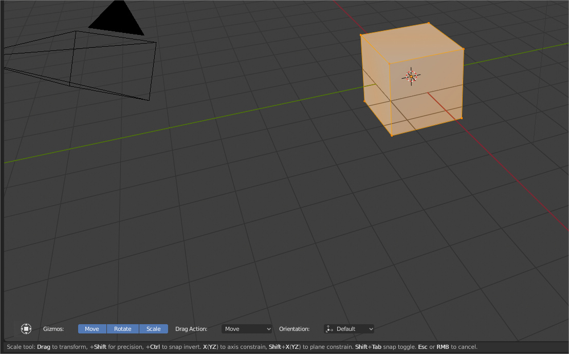
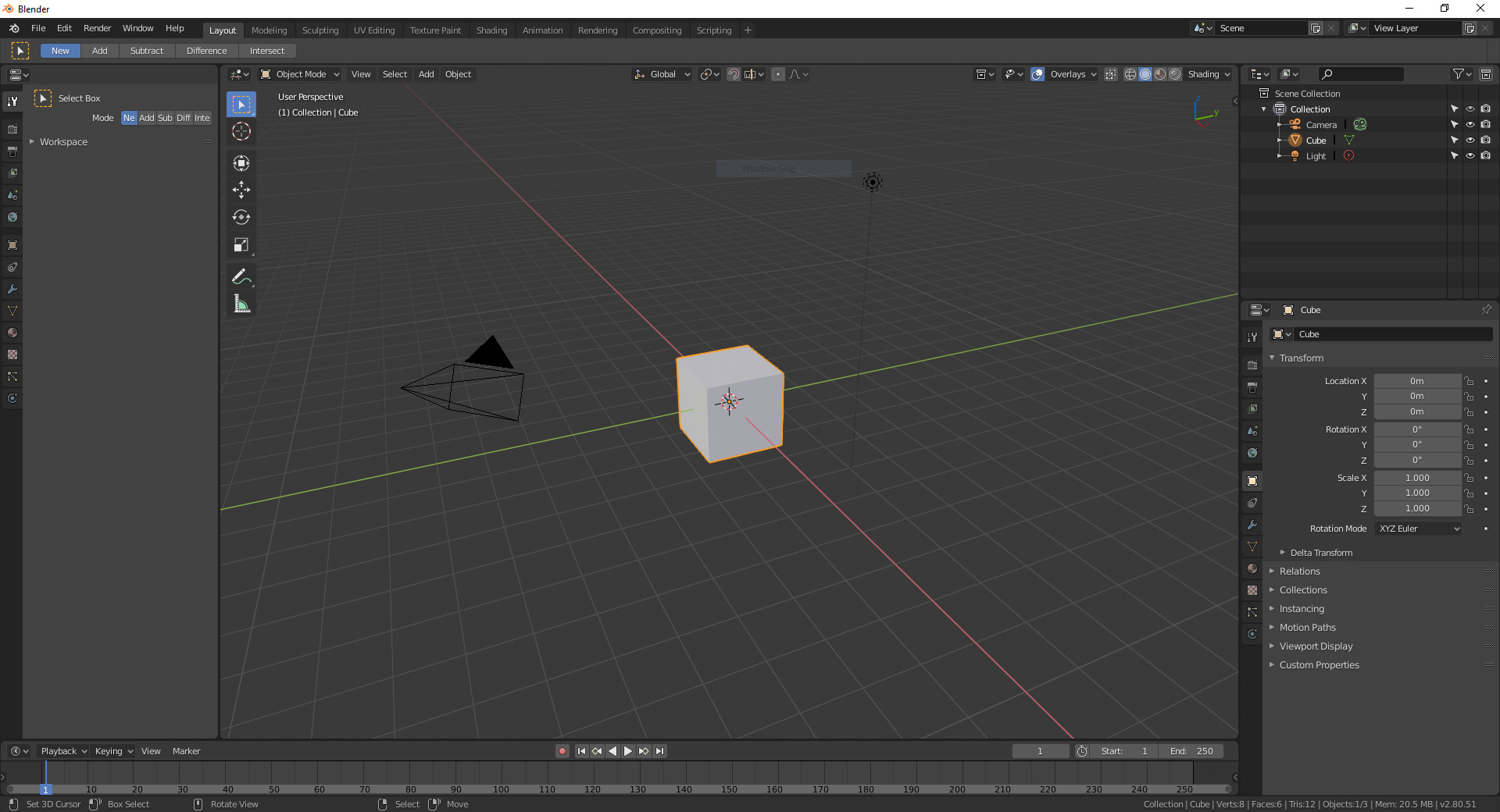
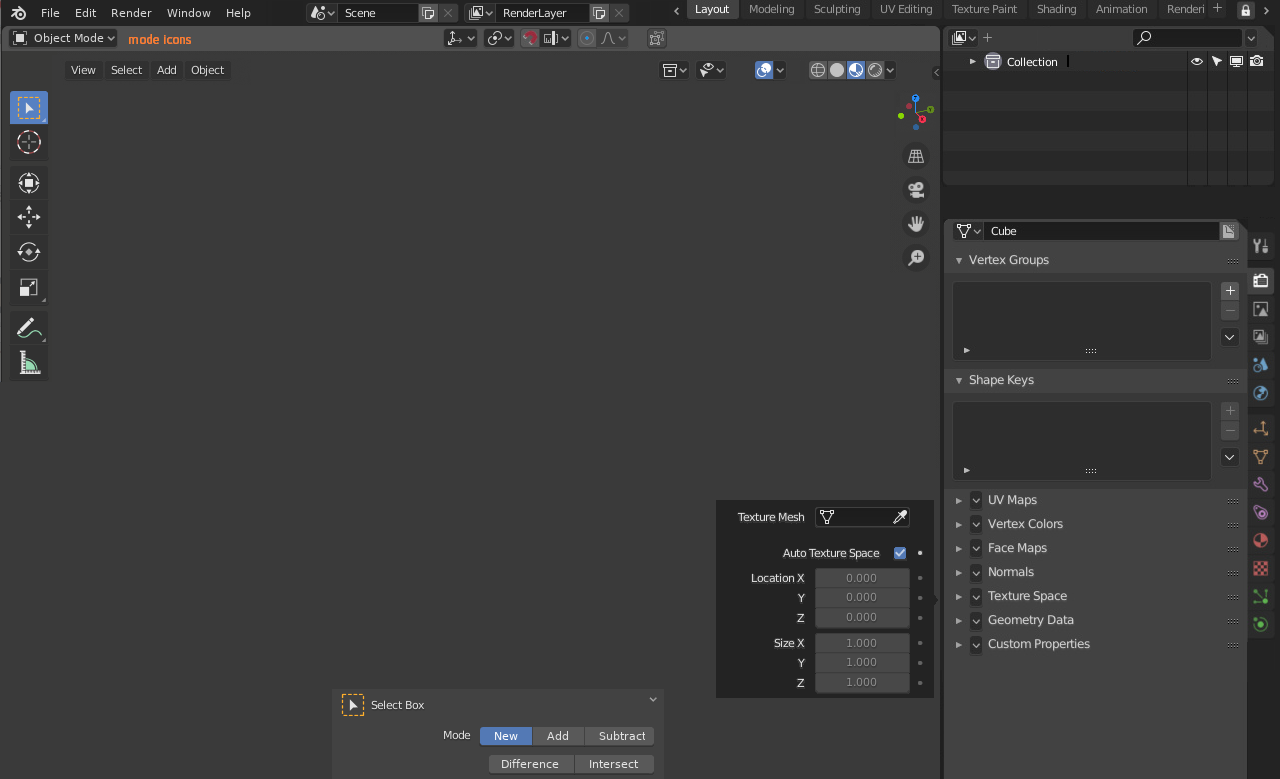
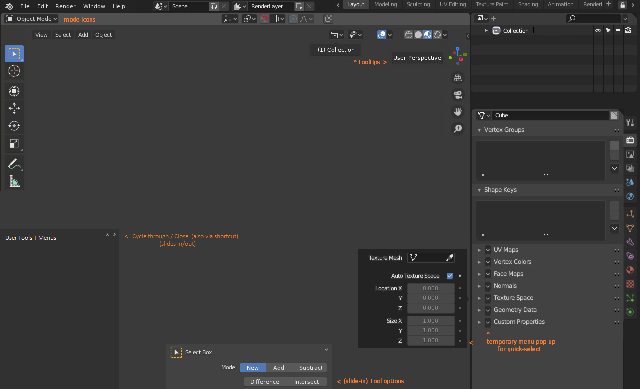
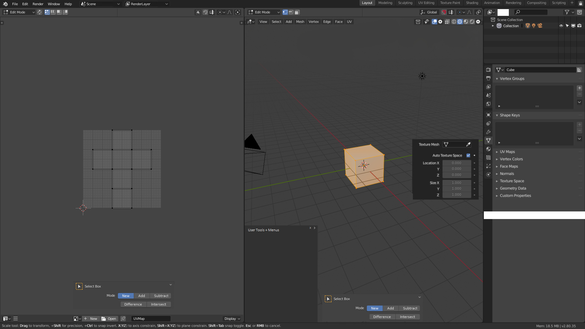
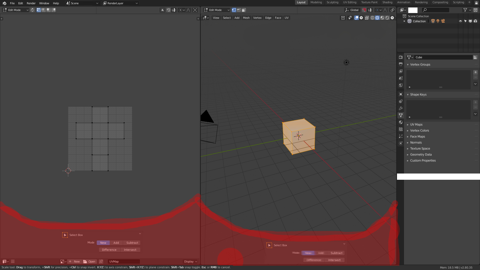
The “topbar header” in my proposal always have BG. Only in the third image appear transparent because the viewport don’t have a grid.
The topbar will be like any other panel or header that blender remember the config.
I work with Two monitors and the option of all in a general topbar or only in properties area is the worst way to work…
All is far from the usual workzone.
I think ThinkingPolygons is intending you do this, or something like it:
So tools are where they used to be, essentially.
The biggest issue, aside from not being editor-specific, is that you can’t collapse this with a hotkey.
1 Like
@Alberto’s mockup is definitely clearer in terms of the Button Soup™ because it keeps things more visually-distinct by using the contrasts in colors and button shapes to great advantage.
That said – your mockup is more-inclusive because it does include tools (which should be offset downward) and gizmos.
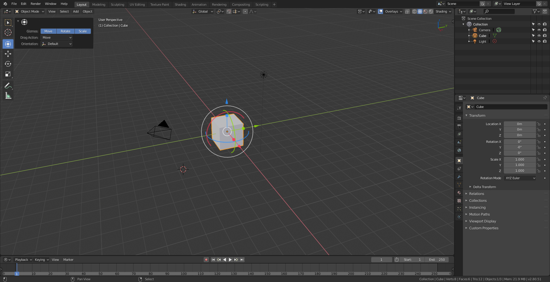
The “User Perspective” and “(1) Collection” text doesn’t seem necessary – it could be a tooltip a tooltip (when hovering over the 3d gizmo or relevant icons), if you really need to know what collection is selected, though with a visually-distinct and better-operational outliner, this would be redundant.
It might be worthwhile if @Alberto made a version with a smaller resolution (including a smaller version of the gizmos IMO).
A screenshot will be forthcoming to explain what I’m talking about a bit better.
1 Like
But then you need to put at least 3 properties editor when you have two screens.
Here, have a full-featured design for the main modes (in 1280x768 – minimum resolution):
and with Annotations + User Area Toolshelf:
This is scalable, so it should work for multi-monitor setups too.
Some other changes:
-
Upgraded the Outliner to be cleaner/sleeker
-
Removed elements that are redundant + never change
-
Added a new functionality (visual-distinction) to the accordian menus – a pop-out version of the contained menus.
(This is because I usually don’t want to have to go back and close the accordian menu everytime I need to quickly and temporarily edit/select one item from there.)
A hybrid approach is best here because there are some menus during some unique times I actually like to keep open most of the time, but this is usually depending upon what I’m doing at the moment!) -
Most importantly – Button Soup™ was eliminated -in its entirety- while maintaining all functionality.
Interesting.
The “Change Editor” menus seem to be deliberately removed. Which is fine, but I can’t see why or what is replacing them.
I might need a better description of “Button Soup” as I think we might all have a different idea of what that is…
I can’t support that idea, it seems to me that it complicates the interface and asks for a great development effort in order to contribute little more in the end. I’m not going to get into the popups that have nothing to do with the topbar issue.
In this proposal the two superior headers do not make sense, all the controls could enter in only one. And the lower panel of the tool, besides being a very annoying popup when a person uses the program, because it even varies in size and is there in the middle of the workspace, does not add much in front of the header of the active tool that I propose and if you want you can put it down.
Also this causes problems in other editors, while that slider works moderately in 3D view, in the shader manager and UV editor is very annoying and eat practically all the space.
The proposal that I make is simple, does not vary almost anything the concept of the topbar, serves for any editor, gives the user complete control over it and if necessary can reorder the controls within it to leave more accessible other controls.
And to don’t add a lot it consume a lot of space and create a lot of visual noise. This is a possible scenario
in the best case that solution use all that space
without any active tool panel, N-panel or something.
In order not to confuse people, both header would be configurable. Allowing this others layout like this
this
this
or this
1 Like
guys, don’t complicate things with too much sophistication …
a simple and clean bar, enough and progresses
that’s what we need most …
then if it is accepted and when we use it, other ideas for improvement will emerge, so be it
@Alberto I think that more generally, if the menus outside the bar were more towards a central area where they do not overlap with the tools, it would be much better …
doing so, the tool bar (or active tools) does not need to create that empty space on the left …
the sense is that these menus floating in the empty space must always be clearly visible and ready to be easily identified and reached … nothing else graphic must disturb them
1 Like
That image is s proposal that i didn’t explanted, i need to explain because all that popover are temporal
1 Like
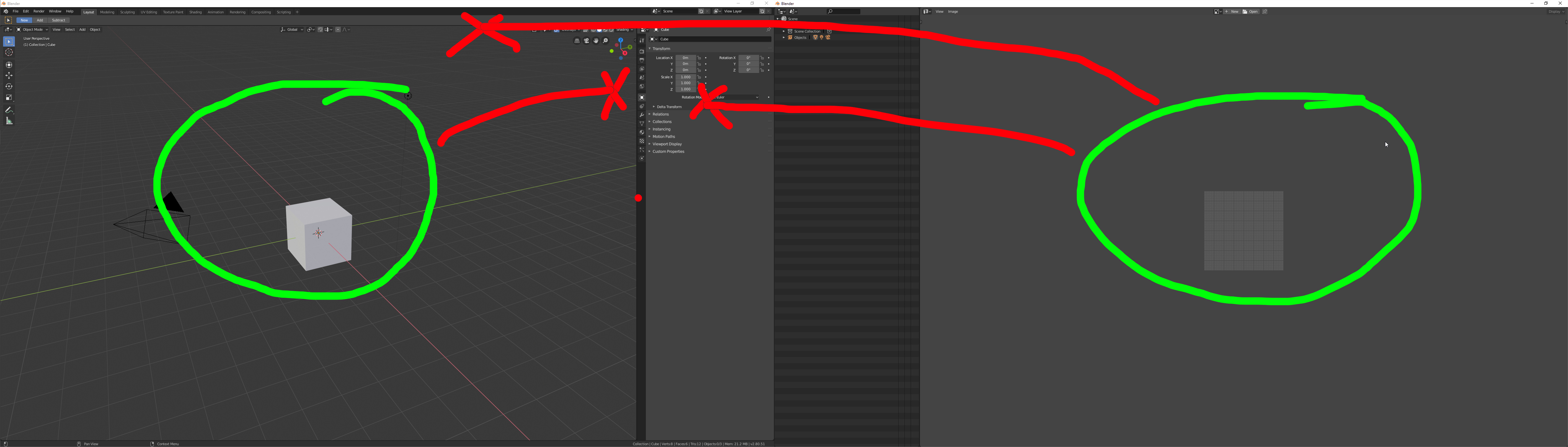
I don’t know if you notice, but I moved the menus and raised the sidebar to make explicit what I wanted to point out
1 Like