Will quote my own statement:
So, it must be done one way or another.
Will quote my own statement:
So, it must be done one way or another.
Well, okay, but complementary to green is red, while to purple is yellow.
Also why we suddenly started thinking of contrast and complementary, while we making monocrome the rest.
Any purple is still unnatural and argressively annoying, that’s why it is never used in software UI design.
Blue is looking much better.
We talk here about colour codes, that are meant to make big lists of similar items readable. There’s need for many colours that are recognizable at a glance and are different from deach other.
Yep - the purple aint comlpementary to green, but I clearly undelined it’s “kind of complementary” 
Also it’s more pink than violet. I may tweak it to make it more obvious.
For sure, we could change the purple to blue in the toolbar icons. Hopefully, we can get the toolbar icons hooked up for theming soon, so that the theme can sort this out rather than the icon itself. The various parts of the toolbar icons already have materials assigned that categorised by type, ie Base, Add, Deform, Remove, Select etc.
you guys remembered me!
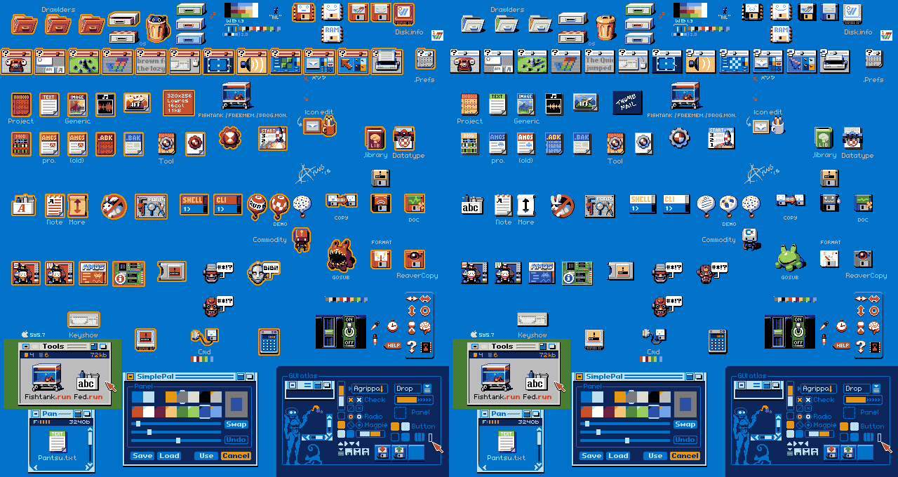
the icons of the old Commodore Amiga of the 90s had 2 animation states
I admit that I would not mind seeing something like this happen for blender icons (although I already know that designer will soon hit me hehehe)

Hi, I’m trying to change the dark grey color in my UI theme but can’t find it. Does anyone know where this color can be found?
Hi there,
first of all I would like to say that some really really good work has been done on the icons both for 2.5 and now for 2.8. Thank you jendrzych!
I read the entire thread here and also on BA and even though I loved the 2.5 icons I see the problems - individiually shaded masterpieces not fit for both light / dark themes, they take away too much focus + impossible to customize.
By my estimate though about 40% people like monochromatic and 60% like colorcoded.
Also obvious is the fact that too much color is very bad as it just messes up with the head. It’s actually much worse than monochromatic as it leads away from the shapes and gives chaos.
There was one very good point made only once in the BA thread by Martynas Ziemys which was that you don’t really need to color according to category (as when you add new modifier - everything is just blue) as then the color loses it’s point. The color is to code the difference between the options.
The icons that get absolutely the most heat are definitely the ones from the properties window. There is no Blender user in the history of the Blenderth not using the properties window and constantly clicking on these icons repeatedly. Also these are the icons that have no text whatsoever and you only get what it is after hovering over it.
There are a couple of icons there that I’m having problems with understanding and therefore recognizing. Those icons are particles and constraints and because these were already pretty much flat in 2.5 I would say it’s safe to just take them from there and make them monochromatic?
When it comes to color-coding, I tried to do something based on the previous icon-set but it’s just impossible to make colors work well on flat icons.
The biggest point of colors is to immediately know where everything is though. Right now I can explain stuff to a total newbie over the phone and I did so multiple times, I also use it when teaching people … red sphere, blue sphere, orange box, blue wrench, yellow stars, … It would be so much harder with monochromatic I am sure.
Well so in the end I added a thin ribbon to be colored per theme. It doesn’t take away from the shapes and it can adhere to outliner’s depiction of modifiers, objects, mesh, materials, cameras…
So here is list of changes in this mockup:
added Africa+Europe and Australia to the world icon (sorry to Asia and my geography teacher) … my reason also was that it resembled material a bit as it was also a circle with top left and bottom right quadrant filled
added 2px horizontally to have vertical ribbons next to the icons based on their type.
brought back constraints and particles icon from 2.5 and made it flat.
colors: white for render settings, blue for world settings, orange for object/data (quite related), purple for modifiers/constraints (quite related), red for material/texture (quite related) and yellow for particles/physics
the physics icon is pretty much what google told me and I am not sure about it… It could work well but maybe not? The current icon is a bit unclear but this one looks imbalanced. But then again I am not really great at creating icons.
The checker pattern in textures I made 2x2 (instead of 4x4) so that it visually connects with the sphere on which that texture is mapped.
re-ordered so that object and data is together & modifiers and constraints are together … It is my understanding that these are related so should be next to each other
Dark:
Light:
Thanks for the icons and all the work and thought put into this. This was my bit of feedback.
This is by far the nicest solution to added color I have seen yet! Very nice job Adam, I love it! Best of both worlds, solves most problems people had with monochromatic icons and stays looking awesome rather than turning into an fugly Christmas tree.
I like your approach to the problem of using colors in Properties editor! Elegant and non-invasive. I love it!
As for the icons, the reasons why pictograms adopted such and not other forms were discussed in the thread on BA, so I will not repeat myself.
Really like your suggestions!
Except for the “physics” and “world” icon which I didn’t like as much in your mockups, the rest is spot on.
The side color bars, the reorganization, bringing back stars for particles, love it all.
Render settings icon should be the same as in outliner
@youthatninja Which icon in the Outlier do You have on mind?
render restrict ofc. as in 2.79, same camera icon everywhere
Love the idea with the coloring!
On a big screen this vertical alignment is wasting space so I would also get rid of the rounding of the tabs and shrink the region horizontally so that the tabs are rectangular.
Those are two different icons but coherent in forms - both of them are a photo camera. One of them illustrates the working part of the camera (the one that takes pictures) and the other one is the back of the camera with the screen on which the device settings are usually displayed. They share the form and meaning with a slight twist.
yeah, i know that. but for newbies it’s confusing. imho icons should be icons without that difficult logic in their relations
Just wondering if part of the appeal of Adam Preisler’s proposal isn’t actually the colors, but how the colors separate the (many) icons into groups…
If the proposal is to separate the icons into groups, I think the Adam’s colored proposal is the best.
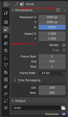
Every tab should have a separator from each other, to the user easily understand that it’s clickable and not just decorative/information, and to know where the tab starts and ends.
