Ok, You’re right. My fault - they’re still mono 
Anyway the goal of the very project was to remove outlines and better utilize the gained space, making a bit bigger, better readable icons.
In theory, the GUI engine could draw a dark backdrop “shadow” under each icon - a kind of postpro outline, that boosts local contract a bit. @Brecht - am I right?
1 Like
It could, though I’m not sure there is enough space inside the button for it.
I asked from pure curiosity. Good to know, that such an option is possible - could be usefull with light themes.
1 Like
Will there be an option to use legacy icons?
Trying a new design is good but given that this is not only a complete redesign but also a change of paradigm, it’s important to have the possibility to compare how productive we are in each mode. Otherwise we won’t be able to tell if there is a real improvement in productivity.
Progress is best when we keep an eye behind.
3 Likes
afaik BA user @BToolPut is going to code something that goes along that line, but anyway: old icons are mapped differently, so you can’t just swap two svg files and get the legacy icons back.
Being able to swap out the icons might be something that is added. So you should probably start now preparing for such an eventuality.
Just take a copy of the old SVG from 2.79, compare it against the current one and move the old icons to where they are located on the new sheet. Then simply make new versions of all the icons that have been added since, but do so in a way that matches the old style. Should only take a few hundred hours… LOL
1 Like
So I should start now taking a few hundred hours for something that will eventually be possible…
I kind of prefer to be sure it’s going to be possible to swap the icon set before I spend that much time on it. Also, aren’t you a bit exaggerating? The new icons take jendrzych a lot of time because he does several attempts with different ideas for each, but once this work is done, the only remaining step is to transpose that design to a colorized version.
2 Likes
The more I use Blender with the new icons the more I feel it’s working just fine. Putting the icons in the pref to the left instead of top increases readability. I like the mockup!
2 Likes
@DanielBystedt In vertical improve the accessibility with the mouse wheel.
@billrey & @brecht
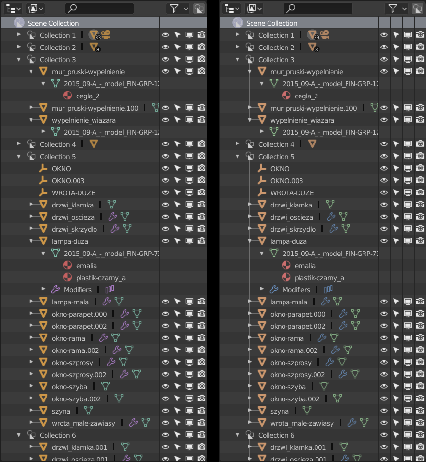
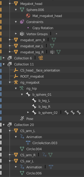
The Toolbox has extablished colour codes, where pale purple is bound with modification/deformation. I think one thing must be done for the sake of clarity and consistency - the colour of mod./deform tools must be changed to blue, to match Modifiers colour or Modifiers colour must turn into purple. I think the latter is better for readability in Outliner, since purple and green (ObData colour) are kinda complementary colours and differ from eachother more than green and blue. The pale blue will work good for animation related icons though.
I’d suggest tweaking colours too.
Original on the right, my proposal on the left:
Blue animation icons:

Tweaked colours codes:
PURPLE:
0,77
0,4
0,93
GOLD YELLO:
0,9
0,7
0,8
MINTISH GREEN:
0,45
0,35
0,9
LIGHT BLUE
0,6
0,45
0,85
TOMATO RED
my tweaked red is too saturated - don't mind it
0,03
0,55
0,8
4 Likes
Sorry, have no free time to watch the video - a depeche mode abstract, please?
I did not ask you to watch a video, I just suggested a method in three words
I thought I do it this way. I suppose, the thesis You’d like to see is quite different from the one I chose at the very beginning.
1 Like
the method is already in place, and I am already satisfied with the results that have emerged
the three words also include the satisfaction of seeing this
they are also a compliment for the work done
Not sure if this was already posted, but I belive one thing I really love of Photoshop is the ability to assign colors to different layers, it makes super easy to spot where is what.
Maybe a little dot or a bar which you can costumize color would be nice
Just gonna use jendrzych mockup to kinda illustrate what I mean
Edit:
I also belive this would work great with the current outliner with the icons in gray scale
14 Likes
Noticed some more and some less “aware” criticism, so just wanted to chip in a voice of support as someone interested in both productivity of Blender and graphic communication as a formal subject.
Blender’s interface indeed is visually noisy (given the task that’s quite understandable), and the idea of improvement is great. I’d push it somewhat radically until it ends up tested on professional users as vast majority of those don’t have the luxury of trying pre-beta versions in real work making initial feedback somewhat skewed. Don’t dilute the idea too much beforehand 
Bit of a tangent but as to whether to have modifier icons - imho - Searching through the list visually can be improved as was suggested, but it is somewhat of an unnecessary problem (for experienced users at least). The fastest not-that-tedious way of using modifier-like systems (choosing from a somewhat constant drop down list) in any UI I’ve experienced to date is semi-hotkey based. That is - the list is too long to create individual hotkeys, but everyone remembers the first letter of what they’re looking for. Just cycling the selection focus through items beginning with the letter pressed develops a muscle memory for how many times you have to press it to find a needed item in just a few encounters. It may seem like clicking the drop-down, pressing “s” four times and then enter is a long sequence of actions, but in reality it is usually quite light on use of already overloaded attention (=fast), via mnemonics and the user having to remember mostly the principle as opposed to remembering individual keys.
3 Likes
@1D_Inc: like this way more than monochrome, good idea !! Readability is much better
1 Like
These colors look great. I don’t think your red is too saturated, but I think red is not the best idea to have in an interface unless it’s something that has to stand out and grab the user’s attention.
Want to ask why blue for animation)
It was for modifiers, and purple can be pretty much annoying (that’s why there were almost no purple before).