Are you saying that you wouldn’t realize they are tabs and figure it out, or are you making up a hypothetical person that would be so confused?
Your example seems disingenuous. Your very top “This isn’t clickable”: to left of it has a “pin” that is clickable, yet doesn’t look like a button. To the right of that same text is a “settings” icons that is similarly not shown as a button. Do those confuse as well? Are you asking that those be changed to look like buttons too?
If I haven’t used Blender with the old properties buttons I would not realize it. How I used, I recognize the icons and associate the tabs of your mockup with the older buttons.
For new Blender users i think it could be confusing.
I didn’t even knew the pin(neither that was a pin) and that settings icon was clickable!
I noticed you removed the background color of the editor icon of the properties tab too, I think this button should remain as it is now, a well identifiable button.
There’s a lot of Blender users, and with the 2.8 I’m sure there will be many new users, maybe not everyone will get the new UI so easy, maybe some will be as slow as me, I think the easier it is to read the UI elements, the more users will benefit.
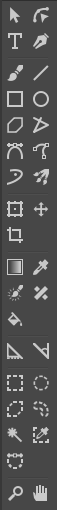
Option: (See img) Move icons to be grouped together. Instead of having colored ones separate from the white, group together. For me it is more organized and less visual noise
they wanted to be more consistent with colors and they turned all icons bw… only to destroy it few weeks later
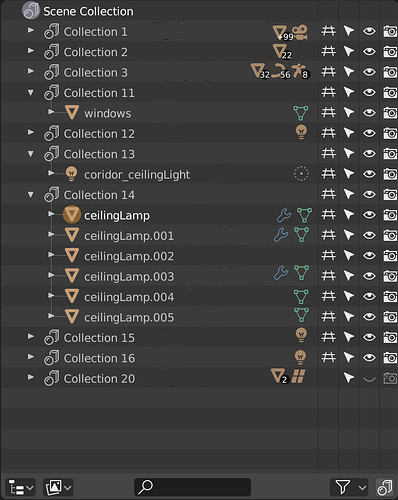
turning outliner into a christmas tree. L - Logic!
Yeah, I think icon organization (UI! go figure ) should be provided out of the box and icon colors should be super easy to change/customize by the user. Subthemes perhaps where you could change only specific panels, or just icons specifically, Would xml be able to do this where you just want to make all outliner icons light gray?
Yeah I agree but I think the icons are based on.svg images and may be tough to color and add color as a background. Its probably too late in the game as 2.8 is in Beta but.I think going to something like fontastic to allow custom icons and colored icons would have been good, after all text color is highly customizable in Blender http://fontastic.me
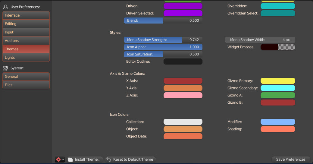
I take that back about editing colors of the icons, and bravo zulu to the Devs, there is an icon color editor in preferences>THemes at the very bottom.
I think there is one icon that absolutely needs a color, the auto key icon. Since it’s supposed to be a “record” icon, and it’s sooooooo linked to the red color, it really looks weird to see it not red (and quite frankly it harder do find such iconic icon (huh) when it’s not red).
Using monochrome icons is a torment for me. I can’t use the program. I look at the screen and I see the puddle with dirty, gray water. These icons are designed against human nature. They are good for dogs and colour-blind people with monochromatism.
I’m with @Baszczer on this.
And no, I do not use proprietary software. That’s one of the reasons I love Blender so much.
The flat grey icons are my main nuisance in Krita. Its toolbox is a collection of multiple monochrome ellipses, rectangles, slashes and crosses that you have to memorize the exact position of because they refuse to utilize the full capabilities of the human eye to guide you in your search for the right tool.
 ) should be provided out of the box and icon colors should be super easy to change/customize by the user. Subthemes perhaps where you could change only specific panels, or just icons specifically, Would xml be able to do this where you just want to make all outliner icons light gray?