Yes. This would speed things up nicely.
1 Like
Yeah, overall I like the new direction, but it definitely doesn’t feel consistent. We have:
- Vertical icon tabs
- Horizontal text buttons
- Dropdown lists with text and icons
- Dropdown lists with just an icon
What if all editors had tabs that could be collapsed into a menu responsively when space is small? As you shrink the window it would go:
Tabs with icon and text -> Tabs with just the icon -> Menu with text and icon, -> Menu with just the icon.
That way we could quickly switch between object and world shaders in the shader editor like before, we could avoid the cramped feeling in the 2d animation workspace, and it would all happen automatically.
By default in 2.79 ctrl+x do dissolve for selected elements. Would be cool to remain this. For instant deleting may best double tab to X key?
1 Like
About 2.8 UV editing work space, there seems no “tool icons” in left side tool section of 3d view edutir and UV /image editer windows. (clear seam, mark seam, and UV unrwap options)
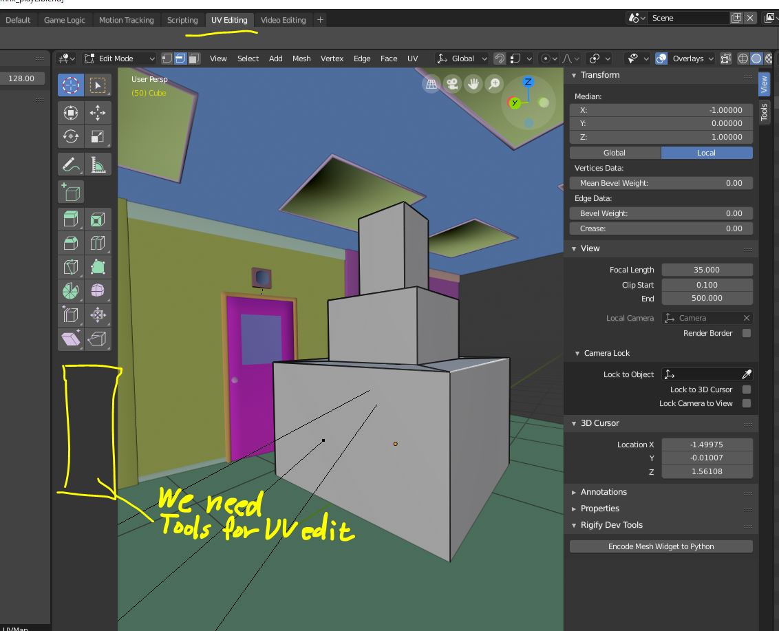
Though I found those commands in header (or bottom) menu of 3d view or i can use short cut. but I believe, work space is desigend to find and use tools which correspond to current work type. Most of new user may serch those UV tools in tool sections.
We need, uv tool buttons, when we choose “edit mode” with “UV editing” layout.
I do not against we keep UV menus in header of 3d view editor, but I can not approve
remove button to set seam , or unwrap button from 3d view.
Please compare 2.79UI
we only need one-click those tool button, to set seam and unwrap after we select " shading tab." in tool shelf. though there is no uv command in header.
About current 2.8 UI, with UV edit layout, we need to go header>UV>mark or clear seam.
it need at least 2 step. for each uv command.
4 Likes
Hi!
Don’t know if it was discussed before, and maybe I just dont understand something, but I’m totally confused with selections in outliner. For example here is my screen and I have selected mesh Cube.002, but why there is also bright line on Cube.061, also Collection 2 is brighter, than current in which I work right now and there is also another Cube selected. Maybe I don’t understand some logic yet, coz I’m learning blender not long, but it’s really can’t help you to understand with which object you working right now. Maybe it can be improved somehow? or just help me please to figure it out whats going on here, coz I always spend a lot of time to finding my active object in the outliner =)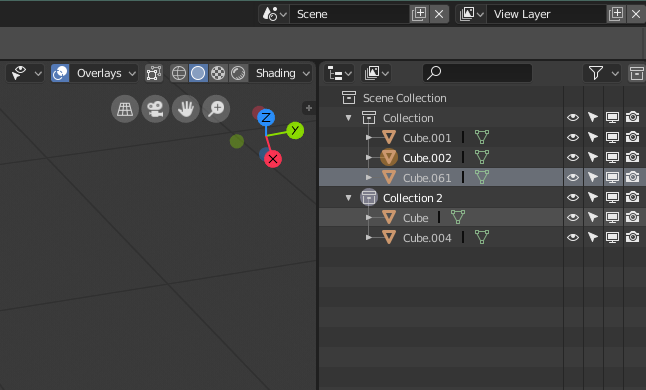
10 Likes
@AlexanderKolyasa
It is not clear enough what there is and what there is not selected, as I have said before. I made some proposals Outliner, Better visualization of the selection, proposal I think it’s still important to be very clear which things are selected and which are not. And here is the other link where you can see the conversation of the colored icons: Colour coded icons
3 Likes
Yeah maybe it would be better to keep CTRl + x for dissolving but since the point of this to make deleting more simple and less clicky. Just a single x could delete it away and double tapping x could open up the menu. Right?
1 Like
Yes this needs to be more clear. One of the issues is that there is a preselection highlight that doesn’t disappear when you move your mouse out of the outliner. You’ve also run into a situation where you have one object selected in the outliner and another in the viewport. I still haven’t found a use for this functionality.This combined how how many steps it takes to multiselect objects in this editor makes an otherwise great outliner difficult to use.
2 Likes
Yes, it is very confusing for new users. I thought blender 2.80 would make the outliner better in this regard but sadly it wasn’t the case.
Thank you guys for the answer! Hope it will be improved maybe after the 2.8, or I just will try to get used to work without outliner))) My colleague told me that he always worked in blender just in viewport, and before 2.8 you couldn’t even do anything in the outliner, you couldn’t rearrange objects, parent them and so on) At least now it’s better in 2.8)
3 Likes
@AlexanderKolyasa
I also had to get used to working without the outliner, I wish I could have a functional outliner.
Well, there could be at least “Shift” function (selects from first selected to the last) 
4 Likes
you can use B key for the rectangle selection in the outliner. But yeah, I also think shift would be better
Yeah I mentioned this already a couple months ago.
To Implement Industry Standard shortcuts when interacting with lists of things in blender (including outliner, vertex groups list, shape keys list, etc):
Ctrl + Left-Click = add single to selection
Shift + Left-Click = add to selection everything in-between first to last selected including both.
At the time no dev replied… maybe this is more work than we imagine for 2.8. But let’s keep mentioning this, maybe for 2.81 and forward versions we will have it 
Also, a rightclickselect suggestion may go a long way.
(This is the post: Outliner suggestions - #2 by Evandro_Costa)
2 Likes
Hi @billrey, here is another proposition I missed to tell you in person on bconf Clicking - selecting through gizmos: Proposition: Make Vertices Selectable again :D Right-Click Select — Blender.Community
3 Likes
i saw some proposal that you guys are going to add a heat preview for proportional editing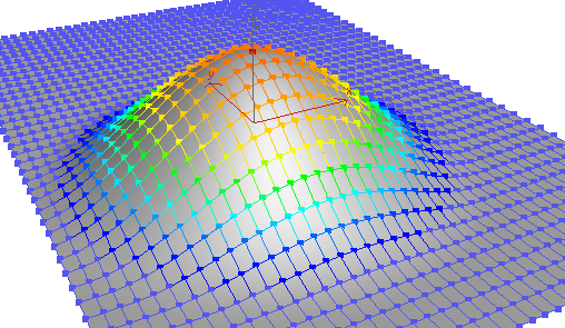
also means that the preview circle should be shown first before moving and not after so it works like loop cuts tool.
13 Likes
Because that mew T panel is “active tools” nonsense…
YES. This is how it is in other programs, too, right? Not 100% sure, but I seem to recall it being one of my first frustrations coming from Maya years ago.
2 Likes
I work with maya everyday and i cry everyday because of gizmos 
2 Likes
This is brilliant! I proposed it to the team and I hope there is time before the beta to squeeze it in. Maybe there could be one for Viewer Node I guess? Maybe it’s too much. But Render at least should be there.
4 Likes