This is why the timeline needs transport controls.
I agree to a point, but the post you link to doesn’t have the coolest and most unique thing that the Blender compositor has going for it: the backdrop. It doesn’t make sense to have both the backdrop enabled and an image editor open from a workflow standpoint but does help new users see more Blender features out of the box. I think this is a good use for the bundled workspaces, especially since I rarely use a workspace preset, because I so quickly stray from them. It’s just so easy to configure the interface for the tasks unique to the project you’re working on. If you open the blend files on my computers at work and at home, you would most likely see a completely different layout for each one.
I have one workspace preset that has just a 3d View, an Outliner, and a Properties view. I have another that is just a Nodes Editor and yet another that is only a VSE and Properties. From these simple layouts I split views when I need another editor. Otherwise, with more complicated workspaces, I spend the first minute or so collapsing the views I don’t immediately need so the window isn’t too cluttered.
1 Like
Scripting
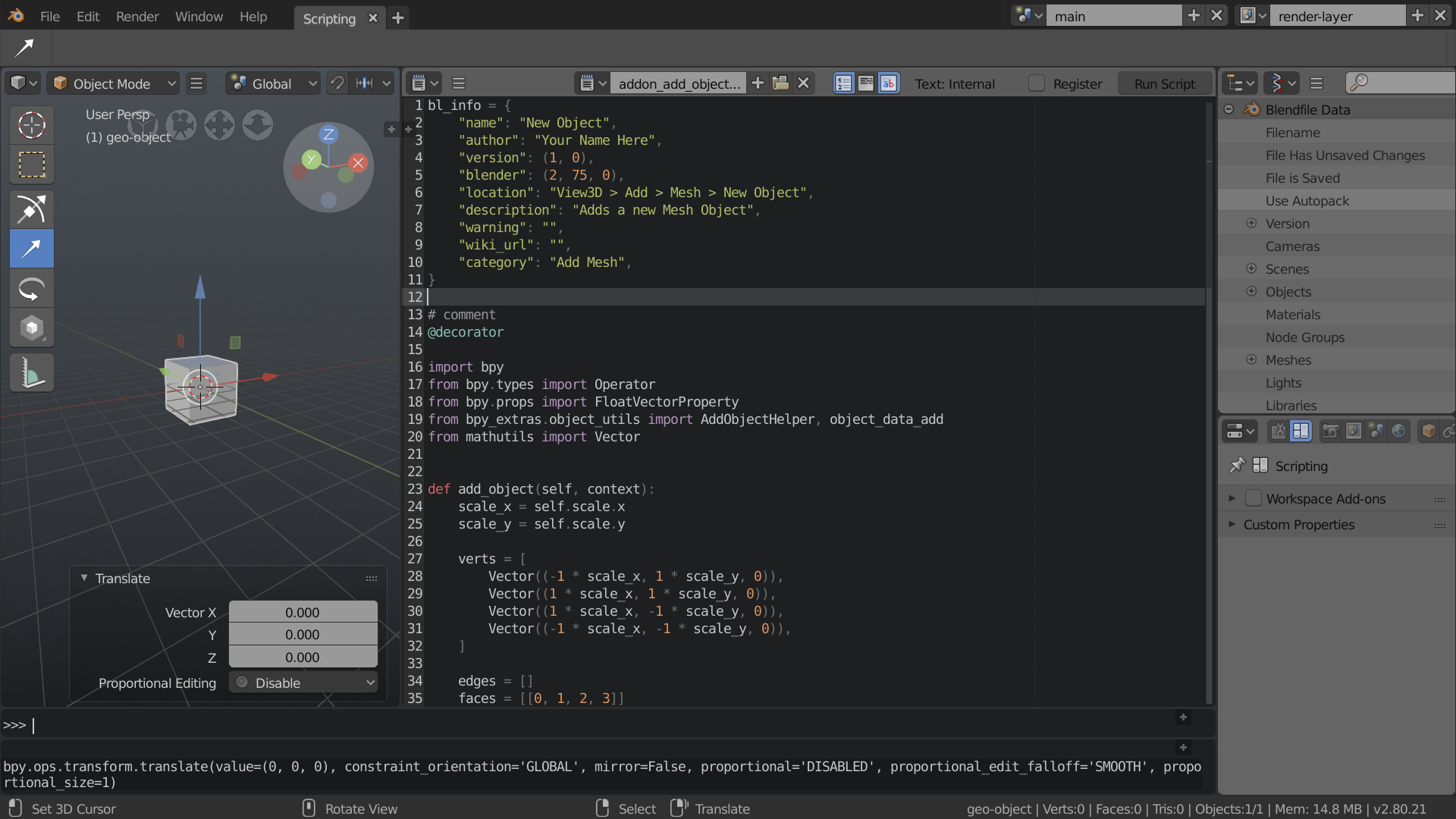
Python Console is pulled all the way down when not in use, maximizing vertical space when scripting.
Outliner is using data API display mode, I think an appropriate default.
Properties is using workspace context, tools may also be a good choice.
Primary benefit here is that the console and info window can have maximum horizontal space while also offering the ability to fairly easily increase vertically, reading wrapped lines of output can be painful.
1 Like
A post was split to a new topic: Proposal: Hide Properties per Workspace
2 posts were merged into an existing topic: Proposal: Hide Properties per Workspace
hmmm not sure about tht. Decluttering is sometimes a good Idea, but just hiding stuff depending on your workspace would
-
a Probably confuse beginners more than it helps them (wait wasn’t there a render settings tab in the Properties? Where did it go?!)
-
b Make it more of a clickfest for advanced users. You can’t possibly predict what tabs they’d need in the different workspaces.
Also since it is planned that the tabs go to the left, they won’t increase the necessary horizontal width of the Properties Editor anymore.
1 Like
Hi @SimonStorl-Schulke Thank you for your comment. I understand the concern, but i think there will be no confusion if the workspace purpose is clear. And the naming itself should already clarify a lot. Already in the current blender functions dis- and reappear based on a selected workspace. The film editing workspace for instance looks completely different to the 3d Workspace and offers different functionality. But if you are in the film editing for instance, you as the user would not need most of the options offered currently in the properties menu.
Another reason why I don’t think it would be confusing, would be because it’s already a common practice in many known softwares today. The adobe suite for instance offers in each of its programs a selection of workspaces with varying properties.
Other programs like Affinity Designer offer fixed workspace personas. The workspaces help even to distinguish the different functionality of very similar looking tools. In the particular case of affinity designer, the user can easily distinguish between vector based or pixel based tools, because they are separated in two different workspaces.
In affinity photo the options for the develop persona and the export persona are also fundamentally different and give the user a clear overview of all options available for the chosen task. In blender that would be a clear overview of his export options, modelling options, shading options, etc.
Material Editing Workspace
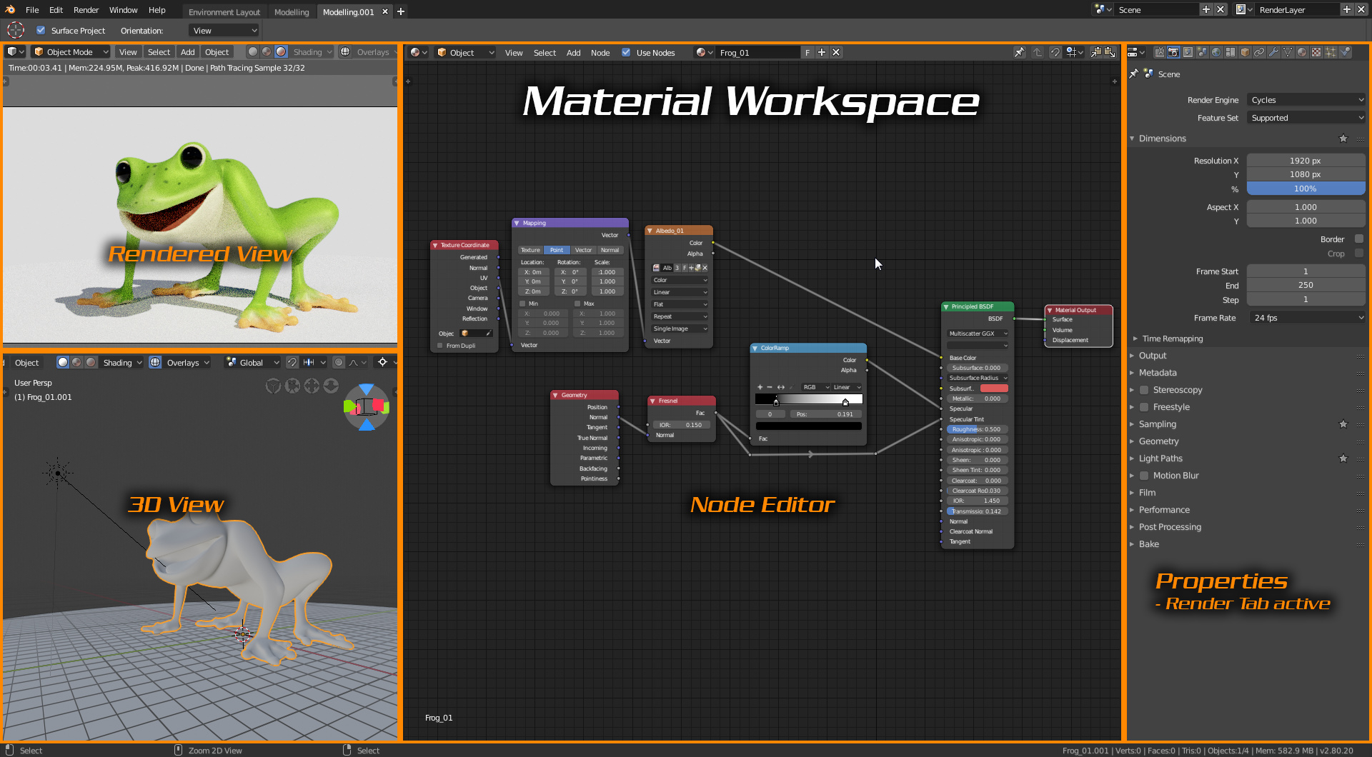
Note: - for this workspace, I was thinking that when rendering in the viewport the smaller the view the faster it renders so it would be useful to have the size at a happy medium to best suit users with decent PCs and those with lower spec’ed machines.
3 Likes
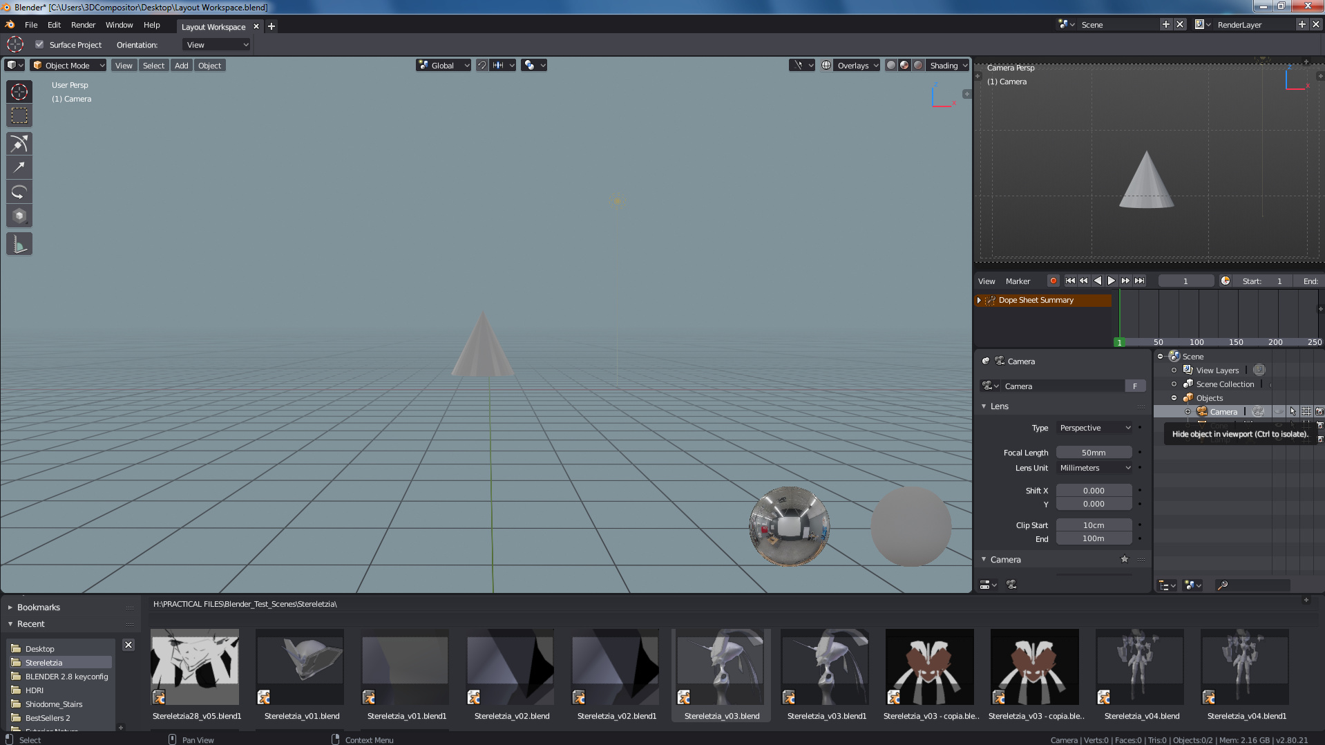
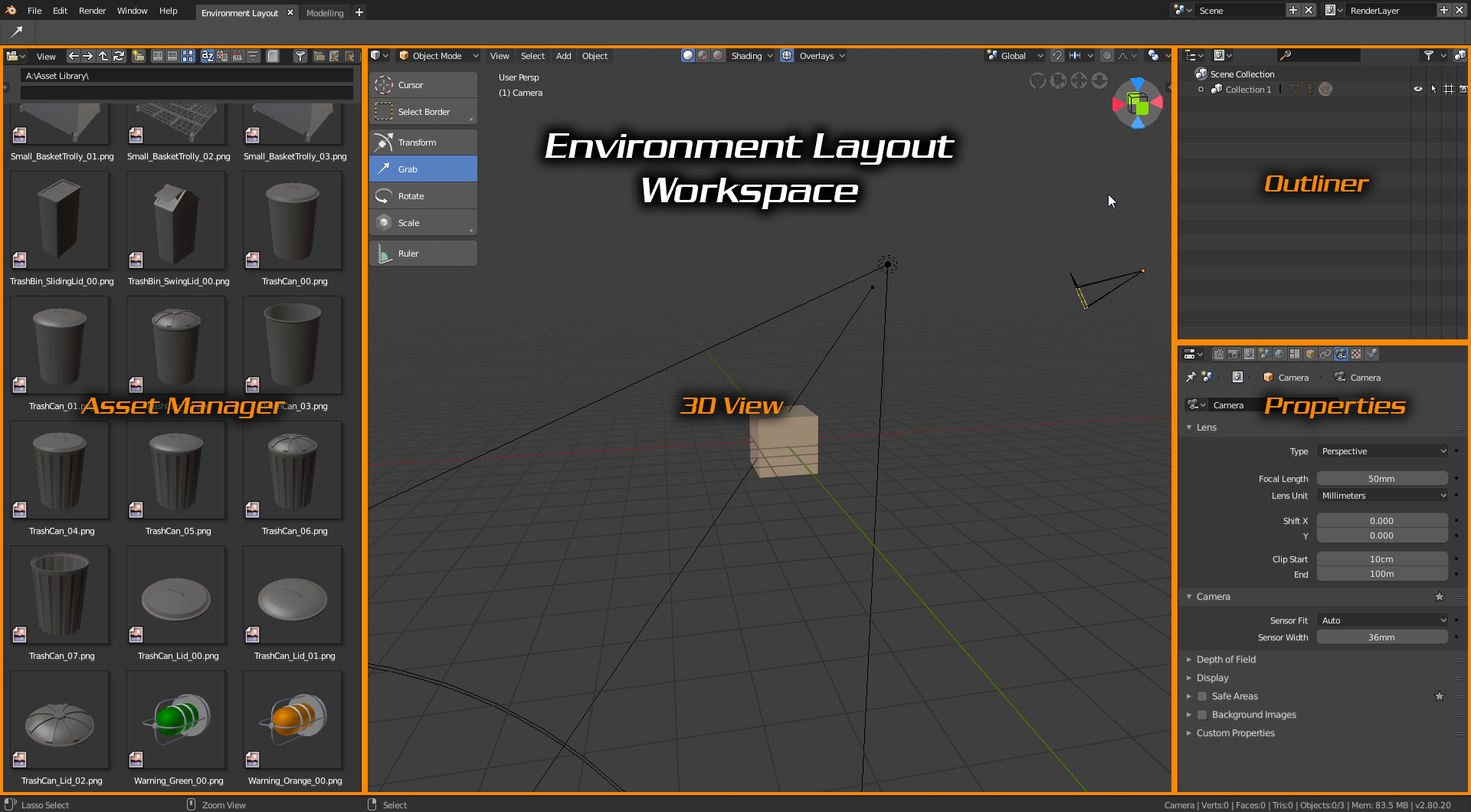
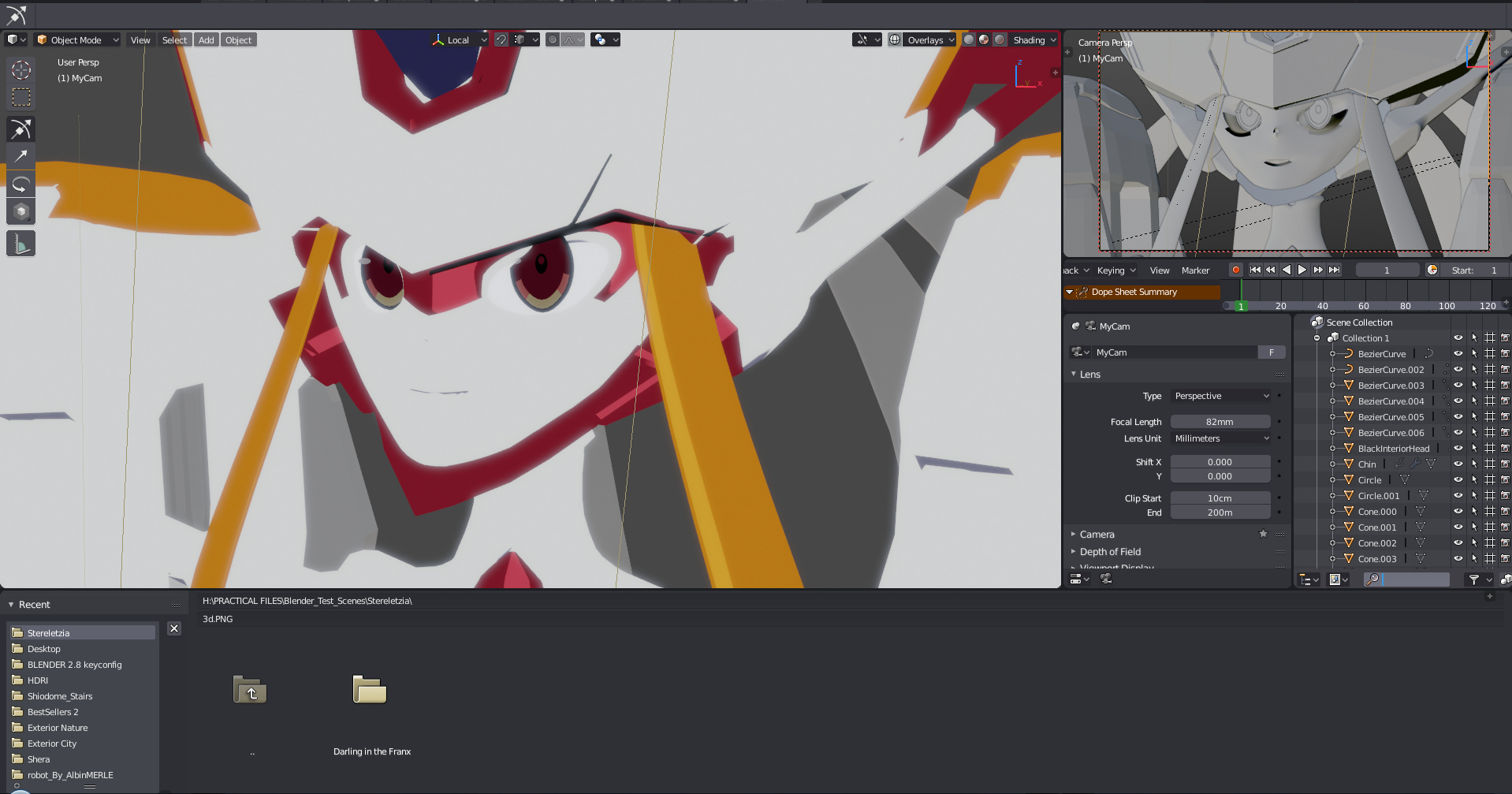
Here´s my proposal for “Layout Scenes workspace”.
A layout artist takes charge of camera timming, asset distribution through the scene and (sometimes) pre-light. These aspects are crucial for previz tests before actual production can start. This is a heavy-transit-assist stage since the general workflow is to:
- Import a lot of assets into the scene
- Organize in collection/outline and name everything correctly
- Pre-light the scene with a very quick test view on camera.
All those elements are placed in this layout named “Layout Scenes Workspace”.
Here´s a loaded scene in this layout:
CURRENT ISSUES:
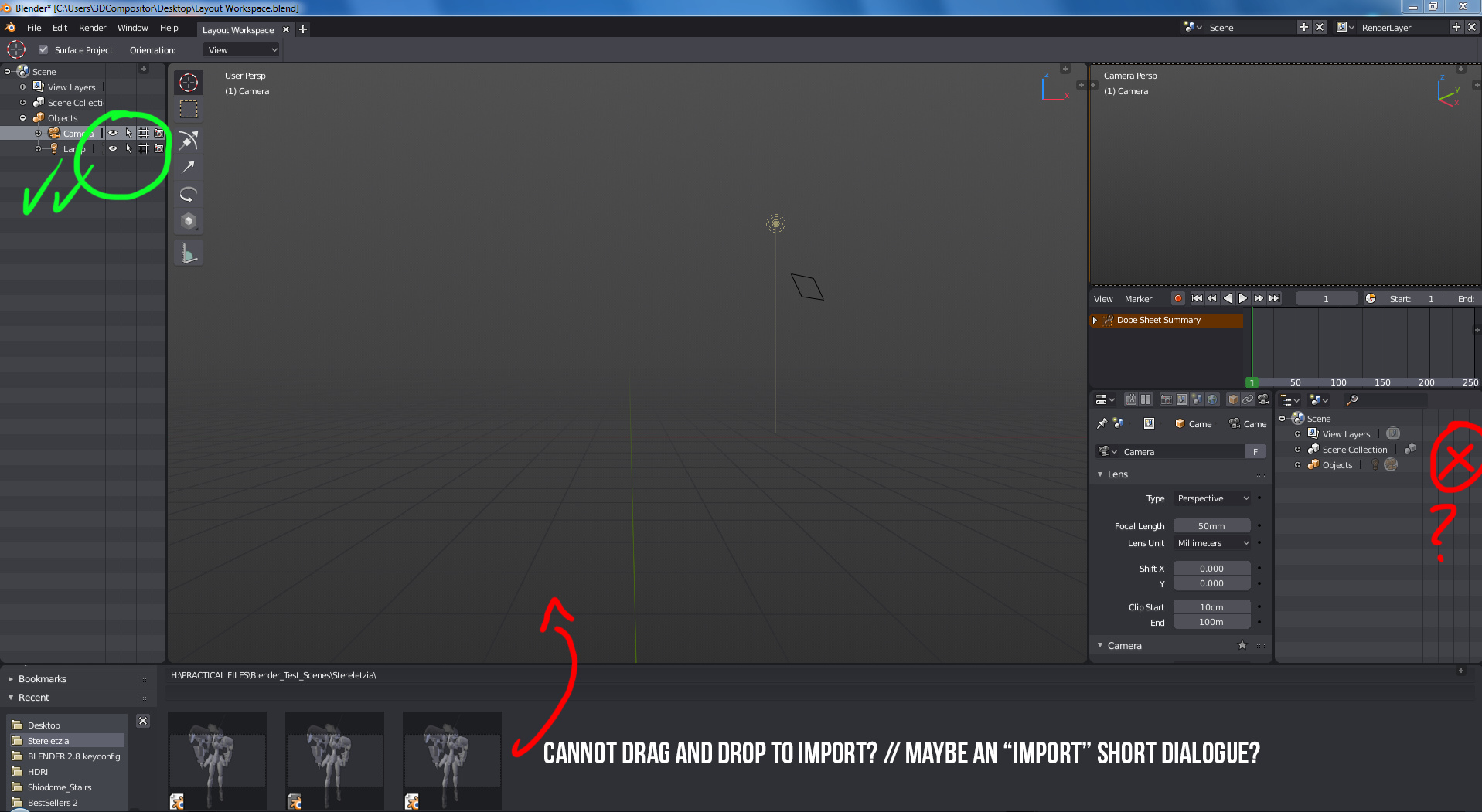
Currently if no blender scene is opened, the file browser shows the .blend files with their thumbnails. If you load a .blend scene for the first time, the file browser doesn´t show the files.blend scenes anymore. Maybe there should be a workaround to make “append” automatically check (or offer the option as a check) to make subsequent (drag/drop) assets to “import” (depending on the .fbx, .abc, .obj …etc… context) or to “append” depending on the “.blend” context. This wil be a huge improvement since new users can learn a .blend is a container with many drawers in which there are many elements like shaders, geometry, lights, etc…
Next issue happens when a second outline space window is opened on 2.8, the icons to the right dissapear. Only the first outline space window contains icons. I suggest there should be a toggle check box right besides the filters, to “mark” what row can be displayed. Then the rows can contract or expand to fix the width just like view filters on programs like After Effects.
And this other issue about the icons on the outliner and files could be adressed as well:
Hope you like the proposal for “Scene Layout Workspace”. Thanks.<<-- this is the link to pasteall.org with the file.
1 Like
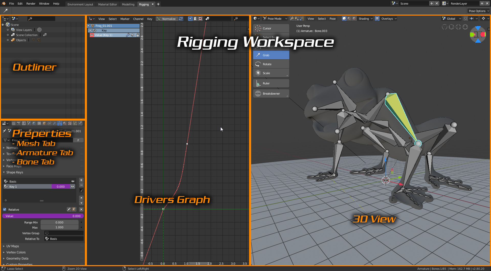
Your Rigging workspace has the Properties + Outliner on one side, while your Material workspace has the Properties on the other side. We shouldn’t mix those without any added benefit. If Properties are on either side, they should be in the same side for every workspace. Consistency is key for muscle memory.
2 Likes
Ahh yes haha thats a good point, i dont know why but ive always just work with it on that side maybe i should change it XD
Actually, forced consistency between workspaces is a limitation, and defeats the purpose of workspaces. A workspace is a workspace, what makes sense in a workspace might not make sense in another… Flexibility is the key of workspaces.
1 Like
It is not forced when you have the option to modify, this request is for default workspaces.
1 Like
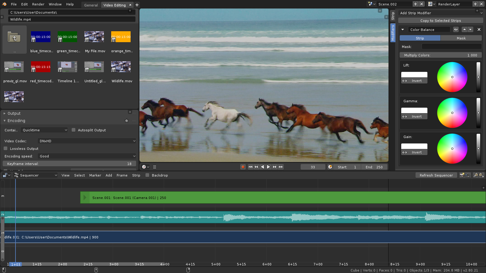
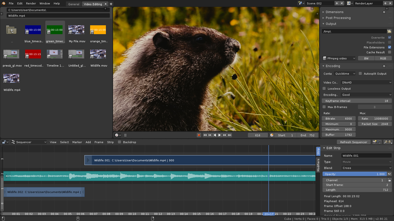
A suggestion for the workspace of the sequencer:
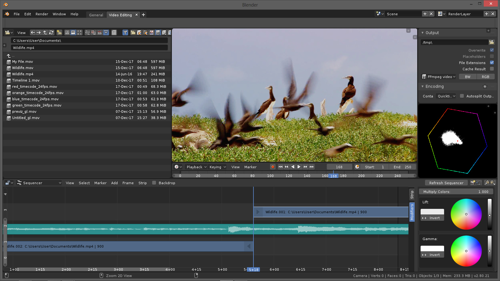
A few findings while trying to come up with this suggestion:
Bug or limitation?
- Video image disappears when opening (+)properties and you’ll have to close it to see the effect of your changes.
Suggestions:
- Automatic rearrange color-wheels horizontally when enlarging clip properties, so you do not have to scroll up and down for them.
- Option to move strip-properties to the left of the sequencer window(in the header menu).
- Only show modifiers which will work on the selected clip type. Eg. no modifiers for audio-strips.
- In scene strips, cameras from other scenes than the chosen scene can be selected, this can cause a lot of confusion.
2 Likes
Workspace Suggestion: Live Presentation editor/player
With Eevee and better control of what’s visible in the editor window in 2.8 Blender becomes a great tool for live presentations straight from the 3D Editor View.
I haven’t fully investigated camera movement plugins ( sniper add-on looked interesting but needs updating ) nor have I looked at a script to let you play forward/back and have it auto-stop at the next break ( I winged it ). An appropriate workspace would have visibility options set for a full screen 3D view and key bindings for forward and back set to common keys used by presentation remotes.
I used Blender in this way in an emergency and it worked out very well but I have not developed a workflow much less a workspace. Just throwing the idea out there. Move to a separate thread for discussion?
It’s a Bug.
T55535
1 Like
Or even more sparse(keeping the traditional properties placement):
However a tool panel is much needed - maybe at the left of the sequencer - there are plenty of VSE tool functions already in Blender, which needs proper buttons and much more functions to cherry pick from in all the VSE add-ons.
1 Like