Some great ideas here that I think fit a specific color-grade workspace (case-specific workspaces can be added from the + tab. For the general Compositing we can go with something simpler like @mfalvay proposed.
@pablovazquez I was just wondering if workspaces can be saved as assets and used with a asset browser which would make it possible to have workspace libraries where users could pick the ones they like to extend/change their workspaces.
Yes it will be possible to share Workspaces or bring them into existing .blend files. The way it is implemented it will make it possible to browse with an asset manager.
Hi there, good start. Here’s some feedback for each Workspace:
2D Animation
- Viewport should not be in Perspective mode
- The Grid should be disabled
- There are two Properties editors on the side, both set to Object - must be a mistake?
- I suggest they be set to Object Data and Materials, respectively.
3D Animation
- Outliner too small. Is used for selection a lot
- Properties too large. You mainly need to see Location, Rotation, Scale
- Toolbar should not be hidden. Animators need to switch between Move, Rotate, Scale
- Toolbar can be in the ‘minimal’ mode to save space
Compositing
- I don’t think we need to have the sidebar or toolbar open - both of these are basically redundant and take up lots of unnecessary space
- Why is there an Outliner for Compositing? I can’t think of a common use case for it here
- There probably should be a viewer to see your result?
Modeling
- I think it probably makes sense for the Properties to be set to Modifiers?
Rendering
- Why are there two Properties set to Object? I think just one will suffice, set to Render
Sculpting
- Again there are two Properties open. When sculpting, you don’t tend to use modifiers, so that one is redundant. We should just have one Properties open, set to Tool Settings
- I think we should disable most (all?) Overlays to make it possible to simply focus on your model
- Maybe we could use a custom, darker background color here, to make objects stand out more
Shading
- We should disable many overlays here too. If you are just shading, so you don’t need the 3D Cursor. All you need is Outline Selected and Look Dev
Cheers
Any chance for the option to lock view to current? Basically just to disable viewport orientation and orthographic/perspective switching. Should be easily and immediately accessible.
Yes, that kind of thing could be useful, but you still want to be able to move around in 3D, as that’s one of the strengths of Grease Pencil inside Blender. It’s just that by default when you are simply drawing, perspective doesn’t make sense.
The default workspace should be the old one with the timeline in it, not the modeling one imho.
no need of the timeline!
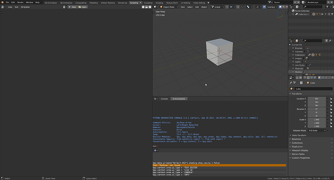
for scripting, I think this workspace is better.
Because placing the 3dview to the left is bad, you need to go from 3dview to outliner and comeback to 3dview.
Also, why do we keep the camera and point light?
Remove them, we don’t need them. I know you will say on some workspace they are needed ![]()
Give it some time…
Default = essentials
No really, in modeling, you don’t need it, beginers will never use it.
Think about them and not about your workflow.
Or show us why it needs to be there by default.
I think timeline is a good area for default, because is the standard in other softwares and newbies try to make animations and play with things instead learn modeling and properly workflow.
But I don’t care about that.
That’s exactly the opposite.
Just look at maya/c4d etc…
On maya I remove it 
it’s not because it’s there by default on other software that it’s good.
Do you use it?
It’s just the best for new users.
that’s why all 3d apps comes with it by default…
I don’t use it, but I can confirm that when I begin in 3D, years ago, the timeline was important to me. And also a way to waste space few years after that.
Sorry but it’s not because other software show something non essential on modeling that blender should do the same.
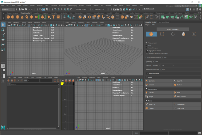
By the way, maya 2018 modeling standard.
No timeline ![]()
We are not talking about the modeling layout.
Standard/default layout is always different from the modeling layout.
Blender needs a standard default layout as before.
I was talking about the modeling layout 
Ah 
The thing is that blender don’t have a default layout anymore… and that should be fixed…
I get what you mean, but I don’t think you get what I mean. It’s going to get really annoying everytime you accidentally press the MMB and rotate the view. There’s a reason I said it should be easily accessible, so it can be turned off as fast as the lock was turned on. 
I also don’t expect it to put the user into orthographic view, just lock to which ever you are in, panning and zooming should still work with the orientation locked.

