Nice! Clean and clear. This makes me think of a proposal I wanted to make time ago, to split the Output/Export settings from Render/Scene, but I’ll mention that in another thread.
This one is pretty similar to the one from 2.79, which I think has a few flaws:
- Animation editors lack horizontal space
- Camera Viewport above the outliner is just too small to be functional
I think this is the direction we should go. I’ve updated the first post with a similar one to this, with a landscape viewport (that will probably make smaller to accomodate more room for the text editor).
1 Like
Pretty neat!
Some notes:
- Move the image editor to the same column as the file browser
- Smaller previews in the file browser
- Collapse the topbar
What do you think?
1 Like
The Flatty Dark Blueberry theme will be available as well, don’t worry! 
Indeed an Outliner comes in handy when sculpting to select multiple objects.
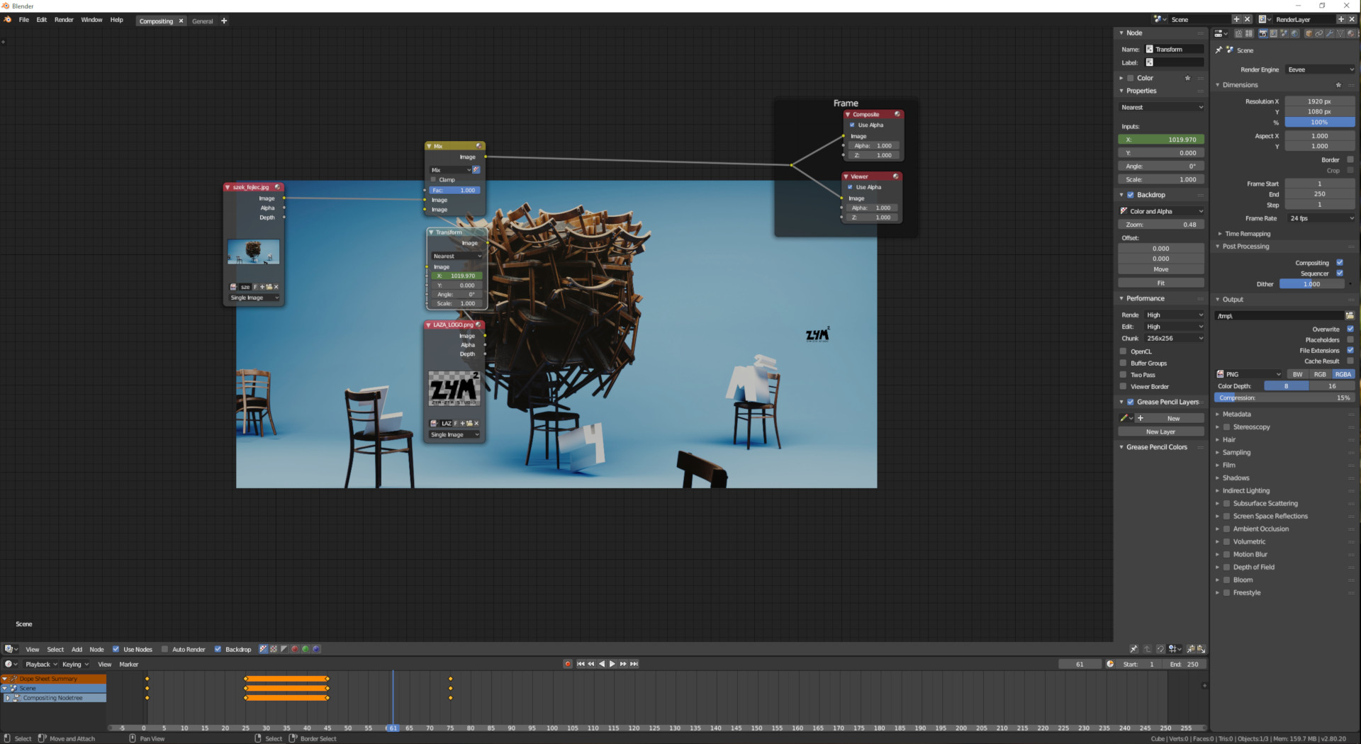
Yay for the Compositor backdrop! 
Do you think the Timeline still deserves such a big chunk of the vertical space though? And we could collapse the topbar for extra space even.
The little trick of having the end of the tree in the corner is fun, but something that should be integrated within Blender. A way to set the Composite output as Viewer, almost a toggle.
2 Likes
Looking good! I’d drop the topbar, and I wonder if the timeline is of any use at all, since scrolling is done in the sequencer anyway.
Way to go! I’d argue the reference image could go elsewhere though.
1 Like
Honestly I completely forgot about the top bar, and should definitely get rid of it. As far as the timeline, I figured it would be useful to have playback controls, and because of the fancy new 2.8 dope sheet timeline combo, for key framing audio or effects, etc.
Where would you put it?.
Hey, thanks Pablo!
Yes, the top bar is useless indeed, however the size of the timeline is needed when you have animated node parameters. Good to have a recognizable visual feedback of the animation, and more easy to handle the keyframes as well.
2 Likes
I’m not sure it’s a good idea to have just the backdrop view as a default compositing workspace - it fails to expose the ability to use image editors to view and compare results. I think it’s important that these workspaces show the options available to the user.
I think the approach in this post is better for a default, though I wouldn’t necessarily include outliner and properties panel.
1 Like

I would like the outliner to stay, just make it a little shorter. I would hide the timeline, as I would think it isn’t used a lot in material editing. When needed, adding the timeline is not hard. A dedicated shader/material workspace is needed, and I hope that one gets added. This looks like a good start. Not all the time a file browser is needed (especially for just modifying an existing material or for procedural materials), so a way to easily hide it would be nice; @pablovazquez recommended putting the image editor in the same column, so that would solve that problem. I would also make the materials tab on the properties pane to be shown by default (if possible).
1 Like
This is my approach based on @PVTR’s. Smaller previews and image editor below, to quickly being able to browse, preview, and drag and drop images to the node editor. Also enabled LookDev preview for this Workspace.
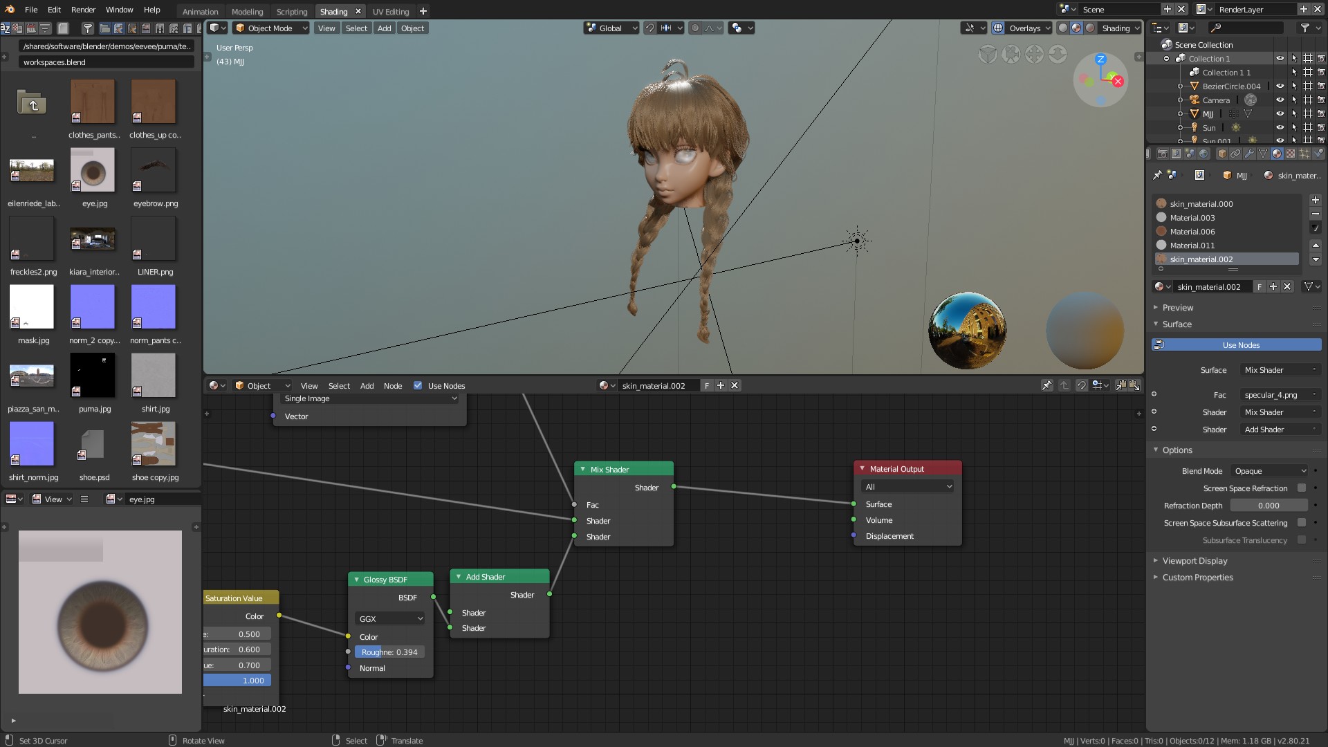
4 Likes
@pablovazquez The image editor is not only for previewing a texture, I would rather use it as a reference to recreate procedural materials. That’s why I think the layout of pvtrcorps was more accurate. You can also collapse the file manager if you don’t need it without losing sight of your reference image in the @PVTR workspace
1 Like
There has to be some give and take here. As a software engineering student, we learned that you can’t please everybody, or you won’t please anybody. The majority of users has to be looked at. Is the majority doing procedural materials or image texture based materials? The image viewer is zoom-able for those who need close ups for procedural/reference images. Besides, these possible default workspace layouts are suppose to be generic to fit the average user. There are some people who will need more specialized layouts, and they will change the defaults how they need to (that is one of blender’s strong points). I do agree with you @zebus3d that those who do procedural textures might want a larger image viewer. However, we are trying to find the best general shading/material editing workspace and @pablovazquez might just have it.
A way around this dilemma is to have a presets list on the right click menu on a workspace tab. The name of the tab will control which set of presets is shown. For example, when editing materials, one might right click on the shading tab and go to Presets and select from a small list of presets like Procedural or Image Texture. This preset list would be controlled by the tab name like:
preset_list = workspace_presets[tab.name.toUpper()]
Until something like this is implemented (which it may not), we need to find the best generic workspace layout.
I love your changes, the viewer in the left column was in my mind too when i did the proposal, but like @zebus3d said, was usefull as reference too.I’m ok with the changes anyway 
PD: I forgot to mention that i left the texture editor on top to get lower render times in cycles too, but thats just because my pc was a potato 