I see that currently Workspace tabs are sorting alphabetically(?) so when you add a new Workspace using the + button, where it shows up is dependent on the name. I was kind of expecting it to get added to the right hand end of the current set of tabs.
The only advantage I can see to this is that when you have multiple tabs for the same Workspace type (General, General.001) that they get grouped together. Otherwise it just feels weird.
What about:
New Workspace tabs created via the + menu get added on the right end.
Allow drag-and-drop re-ordering of the tabs (if possible, or right-click move-left / move-right if not)
Add a right-click option to the tabs to duplicate the current tab which would place it just to the right of the source tab. Maybe also right-click and New Workspace which would be just like the + but would place the new tab immediately to the right of the clicked one as well.
That’s basically the semantics of other current tabbed interfaces like the Chrome web browser.
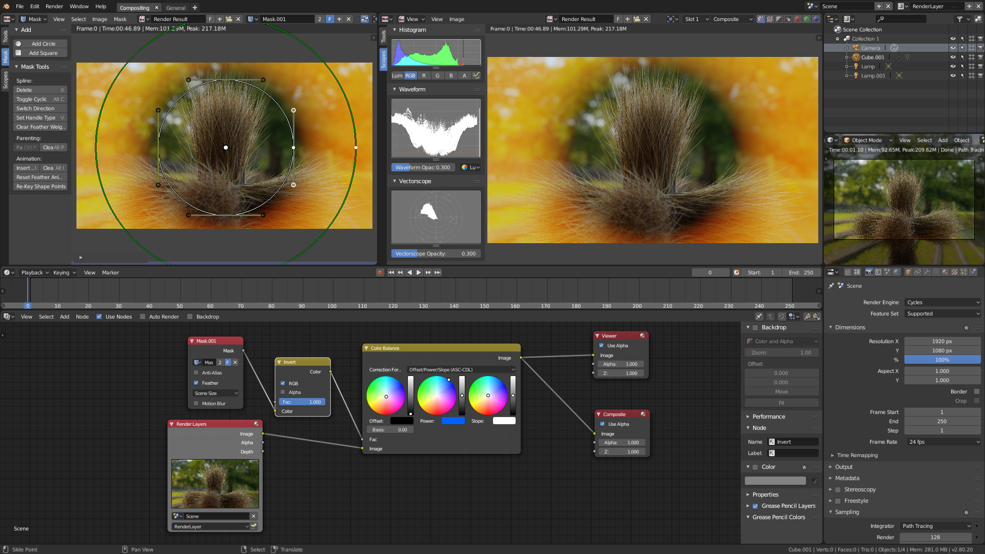
COMPOSITING/COLOR GRADING WORKSPACE
Based on color grading/compositing concept of Davinci Resolve or Fusion
Used addon: Node Wrangler Outliner is for managing View Layers (old name: Render Layers)
Camera preview for the 3D Viewport panel Properties panel for setting up render settings (resolution, output…) Image Editor set in Mask mode: for rotoscoping or color grade masking purpose - Has Mask T panel ON Image Editor set to Rendered Result with Scopes T panel ON Timeline in the middle of the screen for fast scrubbing Compositing (old name: Node Editor) as work area with N panel ON - for coloring or labeling of nodes
The outliner+properties are in the opposite side than most/the default workspace without any real gain, I would move them back to the right side for consistency
Info + Terminal closer together (for copy/pasting), and being in the middle is closer to the text editor
Nice! Clean and clear. This makes me think of a proposal I wanted to make time ago, to split the Output/Export settings from Render/Scene, but I’ll mention that in another thread.
I think this is the direction we should go. I’ve updated the first post with a similar one to this, with a landscape viewport (that will probably make smaller to accomodate more room for the text editor).
The little trick of having the end of the tree in the corner is fun, but something that should be integrated within Blender. A way to set the Composite output as Viewer, almost a toggle.