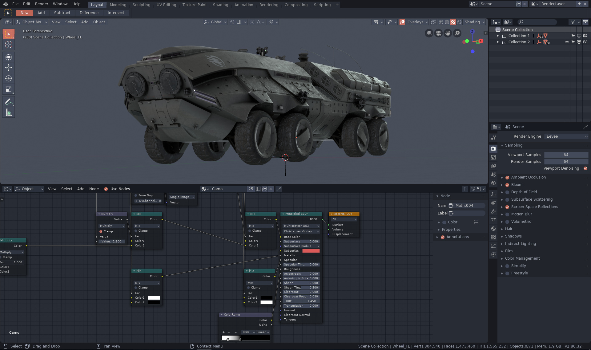
Here’s my theme inspired by One Dark Pro VS Code theme. When I was looking for the best accent color to fit the dark blue tones, I found that orange-red tone olovaxel used in his Odyssey theme fits the dark blue tones best. So the accent color part is inspired by his amazing theme.
While my theme looks a bit similar, it’s built mainly to resemble modern Windows 10 design. Very minimalistic, without unnecessary lines, outlines, shapes and so on.
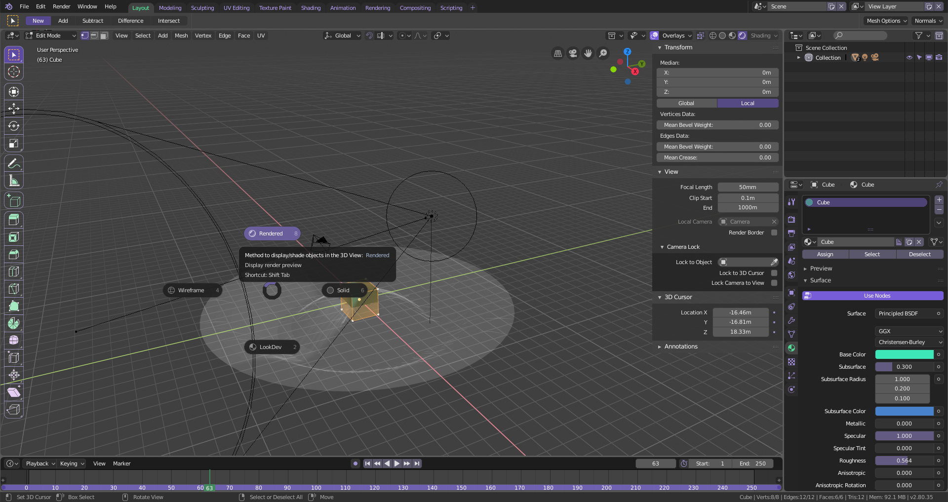
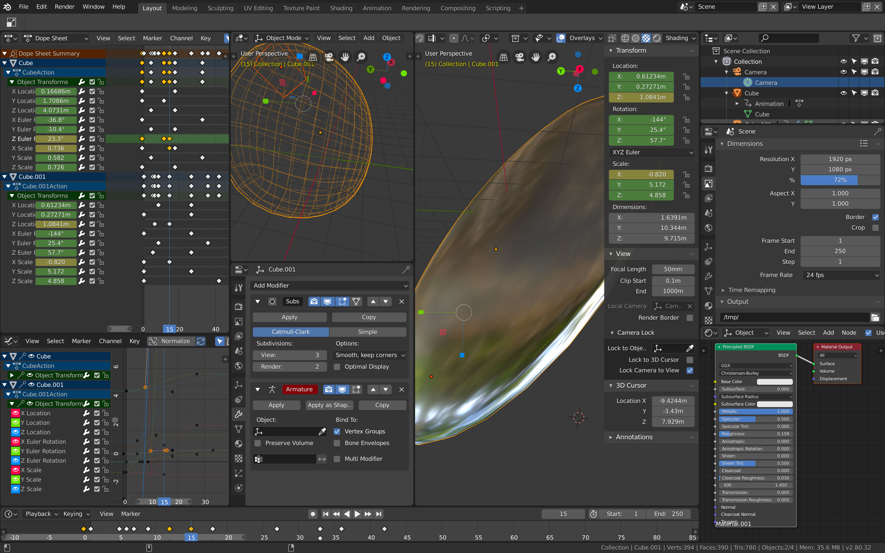
I think the blue in the properties panel is a mistake. You’re using it for the color for selected items, but then you use it as a background . It calls attention to nothing and makes the selected tab not the color of selected items.
That’s my feedback, hope it’s appreciated.
Otherwise I love the theme and voted for it.
I don’t have a version of Lightwave newer than 8.5
Lightwave 2018’s UI doesn’t seem to have much in common with my theme. From what I’ve seen, the last faint echoes of the original LW theme went away after LW 9.6.
I don’t plan to make any more themes until the UI stops making me hunt through the program in order to figure out what every change affects, and stops making me guess what setting affects any given element.
I’ve now added the Lightwavesque XML file in my original post. If you want to use my theme as a starting point for making one based on Lightwave 2018, feel free. I think you are probably better off starting with something like Blender Dark or Dark Blue Gradient, though.
So here is my latest and final update on my rather unexciting dark theme which intends to fix functional issues of the default one.
To summarize:
Like I elaborated on before it fixes
the chaotic visual hierarchies by introducing brightness cascades that emphasize menu structures (higher in the hierarchy = brighter / visually more prominent).
it introduces subtle gradients to clearly distinguish buttons and inputs from other UI elements.
it avoids decorative color in the interface entirely as it is important for a design-application to provide a neutral environment / canvas to work in (I went into greater depth on this here).
Yes I agree. I actually did not make this one as a submission but rather just for fun and anyone can download it as is but if any of the others you mentioned get selected they might need another name probably.
Absolutely beautiful theme! Proves that non flat designs still can look modern and elegant. The only thing i dislike is the usage of 0.0 Black as highlight color, imo something like 0.06 (Brightness Value) looks better.
Edit:
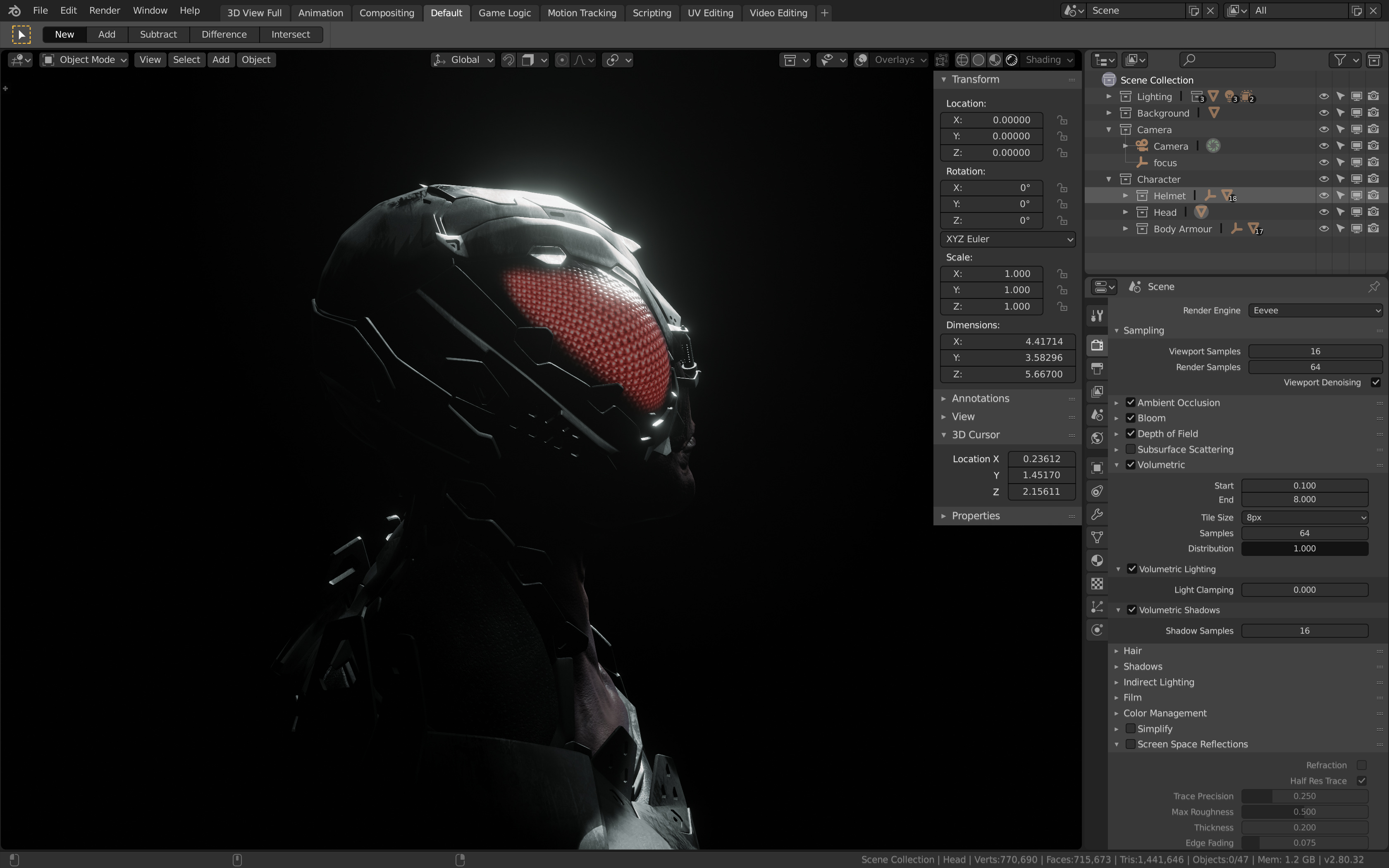
Also the Modifiers Background is too dark to make buttons distinguishable. But i know that this is a problem with Modifiers using the ‘Box’ color that is also used by stuff like lists… I also ran into this problem multiple times. It would be nice if this got it’s own theming option. Or maybe use the “Background” Option from the Properties.
So against better intentions I spent my Sunday improving my theme some more.
Additionally to lotsa details that I addressed there now is a flat version, too.
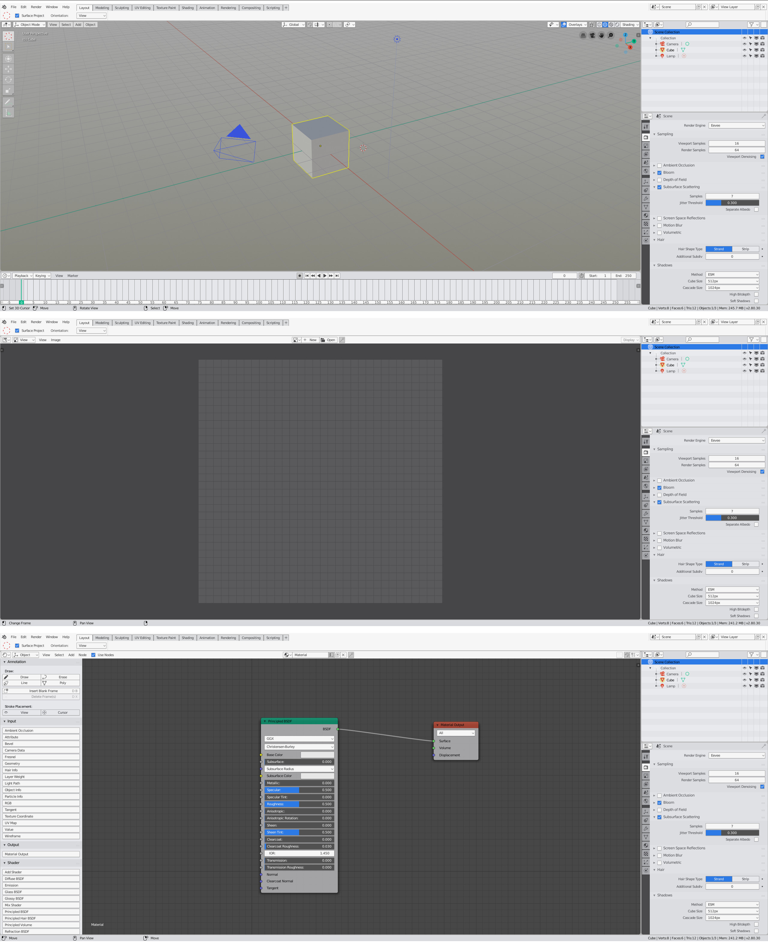
If you try the themes yourself you will find some details that are not visible in the screenshots like the fact that inputs being edited get bright as they are the highest priority elements. Value sliders also increase their contrast while being edited as a side effect.
And finally two a little more flattering screenshots that are not as escalated as the ones above.
Really cool!
One thing that I would personally change though is the animated state, I think it should be a bit more evident, and keep consistency with the default theme, like this maybe:
Another very small thing: in the shaded version I would probably also add the shading to menu items if I were you.
There’s a couple good light themes here already, but here’s what I’ve been using for a year now. It’s lighter than the default light theme in 2.8. I’m thinking of calling it Rain Clouds. EDIT: maybe Light Rain would be a better name