Hi,
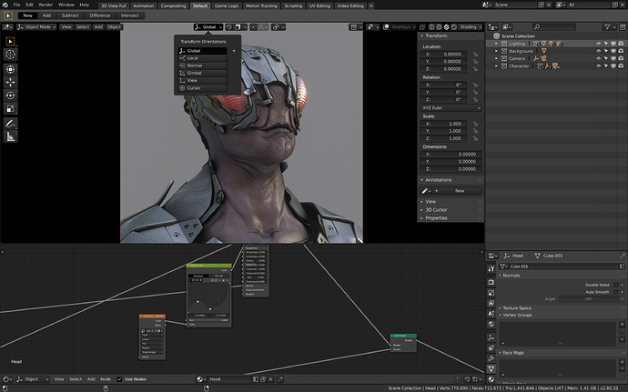
this theme is more of an improvement on the new default theme rather than a new one. The new default theme has two essential shortcomings in my opinion:
-
the visual hierarchies are going up and down randomly which makes it hard to navigate the interface (and from an aesthetical point of view make it look messy). I rose this point a while ago and created a mockup in which i explained the issue in greater depth: http://dropbox.kuen.info/blender28_menus_hierarchy_issues.jpg
(Sorry as a new user I am apparently not allowed to embed more than one image per post.) -
Labels, buttons and inputs are not easily distinguishable in the all flat default theme. There are subtle gradients in mine: buttons bulge out a bit and inputs bulge in.
Sadly as a new user I was not allowed to attach the xml-file so I uploaded it here instead: http://dropbox.kuen.info/okapi-dark.xml
