Great to see other Audio enthusiasts around. I modeled the OP-1 once too.
Haha, I just thought it looked cool. Would be cool to own to play around with, but at $1,000? I dunno.
Yeah, the OP-1 looks super slick and modern. Well if you are not heavily into music production, I don’t think that would be reasonable. 
On behalf of the Blender developers, thank you for all your excellent submissions. I have now attempted to pick 7 themes for inclusion.
I started with the top 20 voted submissions. From here I took the most popular ones and grouped them with themes that looked very similar. I then took those are ordered them from bright to dark to ensure we get a good spread.
Here’s the preliminary list of picks, ordered from bright to dark:
White
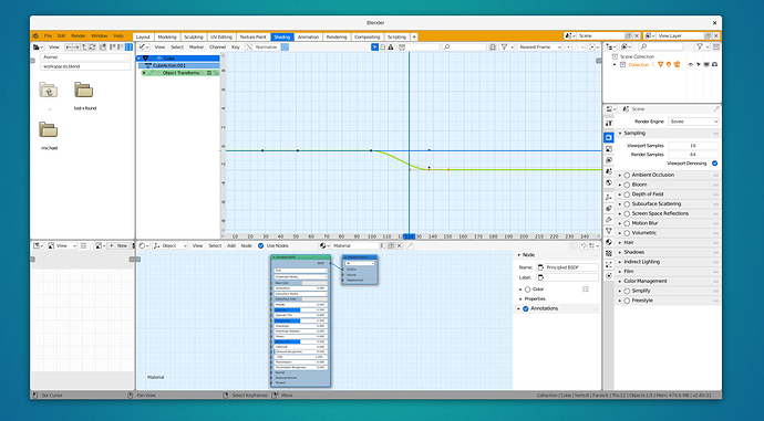
Super bright theme, for certain environments this can make sense.
Fresh Snow
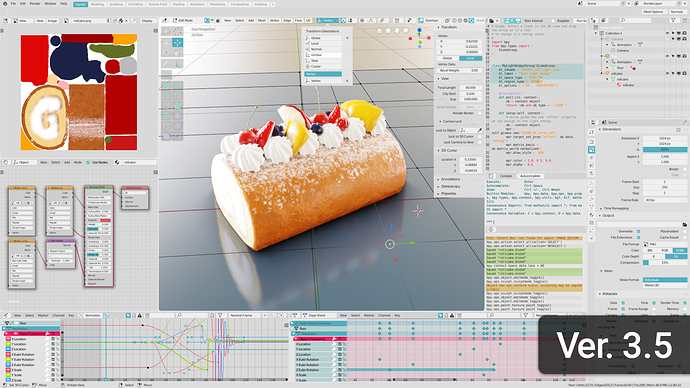
Platinum
Similar to: Breeze
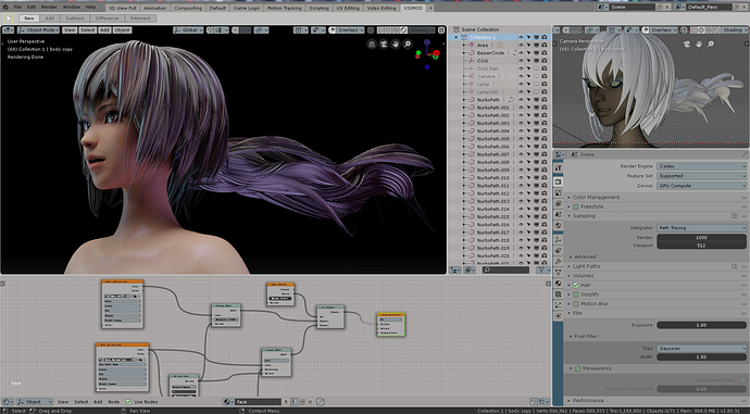
XSI
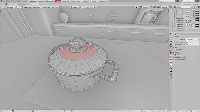
Pro3 (needs a new name)
Nice medium grey
Alternatives: Blender Medium, Modo, Maya, Awesome Theme
Odyssey
Alternatives: Dark Blue, Godot
Dark Minimal
Alternatives: Blender Pro, Greetooth, Yello
Whoa, totally unexpected…
But I already picked my favorite theme.
Shame it’s not included.
Yeah, totally expected this one to be considered.
Cool, alternative pick, thanks! Do you guys want me to keep updating the Blender Pro post here? I still have some colours to set 
If you want, sure. Even if we can’t include all the good themes, at least this thread is a nice resource to download some nice ones.
It’s just incomprehensible. ![]()
But yeah, everybodies free to use whatever theme they please so it’s good so many got made in the process. Can’t wait to try them all out.
Right, but still, no reason to not include one of the best/most liked theme in this thread, even if that means bump the number to 8 instead of 7. I personally would swap all the dark themes in this list, the bright ones are kinda ok.
I know, it’s my favourite one to work in as well 
Why is everybody on here and blenderartists going nuts over this one? Just looks gray with a little orange.
Because it’s elegant and perfectly balanced. It’s hard to find a theme that you can work endless hours without killing your eyes, and that’s the only one I could find able to do that. That’s why people love it.
All look great, and I’m happy to see mine on the list! I also particularly liked Greentooth (definitely a hit with the game dev crowd) and Awesome.
Here’s an update to Minimal Dark that has a few fixes: minimal_dark.xml (41.4 KB)
- I finally found where the “area under the curve” control was hiding, now it’s not blinding white.
- Improved readability of selection and wireframes in edit mode.
- Improved selection consistency between 3d view and all animation editors
- Updated all areas with navigation bars and sub-backgrounds, for future proofing (fixes new preferences design)
- Improved readability of alternative key types in the dope sheet
Last thing that’s driving me a bit nuts - anyone know how to change the color of the object in the source list panel in the NLA editor? None of my NLA colors are like that, and all themes are the same color here, so it almost seems hard coded in.
Well, as explained in the post, some of the popular themes are very similar. I think it would be good to not have a lot of redundancy. We could include the ‘Awesome’ theme at the expense of the ‘Pro3’ theme. Both are medium grey themes.
I’d throw out the XSI theme. Yes, XSI was a great software and yes, quite a few of Blender users are refugees after Autodesk axed Softimage, but UI theme/look was never XSI’s strong side and that directly translated to this Blender theme. It looks like something straight out of 90’s.
Blender 2.79 and earlier had an issue of being bundled with large quantity of low quality themes. Let’s not repeat the same mistake.
If there’s a need for a good looking lighter gray theme to complete the lineup, I am happy to make one 
I’d throw all of them out ,but the Platinum one, LOL. The White one looks like it was made in 2 minutes. Not sure if it’s the orange and blue color ,but it doesn’t look that great if you ask me. The nodes blend with the background to much on the two dark ones. Dark Minimal looks like black was just copy and pasted on every setting. Pro3 looks to much like the new Blender default theme.
I have no problems with that, since the ‘Awesome’ theme got the most votes anyways.
I am obviously a bit biased in this since my theme is also among the alternatives for Pro3, but, if you ask me, the Awesome theme is quite dark and it is much closer to the default one than to a middle grey, so IMO if one should be removed to make space for it, I think it should be one of the brighter ones, for otherwise there would be quite a gap between super bright and super dark themes.
Awesome vs Pro3:
https://cdn.knightlab.com/libs/juxtapose/latest/embed/index.html?uid=a1b5706e-f247-11e8-9dba-0edaf8f81e27
Awesome vs Deafult:
https://cdn.knightlab.com/libs/juxtapose/latest/embed/index.html?uid=11eda986-f249-11e8-9dba-0edaf8f81e27
