okapi-dark.xml (51.3 KB)
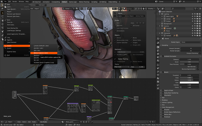
Just updated a few details. Added subtle transparency for the menus and an accent color (the brand-orange) for menu mouse overs.
This by the way is a third shortcoming of the current default theme. Blender is an application intended to create designed content. Just like you wouldn’t want a music application to have background music playing while you write your own songs you don’t want to have an application like Blender show colors in the UI which might not be harmonic with what you are creating. I understand that people might consider a purely black and white UI a little bland, tho. So I think it is a good idea to a. have accent colors show up only temporarily instead of using them to mark permanent UI-states and b. don’t use some random blue for the application’s default theme but the brand color.
