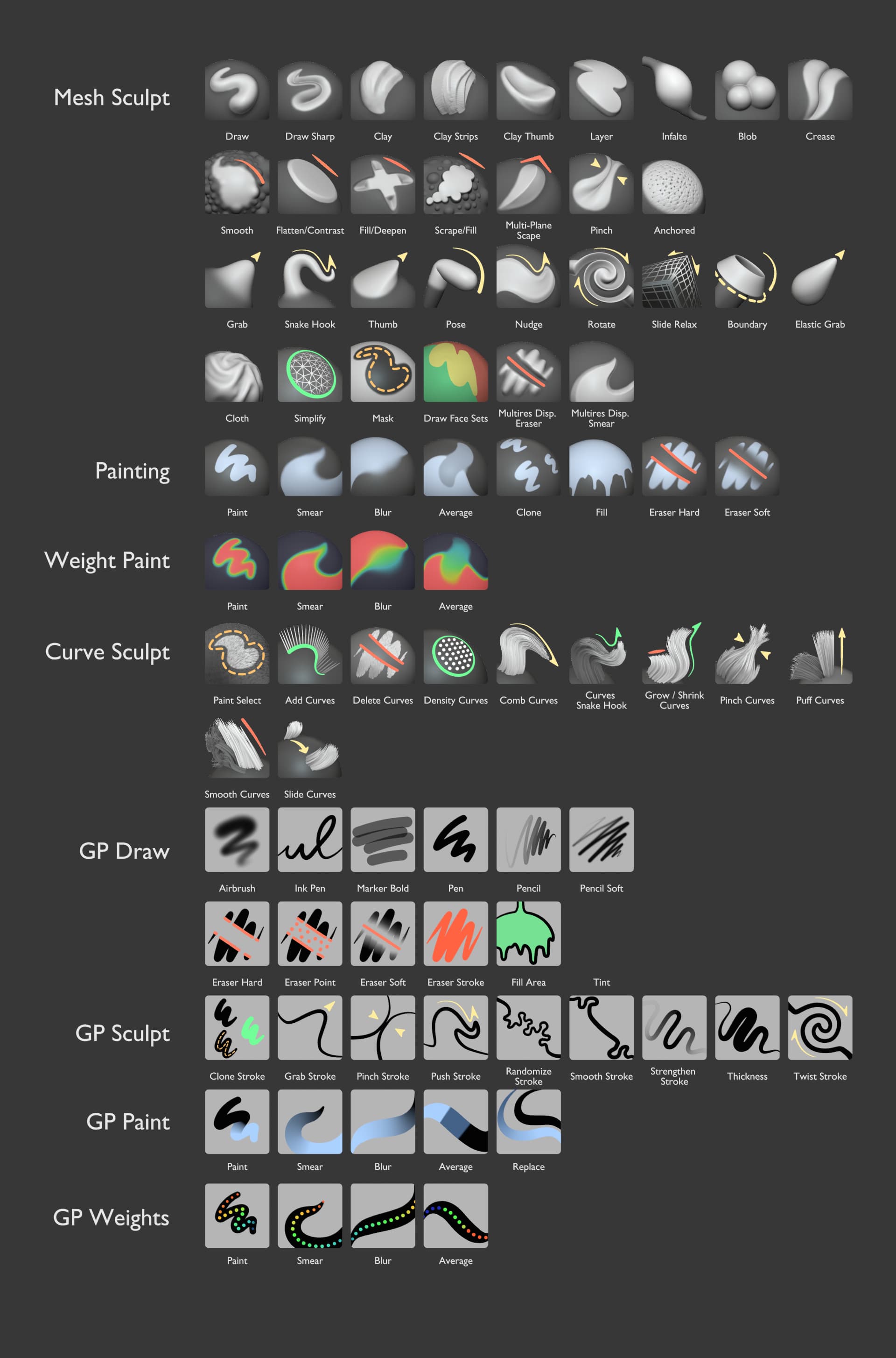
I’ve been reworking the general brush thumbnail design for the upcoming brush asset support.
The goal is to unify the design of brushes across Blender to be cohesive and fit into the current UI.
It’s progressed far enough that I need further feedback from devs & users and approval from the related modules.
Based on this design task. You can find more detailed info there:
The current design
These are still unpolished and only the initial set of brushes. Many more brushes and variations need to be worked on.
Below there’s a preview of how they would look in the smallest size in the asset shelf with sculpt mode as an example.
Only feedback I would have is that Additive/Subtractive brushes for mesh sculpt are really lacking colors. Not only are they associated with light blue color already, but when all sculpt brushes are mostly greyscale, those colored icons in the corners are super helpful as visual guides.
In this image you have blue overlays on additive brushes and bringing them back in some form would improve new design I think. These ones are much easier to find at a glance than new ones.
And another one would be that if additive brushes are to use blue color, I would change paint brushes to something else, to avoid confusion. They’re not really associated with any color in Blender currently, so anything can be assigned to them.
Overall, I prefer the “result” presentation that the icons offer. I think the consistent angles are good, and they are also quite cohesive within each group.
The element that stands out to me the most, as a visual design problem, is the corner icons.
While there are technically ‘categories’ (orange = X, purple = Z), I don’t believe this is information that needs to be communicated to the artist via the icon color. Certainly, BLUR is a “don’t take things away, make it different” while ERASER is “take it away”, but I don’t think in terms of categories when I’m painting. I want it to be blurry, or erased, or smeared, or I’m drawing a line… not “I want it to deform, remove data, modify data, add data”
As they’re all colored by category, it creates a new problem: how to show them on backgrounds with poor contrast. The use of a drop shadow in order to create readability is almost always a failure in core design - not just in UI, but television commercials, print adverts, etc. It’s a hack that is added because there was no other choice. For example, a client has brand requirements that the logo ALWAYS be white… and the background of the filmed shot is a light grey. In this case, the drop shadow is a bandage - not what we would do if we had other choices.
Combining the two above, I would advise doing away with these color icon categories completely. Pick a single color for the sculpting - the orange has good visibility. Reducing the bumps in the Smooth and Scrape previews will give the icon more room to stand out.
For grease pencil, use a monotone black icon for all. On some of the icons (Paint/Average, GP Weights for example), the black icon would not be able to be seen. This can be solved if the “art strokes” are all painted from bottom left to top right, as GP Paint/Blur is done. Example below:
Sculpt mode will be redesigned.
The Tool Shelf will be reduced to a single sculpting tool - “Brush”. The different settings (Types of brush) will be taken from the asset shelf.
The icons for tools in the asset shelf can jus be the current Tool Shelf icons reused. Their design is good. So why not use just those on the asset shelf? Maybe just some tweaks?
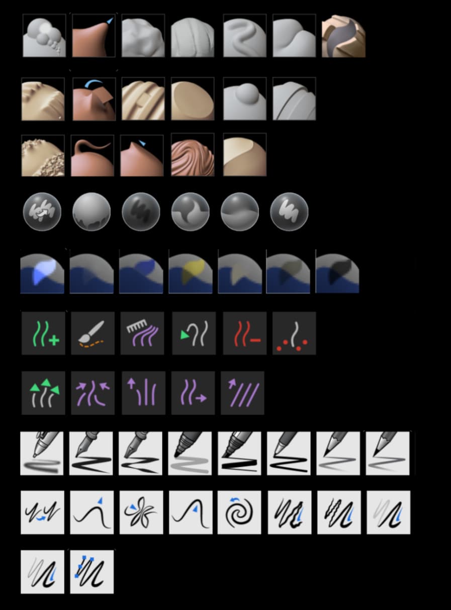
These different thumbnails serve no purpose, currently look like they don’t belong to the same app, and do not need to exist at all:
I always thought the same. Why have a tool icon AND also a thumbnail? I hoped that with the brushes re-design we had a chance to merge these 2 in just one icon. I also love the icons that were introduced in 2.8, and hoped we could just use those.
Just to be clear. The redesign aims to replace the brush tool icons and existing thumbnails. So they are unified and shown in the asset shelf.
The tool icons are sadly too simple to offer the variety that is needed for the essential and community asset libraries that we’re expecting. That will be hundreds of brushes. That’s why thumbnails are the goal instead.
The presented redesign is only the initial batch. The final amount of essential brush thumbnails will expected around 60-80.
I really like the thumbnails for sculpt, paint, weight paint, and curve sculpt, they finally look like they are part of the same program; but the ones for GP aren’t as readable as the current ones, specially at smaller sizes, they look a bit messy.
And I agree with @nickberckley about the colors, a hint of color can help make them more readable at a glance.
Problem with contrast on colored icons can only arise if they’re drawn on transparent backgrounds and can blend into theme. That is now only case for some yellow brushes, but they’ll be fine. If blue icons or strokes are drawn on grey spheres they’ll be readable no matter the theme. And having them readable will help users a lot. I think main goal of these thumbnails is to be identifiable at a glance, in less than a second. And just shapes, when they’re all same color, can’t meet that need.
Because it is challenging to distinguish them between each other and understand their functionality from flat 2d stylization representation.
Sometimes it feels like they would work better being replaced with letters.
However, I am not sure that it is possible to make readable icons of that size in the other way than colored 2d. A smaller thumbnail means harder challenge to design.
Are we missing one for elastic move? Arguably the coolest brush of them all.
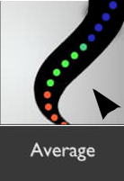
Weight paint average looks a bit like smudge, if weights in the area inbetween were uniform it would be more readable imo.
Painting blur could be a tad more blurred, but maybe just me looking at it on a small screen at the moment.
Looking really nice overall. Just a quick question reagrding the asset shelf - can it be toggled on/off via a hotkey like the toolbar or the n panel? Couldn’t find any info on that.
I like the sculpt icons and I second that it would help if there was a distinction brushes that add volume or reduce volume. Those that modify existing meshes by piching, for example would then be neutral.
The icons I don’t like are the Grease Pencil ones. I believe that since most brushes mimic traditional drawing media, the thumbnails should reflect that. If there is a marker icon as part of the icon, it is clear what you can expect the brush to be, same with a pencil, paintbrush, etc. By taking the medium away, you’ll leave the user to do more trial and error work in finding the right brush. In that sense, I think you could copy Krita’s brush icons for the various traditional media. These could then be re-used by brush makers to create a consistent design for brush packs.
Pie menus is known as a workflow-dependent UI/UX solution.
They are beneficial when cursor position doesnot matter (like sculpting or painting).
In workflows where you expect to edit many similar elements in complex assemblies, the cursor position is used to mark/indicate the exact element you need to edit to distinguish it from the others, so UI splashes and mouse jiggling caused by pie menu using became distracting.
If you’ve ever gotten lost in an unfamiliar place or building, you know the feeling: the architectural workflow in computer graphics is essentially similar, but persistent.
This is why pie menus are not welcome in workflows like architectural or manufacturing.
You make a very good point. Representing the result of the brush is only good for sculpting, for painting it just results in lines, which are indistinguishable on little icons. Every bump and thickness is lost. Showing real life object that best represents that brush behavior is better. I quite like current icons for GP brushes, I would just keep them and create new ones in that style. When I want something that works like Marker I’d rather see marker icon than line that is thicker than pencil one. And bucket is easier to identify as Fill than colored blob.
Also, there was talk about also implementing drawn line previews for brushes like in Photoshop, if that became a case icons with lines become redundant.
Thanks for the feedback! Many really good points were raised. If I don’t address them here just assume that I agree with you
The current design is intentionally not going in this direction. The reason is that the thumbnail is then mostly just an icon of a real world tool. There’s a level of familiarity or experience required to understand them and they distract from the actually important part: What the brush stroke looks like.
They are also harder to create because a significant amount of time is spent to create the icon part.
The new thumbnails are intentionally simple & low effort. Anyone could create one with a viewport screenshot using the existing matcaps, masking, annotate for some color and icons. Custom low effort thumbnails can fit into this design language.
We are also in a digital software with very limited brush customization. None of the brushes can really mimic real life tools. They can get close but most of them will feel and look distinctly digital. A lot of brushes will have no real life equivalent because of that, so trying to find and design real life tools for those is a huge effort.
The focus with the proposed thumbnails is primarily on the brush effect because there can potentially be a massive amount of variation. You’re supposed to see at a glance how the brush will look like when you use it. The real-world-equivalent icon on the thumbnail cannot fulfill that.
That one, the various cloth brushes and more will be added in the final thumbnail set. It will be fairly similar to the Grab brush but with more emphasis on the overall shifting of volume.
Unless the stroke thumbnail changes in real time as we modify it I don’t see the benefit. A tool and a stroke preview should be two different things in my opinion.
