Yes to both. Although I set up cameras to make them consistent to recreate.
I’ll share the file soon and add it to the description.
Automatic brush previews were the original idea years ago but they take a lot more resources to implement and are basically impossible for sculpting brushes.
The second best solution with this design is to be able to make them low effort to create.
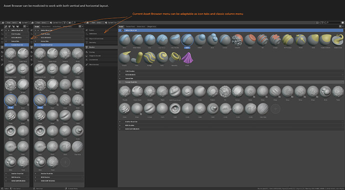
Some softwares add the icons for the real world equivalent when the thumbnail size is changed. I don’t know where the icons are meant to be in the future (asset shelf, N-panel, tool settings or all of these). So I could see larger thumbnails display the type icon (marker, pencil, etc.), whereas small icons won’t — or they would have some other indication like a letter or something.
My point is that you often cannot distinguish between brushes even if they are like 96 px high thumbnails, which is large for an asset shelf. The thumbnail usually only shows the main properties of a stroke (i.e. fall-off, opacity, tip shape, etc). So there will likely already be an element of guesstimation which brush stroke is which brush. Now with an indication of the real world equivalent actually gives you more indication of what to expect. Yes, you won’t see if a brush is hairy or gritty, but if you know the real world material, you actually do. For example, if you see a thumbnail is for a marker and has a broad stroke — and there are only so many broad markers — then you can infer which brush you are looking at. It helps narrowing them down, but also makes it more memorable which one you used earlier due to the added distinction.
Not necessarily, if there was a built in set of icons that you can set to display on top of a stroke (like in Krita), the Blender Foundation (and community) can actually set recognisable defaults, which third party creators can use to categorise their brushes. This helps create consistency for a brush library.
With the Krita example in mind, the way I see it is you give users a scratch pad within which the brush preview is drawn automatically or by hand and the size given to draw on already includes safe margins so that any other (likely SVG) icon for brush type can be placed on top.
For Grease Pencil I don’t see why Blender couldn’t mimic vector brushes from common vector design software, where you take aspects of pen pressure, tilt, drawing speed, etc. into account as well. I mean, lots of these parameters help create a nice feel for a brush, so why impose limits now, if you don’t yet know what the future might hold. It’s not like its not reasonable to assume that the GP brushes can new input features or vector brush features, because GP is roughly equivalent to a 3D vector brush after all.
I understand, but then you’d need really large thumbnails so that you can actually see the fine details in a stroke, which I suppose is not feasible in terms of screen space consumption.
I’m not sure I agree with that. I would argue that it is far more intuitive to see a marker icon and know that it is going to likely be hard edge and semitransparent, than just see the semitransparent overlap. Without the marker reference it just seems like a random tweak to the ink pen to me (e.g. why hard edge instead of soft edge if there is no specific tool backing its conception? why is there a version as a semitransparent ink pen and not some other tweak?).
Or take the chiseled tip marker. It being just a stroke, the thin-thick line could be due to orientation, pressure, etc. You can assume it is because of the tip, but it would be far less obvious without the marker icon to back it up.
Or even the fountain pen variation. It is very digital, as you said. They are by no means a realistic representation of the result an actual fountain pen would give you. But it helps a lot in my view to know why the noise is as it is, why the stroke is configured that way…what the aim is. I think that carries value.
Don’t get me wrong, I’m not trying to defend the current icons as they are, but I think they add a descriptive element that it is very potent, very useful and intuitive. I’ll give it to you that they are much more time consuming to design as icons, that’s for sure.
On the other hand, I think the GP draw icons should keep the same stroke pattern. Two reasons:
Right now they are harder to scan visually. If the aim is to make clear how the brush stroke looks like, all of them having the same stroke makes the difference between them much more apparent. And I would say that it also makes them more consistent, more obviously part of the same pack so to speak, so when the user creates their own set, all the default ones will be more distinct.
As they are now (I get they’re in wip), soft pencil and hard pencil are indistinguishible to me, the stroke is too small to easily notice the differences.
How do these new icons hold their design on light background?
I find the simplify icon actually looks more like as if it adds detail. Perhaps add less small lines or use half of sphere with more detail and other half has less detail to make it more clear it lessens the mesh density
I also like the approach in the post above. Where it adds more distinctive color, this matches the toolbar icon better
I get your points about the real world tool icons. Sadly these are out of the scope for the thumbnails. It’s not feasable to make these part of the unified design language.
If the thumbnails are not recognisable enough by themselves, then that’s a failure their core design. Adding more elements won’t fix that.
I’ll do another pass on the grease pencil thumbnails in particular to make them more recognisable.
I have some ideas.
The issue with that is that every thumbnail starts looking the same. To make them recognisable they each need a much more unique shape.
I like to have some exceptions, like when the brushes share the same core behavior.
The zoomed out spherical thumbnail design is making all brushes look too similar. The new thumbnails should be free to use any zoom, angle or geometry to make their core shapes recognisable.
The grey sphere style of thumbnails is something that is most useful only for textured brushes.
The light/dark contrast of the thumbnails, using bright matcaps and dark mask overlays should make sure they are readable for any theme.
I don’t think it’s necessary to have universal design between Grease Pencil and 3D brushes, that is just handicapping ourselves. They’re too different and GP design shouldn’t be constrained about what is possible in 3D.
Why not keep current design? I think it’s better than anything proposed and it has both, brush stroke preview and real-life tool.
Weight paint icons I would not make so colorful. They could be the same as painting, or maybe with a slight difference. They are for different modes so not easy to mix up. And potentially in the future in the same mode that supports painting multiple types of attributes.
I think the nice thing about the icons by @silex is is that it’s a single integrated shape that you can read at a glance, rather than a 3D shape and an icon in the corner. The arrows seem fine because they are near the 3D shape.
The zoom level I guess is a separate design decision.
Yes I’m trying to make the weight painting thumbnails simpler than the default theme gradient. I can change the gradient further to be less punchy and colorful. Desaturate the blue and red in particular.
Once we there’s support more attributes for weight painting or attribute paint mode, I can update the thumbnails to not just use the color gradient.
I think the uniform circular shape for thumbnails is very appealing. It works fantastically well for material assets for example. But using them as a strict rule will limit the scope of the thumbnails.
For elastic brushes I’d love to use zoomed out shapes for example. Because those brushes in particular affect a large area and are used to loosely reshape entire objects.
Maybe I can implement the feedback I got so far tomorrow. Will share more soon!
Here’s one thing to think about: Color coding.
Something like this:
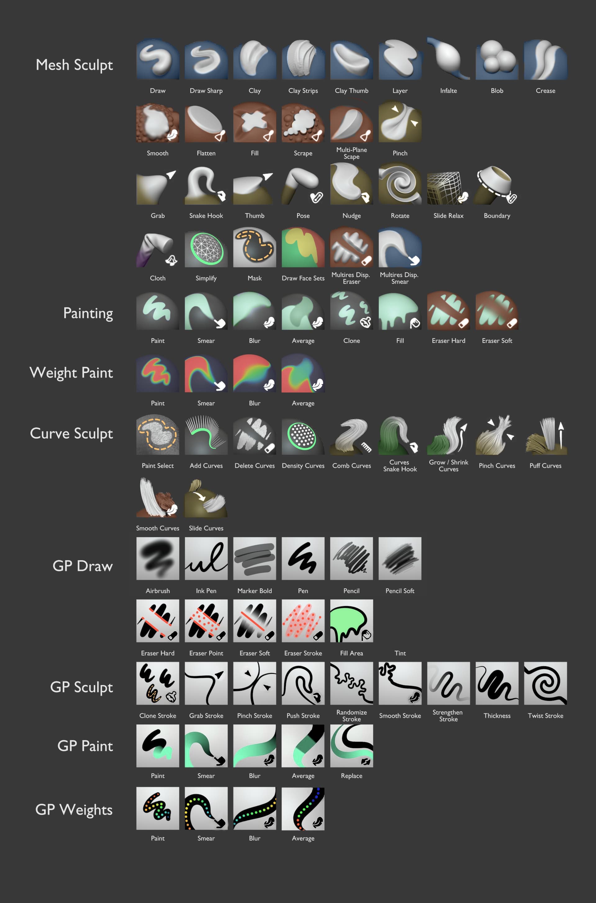
Add detail (Draw, clay, blob, etc) - Green
Reduce detail (Smooth, fill, flatten, etc.) - Red
Deform (Grab, Snake hook, Pose, etc.) - Violet
Physics (Cloth) - Blue
Utility (Simplify, mask) - Black/white/gray
etc…
Just make sure these fit the color palette of blender icons, and are consistant with other modes (Check the tool palette colors of edit mode, for example, and see what each color means).
There’s no unified guideline on the meaning of colors across Blender.
I tried following other examples of Blender before mostly landing back on the original brush colors.
I believe the brush thumbnails should follow their own color guidelines.
The rest of Blender’s UI is not a great base for consistency …
Currently both simulation and deformation are typically using purple. Adding/removing something is very loosely defined.
In this design proposal the only case that is still a bit messy imo in terms of use of color are the curve brushes. Puff and smooth should use red since they remove detail an straighten curves. Snake Hook and grow should use yellow unless they start resampling curve points.
Agreed. And as i discussed above, the use of color coding to “help” the artist find the desired brush - in my opinion - would only assist those who have a firm grip on what each color category actually means. Otherwise it’s just visual noise.
And again, “add detail” vs “reduce detail” brushes - I think this gets into the minutiae. Even in 2D painting, I’m not choosing a brush by a category of does it “change” vs “add”. I know I want to blur a stroke, I pick up the blur tool - I don’t think “let’s go to the brush modify result category”.
@JulienKaspar I personally am digging the new icons. But in fairness to feedback made. (not all of it…)
I think what you’ve made (visually) is great. It definitely stands out, and is legible at first glance for a veteran industry artist like myself. Its also great, because it gives Blender more …how would you say it?.. An “official” personality, or identity at a glance that can separate itself from other apps.
I do hold an agreement to what @FreeMind had written about color coding. That part definitely struck me beyond the visual eye-candy of the icon. Because one thing where the new icons confuse me, is that part where I double check. Was this that brush that “adds or subtracts, etc.?” Right now, it looks like icons contain 3 sets of colors. (That’s OK!) - But what would help is possibly adding a color Dot, in the upper left corner that is a color code marker for the brush type function. This is a great idea to add! (I think.)
I would say try that out 1st, before doing any drastic changes to what’s currently there. Also, is there a specific build I can try these out myself to test on for user experience? I think while everyone has fair feedback, its always best we try before we buy into the criticism or settlement of the current design.
Other set of icons mentioned are too colorful and ‘thick’ in my opinion. Looks less like official brushes in 3D suit and more like collectibles in Nickelodeon video game. Julien’s designs are very beautiful and really have identity to them. And Recreating them can be very simple if you just have same camera angle he has.
I wholeheartedly agree with this. When I first started using gp I always got confused trying to find the brush with the hard edges. The old icons were just not helpful because I would think it was the marker or the pencil, in addition to the stroke in them not being accurate. What I was actually looking for was the ink pen tool, whose icon does not match the behavior or the strokes.
The new icons are so much better at letting me know what the results will actually look like.
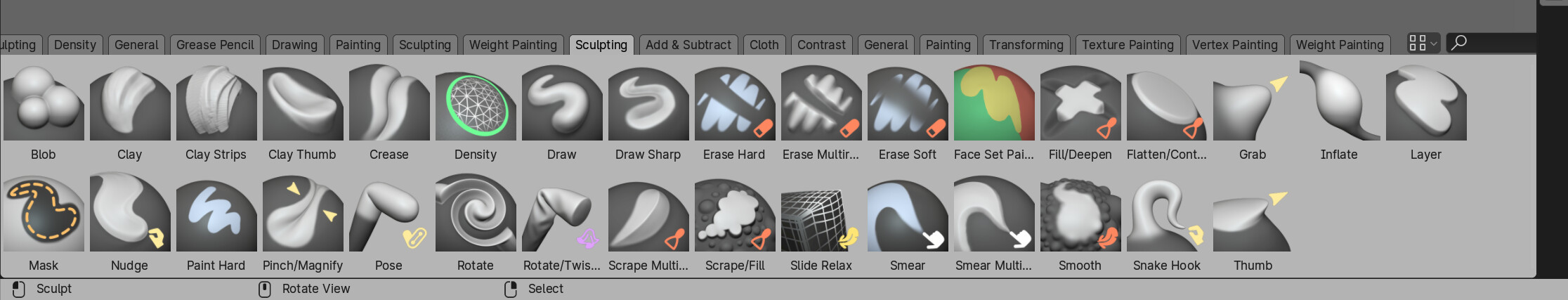
Also I think the current colors for the sculpt icons are blue for regular, red for polish, and yellow for deform I guess.
Here’s an experiment, painting over the proposed thumbnails:
Monochrome corner icons (White or black depending on the background)
Colored dark areas (Would be using vertex paint instead of masks)
Painting brushes are now mint-green
Additive/Subtractive sculpt brushes are blue
Tweaked weight paint brushes
More identifiable strokes for Gpencil Draw thumbnails
Overall I think it’s a positive change. Icons are more readable. Colors are easier to identify (Although they turned a bit muddy. Doesn’t yet look good on most curve brushes).
The Gpencil sculpt brushes also lost all their color, but it’s not that bad as there’s no incentive to make custom brushes. The set of brushes is and may stay very small.
It’s good but I would just flip the colors. Leave bases grey and color the tips/strokes. It will have better balance I think.
Also might be my monitor but some colors seem really dark, like different shades of brown. Previous saturation/value was better imo
I know I’m in minority here but originally proposed thumbnails are still best in my opinion. Besides adding hint of blue lines/icons to additive brushes I wouldn’t change anything about them.