More of a UI wound rather than a papercut.
Recent builds are causing any edits done to the modal keymaps to shift the hotkey view and collapse the entries.
I’m only able to show this in a concise gif because I practiced it 10 times.
More of a UI wound rather than a papercut.
Recent builds are causing any edits done to the modal keymaps to shift the hotkey view and collapse the entries.
I’m only able to show this in a concise gif because I practiced it 10 times.
When not selected there is a thin line triangle. When selected i think it should be enough to thicken the line to maybe 5-10 pixels. We could look trough and also know which camera is active.
One little paper-cut
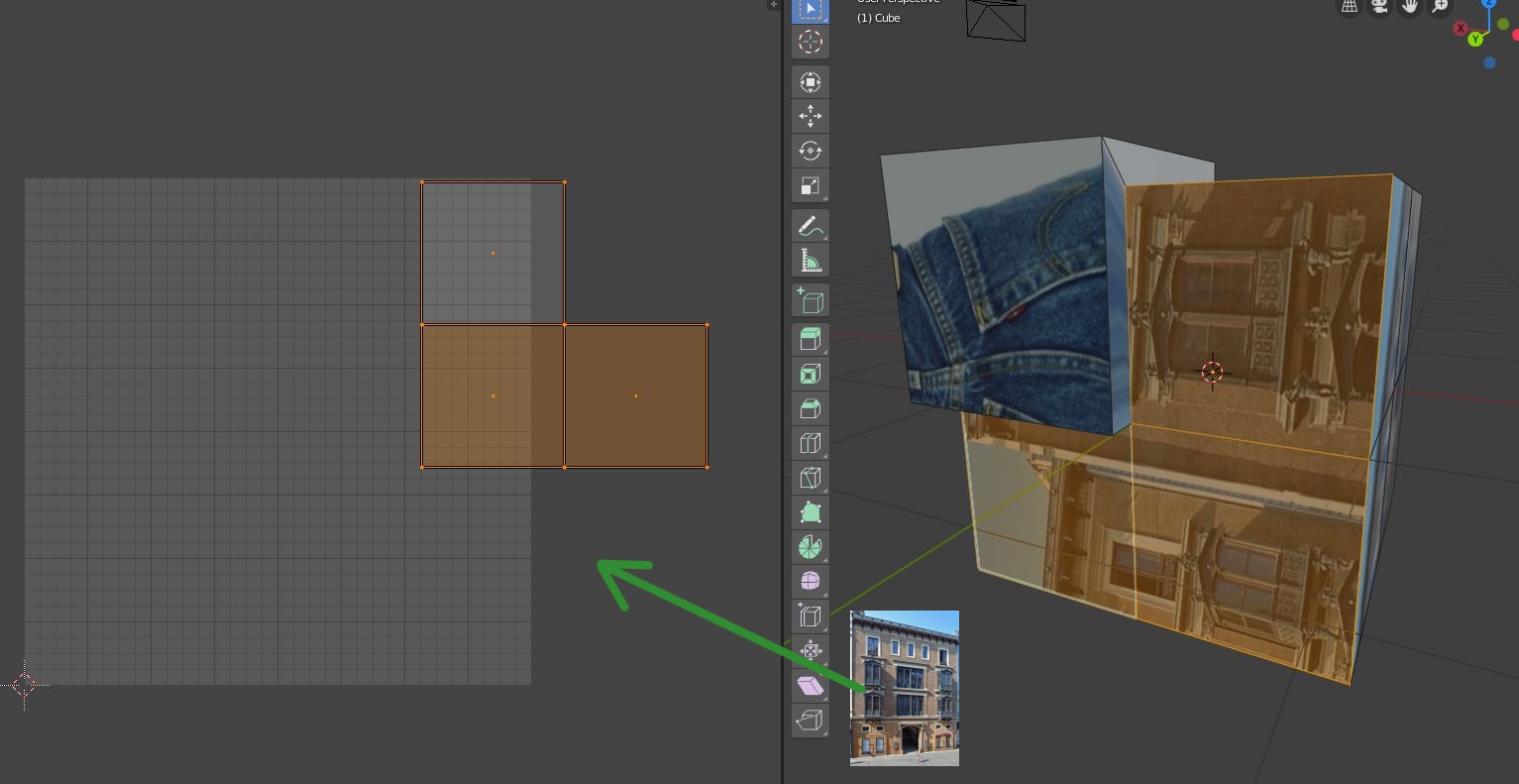
automatically show texture of selected face/vertex/edge.
reminder of feature on rightclick select ![]()
This is kind of problematic, because of blenders philosophy of not deciding what’s best for the user. Because if you do not want this to happen, it can get really annoying really fast. Also most materials utilize multiple textures so there’s another problem.
I think it mihgt be possible to add a button to the image editor that when toggled always switches to an the active image of the material assigned to your active face.
but since Edges and vertices can be next to multiple materials, it will only work with the active face or the majority of selected faces…
But I’m not shure, if this is a UI papercut (small pesky bugs), since it kind of is more of a feature request. Also I think this is probably better dealt with by making an addon.
I agree with a button. Have an option is better then nothing.
I do not agree with add-on. This is something for default and add-on may get in the way of optimization if not coded properly or get in the way of other add-ons.
Ctrl+click on the header would do the job. Love the idea!
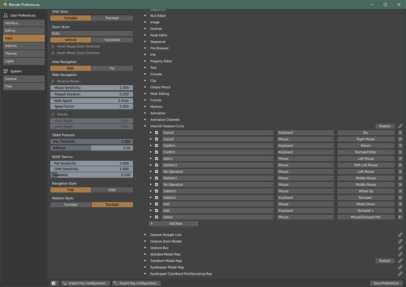
You need to use the top level section. Don’t go into 3D View, just scroll down towards the bottom, you’ll see View3D Gesture Circle. Edit it there. The Knife Tool Modal Map does the same thing.
A suitable workaround. Thank you ![]()
EDIT: Resolved with the latest Preferences changes. Thanks!
May as well use this post to add another, but this time more of a peculiarity:
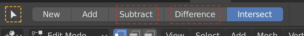
For the “Select Box” mode, which refers to what to do to the selection using input from the drawn box:
Before
After
Reasons
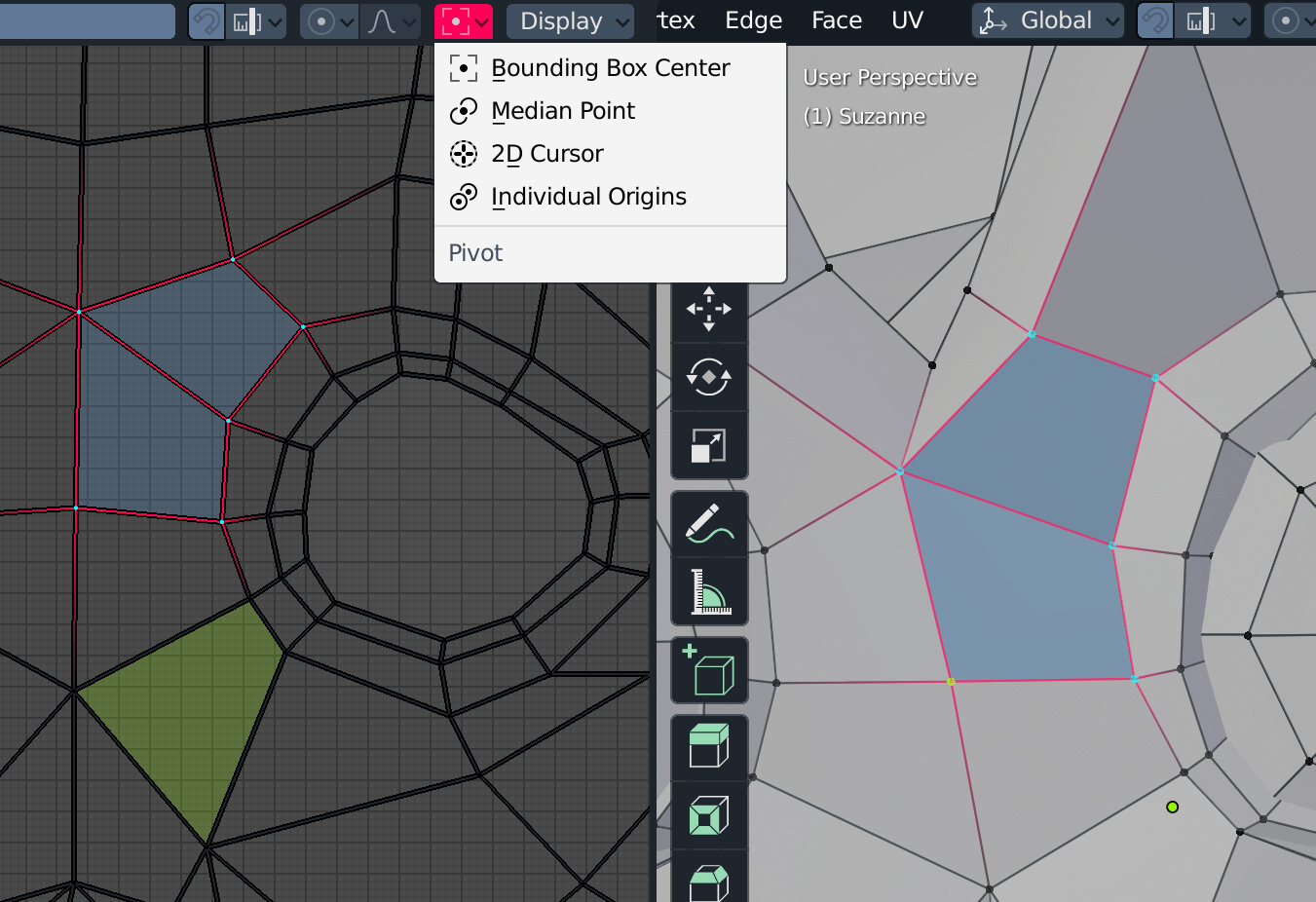
Adjusting the colors of the theme, I have seen that in the 3D view the faces can not be active (active element), and in the UV Editor, the vertices and the edges can not be activated either, only the faces.
On the other hand, in the UV editor I can not pivot from the active element.
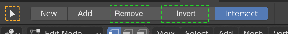
Yes I agree. “Invert” and “Remove” make sense for me.
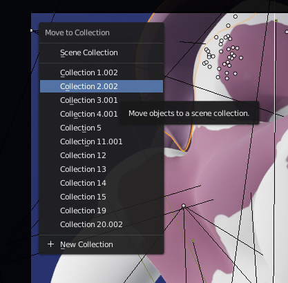
When moving something to a new collection you shouldnt have to actively click into the “name” field.
So if you dont want to rename you can still click “enter”, but if you want to rename, you can just type without having to click into the "name field. ![]()
Just a small thing, but I think about that everytime I do it ![]()
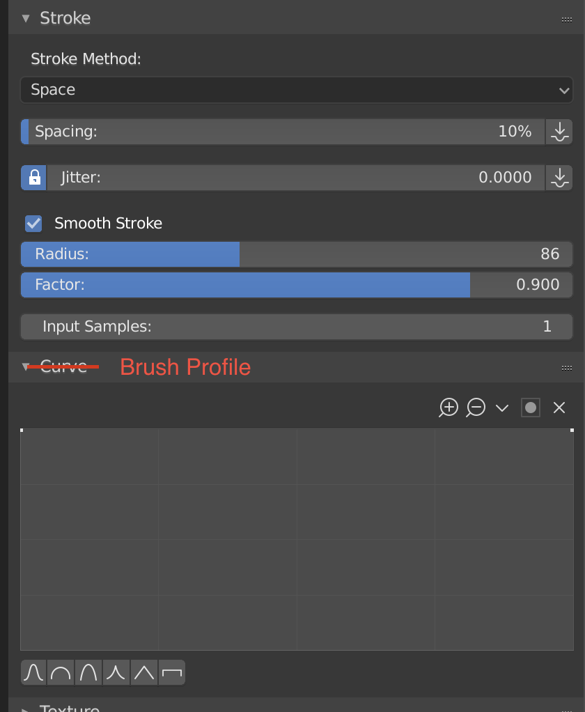
I’m always becomes slightly confused when I need to open up the curve setting for brushes… I think it should have a more describing name like “Brush Profile” so that it becomes clearer what it’s for.
In regards to moving objects to collections:
As it is now, when pressing M to move an object or selection to a collection it just gives you a plain list of all collections:
I think it’d be helpful if an indicator were next to each collection in the list displaying it’s visibility status; whether it’s visible in display, render, etc (similar to the visibility buttons/icons in the outliner).
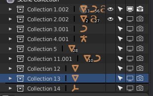
Sometimes when moving things I just want to add it to a invisible collection or vice versa for quickly setting up the scene for a render, considering that the old view layers system in 2.7 did exactly this I think it’s a given that some of that functionality is brought in to collections.
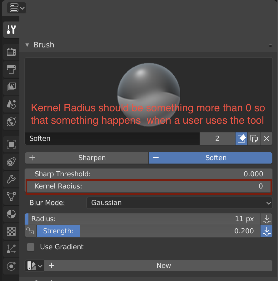
Please change the default Kernel Radius on the Soften Texture Paint Brush to something that makes it do something. Maybe 3 could be a good number?
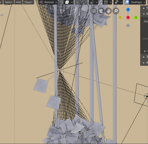
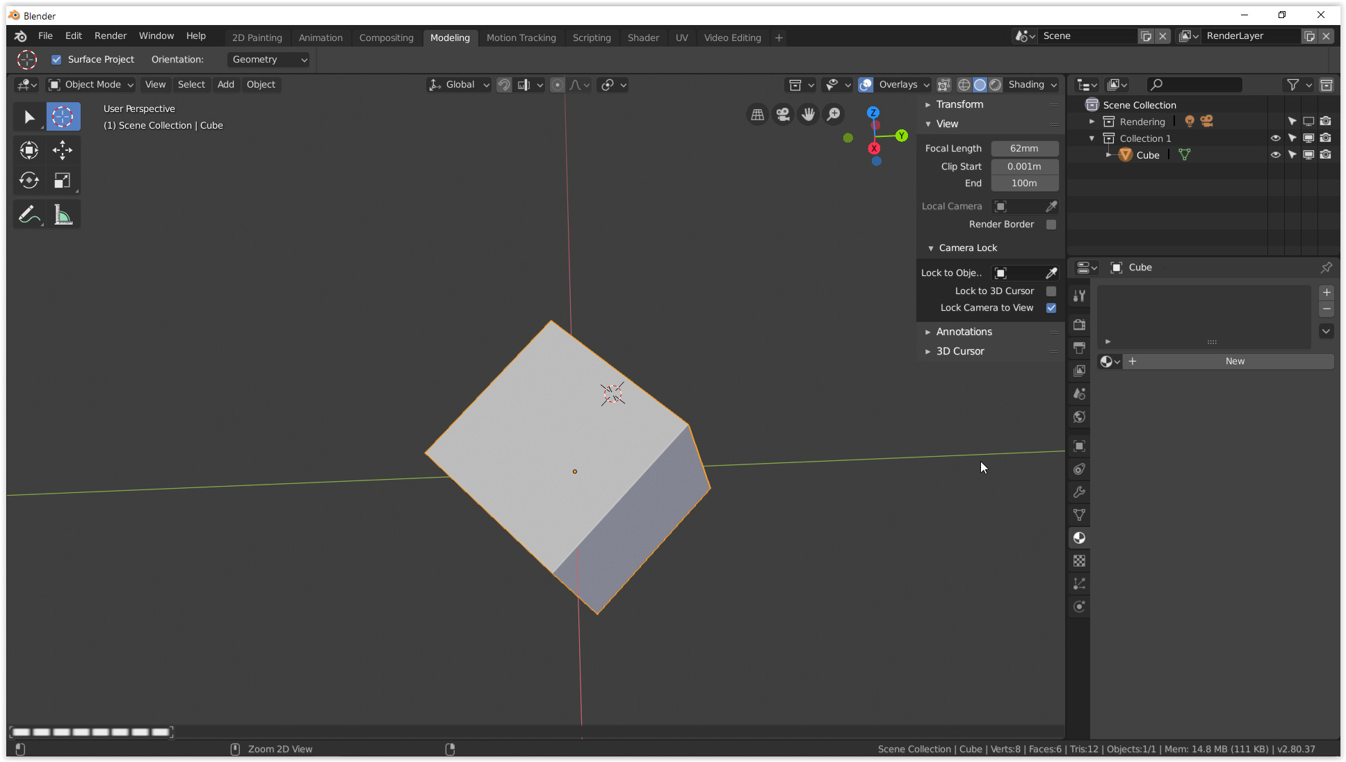
Lets talk about RELATIONSHIP LINES, they’re heavy to draw, super obstrusive, and really you cant tell hierarchy from them, It’d be better if the children objects would get an outline (like the selection one) but with a secondary color that lets the user know that is a child object.
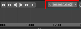
Changing the Timecode Style doesn’t have any effect on the timeline widgets:
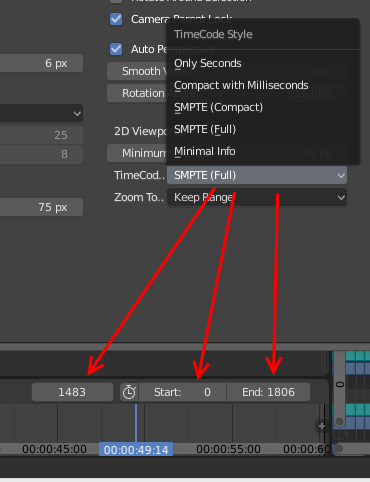
Instead there should be editable smpte widgets:
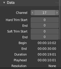
This widget will also be very useful in the strip properties panel:
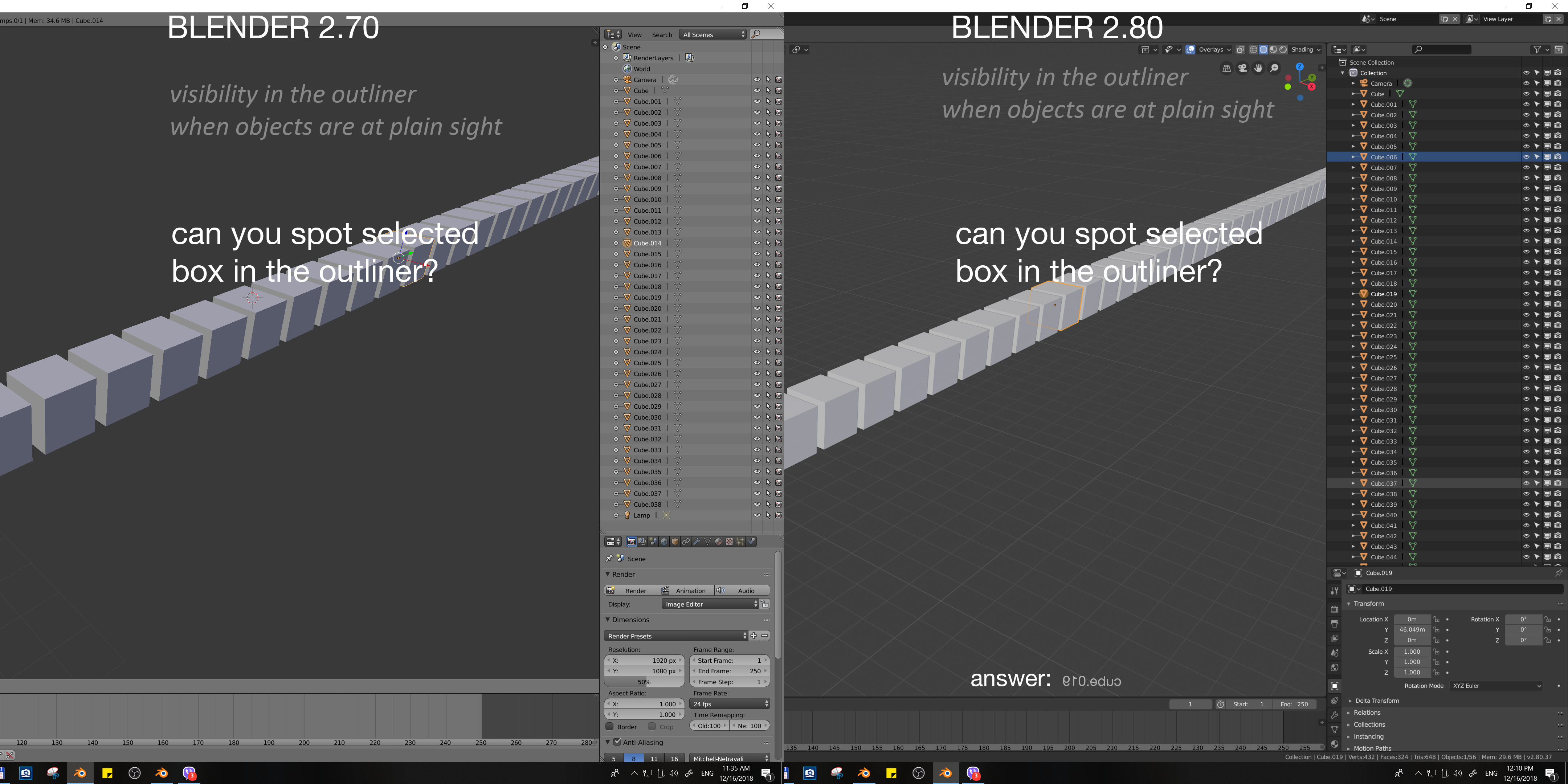
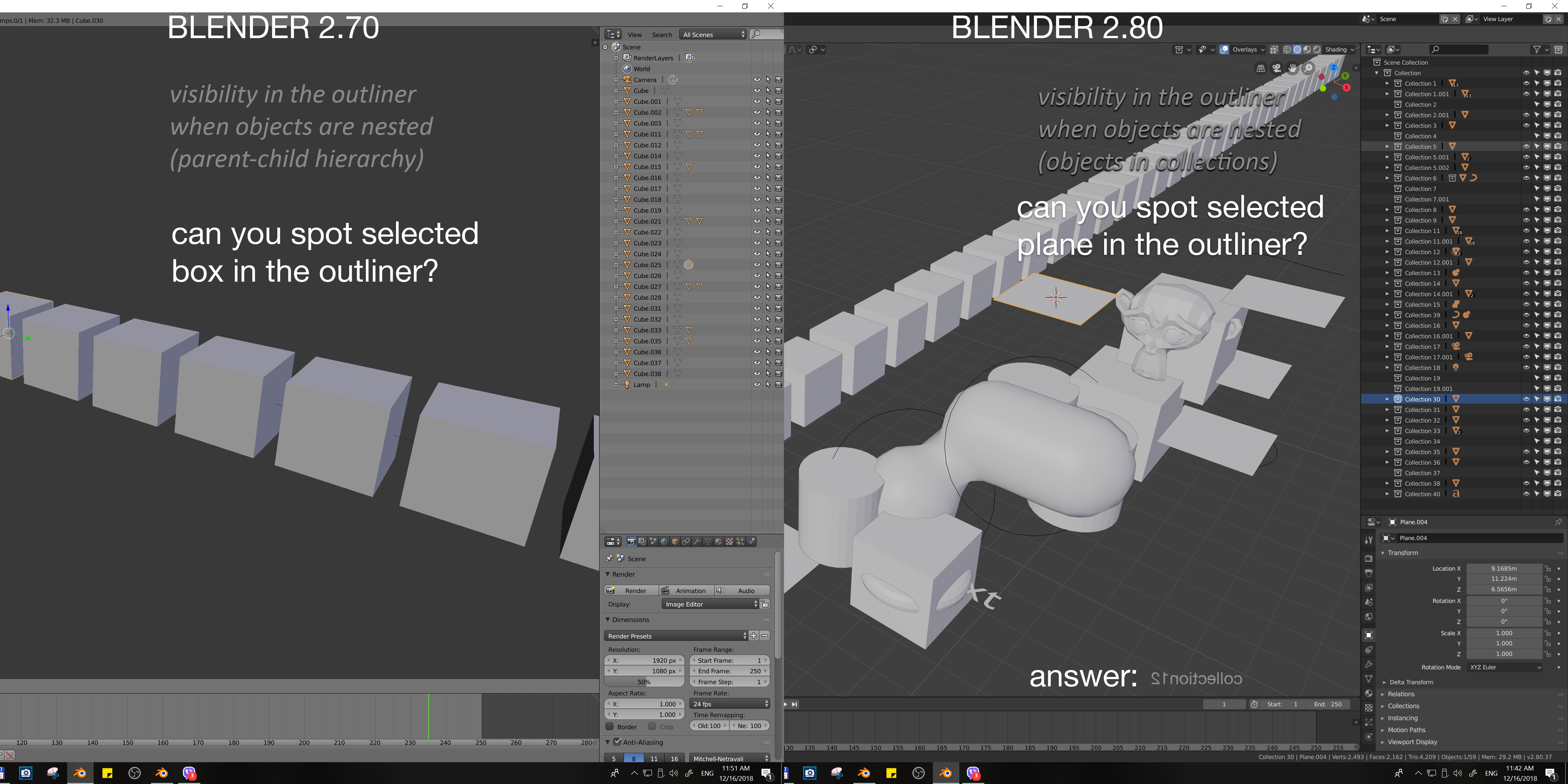
I love the new outliner and Collections. Now it is much more important part of the workflow, and after using 2.80 in a first project, I noticed something which classify as papercut “A small, isolated UI problem that makes using Blender annoying”. Here is a little quiz, I think my point will be clear. Directions: Try to find selected object from the scene in the outliner, preferably in a single glance
I hope that we can all agree that readability of selected objects from the scene in the outliner is difficult and after short time using it, produces strain in the eyes. I don’t know how much customization can be achieved with the custom themes, but I think that default theme should clearly highlight selected objects. It is true that outliner got some improvements in the selection within it (blue srip) and needs just a little bit of work to be perfect!
edit: this might seem quite out of context, it is in response to some early comment on the undo history.
i would like to see some changes in the undo system, one thing would be to make the undo history per object (or whatever fits the context) and having a visual slider (yeah its inspired from a well known software).
(see bottom left of image)
There is more places like that and I definitely vote for your proposal, but make it as general behaviour in blender probably wouldn’t be so easy. What if popup window consists from more than one field? Make it work only for windows with one field or define what field become ready to type? And so on …