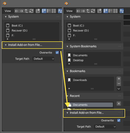
I think I heard Pablo said something about this a while back in one of his videos but it doesn’t seem to be fixed yet. This little options tab gets in the way always hiding away the most important stuff which are the bookmarks and recent folders. Should we stick it to the bottom like hooked to the bottom? Or at least it should remember where you put it last time you used the browser.
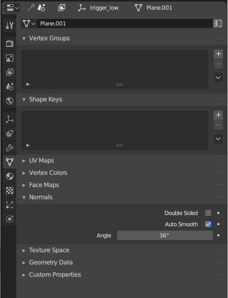
I find myself having to check “autosmooth” on almost every object I create. I’d probably save myself a lot of time if it was checked by default. Might be subjective though.
Definitely one of my biggest gripes with Blender, I also end up turning it on for all meshes. Would love to see a setting in preferences for if you want it on/off and what angle you want all new meshes to default to.
While on the topic, a related baby papercut is the cube in the start scene has the value set to 180 for some reason but all new meshes come in with it set to 30.
Thank you Pablo for fixing some of the VSE “paper cuts” so quickly!
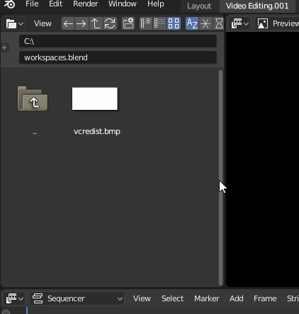
I noticed another one: in the VSE workspace filebrowser, if you open the lower area, it will cover almost the entire left area with an odd result:
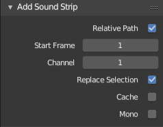
Also, in the VSE File Browser, the various import settings are not available in the default VSE workspace file browser. I mean these:
VSE Header > Add (menu) > Sound NB. Right aligned - the following import settings are left aligned.
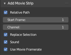
VSE Header > Add (menu) > Movie Could be very helpful if the “Add Movie Strip” import options also had “Use Movie Resolution” and maybe “Use Movie Ratio” too?
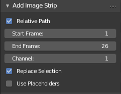
VSE Header > Add (menu) > Image
Maybe they all should be accessible in the VSE Workspace File Browser as default?
Or maybe the current file browser file selection(depending on extensions) should determine what options are available?
Or maybe the “Filter”/"Show… " file browser buttons could determine what import options are available?
And if added, maybe these options should be visible upon opening the default VSE workspace?
On the same note/same area in the File Browser when opening an add-on - this import-options-area could be minimized a lot(as default):
In the Graph editor, scrolling the mouse zooms in and out on both axes.
To scroll precisely on a single axis, one should click and drag the ends of the axis indicator: rather clumsy especially because it must be done on both ends: that’s a lot of clicks. One could also use Ctrl+MMB+“X” and Ctrl+MMB+“Y”, which is more difficult to remember.
But from other software usage, I get the feeling that hovering an axis and scrolling the mouse wheel shold constrain the zoom to that axis.
Please do hotkeys for call ‘overlays’ and ‘shading’ menus. These are kind of menus you use very often and it takes too much time to call them with a mouse everytime. It would be even better to do popup panels, you press hotkey once and e.g. ‘overlays’ panel popups, then you choose what you want then press same hotkey again and panel disappears.
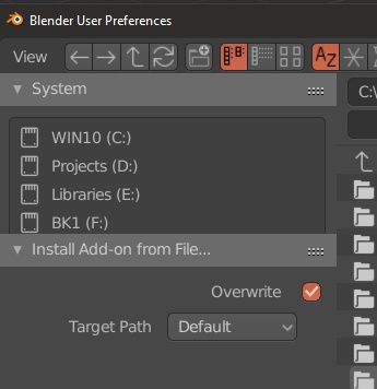
For me when I go to install an addon it always shows up like the above picture. No matter what. I downloaded the latest version this morning. Its happening while installing new HDRI files too.
Another thing I noticed is that the preferences window appears at the top along the screen width depending on where you closed it last time. Maybe it should always stick to the top center or even the center of the screen. Is there any reason not to cover the viewport? It would also be great if it could remember the resolution you closed it at. I tend to expand it and it always reverts back to a default size. Not a big deal but it could help to customize Blender for the user taste and more than anything users screens.
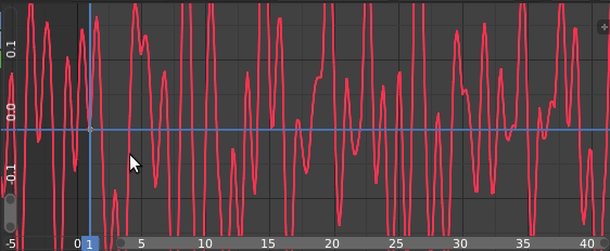
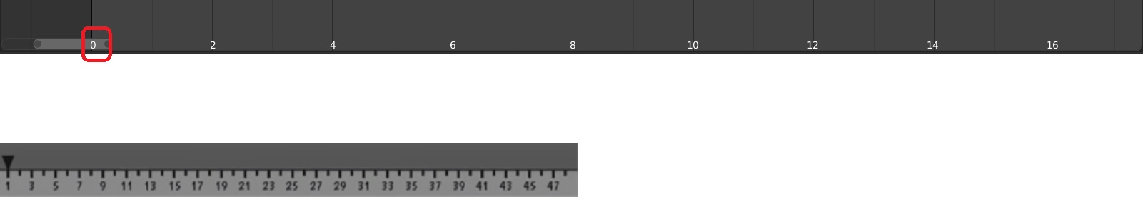
this one is really annoying, the time range starts with zero and goes in even numbers.i don’t think any animator finds this useful in any way, it’s better to show whole numbers, or odd ones like Hjalti showed in his Talk, which is btw the best numbering system for animation developed by Disney/Milt Kahl,
sorry for these probably i got an OCD and i want everything to be perfect!
Hi.
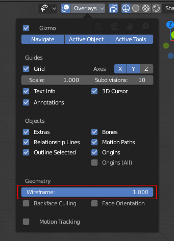
You are referring to default values in Wireframe mode, right?
I’m not sure if everyone has realized that all the geometry is drawn when an object enters to Edit mode, regardless of Wireframe value. You imagine a dense external mesh/object, and inside it other objects. If you select inner object and you enter to Edit mode, a Wireframe=1 value can make dense external mesh visually interfere with the work of what you really want to Edit/Work that is inner object. I know you could hide outside mesh and other things, just trying to understand if Wireframe=1 by default simplifies or makes things worse.
I think (I’m not completely sure too) that more important would be to have alpha X-ray value=0 by default under Shading options.
When you press “alt + a” to deselect in the Outliner, this is not reflected in the viewport. And if you deselect something in the viewport this is not reflected in the Outliner either. Could you synchronize the selection of both? otherwise it is quite confusing, especially for users who come from other software and new users.
At least that it could be optional, you could enable or disable viewport in sync.